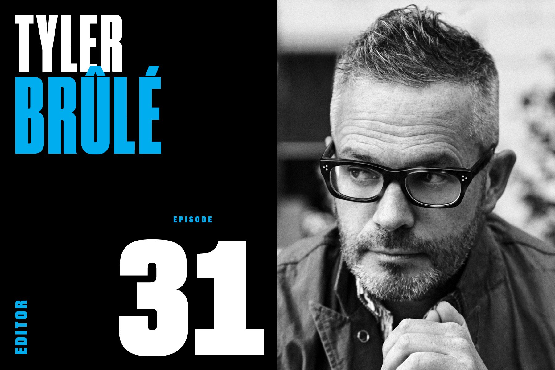
Episode 31: Tyler Brûlé (Editor & Founderer: Monocle, Wallpaper*, Konfekt, more)


“When life itself seems lunatic, who knows where madness lies? Perhaps to be too practical is madness. To surrender dreams, this may be madness. To seek treasure where there is only trash. Too much sanity may be madness. And maddest of all, to see life as it is, not as it should be!”

— Don Quixote de la Mancha


Monocle, the brainchild of the expat Canadian magazine maker, Tyler Brûlé, was born in early 2007, a relatively awful year for the magazine business, not to mention the entire world. In that year alone, more than 100 print magazines folded—or, as Wikipedia terms it, were “dis-established”—among them: Life (yet again), Premiere, Red Herring, House & Garden, Jane, Child, and Business 2.0. Months later, the global economy was hit by the Great Recession.

But Brûlé was coming out from under a rather lengthy non-compete agreement with Time Inc., after selling his previous startup, Wallpaper*, to the American media giant, and he was desperate to get back to the newsroom.

Given the times, and the stream of fading print publications, one could judge Brûlé’s resolve as “madness,” as Don Quixote cried in the opening clip. Digital was all the rage, the iPad was knocking on the door, and the radiation of the frenzied dotcom meltdown was still slowly killing legacy media.

“Madness”? Not if you know Tyler Brûlé. 

In his world, “life as it should be” is rich—a morning espresso in a bustling cafe with a crisp newspaper written and edited in the romance language of your choice, sorting out weekends skiing the Alps or lounging on the Med while riding the night train to Vienna.

And then there’s the print—not only the magazine itself, printed on “upwards of nine different paper stocks, crammed with extremely niche articles about carbon-neutral airlines in Costa Rica and sleek Afghan restaurants in Dubai,” but also special edition newspapers, coffee table books, and Monocle-approved travel guides. 

(Someone forgot to tell Brûlé and his brilliant team of collaborators that print is dead).

In a media culture traditionally obsessed with scale at any cost, Monocle’s modest 100,000 circulation belies a thriving multi-media juggernaut that confidently ignores the lure of social media. “We’re in a very fortunate position that we’re an independent publisher,” says Brûlé, “and we don’t have the commercial pressures of a big parent. And those commercial pressures can be two-fold: One is cost savings, but the other pressures are to go and chase after every new trend.”

In fact, Brûlé thinks of Monocle as a family business.

“We don’t set out to be pioneers, but also we’re a family company, and we can choose to do things quickly if we want to.”

That same culture has manufactured the pressure to establish one’s entrepreneurial cred. You’re not the editor, you’re the founding editor, the founding creative director, the founding director. But when asked about how he thinks of and refers to himself, Brûlé answers simply:

“If I think about ‘What do I do?’ I’m a journalist. I’m out to be a witness. I’m out to absorb, I’m out to interpret, and I’m out to communicate. 

A print-centric media phenomenon, created as a family business, led by a journalist. Surprising? Not for someone who’s been building a life—as it should be.

Here’s our editor-at-large George Gendron with Tyler Brûlé.
 

Episode 30: Stella Bugbee (Editor & Designer: NYTimes Style, The Cut, Domino, more)


This summer, our first collaboration with The Spread—the Episode 21 interview with former Cosmopolitan Editor-in-Chief Joanna Coles—became our most-listened-to episode ever. Now Rachel Baker and Maggie Bullock are back, and this time they’re speaking with another game-changing woman in media: Stella Bugbee, the editor of The New York Times Style section.

For our new listeners, Rachel and Maggie are a pair of former Elle magazine editors and “work wives.” In 2021, like many of you, they found themselves wishing for a great women’s magazine—and watching the old-school women’s mags drop like icebergs from a glacier. They decided to be the change they wanted to see—and The Spread was born.

Now, more than two years into publishing their dream weekly on Substack, rounding up juicy gossip, big ideas, and deeply personal examinations of women’s lives—from The New York Times and The Atlantic to Vogue and Elle to NplusOne and The DriftThe Spread is a cult favorite of media mavens and the media-curious. 

Rachel & Maggie call Bugbee “a magazine-making unicorn”—we’re excited to be able to share their conversation with you.


Episode 29: Albert Watson (Photographer: Vogue, Rolling Stone, Harper’s Bazaar, more)


Today’s guest, the celebrated photographer Albert Watson, OBE, is a man on the move.

This is not a recent development. Watson’s professional journey began in Scotland in 1959, where he studied mathematics at night. His day job? Working for the Ministry of Defense plotting courses—speed, altitude, distance, payload—for British missiles pointed towards Cold War Russia.

Watson’s affinity for the mathematical gave way to his interest in the arts when, in school, he dove head-first into all of them: drawing, painting, textiles, pottery, silversmithing, and graphic design. 

Later, on his 21st birthday his wife bought him a small camera. He became obsessed:

“All I know is that I clicked the shutter, and suddenly, magically, I got negatives back, that I could learn to process myself. And then, even better, I got into a dark room with a piece of white paper under an enlarger, and you put it in some chemistry, and lo and behold, up comes an image. Magic! Black magic! I called it. Amazing, insane, beautiful.”


Then came the magazines: Harper’s Bazaar, Rolling Stone, GQ, Mademoiselle, Entertainment Weekly, Details, and Vogue. All of the Vogues. And the ad campaigns: Prada, Chanel, Revlon, and Levis.

And yet, after all that, talk to the man about his work, any facet of his career, and the conversation invariably comes back to “the print”—the math, the chemistry, the graphic design involved—and about the journey the print takes, from camera to magazine, from magazine to gallery and, sometimes, from gallery to museum, as so many of his have.

Our editor-at-large George Gendron talks to Watson about all of it—day rates, social media, and that stunning apartment in TriBeCa.


Episode 28: Gail Anderson (Designer: Rolling Stone, SpotCo, SVA, more)


It’s impossible to look at Gail Anderson’s body of work and not be reminded of the limitless potential of design.

A traditional biography might pinpoint her education at the School of Visual Arts in the early eighties as her launchpad. But Gail actually kicked off her career much earlier when, as a kid, she created and designed her very own Jackson 5 magazine.

What followed was a series of career moves that also happened to coincide with major inflection points in the history of American graphic design:

  • After SVA, where she was mentored by Paula Scher and Carin Goldberg, Anderson accepted her first job, at Random House, where Louise Fili was reimagining book cover design.

  • Next, Gail made the move north to join Ronn Campisi and Lynn Staley’s team at The Boston Globe, at a time when the paper, and its internationally-renowned Sunday magazine, filled design award annuals.

  • Building on that experience, Anderson was summoned back home to New York to help Rolling Stone’s brand new art director, Fred Woodward. The two would spend the next 14 years showing the rest of us how magazine design is done.

  • Upon Woodward’s departure for GQ, Anderson exits stage right to join her SVA classmate Drew Hodges at SpotCo, a firm that specializes in work for theater. This, naturally, happens to be the precise moment Broadway was learning new ways to present the magic of the stage to new generations of audiences.

  • Also, just a quick sidebar to point out that in the middle of all of the above, Gail was collaborating with Steven Heller as he was ramping up his “side gig” as one of the world’s leading design-book authors.

  • And now, Gail is back at SVA working with aspiring designers, yet again at a moment when everything about the design world is rapidly changing.

It’d be implausible—and wrong—to suggest that Gail Anderson “Forrest Gump’ed” her way through her career. You could call it luck. (She does). But the reality is that Gail has made her own choices, created her own opportunities—“designed” (there we said it) herself a life, all the while bringing to the world what everybody loves about her: her sense of self, her joy for life, her humility, and her standards of excellence.


Episode 27: Terry McDonell (Editor: Sports Illustrated, Esquire, Rolling Stone, Newsweek, more)


Today’s guest, Terry McDonell, is the kind of editor you fear based on reputation, but would probably run through a wall for at 3am on deadline day.

As for that reputation, we’ve never worked with McDonell, but a simple Google search fills the screen with an undeviating set of impressions like these:

  • “he helped define American masculinity” 

  • “a version of manhood inspired by Hemingway”

  • “the manliest of literary men”


And indeed, his corps of collaborators includes a rogue’s gallery of literary tough guys: Jim Harrison, Edward Abbey, Tom McGuane, George Plimpton, and Hunter Thompson.

But missing from all that testosterone, until now, has been the true hero of McDonell’s life and career, and the subject of his beautifully-crafted new memoir: Irma: The Education of a Mother’s Son.

But read his other book, The Accidental Life, and you’ll discover a true editorial savant—an engaged partner to his coworkers, whose adventurousness knows no limits.

And apparently, neither does his resume. McDonell, an ASME Editor’s Hall of Famer, has topped the masthead at more magazines than anybody we know.

And those magazines have been nominated for 29 National Magazine Awards, winning in 2003, 2005 and 2010.

“Terry is one of the legends of our craft,” says ASME’s executive director Sid Holt. “He’s a supremely talented editor whose legacy to magazines will include not only unforgettable stories and images but also an inspiring vision of what magazines can be both in print and on digital platforms.”


Episode 26: Robert Priest (Designer: 8 by 8, Esquire, GQ, Condé Nast Portfolio, more)


If you can count yourself among the lucky ones who’ve met Robert Priest in person, any chance you remember what you were wearing?

Well, fear not: He does. According to his business partner, the designer Grace Lee, Priest possesses a near-photographic memory of how people present themselves. And those first impressions last a lifetime. 

To hear him talk, though, it’s not at all about being judgy. Priest is just naturally consumed with all things visual. He has been since childhood. (He gets it from his mother). To him, design is everything.

Priest has dedicated his 50-plus-year career to the relentless pursuit of taste, style, and fashion. And it shows. He has led design teams at all of the big magazines: GQ, House & Garden, InStyle, Newsweek, and Esquire (Twice!)

But there’s another side to Robert Priest. He’s a huge sports fan. And designing magazines is his sport. Indeed, like a head coach, he’s hired to win. And the trophies in this case are readership, advertising, circulation, and buzz—and when that’s all taken care of, the design awards start to pile up—they certainly have for him.

We talked to Priest about his early days in London, when he—and The Beatles and the Rolling Stones—were just getting started, about why soccer is the real football, and the rise and fall of one of the biggest magazine launches in history, Condé Nast Portfolio.


Episode 25: Gloria Steinem (Author, Founder & Editor: Ms. Magazine, more)


This episode is about a girl from East Toledo, Ohio.

A girl who taught herself to read by devouring comic books, horse stories, and Louisa May Alcott. A girl who didn’t set foot in a school until she was 14.

A young woman who went to India for two years to avoid getting married—to anyone. A young woman who was described by one Esquire editor as the only writer he knew who could make sex boring.

A woman who has never, ever, worked for a paycheck—who made up and launched her own idea for a column in New York magazine. (It kind of still exists.)

A woman who, while on assignment, was kicked out of the lobby of the Plaza Hotel because “she must have been a hooker.” Because all unescorted women who hung out in hotel lobbies in the 1960s must be sex workers, right?

A woman who describes herself as a “hope-aholic.”

This episode is about Gloria Steinem, the woman who created Ms. magazine—and started a revolution.

Our editor-at-large George Gendron caught up with Steinem on the occasion of the magazine’s 50th anniversary.


Episode 24: Bob Ciano (Designer: LIFE, Esquire, Redbook, Wired, more)


Today’s guest, Bob Ciano, is probably best known as the designer who guided the venerable LIFE magazine into its second chapter, shifting, after five decades as a weekly, to a monthly. But in an era where editors and art directors did not enjoy the downright chummy partnerships we have now, he’s known for a lot more.

In his career, which continues to this day, Ciano has punched his time card at all of these places: The Metropolitan Opera, Redbook, Opera News, Esquire, The New York Times, LIFE, Travel & Leisure, Wells, Rich & Greene Advertising, The New York Times (again), Encyclopedia Britannica, The Industry Standard, Forbes ASAP, Wired, St Mary’s College, Cal Arts, as well as his current Bay-area studio, Ciano Designs.

And in the middle of all that, he had an entire side career as a renowned album cover designer.

Talented and successful—and, by all accounts, extraordinarily kind—Ciano did not leave all of these jobs voluntarily. As he says in our interview, “firing art directors was a sport in those days.” Ciano himself has lost more jobs than most people have had.

In preparation for this episode, Ciano shared an fascinating artifact from his archive. It’s a note from LIFE editor-in-chief Richard Stolley’s monthly column, where Stolley is taking the opportunity to sing the praises of his unsung art department. This is what he wrote:

Next to my office on the 31st floor of the Time & Life Building is the layout room. It is dominated by a 19-foot counter set three and a half feet off the floor so you don't get a crick in your back bending over color transparencies. All the ingredients of the stories in every issue come together in the layout room. First, departmental editors, reporters and picture editors gather there, and we begin to put slides and pictures in a logical sequence. About that time, I turn to somebody and ask, “Will you please get Ciano?”

Moments later, Bob Ciano, LIFE’s art director, strolls in. Bob wears a beard and jeans, a kind of uniform of the day among art directors; in every other way, he is unique and one of the best in the magazine business. It is his job to take all the elements and ideas that other staff members have brought to a story and transform them into vibrant, intelligent layouts. The task is not unlike turning a kitchenful of ingredients into a feast. (It is no accident that Ciano is a great cook.)

Ciano has been in charge of our art department since LIFE became a monthly in 1978, having previously worked at Esquire and The New York Times. He decides which of his associates will design an article or does it himself. The arson story in this issue is his. “Fires are hot and colorful,” Ciano explains, “but because of the conditions, this story had to be shot in black and white.” Ciano decided that a symbolic point could be made by literally setting the opening photograph on fire. He put a match to it, and the blazing print was re-photographed in our lab. “If we can make a reader feel heat coming off that page, then we’ve done something he’ll remember.”

Though LIFE designers have won [hundreds of] awards, they toil in anonymity, getting no bylines on the articles they play a major role in shaping. Their reward, as Ciano puts it, “is to move readers, to touch their emotions. We’ll use whatever graphic tools we can.”

Ciano left LIFE—by his own decision—after an 8-year stint. Why? Because there’s something worse than getting fired, and that’s getting bored. It happens.

Our editor-at-large Steven Heller caught up with Ciano recently. Their lively conversation covers the magazine business the way it was, the way it is, and the way it will be.


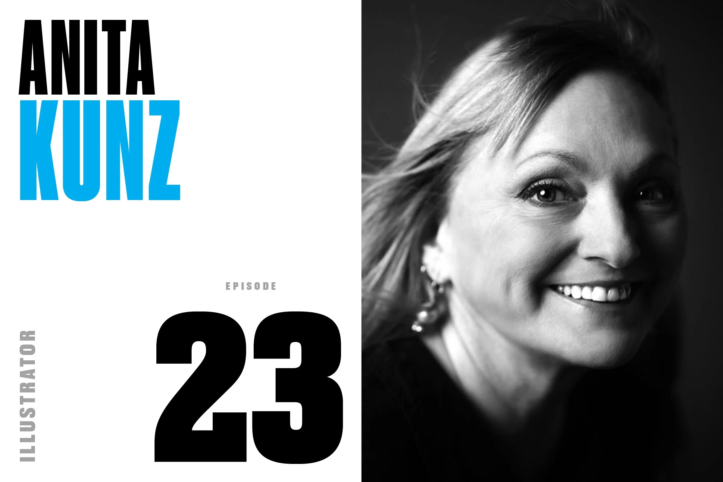
Episode 23: Anita Kunz (Illustrator: The New Yorker, Rolling Stone, more)


By any measure, Anita Kunz has built a dream career.

She’s won every award, been inducted into every hall of fame, won every medal and national distinction. When her native Canada ran out of honors to bestow, the country minted a postage stamp in her honor.

Over the last 40 years, the Toronto-based illustrator has created covers for The New Yorker, Rolling Stone, Time, and many (many!) others. On top of that, she’s now authored two volumes of her own work.

“She is,” as Gail Anderson, her former Rolling Stone collaborator puts it, “a freaking national treasure.”

And yet, despite all that success, Kunz confesses to still battling with self-doubt. No matter how great the genius or how many accolades hang on the wall, the familiar feeling of insecurity and inadequacy spares no one it seems. Is this good enough? Am I good enough? Every thinking creative person faces these questions at some point in their career.

While the universality of self-doubt may serve as consolation for those wrestling with some type of creative crisis, today’s guest has a different attitude about it. Instead of trying to quash self-doubt, “embrace it,” she says. 

“Self doubt is fuel—a generative force. Allowing a measure of uncertainty fosters experimentation, playfulness, and an open-mindedness that helps keep the ego in check.” And in a profession like editorial illustration, where rejection is ever present, self-doubt can transform into a survival skill.

In this episode, we delve into all of this, and we’ll talk about Kunz’ recent turn as an author, her favorite art directors, and that time she collaborated with an artistic monkey named “Pockets Warhol.” We also go into a dark moment when she was embroiled in a nightmarish copyright lawsuit. And, because it’s 2023, we’ll talk about what artificial intelligence means for her profession.


Episode 22: Jann Wenner (Founder & Editor: Rolling Stone, more)


Imagine there’s no sixties.

In 1967, today’s guest was a college dropout whose Plan B was to start a rock ’n’ roll magazine. Plan A? “Kicking back, having a good time, delivering letters, and smoking dope all day” as a San Francisco postal worker. But thanks to a nudge from his mentor, Ralph Gleason, and a cash infusion from his soon-to-be-wife, Jane Schindelheim, Rolling Stone founder Jann Wenner dove head first into Plan B. And the rest is magazine history.

Imagine there’s no Gonzo.

Rolling Stone was an instant hit. But it wasn’t until Wenner met the now legendary journalist, Hunter S. Thompson, and later published his “Fear and Loathing in Las Vegas,” that Wenner found the editorial promised land. Thompson’s explosive, unhinged prose created space at Rolling Stone for a legion of iconic writers—Tom Wolfe, Lester Bangs, Joe Eszterhas, PJ O’Rourke, Matt Taibbi, and others—and allowed the magazine to expand its reach from music to something much bigger. “If it feels good, man, just do it.”

Imagine there’s no Annie.

In 1970, a 21-year-old newcomer was given her first paid assignment for Rolling Stone: a cover shoot with recent ex-Beatle John Lennon. In short time, Annie Leibovitz was named the magazine’s chief photographer. But it was a nude portrait of teen idol David Cassidy for a 1972 cover that signaled another watershed moment for Wenner. The allure of celebrity fueled the young editor’s personal obsession to join the cultural elite, and the cover of Rolling Stone became his ticket in. The combination of Thompson’s wild-eyed, uninhibited ramblings and Leibovitz’s intimate, provocative imagery was the magic that set Wenner free.

Imagine all the memories. It’s easy if you try.

Five decades on, Rolling Stone is a boomer autobiography—its pages filled with Random Notes and “All the News that Fits,” epic stories documenting massive successes, abject failures, and the lives and deaths of the culturally relevant, all accompanied by unforgettable photographs and game-changing design. The magazine has survived near-bankruptcies, editorial scandals, cross-country moves, and yes, even that Reagan-era “Perception vs Reality” ad campaign.

In the end, though, Wenner’s story is a somber one. Any time a parent outlives a child, there’s immeasurable sadness. Of course Rolling Stone lives on—“digital-first” as they say—with new owners. And with Wenner’s son Gus taking the reins in 2017. But it’s not the same Rolling Stone. How could it be?

As for the man himself, that legacy is “complicated.” But in this episode, you’ll get glimpses, as Rich Cohen describes in The Atlantic, of Wenner’s “infectious charm, his gleeful, let’s-hope-we-don’t-get-shot zeal for adventure, how contagious his enthusiasm was, and how important his loyalty could be.

“Wenner’s pen and language weren’t what defined him as an editor. It was his vision and energy that attracted the best talent and inspired such memorable work.”


Episode 21: Joanna Coles (Editor: Cosmo, Marie Claire, more)


Maggie Bullock: It’s 2016. Rachel and I are sitting at our desks on the 24th floor of the Hearst Tower working at Elle magazine when the glass double doors blow open—or at least that’s how I remember it—and a vision of white-blonde hair, metallic pants, and checkerboard platforms, breezes into the office speaking in a commanding British accent to two or three minions in her wake.

There are no cameras in sight, but it’s as if we’re watching a grand entrance and a reality TV show. You can almost feel the wind machines in the air, which is what it’s like pretty much any time you witness a Joanna Coles appearance in the corridors of Hearst. There’s just something cinematic about her.

Rachel Baker: Joanna started her career as a reporter in London, moving to New York in the late 1990s to be The Guardian’s New York bureau chief. Next, she shifted into editing. First, as an articles editor at New York magazine, then over to More magazine.

By 2006, she grabbed hold of the editor-in-chiefship at Marie Claire, part of Hearst, and in 2012 became the editor-in-chief of the company’s largest title, Cosmopolitan.

Maggie Bullock: By the time she strode into the Elle offices in 2016, she was much more than an editor. She was also a reality TV star, a television producer, an author, a public speaker, a driving force of the “girl boss” movement, besties with Sheryl Sandberg, and a celebrity in her own right, who famously ran meetings from the helm of a treadmill walking desk.

Rachel Baker: The Jo-Co who walked into our office in 2016 had been newly-crowned as Chief Content Officer of Hearst Magazines—the first to hold the title—and tasked with consolidating the creative side of the 100-year-old publishing giant in the new digital-first era.

Maggie and I are a longtime print editors, so you can imagine how that sounded to us. But even through our fear goggles, we could also see that Joanna was ready to do the necessary surgery that other print editors didn’t have the stomach for, so that legacy magazines might live to see another day.

Maggie Bullock: Joanna was certainly the most famous women’s magazine editor at Hearst at that time. But what wasn’t clear back then, and is undeniable now, is that she was the last of her breed. There was a rich history of iconic women’s magazine editors that came before Joanna, but can you think of an iconic, larger-than-life one that came after her?

Rachel Baker: Joanna left Hearst in 2018, roughly around the same time that both Maggie and I did, and today she’s a board member for major tech companies like Sonos and Snapchat and an executive producer for major Hollywood projects, including an upcoming Amazon series starring Priyanka Chopra.

And she is, as ever, a baller.

Setting up our interview, with what lesser individuals might call a “personal assistant,” but Joanna has anointed Chief Get-It-Done Officer, when we met JC via Zoom, she was without pretense or treadmill desk. She was disarmingly down to earth.

Maggie Bullock: And yet somehow she still emanated that chutzpah or moxie—or maybe we should bring back the word “pizazz” to describe it. The X-factor that, in a 44-floor media empire brimming with big egos and considerable talent, made her one of media’s biggest stars.


Episode 20: Barry Blitt (Illustrator: The New Yorker, Air Mail, more)


Barry Blitt wants you to laugh at him, not with him. Because laughing with him means you’d have to be where he is. And—“thanks very much!”—but he’d rather not. He’s happy enough just drawing for himself.

“I’m trying to make myself laugh,” he says. “That’s the point, that’s part of the process, it’s as un-self-conscious as possible.”

Blitt is a Pulitzer Prize-winning cartoonist and an Art Directors Club Hall of Famer. He’s been called one of the “pre-eminent American satirists.” And, in a recent interview, he was asked what makes him laugh. His answer? “Awkwardness. When people are uncomfortable.”

Which, as it turns out, is right in Blitt’s, dis-comfort zone. In the introduction to his 2017 book, Blitt sums up the effect of all that attention and all those accolades: “I’ve never felt more naked,” he wrote.

Artists are especially prone to self-doubt. They pour their hearts and souls into their creations, whether it’s writing, or photography, or illustration—or cartooning. Then they have to find the courage to put that work out into the world. A world full of critics, and judgment, and rejection.

“I don’t see how the work can be separate from who you are,” Blitt says.

And in today’s explosive media climate, where standing by your work can sometimes mean life or death, Blitt shrugs:

“It’s amazing that I haven’t been punched. But I’m only 65 and, you know, there’s plenty of time for that, I expect. Especially with the hostilities and tensions in the air.”

Regardless, Blitt continues to churn out work. He’s completed over 300 assignments for The New Yorker alone—more than 100 of them covers. That work led to his Pulitzer in 2020, “for work,” the committee said, “that skewers the personalities and policies emanating from the Trump White House with deceptively sweet watercolor style and seemingly gentle caricatures.”

We talked to Barry about how, and why, he made a Time magazine art director cry, about who and what makes him laugh, about his biggest paycheck ever, about what weed can do for your creativity, and about fighting every urge in his body to self-edit.


Episode 19: Walter Bernard (Designer: New York, TIME, Fortune, more)


When your business partner is Milton Glaser, the most celebrated designer in the world, what does that mean for you? If you’re Walter Bernard, today’s guest, you accept it as the gift it is, and then you go out and make yourself an extraordinary career.

Here’s three things you need to know about Walter Bernard: 1) He was the founding art director of New York magazine, 2) he once produced a top-secret overhaul of Time magazine, and later became its art director, and 3), along with Glaser, he’s designed or redesigned over 100 publications around the world.

And Bernard is happy to talk about working in Glaser’s shadow:

“Milton was extraordinary in his capacity to work, and work quickly, and work brilliantly. And, there was no competition there. I was just kind of a student. And even though we worked together at New York, and I was the art director and he was design director, there was no question that he was the mentor and also the lead.”

But as we all know, magazine making is among the most collaborative pursuits in the world. As Gloria Steinem wrote in the foreword of Mag Men, Bernard’s and Glaser’s career retrospective monograph, “There is something about word and visual people sitting together in a room, riffing off each other’s ideas like jazz musicians, arguing and coming up with a result that no one of us would have imagined on our own. It’s as much a proof of freedom as laughter, which is also a mark of editorial meetings.”

As Bernard says, “On its most fundamental level, a magazine is a collection of energy and information.” That’s his wheelhouse. Collaboration is where Walter lives.

His secret weapon is his calming and confident presence, along with a Rolodex of the greatest photographers and illustrators around—priceless skills for a usually frenzied and chaotic line of work.

We talked to Walter about working with George Lois at the height of his powers, the time he and Glaser were redesigning competing newsweeklies just a few feet away from each other, and about the thrilling late-night knocks on his door every Sunday in the late 70s.


Episode 18: David Granger (Editor: Esquire, more)


We’re 18 episodes into this podcast, and, while several interesting themes have surfaced, one of the more unexpected threads is this: Nearly all magazine-inclined men dream of one day working at Esquire. Some women, too.

Turns out that’s also true for today’s guest, which is a good thing because that’s exactly what David Granger did.

“But all this time I’d been thinking about Esquire, longing for Esquire. It'd been my first magazine as a man, and I'd kept a very close eye on it.”

Unless you’re old enough to remember the days of Harold Hayes and George Lois, for all intents and purposes, David Granger IS Esquire. And in his nearly 20 years atop the masthead, the magazine won an astounding 17 ASME National Magazine Awards. It’s been a finalist 72 times. And, in 2020, Granger became a card-carrying member of the ASME Editors Hall of Fame.

When he arrived at Hearst, he took over a magazine that was running on the fumes of past glory. But he couldn’t completely ignore history. Here, he pays homage to his fellow Tennessean, who ran Esquire when Granger first discovered it in college.

“What Phillip Moffitt did was this magical thing that very few magazine editors actually succeed at, which is to show their readers how to make their lives better. And while he’s doing that, while he is providing tangible benefit, he also coaxes his readers to stay around for just amazing pieces of storytelling—or amazing photo displays or whatever it is—all the stuff that you do because it's ambitious and because it’s art.”

Upon taking over at Esquire, Granger’s instinct was to innovate—almost compulsively. Over the years, he’s introduced some of print’s most ambitious (and imitated) packaging conceits: What I’ve Learned, Funny Joke from a Beautiful Woman, The Genius Issue, What It Feels Like, and Drug of the Month, as well as radical innovations like an augmented reality issue, and the first print magazine with a digital cover.

Over and over, those who’ve worked with Granger stress his sense of loyalty. Ask any of his colleagues and you’ll hear a similar response: “David Granger is one of the finest editors America has ever produced. He also happens to be an exceptionally decent human being.”

At his star-studded going-away party after being let go by Hearst in 2016, Granger closed the evening with a toast that said it all: “This job made my life, as much as any job can make anybody’s life. It had almost nothing to do with me. It had everything to do with what you guys did under my watch. I’ve done exactly what I wanted to do—the only thing I’ve ever wanted to do—for the last 19 years. I’m the luckiest man in the world.”

We talked to Granger about retiring some of Esquire’s aging classics (Dubious Achievements, Sexiest Woman Alive), his surprising and life-changing Martha Stewart Moment, and what really went wrong with the magazine business.


Episode 17: Alex Hunting (Designer: Kinfolk, Mondial, Sabato, more)


For the past ten or so years, indie magazines have been booming. As digital media platforms relentlessly chase clicks and smartphones paralyze our focus, a host of fresh print publications are taking a slower and more measured approach. 

Guided by the tenets of the “slow media” movement, this new breed of publishers focuses on correcting the pace of media creation and consumption in the digital age. They advocate for alternative ways of making and using media that are more intentional, longer lasting, better written and designed, more ethical—all delivered in a tactile, bespoke package.

In this episode, you’re going to encounter magazine brands you’ve never heard of: Avaunt, Flaneur, Mondial, Monocle, and Port—and, one of the great success stories of the indie boom, Kinfolk. Born in Portland, Oregon, in the early 20-teens with the tagline, “A Guide for Small Gatherings,” the magazine was often referred to, dismissively, as “Martha Stewart for millennials.”

But, in recent years, Kinfolk, like its millennial stans, has grown up. The mag moved its offices to Copenhagen. They created a clothing brand, licensed local editions in South Korea, China, Japan, and Russia, published a series of coffee table books, and, in the ultimate act of adulting, launched a magazine for “people with kids.”

But one of the best moves they made was hiring today’s guest, the incredibly talented British designer, Alex Hunting. 

Intentional or not, Hunting is a practitioner of slow design. His instinct for space allocation and pacing eliminates those outdated, overwhelming TL;DR sections. His stunning magazine pages are subtle, spare, and expertly crafted. Perfect for indie magazines, which is good, because that’s pretty much all he does.

We’ll talk to Alex about why, at age 35, he’s so bullish on print, why his university experience didn’t go as planned, and how a pair of mentors literally changed his life.

And, if all of this bores you, well, there’s plenty of talk about houseplants.


Episode 16: Dan Okrent (Editor & Author: Life, Time, New England Monthly, more)


Back in April, 1966, Time magazine famously asked America the big question: “Is God Dead?” 

Thirty years later, as Time Inc.’s Corporate Editor at Large, Dan Okrent posed an equally existential question: Is print dead? His answer: An unequivocal “yes.”

“Finished. Over. Full stop,” he declared in a 1999 lecture at the Columbia School of Journalism.

Despite that, it’d be unfair to call Okrent the Grim Reaper. (Just don’t ask what he said about Detroit in the early 2000s). A lifelong realist, Okrent simply viewed digital delivery as the most sustainable path forward for magazines, thanks to the skyrocketing cost of paper, printing, and postage. Publishers, however, ignored Okrent’s prophecy, and continued to feast on their circulation revenues while treating their digital efforts purely as supplemental to print. 

“How do you say goodbye to that cash? You don’t. And then you end up seeing what happened in the slaughter of the next 10, 15 years. And this was before the smartphone!”

Okrent made his name as the cofounder of the highly-acclaimed regional, New England Monthly, in 1984—his first job as a magazine editor. He went on to work at Time Inc., Life magazine, and The New York Times, where he served as ombudsman in the wake of the Jayson Blair plagiarism scandal

He’s the author of numerous books, including Great Fortune, a 2003 history of Rockefeller Center that was shortlisted for a Pulitzer Prize. 

In this episode, Okrent talks about his personal board of advisors and the roles they’ve played in his life, about his career highs and low—including a “humiliating” bake-off he was part of when Sports Illustrated was looking for a new editor, about how he introduced the world to fantasy sports, but didn’t make a dime, and how he later pivoted to fame and fortune “off” Broadway.


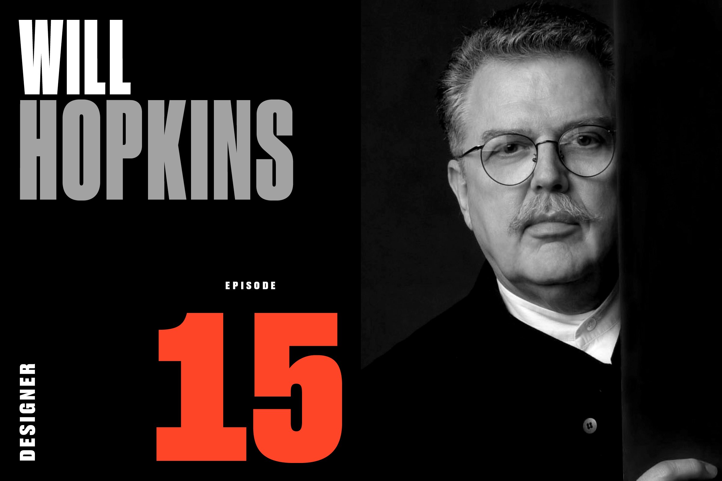
Episode 15: Will Hopkins (Designer: Then, Look, American Photographer, more)


If Marianna, Arkansas looks like the kind of place that Walker Evans would’ve photographed, that’s because it is. And it was in that cotton belt town in 1936 that William Paschal Hopkins came to be. 

Born to Charles, a cotton merchant, and Martha, a housewife, young Will Hopkins was on a path to follow his father into the cotton business. But thanks to the intervention of a distant aunt, a fashion illustrator in New York City, Hopkins’ parents were persuaded into shipping their creatively-inclined boy off to the celebrated Cranbrook Academy of Art in Detroit.

Hopkins became the “Arkansas Traveler.” After school, he took a job at Chess Records in Chicago, designing for the likes of Muddy Waters, Willie Dixon, and Bo Diddley. But soon the road was calling again.

“One Sunday afternoon, I’m walking down the street in Chicago. I said to this friend of mine, ‘You know, I’m gonna go to Germany.’”

Through a friend, Hopkins had discovered Willy Fleckhaus, one of the most innovative, creative, and influential graphic designers in postwar Germany. He knew he had to go.

Through his revolutionary work at the magazine Twen, Fleckhaus taught Hopkins everything about the business, including the “12-Part Grid,” his layout innovation that transformed the way magazines were designed.

After three years in Munich, Hopkins moved to New York to take the helm at Look magazine. Look enjoyed a spirited rivalry with the more conservative Life magazine, and published hard-hitting stories on civil rights, racism, gay marriage, and the environment. It featured the more cutting-edge design of the two, which Hopkins credits to his implementation of Fleckhaus’s grid system.

After Look closed in 1971 (followed by Life in 1972), Hopkins would go on to open his own studio where he continues to run a thriving design business, Hopkins/Baumann, in Minneapolis.

After a non-stop, 65-year career in magazine publishing, Hopkins’ memory is rich, but not quite what it used to be. But thanks to his partner in work and in life, Mary K Baumann, who helped to fill in the gaps, we learned why Hopkins seemed to attract magazines with “American” in the title (American Photographer, American Health, American Craft), how to drive a Volkswagen from Chicago to Germany, and about the good old days when art directors got wined and dined by French publishers.


Episode 14: Kathy Ryan (Author & Photo Director: The NY Times Magazine)


Kathy Ryan’s career journey began in Bound Brook, New Jersey, at St Joseph’s Catholic School. Her third grade teacher, Sister Mary William, had a thing for great works of art. And, as it turns out, so did Ryan.

“I got it. I so got it. Looking at the pictures and just understanding. It was like, ‘Wow, I get it.’”

That understanding of the power of the visual led Ryan to a focus on art in college—on lithography and printmaking. But the solemn life of an artist wasn’t for her. She hated being alone all day. She loved working with people. She wanted to be part of a team.

Kathy Ryan was made for magazines.

After starting her career at Sygma, the renowned French photo agency, Ryan was hired away by The New York Times Magazine in 1985. She had found her team.

In her tenure at the Times, she has collaborated with all the bold-face names: Jake Silverstein and Gail Bichler (the current editor-in-chief and creative director) as well as Adam Moss, Rem Duplessis, Janet Froelich, Peter Howe, Diana Laguardia, Gerald Marzorati, Ken Kendrick, and Jack Rosenthal. And between and among them they’ve won all the awards—and created one of the world’s truly great magazines.

Recently, Ryan’s work at the Times took a new turn. Inspired by her collaborations with the most gifted photographers in the business, Ryan started making a few pictures of her own. 

She had always been mesmerized by the way the light hit the Renzo Piano-designed Times headquarters. But on this particularly sunny morning, Ryan pulled out her phone and snapped a picture. Then she took another. And another. She started seeing pictures everywhere. Portraits, abstracts—whatever caught her eye. Encouraged by friends and colleagues, she posted them on Instagram with the hashtag #officeromance.

After a career of looking at pictures, she is now making them. And that led to her glorious book, Office Romance, published by Aperture in 2014.

We talked to Ryan about her passion for the art of work, about the thrill of discovering incredible talent in unexpected places, and about the responsibility that comes with sending photojournalists into harm’s way.


Episode 13: Metropolitan Home (Dorothy Kalins, Editor & Don Morris, Designer)


For me, the 1980s comes down to two things: The Nakamichi RX-505 Cassette Deck and Metropolitan Home magazine.

First, the gear.

The Nakamichi RX-505 was an audiophile’s wet dream. It was prominently featured in the steamy 1986 film, 9½ Weeks. In a scene from that movie, Mickey Rourke walks Kim Basinger into his monochrome Hell’s Kitchen penthouse, where she glides through a living room full of furniture by Marcel Breuer, Richard Meier, and Charles Rennie Mackintosh. In the middle of it all, the Nakamichi opens, flips the Brian Eno cassette, and closes, automatically.

And now, the magazine.

Eighties movies featured a slew of inspirational apartments: Tom Hanks’ Soho loft in Big, Judd Nelson and Ally Sheedy’s Georgetown pad in St. Elmo’s Fire, Billy Crystal’s East Village flat in When Harry Met Sally. So when apartment dwellers from Des Moines to Manhattan asked themselves “How can I make my apartment look like the ones in the movies,” they turned to Met Home.

While the old guard, House & Garden, Architectural Digest, and House Beautiful, relished in displaying palatial estates and lavish celebrity spreads, Met Home was the design inspiration for the rest of us.

By the mid-80s — thanks to today’s guests: editor Dorothy Kalins and designer Don Morris — Met Home was the best-selling shelter magazine in America, boasting a higher circulation than all of them.

It was a magazine rich with design and lifestyle inspiration and beautiful apartments and houses, but Met Home was not a typical decorating magazine. Its stories were very personal and captured its subjects’ individual passion for the things that surrounded them.

But it didn’t last long. By the early 90s, thanks to a recession, Meredith sold Met Home to Hachette, who out-bid Jann Wenner’s Straight Arrow Publishers for the magazine. Hachette, though, was more focused on its own shelter book, Elle Decor, and left Met Home to languish and fade.

Kalins and Morris were gone, each off on their own new adventures.

For many of us, Metropolitan Home was a special magazine from a special time. A hopeful time. We were moving out — to dorms, first apartments, or starter homes. We bought affordable modern furniture from a brand-new Swedish big-box store called Ikea. We drank the New Coke while we played Donkey Kong on our Nintendos. We sang along with “We Are the World.” We watched Top Gun — the original — on our VCRs. And we paid an average of $375 (!!) a month for our rent.

Met Home gave its intrepid readers permission to indulge themselves in creating their own home design. And, as Morris says, “We helped expose people to a lot of design trends, but also gave them a sense of how they might be able to bring that into their own lives.”

To read the full transcript and view the portfolio, visit Print Is Dead. (Long Live Print!).

LISTEN
Apple | Google Podcasts | Spotify | Amazon Music


Episode 12: Gael Towey, Designer (Martha Stewart Living, MSLO, House & Garden, more)


In 1995, New York magazine declared Martha Stewart the “Definitive American Woman of Our Time.” And, as the saying goes, sort of, behind every Definitive American Woman of Our Time is another Definitive American Woman of Our Time. And that’s today’s guest, designer Gael Towey.

But let’s back up. It’s 1982, and Martha Stewart, then known as the “domestic goddess” — or some other equally dismissive moniker — published her first book, Entertaining. It was a blockbuster success that was soon followed by a torrent of food, decorating, and lifestyle bestsellers.

In 1990, after a few years making books with the likes of Jackie Onassis, Irving Penn, Arthur Miller, and, yes, Martha Stewart, Towey and her Clarkson Potter colleague, Isolde Motley, were lured away by Stewart, who had struck a deal with Time Inc. to conceive and launch a new magazine.

Towey’s modest assignment? Define and create the Martha Stewart brand. Put a face to the name. From scratch. And then distill it across a rapidly-expanding media and retail empire.

In the process, Stewart, Motley, and Towey redefined everything about not only women’s magazines, but the media industry itself — and spawned imitations from Oprah, Rachael, and even Rosie.

By the turn of the millennium, Martha Stewart Living Omnimedia, as it was rebranded in 1997, included seven magazines, multiple TV projects, a paint collection with Sherwin-Williams, a mail-order catalog, Martha by Mail, multimillion-dollar deals with retailers Kmart, Home Depot, and Macy’s, a line of crafts for Michael’s, a custom furniture brand with Bernhardt, and even more bestselling books. And the responsibility for the visual identity of all of it fell to Towey and her incredibly talented team. It was a massive job.

We talk to Towey about her early years in New Jersey, about being torn between two men (“Pierre” and Stephen), eating frog legs with Condé Nast’s notorious editorial director, Alexander Liberman, and, about how, when all is said and done, life is about making beautiful things with extraordinary people.

To read the full transcript and view the portfolio, visit Print Is Dead. (Long Live Print!).

LISTEN
Apple | Google Podcasts | Spotify | Amazon Music