Rick Fiala, art director: Christopher Street, 1976-1979
/Cover credits (clockwise from top left):
July 1976: Illustration by David Edward Byrd; August 1976: Illustration by Rick Fiala; October 1976: Illustration by Arthur Engvik; September 1976: Illustration by Fred Baldus
Christopher Street was the first slick national gay magazine, founded in 1976 in New York City. It was originally conceived as a gay version of The New Yorker, with illustrated covers without headlines, and text-heavy pages of reviews and cultural essays, broken up with cartoons. The content was very tame by today’s standards, but it was so provocative at the time that subscribers received their mailed copies in plain envelopes. Rick Fiala was the founding art director, hired in part “because I was willing to work for free, at first.” During his three years at the magazine, he guided Christopher Street through several remarkable designs, and also drew nearly all the cartoons, often in different styles and with made-up bylines. Fiala later went on to a notable art direction career at Skiing and many other publications, and today lives in Athens, Georgia. Christopher Street ceased publication in 1995. Christopher Street, and the work of Rick Fiala in designing and branding it, made history and helped expand LGBTQ rights.
How did you end up at Christopher Street? What was your background?
My first job as a graphic designer was at a small printing shop in Lancaster, Pennsylvania. I designed a huge variety of projects there: display ads, invitations, food labels, calendars, brochures, booklets. Plus, I got to know the printing process from camera work to binding, which was very useful in most of my later jobs, since designers often act as their own production managers.
In New York, I was hired as the graphic designer in the promotion department of Springer-Verlag New York. Springer was then the world’s largest publisher of medical and scientific books. In Europe, its publications practically sold themselves, because of Springer’s reputation, but in the U.S., more of an effort had to be made in promotion. I was hired to “Americanize” the look of ads, brochures, and catalogs.
I left Springer after two years to freelance. I did display ads, book covers, posters, graphics and drawings for trade magazines, and other miscellany. Then one day, a friend told me that he was part of a group that was going to launch a “gay literary magazine.” It was going to be a sort of “gay New Yorker,” he said, “called Christopher Street.” They needed an art director—one who would work for free in the beginning. I was—and remain—a magazine junkie and, like everyone else I knew, subscribed to The New Yorker, so I was very interested when he asked if I’d meet the other members of the group and show them my portfolio.
At the meeting I met the publishers, Chuck Ortleb, who would become the editor in chief, and attorney Dorianne Beyer; editors Sharon Delano (from The New York Review of Books) and Michael Denneny (McMillan and then St. Martin’s Press), and two other founding members. My portfolio had no magazine work at all; instead I showed them ads and brochures for publications with titles like Atlas of Red Corpuscles and International Journal of Nephrology. But they thought my work was “classy,” and I was, after all, willing to work for free.
Inside pages from Christopher Street, 1976, showing The New Yorker influence. Cartoons illustrated by Rick Fiala
How did you put together the first issue?
As a literary magazine, Christopher Street would be text-heavy, and like The New Yorker, its pages would be broken up by single-gag cartoons, poems, and little pen-and-ink drawings. Unlike The New Yorker at the time, Christopher Street would include photographs now and then for interviews, “galleries” of art and photography, and stories about theater and dance.
I didn’t really know how to lay out a magazine. But editor Sharon Delano came over to my apartment one day with mechanical (i.e., layout) boards from the Review, long, loose paper columns of text, some clipart, and a waxer. She taught me how to lay out articles with art, plan for captions and ads, and when to let editors know if lines had to be cut.
Sharon DeLano and Michael Denneny had already acquired an impressive collection of articles for the magazine. The first issue included work by Paul Goodman, Harold Rosenberg, Joan Larkin, Mutsuo Takahashi, Edmund White, Richard Howard, James McCourt, Frank Rose, Gregg Kilday, Bertha Harris, and Peter Anastos. We would have a front-of-the-book section called “Out & Around,” in imitation of The New Yorker’s “Talk of the Town,” followed by feature stories. Reviews would come at the end. David Edward Byrd, the most famous poster artist in New York (Follies, Godspell, Fillmore East posters), had already completed the cover illustration for the first issue. So I concentrated on the interior of the magazine.
We had accounts at a nearby office supply store, a photostat shop, and a type-setting place. The typesetter was for display type only, because the columns of text would be set in-house with an IBM Electric Composer, which, I think, we rented.
What was the concept of the original design? In what way was it targeted to a gay audience?
As noted above, much of the inspiration for the design of Christopher Street was The New Yorker. But I also liked the look of New York magazine and started to incorporate certain elements from it, especially in later issues.
I wasn’t conscious of any way the magazine’s design targeted the gay audience, and we never discussed such a thing. We thought the subject matter alone targeted the gay audience, and that the design should just be clean, readable, and “classic.”
All cartoons illustrated by Rick Fiala
You began cartooning for Christopher Street with no experience. How did you make that happen?
I started drawing cartoons because none of us knew any cartoonists, and cartoons were to be an essential part of the appeal of the magazine. Most of the gaglines were from Chuck Ortleb, who initially pasted new lines onto cartoons he’d cut out from The New Yorker. That would give me the “scene” he had in mind and then I would draw my version of it.
But soon Chuck was giving me lines without accompanying cartoons. I’d read a line and the scene would just come to me, which is why we made such a good team. I learned a lot about what makes a cartoon funny, which has to do with the gagline, of course, but also with the expressions on the faces of the figures. I got pretty good at depicting blank, innocent, stunned, blasé, irritated, and haughty looks.
In the beginning, I tried to draw in different styles, signed with different names, to make it appear that Christopher Street had a whole stable of cartoonists. Out of this attempt to draw in these styles, I learned that some ideas were well suited to a rich look with a lot of detail and ink washes. Others seemed funnier with a quick, “unschooled” line drawing, like the kind James Thurber drew for The New Yorker in the 30s and 40s, the kind that made one book publisher (for Thurber’s and E.B. White’s Is Sex Necessary?) ask where the “finished” drawing were. The cartoons were very well received and, we thought, had a lot to do with people buying the magazine. They were collected into three books published by Avon and St. Martin’s Press.
When did you start getting paid for your work at Christopher Street?
I can’t remember how many issues I did before I was paid. I think that maybe after two or three issues, I was paid something like $85 a week. (I still had to do outside freelance work to survive.) That amount was raised now and then, when the magazine could afford more.
After a year in an office in the Village, we moved to a suite of offices in the Fisk Building on West 57th Street. That’s when I thought we must have been doing pretty well and could be considered a success.
We had two-color covers for the first year, but sprang for three colors for our first anniversary issue (July 1977). In 1978, the February to May covers were also three-color; we finally went for 4-color covers in June of that year. That was also a sign, to me, of a certain success.
Also, publishers were seeking us out to have chapters of books printed in Christopher Street before or concurrent to publication. And I didn’t have to look for illustrators or photographers by the summer of 1977; they came to us. I was very proud of the fact that we were publishing work by Roz Chast and Robert Risko before Condé Nast put them both under exclusive contracts.
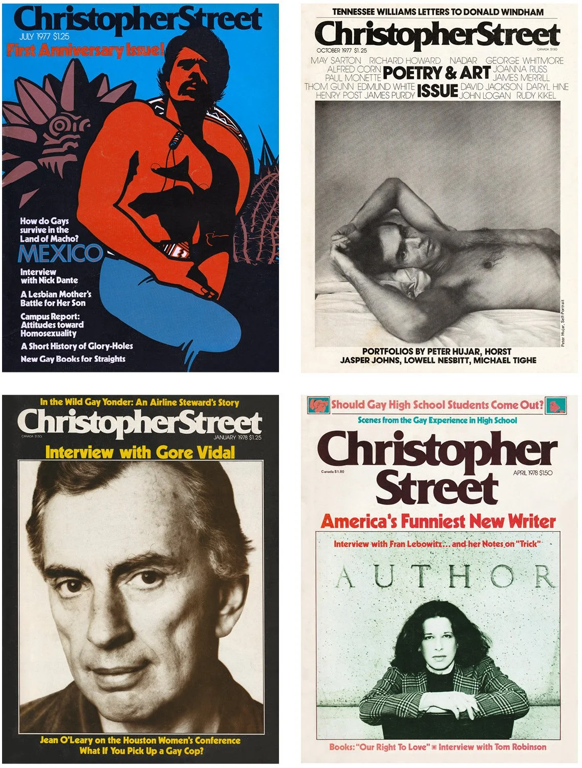
Cover credits (clockwise from top left): July 1977: Illustration by Robert Ein; October 1977: Photograph by Peter Hujar; April 1978: Photograph by John Bean; January 1978: Photograph by Matthew Rolston
Christopher Street was the first slick national gay magazine. Did you feel like you were making history at the time?
Yes. The only other “slick” magazine that was popular with gays was After Dark, which covered entertainment. It was famous for the gorgeous photos of its subjects, which were often barely-clothed men. That was the closest to a slick national “gay” magazine on the stands, though the word “gay” was very rarely mentioned and the magazine purported to be for everyone.
I did feel we were making history—we all did—and we joked we were the “solar plexus of the gay world.” But it did feel like being a part of something important.
How did Roz Chast end up publishing her first cartoons in Christopher Street?
When Roz came into our office to show me her work, I wondered how she knew about us. She told me that she had picked up an issue someone had left on the seat in the subway, and when she saw that it had cartoons, she decided to make an appointment. (She’d been making the rounds to various magazines for weeks.)
Roz isn’t gay and her cartoons aren’t gay-themed, but I fell in love with them. We thought our readers would love her little fables on the minutiae of American life. Roz’s drawings are funny in themselves, but I regard her as a writer first. That’s another reason I thought our audience would love her work: ours was a readers’ magazine.
After six months you changed the cover format, to add cover lines and be much more aggressive in terms of newsstand sales. What was the idea behind this?
I thought that imitating The New Yorker, which has no cover lines, could only go so far. The New Yorker had been around since the 20s and people knew what to expect of it. Christopher Street was new and evolving, and I thought cover blurbs would make it more noticeable and boost sales. Cover blurbs are teasers and tell a potential reader what’s inside. I certainly read magazine covers before I buy and I think most people do. Besides their commercial value, I think they have design value. I love words and typefaces and images together—as in a poster. The most beautiful magazine covers, to me, are the ones that combine words and imagery.
Cover credits (clockwise from top left): May 1978: Photograph by Ed Bahlman; June 1978: Illustration by Gary Bralow; May 1979: Photograph by Arthur Tress; November 1978: Illustration by George Stavrinos
After a couple of years you revamped the cover, made the logo bigger and stacked it, and introduced new typefaces. How did that come about?
In January 1978, the main feature was an interview with Gore Vidal. Vidal’s office gave us two beautiful portraits of him by Matthew Rolston. They were close-ups and I couldn’t see putting the Christoper Street logo and cover blurbs over Vidal’s hair and certainly not over his face. So I put one shot—the one in which Vidal is looking straight at the reader—in a “window” and the logo and blurbs in the surrounding background color.
That was supposed to be a temporary solution to a specific problem. But the very next issue was our “Gay Love” issue, whose main story was made up of interviews with two men who described their relationship from their individual perspectives. I had a good black-and-white photo of them, cropped in a way that made the “window” necessary again.
I thought that the logo and cover lines on the Gore Vidal cover looked too tight. When I stacked the logo, it automatically produced some white space on both sides of the word “Street,” and made the photo under it pop more. The staff really like it, and we settled into that format as a look for the magazine for the next year-and-a-half.
In 1979 I started working with a photographer named Arthur Tress. He’s a great photographer and a real “concept” man. He shot photos specifically for the window look of the cover, and the last two issues I worked on—May and June of 1979—were among my very favorite covers. In fact, between the look of the cover in those last months and the look I’d developed for the inside, I thought Christopher Street had finally settled into its own “brand” look.
What do you think now looking back at your time at Christopher Street?
First and foremost, Christopher Street gave me my opening into working in magazines, something I had wanted to do for a long time. And it was just as I had imagined: I loved reading the articles before they were set into type, discussing the art that would accompany these stories, choosing illustrators and photographers, and laying out the pages. I also was working with interesting people and meeting interesting people. It had a certain glamour, even on the occasions I’d have to spend all night in the office with beer and cigarettes, putting the final touches on the pages before the printer picked them up in the morning. I’d often walk home those mornings exhausted and elated.
I worked with terrific people, some of whom are still friends today: art assistant Kevin Fisher, who went on to art direct Film Comment and Audubon magazines; our typesetter Ron Gans; our attorney Dorianne Beyer; artist David Edward Byrd; Vanity Fair caricaturist Robert Risko; authors Andrew Holleran and Ed White; editors Patrick Merla and the late Michael Denneny.
I was an accidental cartoonist, but I really loved doing those drawings, until it became a chore. I began to resent having to do them toward the end—the quality of drawing shows it, too— and I never did them again after leaving Christopher Street.
My Christopher Street portfolio got me my job as art director of Skiing magazine, where I suddenly had a pretty big budget and a lot of help in the art department. I also went on to art direct the in-flight magazines of USAir, Eastern, and United, and then became the founding art director of Long Island Monthly. Later, I worked for the Miami Herald, Southern Voice (in Atlanta), and in the public relations and development divisions of the University of Georgia and Emory University. I’m now in the process of re-designing the alumni magazine for the UGA’s vet school, so I’m still in the magazine biz (sort of).
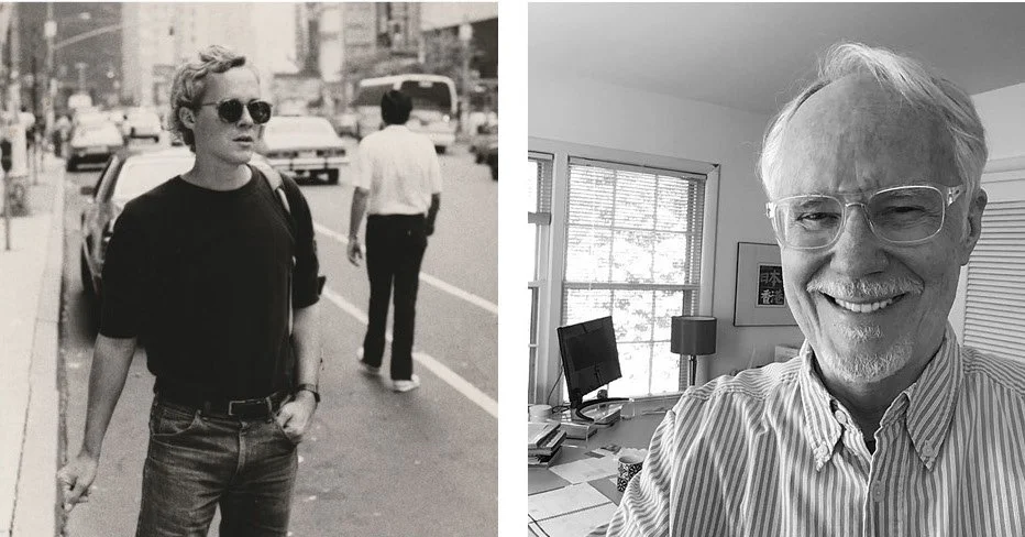
Left: Rick Fiala, New York City, 1976. Right: Rick Fiala, Athens, Georgia, 2024


