Werk #1: Good Housekeeping, Group Creative Director: Melissa Geurts
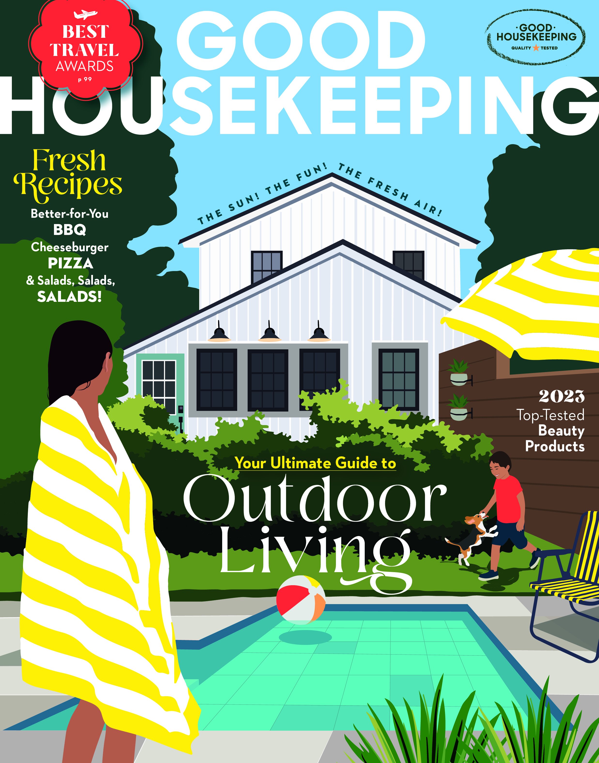
/May 2023 cover of Good Housekeeping. Group Creative Director: Melissa Geurts; Editorial Director: Jane Francisco; Illustrator: Camila Pinheiro
Welcome to Werk!, a new Society of Publication Designers column that will be an ongoing showcase of smart, cool magazine making of all kinds: design, photography, illustration, data visualization, and more. We hope to highlight work that first and foremost shows a love and joy in the actual creation process, that is not only inspiring to look at, but that shows a passion for the art, science, and process of editorial visual storytelling. Every day we see folks out in SPD land who are rocking it with amazing, accomplished, state-of-the-art magazine design and visuals, creations so strong that the only correct response is to say “WERK!” Every two weeks or so we’ll have something new that will hopefully make you smile and give you a jolt of creative energy. And at the end of each column there will be a short, highly curated list of fun things to read, view, watch, or listen to while doing your own work.
Good Housekeeping illustrated covers by Alex Ross. Clockwise from top left: May 1951, April 1953, April 1945, February 1950. These covers and much more via Today’s Inspiration.
Good Housekeeping is a legendary magazine brand. For much of its 130 years GH featured illustrated covers, many of them by Alex Ross, who during the 1940s and 50s created 130 covers for the magazine. (For more on Ross, check out Today’s Inspiration).
The May 2023 issue of Good Housekeeping marks the mag’s first cover illustration in 60 years, with art by Camila Pinheiro and creative direction by Group Creative Director Melissa Geurts. It’s a remarkable change of pace for the women’s magazine, bold and modern but right on brand. Geurts explains: “We wanted to revive a piece of our heritage while still capturing the current moment. The cover illustration is like our magazine…classic, with a modern twist.”
Credits, all issues: Group Creative Director: Melissa Geurts; Visual Styling Director: Lis Englehart; Photographer: Mike Garten; Visual Director: Roni Martin-Chance; Chief Food Director: Kate Merker; Editorial Director: Jane Francisco
April 2023: Prop Stylist: Alex Mata, Craft Stylist: Lis Englehart; December 2022: Food Stylist: Christine Albano; October 2022: Craft and Prop Stylist: Lis Engelhart and Alex Mata, Food Stylist: Erika Joyce
This is just the latest of a remarkable series of Good Housekeeping covers created by Geurts and her collaborators Lis Englehart (visual styling director), Mike Garten (photographer), Roni Martin-Chance (visual director) and Jane Francisco (editorial director). Together they have produced masterful images, finely crafted and beautifully detailed, and filled with what Geurts refers to as “deliciousness.” The current era of magazine cover design seems to swing between extremes of complete spareness and simplicity and massive clutter and coverline overload. Good Housekeeping draws on the influences of classic Martha Stewart cover images, mixed with Entertainment Weekly-style typography, graphics, and cool visual touches. There’s a smart conversation going on here between the magazine’s creators and the readers; each cover is packed with detail and brilliant graphic embellishments. Check out the paint swatch popping off the bottom of the January/February 2023 cover, the spider hanging from the G in the logo on the October 2022 cover, and my favorite, the straw that pokes through the descender of the g on the December 2022 cover. These covers are state of the art in every way: craft, art, and pure genius magazine making. I can’t stop looking at them!
3 QUESTIONS WITH MELISSA GEURTS
Good Housekeeping Group Creative Director Melissa Geurts has been at the magazine since 2014. She previously worked at Chatelaine magazine in Canada. Geurts splits work between her office in midtown Manhattan and her home in Greenpoint, Brooklyn.
ABOUT THE COVER: Our goal is to create a world of possibility for our readers on the cover, where they can find inspiration and practical advice for creating a beautiful, simplified life. We want them to feel like they can taste the deliciousness and dive right in! We want the magazine to feel like a trusted friend, offering awe-inspiring and informative, reliable content.
ONE COOL THING ABOUT MY JOB: Working with the scientists at the Good Housekeeping Institute. If you ever get the chance to visit their offices (tours are available!), you'll feel like you're in a science lab, with all sorts of testing being conducted to ensure the products we feature meet our extremely high standards. And when we figure out how to showcase those products in a fun, beautiful, and informative way, it's like solving a puzzle – so satisfying.
MY INFLUENCES: Early in my career, I fell in love with print magazines that focused on intricate packaging and layered information, like Monocle, Men’s Health, and Fast Company. At Good Housekeeping I get to channel that inspiration and bring it to life in a design-forward way. It's like a dream come true to work for a brand that values creativity and storytelling as much as I do.
WERK IT!
Cool stuff we like that will make your days and nights much more fun!
Clockwise from top left: Design Thinking! Comic; Adi Oasis, Lotus Glow; Dream Big, Laugh Often and More Great Advice from the Bible; Price, Peace, and Love T-shirt, designed by Joseph Caserto.
INSTAGRAM: Design Thinking! Comic @designthinkingcomic are self-described “comics dragged kicking and screaming from a designer’s head.” The creator is Stephen Waller, a digital designer in the UK with a keen sense of the rights and wrongs (mostly wrongs) of a designer’s life and work. Funny stuff. You can sign up to have it delivered to your inbox for a good laugh in the morning.
MUSIC: I’ve been loving the new album by Adi Oasis, Lotus Glow. The French-Caribbean, Brooklyn-based singer/producer/bass player mixes some nifty guest vocalists (Kirby, Jamila Woods) with a sweet, funky dance/R&B groove. Perfect for late night work of any kind.
BOOK: Illustrator supreme Hanoch Piven has a masterful new children’s book out, created with Shira Hecht-Koller, Dream Big, Laugh Often and More Great Advice from the Bible. Whatever your religious background (or even if you have none), you and yours will delight to Hanoch's super duper illustrations and the life lessons from Moses, David, Deborah, Ruth, Elijah, and other Bible notables. Every page is filled with fun details (check out Noah's water wings and toothbrush feet on the cover!) and good learning. This will definitely be my #1 holiday gift-giving item this year!
T-SHIRT: June is Pride Month, and you can celebrate and represent with this brilliant (and stylish) Pride, Peace, and Love T-shirt, designed by graphic designer/editorial art director Joseph Caserto. Joe has a very cool graphics side hustle on Etsy, featuring Pride-themed T-shirts, posters, mugs, and cards. His shirts are the perfect apparel for the Queer Liberation March on June 25 in NYC, or for the pride march in your hometown.
Find more cool work (and Werk!) on Instagram via @newmanology.


