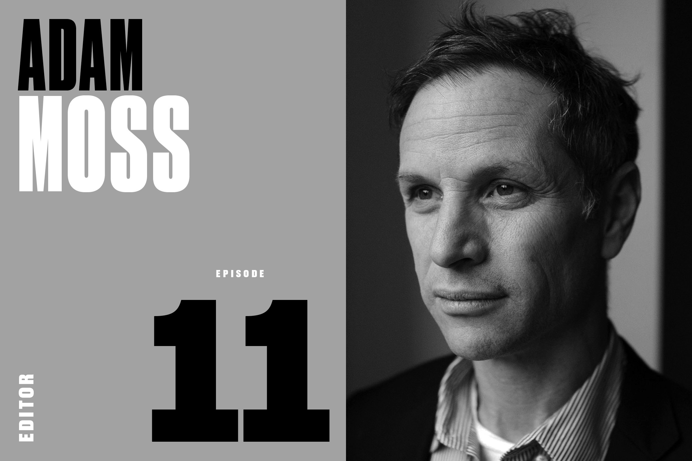
Episode 11: Adam Moss, Editor (New York, The New York Times Magazine, more)


Adam Moss is probably painting today. He’s not ready to share it. He may never be ready to share it. You see, this ASME Hall of Famer unabashedly labels himself as “tenth rate” with the brush. And he’s okay with that. 

As Moss explains, it’s not about the painting. After decades of creating some of the world’s great magazines, he is throttling down. He’s working with canvas, paint, and brush — and reveling in the thrill of making something, finally, for an audience of one.

It hasn’t always been this way for Moss. Like most accomplished editors — like most serious creatives — Moss spent the better part of his career obsessed. Obsession is essential, he says, to the making of something great.  

Growing up on Long Island, Moss became obsessed with Esquire and New York magazines. “My parents were subscribers,” he says. “I was in the suburbs. I’d open them and it was my invitation to New York City. And to cosmopolitan life. And to sophistication.” And knowing that it was all happening just a short subway ride away made it irresistible.

Moss’s publishing portfolio is rotten with blue-blood brands: Rolling Stone, Esquire, The New York Times, and New York magazine. He’s collaborated with editorial legends. 

In 1987 Moss decided to create something of his own. Invited to pitch an idea for a new magazine to the owners of The Village Voice, Moss did his song and dance. The folks in the boardroom were … unmoved. Afterwards, Moss retreated to the men’s room to ponder his humiliation. Minutes later, Leonard Stern, the Voice’s owner, took a spot at the next urinal, where he turned to Moss and said, “Okay, we’ll do your magazine.”

What Moss pitched was a city magazine called 7 Days. It only lasted two years. But two weeks after ceasing publication, 7 Days was presented the National Magazine Award for general excellence.

The splash it created propelled Moss to The New York Times, where, in a few short years, he transformed the paper’s Sunday supplement into an editorial juggernaut for creative talent — the Esquire or New York magazine of the 1990s. 

In 2004 Moss joined another venerable brand, New York magazine, where he not only completely reimagined the print magazine, he bear-hugged the encroaching internet menace, creating more than 20 new digital-only brands, five of which — Vulture, The Cut, Intelligencer, The Strategist, and Grub Street — remain heavyweights of modern online editorial. 

In 2019, Adam Moss ended his 15-year run at New York, saying, “I want to see what else I can do.” So … painting. But, once obsessed, always obsessed. Moss is currently at work on a book about creation and creativity. The book will decode how creative geniuses transform an idea into something real. A song by Stephen Sondheim. A sculpture by Kara Walker. A film by Sofia Coppola.

Asked to describe what he’s making, Moss calls it a “big, overgrown magazine.” Of course he does.

To read the full transcript and view the portfolio, visit Print Is Dead. (Long Live Print!).

LISTEN
Apple | Google Podcasts | Spotify | Amazon Music
 

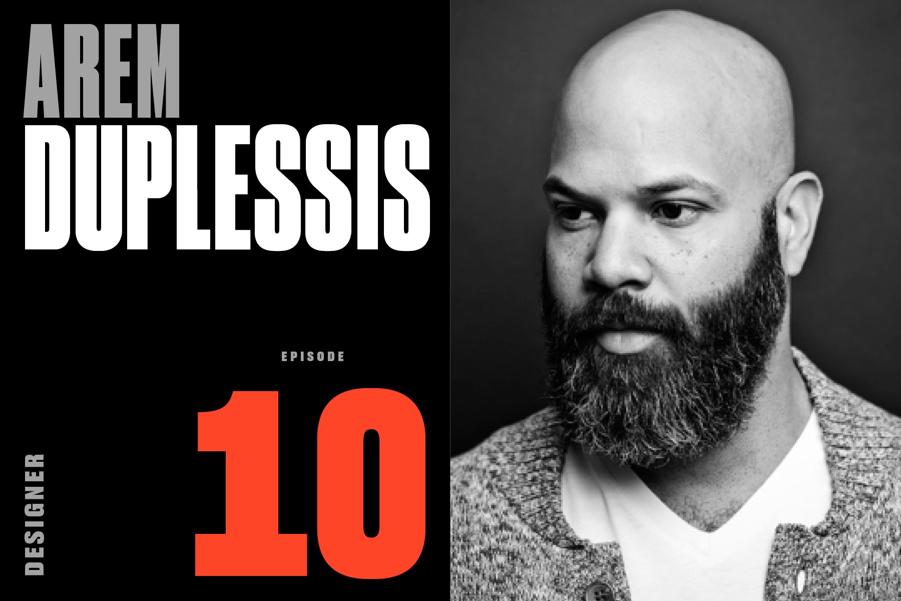
Episode 10: Arem Duplessis, Designer, Apple, The New York Times Magazine, GQ, Spin, more


Where do magazine designers go after all the magazines are gone? That’s a question we’ve often pondered in recent years.

Well, if you’ve been paying close attention, you’d probably guess, as it turns out, a lot of them go to Cupertino. And much of this migration can be traced to 2014, when today’s guest, AIGA Medalist and Emmy Award-winning creative director Arem Duplessis, left his storied job at The New York Times Magazine to go to work at Apple.

You might be asking yourself, Why would one of America’s most high-profile magazine designers leave a coveted job at an iconic publication—one that brought him global recognition, countless awards, and deep creative satisfaction—for a famously secretive company known, well, for locking away its talent in a vault of non-disclosure agreements?

But the better question might be, Why wouldn’t he?

Duplessis is arguably one of the most influential creative directors of his time. His ten years of covers for The New York Times Magazine shaped its vision and identity. As design director at GQ, he helped create the now-ubiquitous Gotham family of fonts. And now he’s blazed the trail for print designers in search of digital futures.

While the departure of big-name magazine designers like Duplessis to Silicon Valley may strike fear in some, it reaffirms what many of us have long known: Despite years of slumping newsstand sales and magazine closures, the all-purpose skills of elite creative directors are still very much in demand.

As former ESPN creative director Neil Jamieson says, “Why wouldn’t Apple be hiring magazine designers? No other category of designer is more multifaceted. Beyond the fundamentals, they do branding, packaging, identity, storytelling. They have experience on set, with video, social, and short-form storytelling.”

There’s no question there’s a dire need in the corporate world for these kinds of skills. The question that remains unanswered, so far, is: Can that kind of digital work ever deliver the same creative fulfillment that magazines do?

We talked to Duplessis about learning to scuba dive in his Dad’s Virginia quarry, the modeling career that wasn’t, cutting his teeth at the controversial hip-hop magazine, Blaze, adapting to life on the West Coast, and what he’s planning for life after work.

To read the full transcript and view the portfolio, visit Print Is Dead. (Long Live Print!).

LISTEN
Apple | Google Podcasts | Spotify | Amazon Music


Episode 09: Hans Teensma, Designer, Outside, New England Monthly, Disney, more


Dutch-born, California-raised designer Hans Teensma began his magazine career working alongside editor Terry McDonell at Outside magazine, which Rolling Stone founder Jann Wenner launched in San Francisco in 1977.

When Wenner sold Outside two years later, Teensma and McDonell headed to Denver to launch a new regional, Rocky Mountain Magazine, which would earn them the first of several ASME National Magazine Awards. On the move again, Teensma’s next stop would be New England Monthly, another launch with another notable editor, Dan Okrent. The magazine was a huge hit, financially and critically, and won back-to-back ASME awards in 1986 and ’87.

Ready for a new challenge—and ready to call New England home—Teensma launched his own studio, Impress, in the tiny village of Williamsburg, Massachusetts. The studio has produced a wide range of projects, including startups and redesigns, as well as pursuing Teensma’s passion for designing books.

Since 1991, Teensma has been incredibly busy: He was part of a team that built a media empire for Disney, launching and producing Family Fun, Family PC, Wondertime, and Disney Magazine. He’s designed dozens of books and redesigned almost as many magazines. And he continues to lead the creative vision of the critically-acclaimed nature journal Orion.

You might not know Teensma by name, but his network of deep friendships runs the gamut of media business royalty. Why? Because everybody loves Hans.

When they designed the ideal temperament for survival in the magazine business, they might as well have used his DNA. He’s survived a nearly 50-year career thanks to his wicked sense of humor, his deep well of decency, and above all, his unlimited reserves of grace.

You’re gonna love this guy.

To read the full transcript and view the portfolio, visit Print Is Dead. (Long Live Print!).

LISTEN
Apple | Google Podcasts | Spotify | Amazon Music


Episode 08: Dan Winters, Photographer, The New York Times, Texas Monthly, Wired, more


Photographers are gearheads. They’re always throwing around brand names, model numbers, product specs.

So when legendary photographer Eddie Adams asked today’s guest, Dan Winters, if he knew how to handle a JD-450, it was a no-brainer. He had grown up with a JD-350. So yeah, the 450 would be no problem.

But here’s the funny thing: the JD-450 is not made by Nikon. Or Canon. Or Fuji. Or Leica. Not even his beloved Hasselblad. Nope. The JD-450 isn’t made in Tokyo, Wetzlar, or Gothenburg.

The John Deere 450 bulldozer is made in Dubuque, Iowa, USA.

And what Eddie Adams urgently needed, right at that moment, was someone to backfill, level, and compact a trench at his farm, which, coincidentally, was prepping to host the first-ever Eddie Adams Workshop, the world-renowned photojournalism seminar, at his retreat in Sullivan County, New York, near the site of the 1969 Woodstock music festival.

Get to know Dan Winters a little bit, and none of this will come as a surprise to you. It also won’t surprise you that the bulldozer incident isn’t even the funniest part of the story of how Winters got to New York City in 1988 to launch what has become one of the most distinguished careers in the history of editorial photography—a career that began with his first job at the News-Record, a 35,000-circulation newspaper in Thousand Oaks, California.

The secret—spoiler alert—to his remarkable career, Winters will say, “is based in a belief that I’m being very thorough with my pursuits and being very realistic. I’m not lying to myself about the effort I’m putting into it. Because this is not a casual pursuit at all. This is 100 percent commitment.”

Well, that, and out-of-this-world talent and vision.

To read the full transcript and view the portfolio, visit Print Is Dead. (Long Live Print!).

LISTEN
Apple | Google Podcasts | Spotify | Amazon Music


Episode 07: Janet Froelich, Designer, The New York Times Magazine, T, Real Simple


For decades, The New York Times Magazine has dominated the conversation about the best-designed magazines in the world. Much of the credit for that goes to today’s guest, Janet Froelich.

One of the most influential and groundbreaking creative directors of all time, for the better part of her career, Froelich navigated the mostly male-run world of magazines and joined other pioneering women—Cipe Pinelas, Bea Feitler, and Ruth Ansel—in paving the way for the women who would come after.

After learning the ropes of magazine design at the feminist arts collective Heresies in the late ’70s, Froelich moved on to work with the legendary editor Clay Felker, to launch a magazine at the New York Daily News, followed by a wildly-successful 24-year run as the creative director of The New York Times Magazine, and was the co-creator of its sister brand, T: The New York Times Style Magazine.

“She’s an art director’s art director,” says the noted author and design critic Steven Heller. She’s also a New Yorker through and through, having lived and worked in the city her entire life.

In this episode, Froelich recalls her own personal 9/11 story, and what is was like to be in the newsroom on that day, as well as how, in only three days, she helped create the magazine cover that inspired and informed the memorial to the Twin Towers and those who lost their lives there. She talks about other Times magazine covers that left a mark, about her early years as an artist living in Soho and hanging out at Max’s Kansas City, and why you should never be afraid to hire people better than you.

To read the full transcript and view the portfolio, visit Print Is Dead. (Long Live Print!).

LISTEN
Apple | Google Podcasts | Spotify | Amazon Music


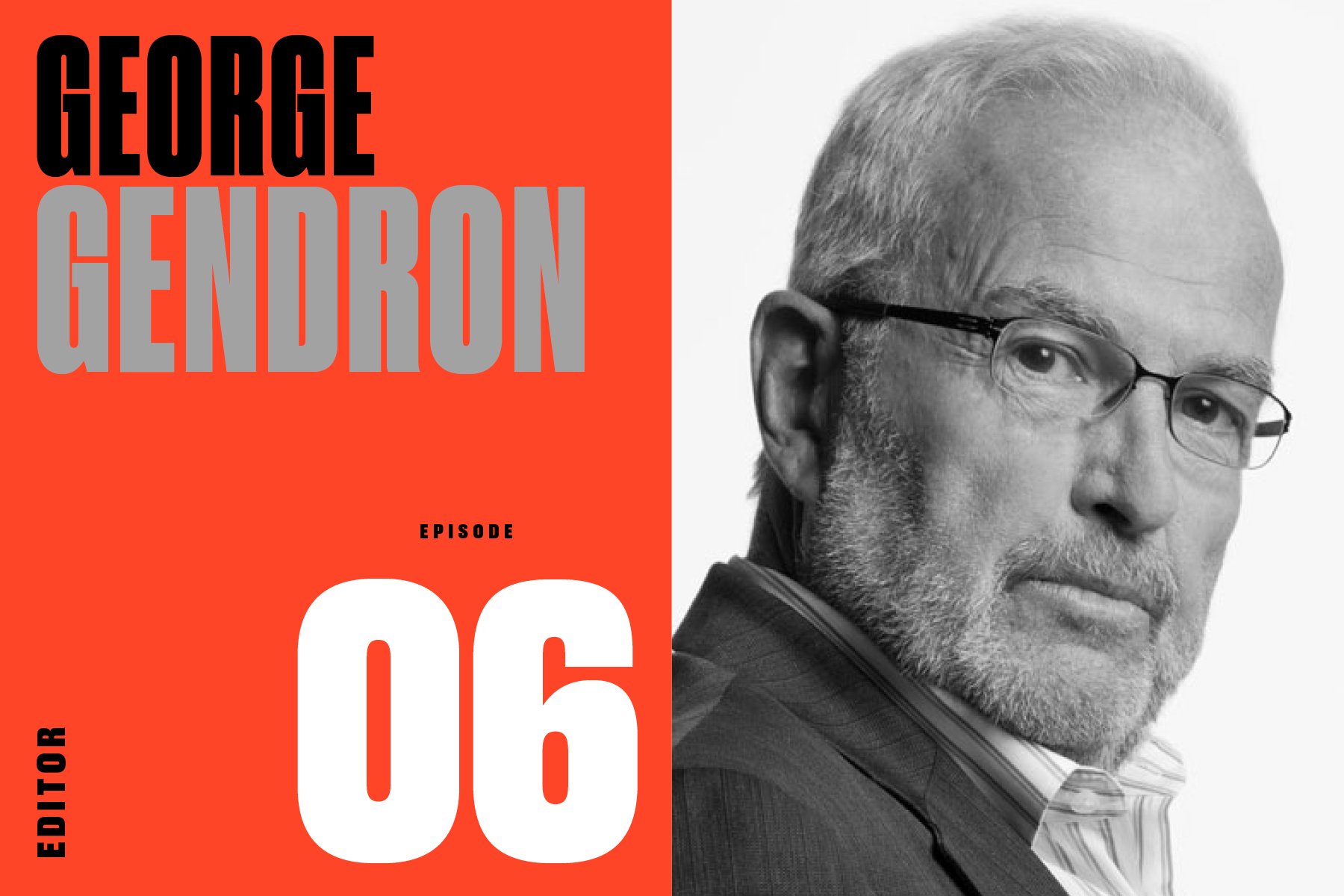
Episode 06: George Gendron, Editor, Inc. Magazine, New York, Boston, more


In this episode, we talk to George Gendron, the long-time editor [Inc. Magazine] and educator who created one of the first liberal arts-based entrepreneurship programs in America. We talk about his first job working under legendary editor Clay Felker in the early days of New York magazine, how a third-grade book report set him up for a life in publishing, the near-fatal car accident that changed everything, why we should look to TV for the future of magazines, and how to build an economically-sustainable life around doing the work that you love.

— 

George Gendron has spent his professional life at the intersection of media, innovation, business, and education. For over 20 years, he documented the burgeoning world of startups and entrepreneurship as the editor of Inc. Magazine. But nothing has done more to influence his career than his time working for the legendary founder and editor of New York magazine, Clay Felker. We’ll circle back to Felker and New York magazine in a bit. But first, where does a 50-year career as an editor begin?

In New Jersey, of course. In the third grade…

To read the full transcript and view the portfolio, visit Print Is Dead. (Long Live Print!).

LISTEN
Apple | Google Podcasts | Spotify | Amazon Music
 

Episode 05: Brad Holland, Illustrator, Playboy, The New York Times, Time, more


It’s 1967 and your train from Sandusky, Ohio, just rolled into Grand Central. You’ve got a suitcase in one hand and your portfolio in the other. You exit the station and take a right, uptown, before realizing it’s the wrong way. (It’s ok, you’re not from around here). So you turn around, and head down to 223 East 31st Street, the studio of the celebrated designer Herb Lubalin, who was about to give you your first assignment in the big city.

And so begins the career of legendary illustrator Brad Holland — a 50-plus-year career that put him on the Mt. Rushmore of contemporary American illustration alongside Milton Glaser, Edward Sorel, Ralph Steadman, Seymour Chwast, and the recently-departed Marshall Arisman.

When you begin your career in the Summer of Love, at some point the conversation is gonna turn to sex. After turning in his first piece to Lubalin’s Avant Garde, a magazine with mild sexual themes, Holland’s next few assignments came from magazines who liked it a little rougher: Screw Magazine and The New York Review of Sex, before finally landing a steady gig at Hugh Hefner’s Playboy.

As Playboy’s legendary art director Art Paul would soon find out, Holland wasn’t like other illustrators. Inspired by Gary Cooper’s Howard Roark in the movie The Fountainhead, who battled against conventional standards and refused to compromise with the establishment, Holland was not willing to execute the spoon-fed instructions given by magazine art directors. He revolutionized the illustrator-for-hire dynamic. It changed everything.

In this episode, Holland talks with our editor-at-large and esteemed design critic, Steven Heller, the co-chair of the MFA Design Department at the School of Visual Arts in New York, an Art Directors Club Hall of Famer and AIGA Medalist, who also calls Holland one of his oldest friends and mentors.

They talk about their early days together, what it’s like to tell your mother that you’ve finally sold a cover illustration—to Screw Magazine, how to say NO to a creative director, how to crop an Ayatollah, and—spoiler alert—how to avoid getting mugged in Alphabet City.

To read the full transcript and view the portfolio, visit Print Is Dead. (Long Live Print!).

LISTEN
Apple | Google Podcasts | Spotify | Amazon Music
 

Episode 04: Robert Newman, Designer, Entertainment Weekly, Details, Fortune, Vibe, more


To call designer Robert Newman “ubiquitous” might be an understatement. The entries on Bob’s resume are a name-droppers dream: The Village Voice, Entertainment Weekly, New York Magazine, Details, Vibe, Fortune, and Real Simple. That’s enough brands for multiple careers, but Bob has worked on all of them—and quite a few others—in one lifetime.

And he’s still at it.

Despite all of the accolades, Bob is one of the nicest guys around. Those who’ve worked for him—and there are many—use descriptions like, “kind,” “supportive,” “mentor,” “constant,” “spokesman for our industry,” and “unwavering friend.”

Need proof? After a devastating injury in 2013 that put him in a coma for more than three weeks, Newman’s friends and fans rallied to raise tens of thousands of dollars to help pay for his mounting medical bills and treatment costs, and to help him support his family.

He’s a popular guy.

In 1998, along with Janet Froelich, Bob created the Magazine of the Year Award, given out annually by the Society Publication Designers, as its highest honor.

To read the full transcript and view the portfolio, visit Print Is Dead. (Long Live Print!).

LISTEN
Apple | Google Podcasts | Spotify | Amazon Music


Episode 03: Michele Outland, Designer, Bon Appétit, Gather Journal, Nylon, More


Michele Outland has spent her career at some really beautiful magazines. Beautiful ... because she made them that way. Her resume includes stops at Martha Stewart’s Everyday Food, Domino, Nylon, and Bon Appétit, as well as the magazine she created and launched with her good friend, Fiorella Valdesolo: Gather Journal.

Gather, which only published 13 issues, made a powerful impact on the magazine business. In its five-year run, it won a James Beard Award for visual storytelling, an Art Director’s Club Award, and twenty medals from the Society of Publication Designers, including being named “Brand of the Year” in 2015.

Under her leadership, Bon Appétit won the ASME National Magazine Award for Design along with a slew of SPD awards. 

We talked to Michele about the power of internships, her Korean mother’s influence on the way she thinks about food, about how to start a magazine in a post-print world—and when we can expect the return of Gather Journal, the strong female role models who shaped her career, and, of course, pizza.To read the full transcript and view the portfolio, visit Print Is Dead. (Long Live Print!).

LISTEN
Apple | Google Podcasts | Spotify | Amazon Music


Episode 02: Kurt Andersen, Author and Editor, Spy Magazine, New York, Studio360, more


We’ve always had a thing for magazine launches. They’re filled with drama and melodrama, people behaving with passion and conviction, and people ... misbehaving. Anything to get that first issue onto the stands and into the hands of readers.

Some new ventures seem to sneak in the back door. Who saw Wired or Fast Company coming?

Others are to the manner born, and from the most elite print parents. But, even with that pedigree they never gain traction, never display the scrappiness and experimentation that we’ve come to expect from anything new. (You know who you are).

But then, one day, along comes The Greatest Startup in the History of Magazine Startups. A magazine that dares to mercilessly, and humorously, vilify high society. The one that big time journalists pretend to ignore but were first to the newsstand each month to grab their copy. The one that created packaging conceits: Separated at Birth, Private Lives of Public Enemies, Blurb-o-mat, and Naked City. Plus, the adorable nicknames—“Short-fingered vulgarian”—that persist to this day.

That’s right, we’re talking about Spy.

And in this episode we’ll meet Kurt Andersen who, along with Graydon Carter and Tom Phillips, founded what became an instantaneous cultural phenomenon: Spy magazine. The axis of the publishing world tilted when it hit the stands.

Spy was the most influential magazine of the 1980s,” the author Dave Eggers wrote. “It definitely changed the whole tone of magazine journalism. It was cruel, brilliant, beautifully-written and perfectly-designed—and feared by all.”

There had never been anything like Spy before. Nothing since has come close.

To read the full transcript and view the portfolio, visit Print Is Dead. (Long Live Print!).

LISTEN
Apple | Google Podcasts | Spotify | Amazon Music


Episode 01: Roger Black, Designer


Roger Black is a pioneer. His art direction of iconic print brands and high-profile redesigns, his early embrace of digital publishing technology, and his typographic innovations are hallmarks of a 50-year, trailblazing career. 

He’s refined his design mastery at publications ranging from Rolling Stone to Esquire to Newsweek to The New York Times Magazine. He’s written books and started companies. He’s worked for clients on every continent. 

And now, at 73, Black’s focus has shifted to type. More specifically Type Network, a font platform launched in 2016, where he serves as the company’s chairman.

Black’s design legacy not only includes memorable makeovers but also the fundamental need for an underlying reason and purpose behind them, often sophisticated, always functional. Throw in his signature color palette — red, white, and of course, Black — and you’re in business.

All that said, Black preaches that the true DNA of a successful brand identity is its typography. 

We talked to Black about why he left home in the third grade, how an early blunder almost cost him his publishing career, what it felt like to follow in his mother’s footsteps at the New York Times, what he thinks are the five best-executed magazines of all time, and about why he’s always on the move — and where he’s headed next.

To read the full transcript and view the portfolio, visit Print Is Dead. (Long Live Print!).

LISTEN
Apple | Google Podcasts | Spotify | Amazon Music