Tom O'Quinn, Creative Director at Thrillist

3f4ad20829d6b07955e08787b6af1365.jpg

SPD: What year?
Tom O'Quinn: 1986

SPD: What were you up to?
TO: 15 years-old. Living in Red Deer, Alberta, dying my hair black and sneaking into punk clubs with my older sister in Edmonton. Keep in mind the legal drinking age in Alberta is 18, so it really wasn’t that big of a deal.

SPD: What magazine?
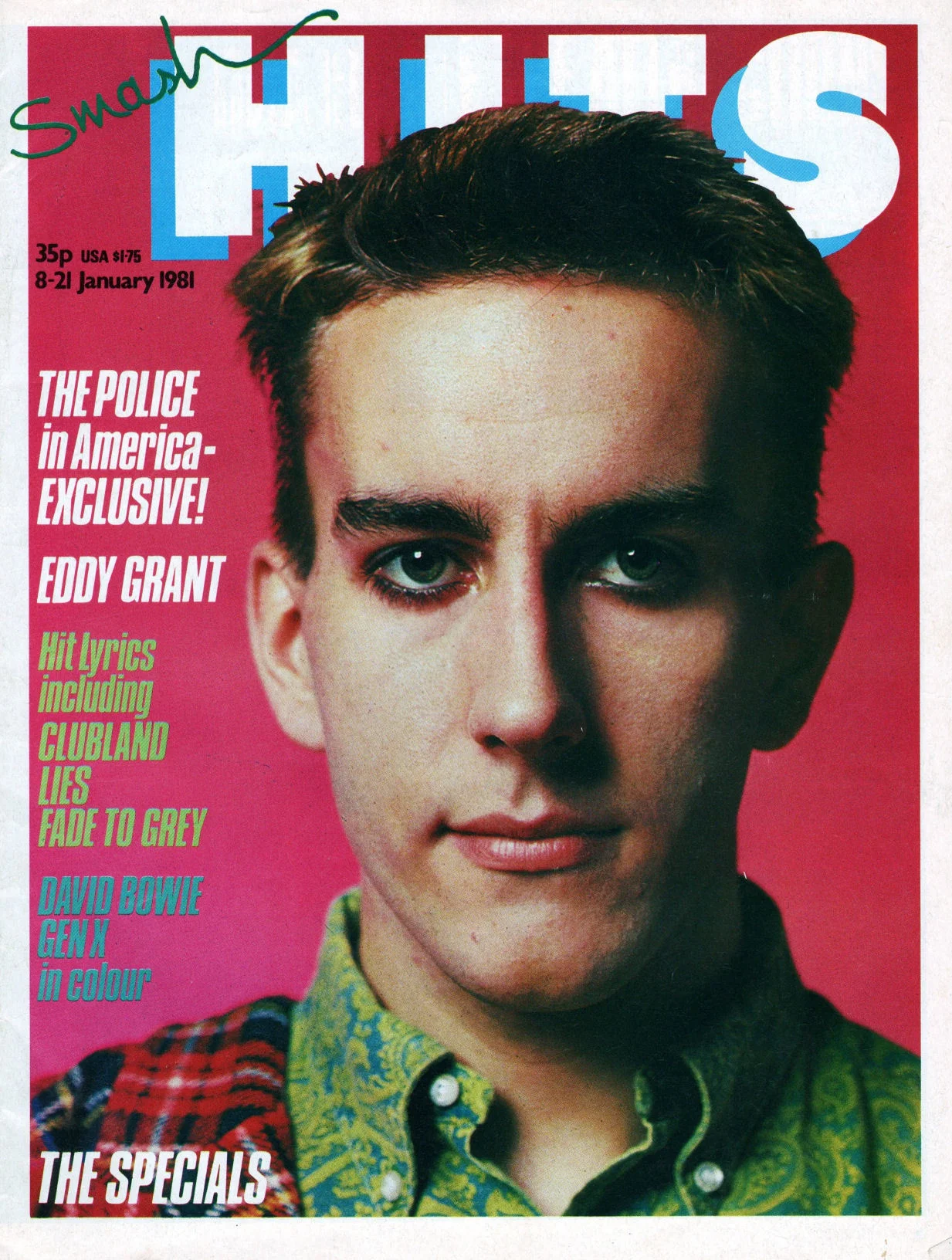
TO: SMASH HITS

77b23dca8082fdf21b1bf918a2e47fa5.jpg
www.tilleysmagazines.com-Magazines-Comics-SMASH-HITS-14.jpg

SPD: What was it that so enthralled you?
TO: At that age, all you care about is defining your identity. SMASH HITS was a UK magazine but we got it in Canada as well. It was so much cooler than any American magazine available to me at the time and was really cutting edge in terms of photography and type. The subject matter was mostly popular British bands with some American stuff thrown in. Looking at it today it seems almost cute, but at the time it was very “insider”. I found my escape from small-town life through this magazine and also through MuchMusic and MusiquePLus, the Canadian equivalent to MTV. Toronto was where it was all happening back then…but I ended up in Vancouver and then Los Angeles before coming to NYC.

SPD: Do you know now who the creatives were?
TO: I have no idea, but it would be so interesting to talk to them. Patrick Nagel did Duran Duran’s Rio cover and had a huge influence on 80s design, so he was probably the first illustrator/designer that made me want to have a creative career. In the late 80s and early 90s, I started reading The Face, which was my second love…so Neville Brody was probably the first magazine designer I can identify who had an impact on me. And Vaughn Oliver of course for music packaging….

www.tilleysmagazines.com-Magazines-Comics-SMASH-HITS-7.jpg
smash-hits-1981-01-08_0000.jpg
2083d93874bb6a85314542f1e5de7d85.jpg

SPD: How does that inform your creative now?
TO: I tend to design big with lots of dramatic type and color… and then pull back. There was a period before magazines where I designed corporate annual reports, so I learned refined typography by reading The Elements of Typographic Style and by designing lots of financial charts printed on 100% cotton paper. My first Art Director job was with Out magazine, and that’s when I knew I loved working in pop culture and entertainment more than anything else. Now I am working 100% in the digital space, with a growing focus on video. So it some ways it’s come back full circle for me, using those initial inspirations of music videos to inform what I do now. Not a lot of typesetting beautiful paragraphs of copy anymore, but using type, image and motion to tell stories in different, exciting ways.
bd41dd1c0573ac38d9ed2ae6eaed6036.jpg
fit-520x390.jpg
Smash-Hits-Covers-from-The-80s-8.jpg
tumblr_nyvyzsLaWl1udnvfeo1_500.jpg

Rachel Gogel, Creative Director

Rachel Gogel: I fell in love with GQ Magazine in 2005.

Who would have thought that six years later I would land a job at this iconic publication?

The truth is, I've always been drawn to editorial design, typography and layout. Since I traveled a lot with my family growing up, purchasing magazines at airports for long-distance flights happened often. In high school, designing covers and pages for our annual Yearbook was the next best thing to working in publishing.

Once I moved to the United States from France in 2005 to attend university, I read all kinds of magazines — Wired, Vanity Fair, The New Yorker and New York Magazine — but my all time favorite was always GQ for its cool visualizations, bold colors and witty custom letteringAnd you may have guessed by now, but I chose to major in Communication Design.

gq-truelove-1.jpg

I aspired to work for a magazine one day and became fascinated by Fred Woodward, who is being honored at this year's SPD Gala. In 2001, Woodward moved from Rolling Stone and became editorial design director of GQ, instantly transforming the publication and injecting his delightful, creative and innovative work into the brand's look and feel. I was lucky to land a few internships in publishing throughout my college years that would hopefully bring me closer to that dream.

gq-truelove-2.jpg

When I graduated in 2009, I moved to New York without a job and spent hours in a Borders bookstore (RIP *sad face*) looking at mastheads and writing down designers’ and art directors’ names from my favorite magazines. GQ was my main target but the job market that year was not great and I had to keep my options open. (The best part about this sheet of paper is that I recognize or have met several of these people since, thanks to SPD and my work in the industry.)
gq-truelove-3.jpg

Unfortunately though, after reaching out to as many people as I could, I only heard back from a handful. While disappointed, I remained optimistic. I worked at DVF and Travel + Leisure before GQ became a freelance client of mine (I built a site for them in Wordpress!) thanks to old contacts on the marketing team. Suddenly, I felt like I was getting closer to my teenage ambition.

gq-truelove-4.jpg

Flash forward to summer of 2011: a former boss of mine from a Condé Nast internship had left GQ and there was suddenly an opening. I put my name in the hat, and soon after was hired as Associate Art Director on the business side. The role came with high expectations for quality and Woodward-like executions. Our clients came to us for what our sales team pitched as editorial-caliber branded content and infographics. My goal was to find a balance and create a complementary aesthetic that put our advertorials on the map without confusing our readers.

Other than Fred Woodward, who left the title last year after sixteen years, I now know that other creatives involved on the editorial side were Anton IoukhnovetsChelsea CardinalDrue WagnerMichael PangilinanRob HewittBenjamin BoursAndre JointeDelgis CanahuateEve Binder and many more. I learned so much and was inspired every day until I left as design director of marketing in 2014 for a new gig at The New York Times

Needless to say, I'll never forget my first crush, GQ Magazine, since it kickstarted my lifelong love of design.

Follow Rachel on Instagram

gq-truelove-5.jpg

Nichole Washington, Visual Artist

05c5f210-3576-0134-0aea-0629623c6db9.jpg

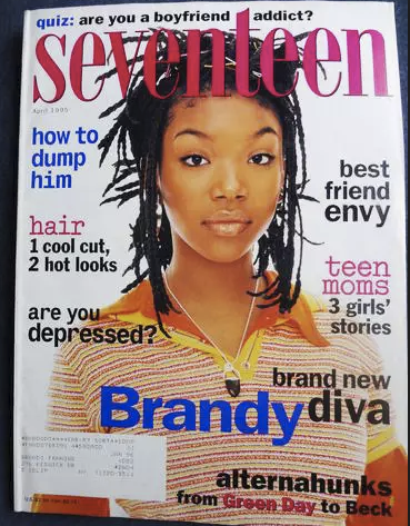
Nichole Washington: As a young girl I loved the experience of reading a magazine from start to finish in one sitting. I would wait for the perfect time to lay out on my bed, turn on my radio and have a solo chill session. I always started at the beginning and gave my attention to every page, even the ads. Magazines like Seventeen were really great because there was loads of entertaining info packed in each issue. I could read a personal interview on the cover star, check out the latest fashion trends, and take a fun quiz at the end!

Screen Shot 2018-02-19 at 9.37.50 PM.png
Screen Shot 2018-02-19 at 9.38.42 PM.png

SPD: What year?
NW: 
Mid to late 90s

SPD: What were you up to?
NW:
I was a young girl day dreaming of leaving Minnesota to finally live a cool and confident life.

SPD: What magazine?
NW: 
Seventeen

Screen Shot 2018-02-19 at 9.50.36 PM.png
0e1929f72659d9b549c432e5455e817c--claire-danes-fashion-magazines.jpg
54ee70fc7e114_-_sev-january-2004-de.jpg

SPD: What was it that so enthralled you?
NW: 
I loved how fun and casual the magazine was and there would always be a cool pop star on the cover. The inside layout had a cut and paste feel and there were a lot of exciting things to look at on just one page. Every element was a part of the design from brightly colored text to the cut out images. 

SPD: Do you know now who the creatives were?
NW: 
No, not at the time. 

7219146460_3be937b938_c.jpg
26.jpg

SPD: How does that inform your creative now?
NW: 
Having obsessively flipped through pages of Seventeen Magazine for at least 10 years of my life has definitely influenced my creative aesthetic. My color palettes is usually very bright and I am more interested in the unique expression of a design rather than it being technically perfect. It is most important that my spirit and identity are present in my work. 

www.nicholewashington.com

Matthew Salacuse, Photographer

 
IMG_4250.jpg
 

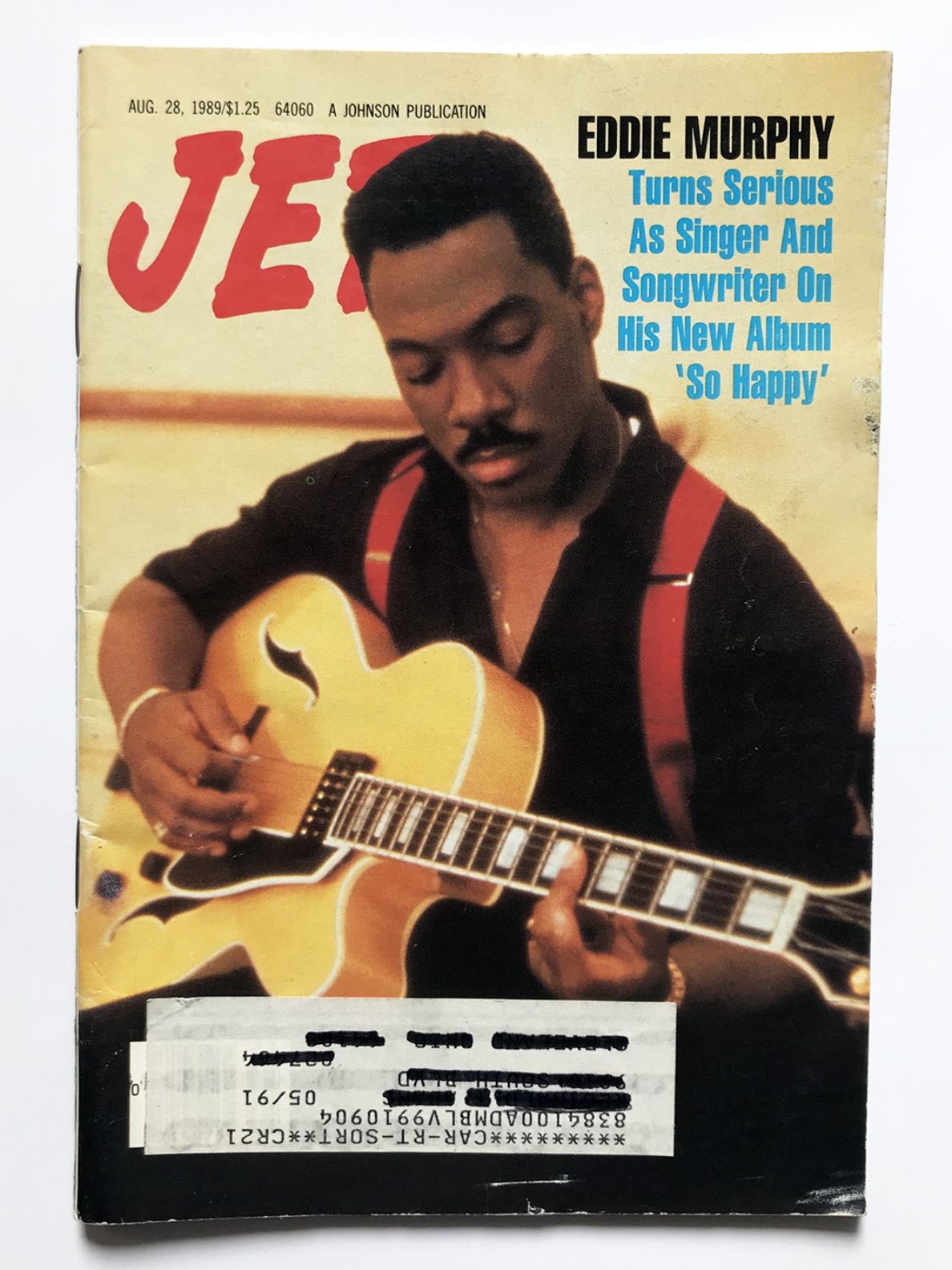
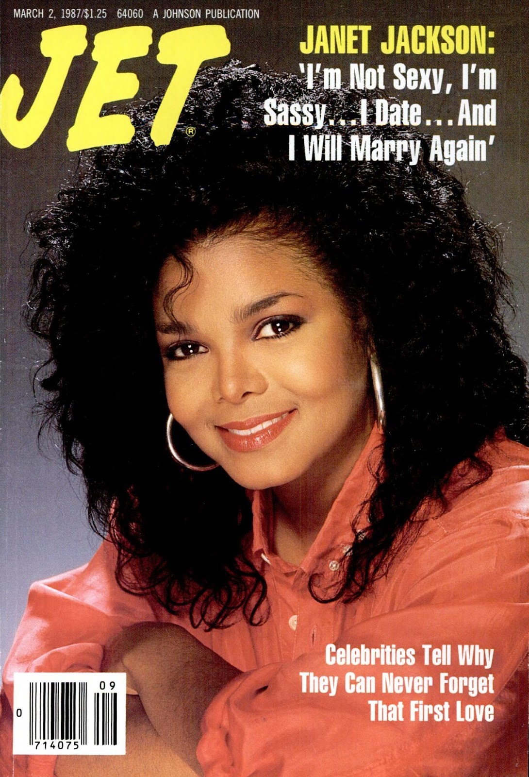
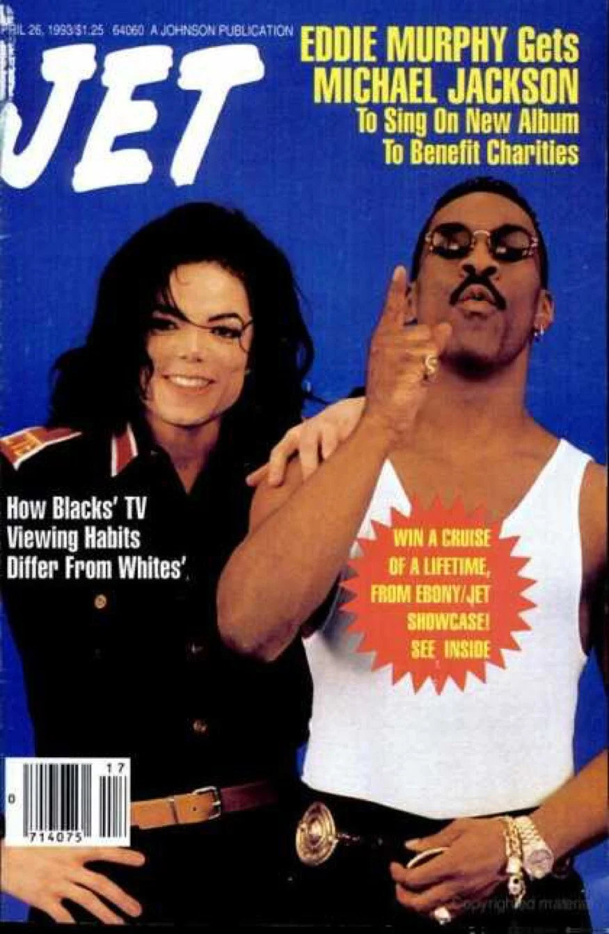
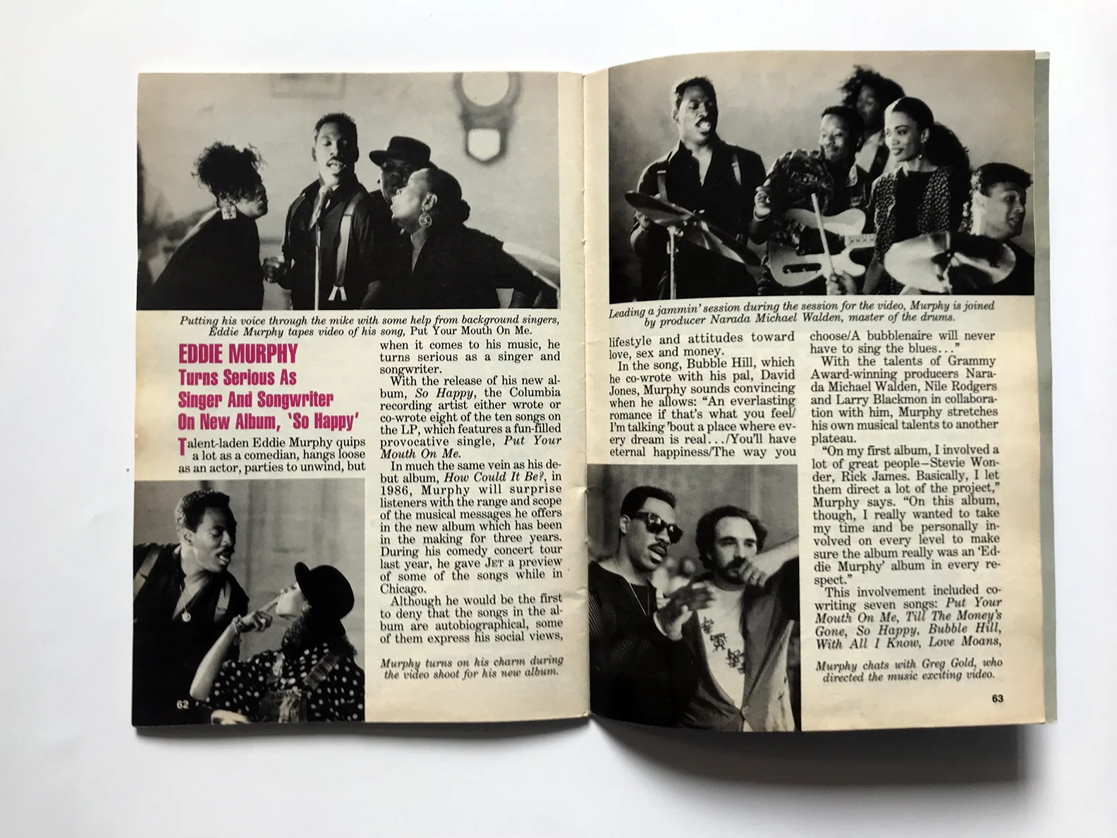
Matthew Salacuse: The very first subscription I had was when I was 11 years old and it was to JET Magazine.  It may have looked a bit strange for a little white boy thumbing through Chaka Khan stories on his Brooklyn stoop in the 1980s, but to me it made the most sense.  This is what I was into and I wanted to know more about it on a weekly basis.  There was a list in the back called “JET’s Top 20 Singles” where I would get to see all the music that I heard on the radio but was being left off the Rolling Stone Top 40 chart and totally ignored by MTV video rotation.  (Do you remember seeing THIS on MTV? I don’t, but I learned about it in JET)  For the advertisers, I was a swing and a miss, but for finding out Lionel Richie’s tour was rewarding students with good grades, it was a home run.

janet jackson jet magazine march 1987 1.jpg
IMG_4253.jpg

SPD: What year?
BO: 
1984-1987

SPD: What were you up to?
BO: 
Breakdancing in the lunch room. Homework. 

SPD: What magazine?
BO: 
JET

jet.jpg
Jet copy.jpg

SPD: What was it that so enthralled you?
BO: 
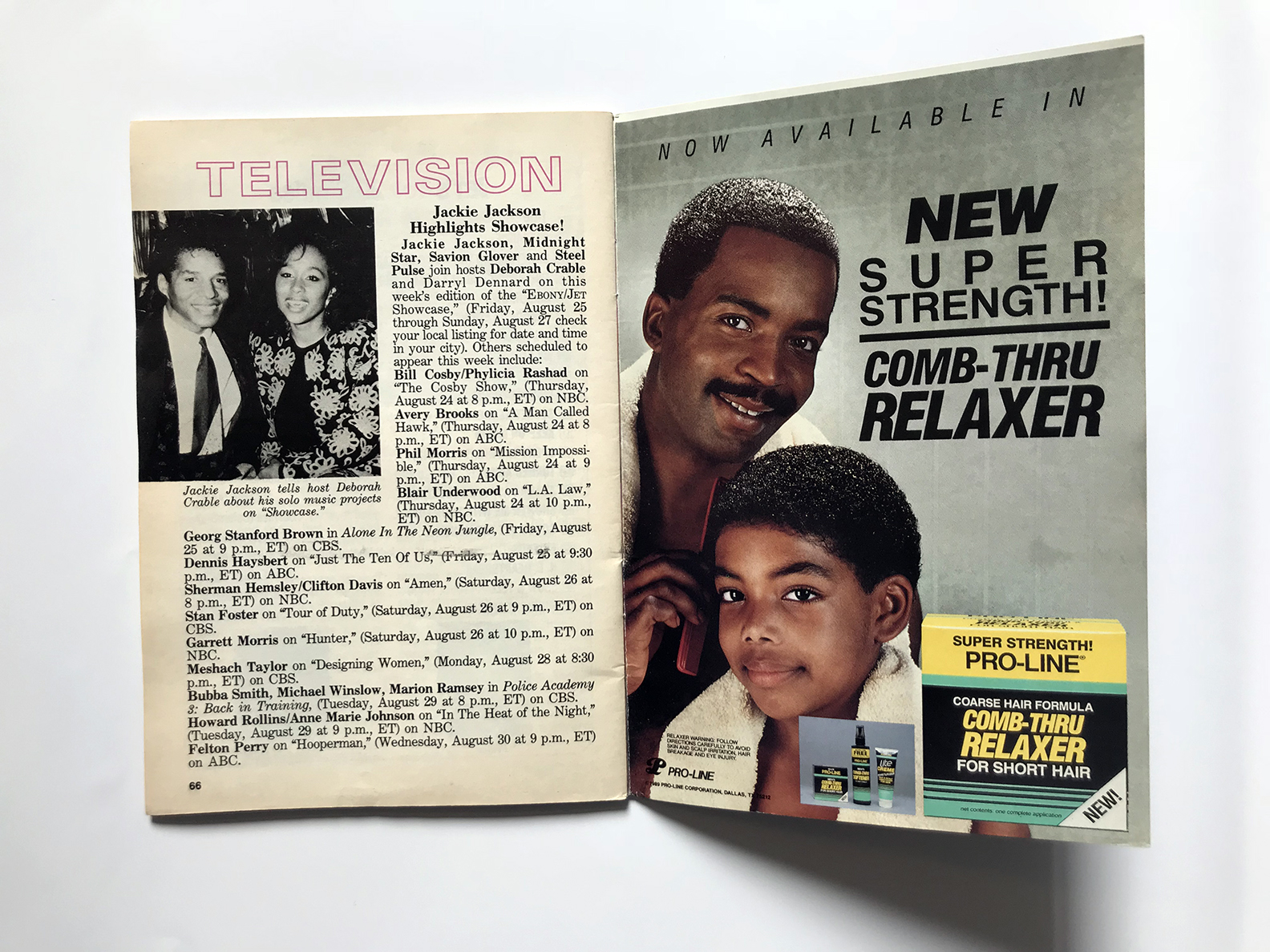
Growing up in Brooklyn, I was exposed to a lot of black culture in the streets and from friends but it was not well represented in the media.  JET literally had a page called TELEVISION that alerted you to which shows black actors would be appearing on.  

IMG_4251.jpg

SPD: Do you know now who the creatives were?
BO: 
I had to go buy an old issue to dig this up because back then I had no concept that people made magazines:

Art Director: Norman L. Hunter; Staff Photographers: Vandell Cobb, James Mitchell, Maurice Sorrell, Fred Watkins

SPD: How does that inform your creative now?
BO:
When I came out of college I immediately gravitated to photographing the underrepresented side of culture; whether it be small biker rallies in Iowa or rappers in the Queens Bridge Housing Projects. By the mid 2000s I had made quite a strong reputation in the hip hop world by shooting for XXL, Vibe, The FADER, Blaze, King Mag, Rides and others.  I am still waiting for that call JET.

www.salacuse.com/

IMG_4255.jpg

Abbey Kuster-Prokell, Creative Director at Martha Stewart Living

 
RealSimple_cover.jpg
 

SPD: What year?
Abbey Kuster-Prokell: April 2000

SPD: What magazine?
AKP: 
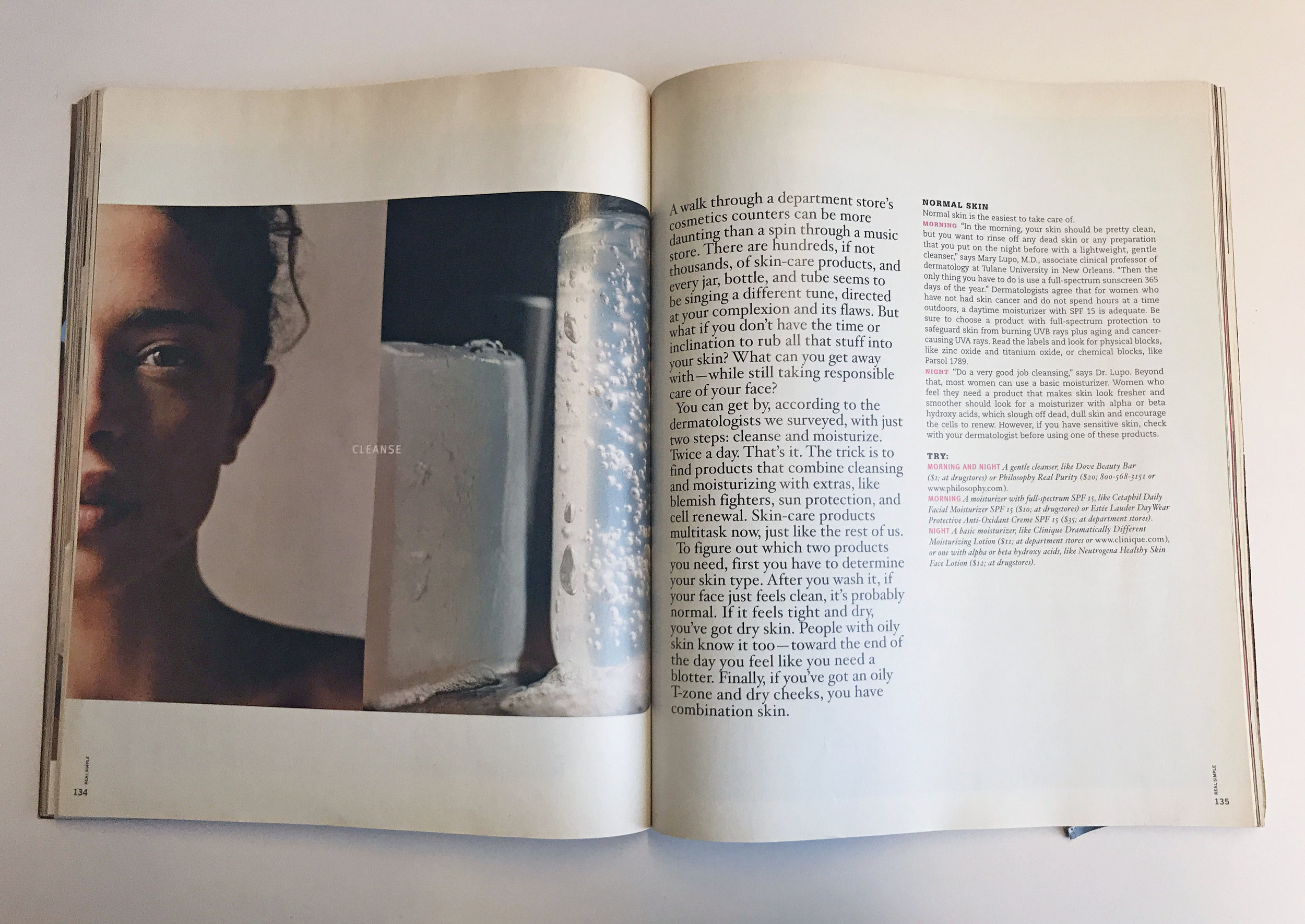
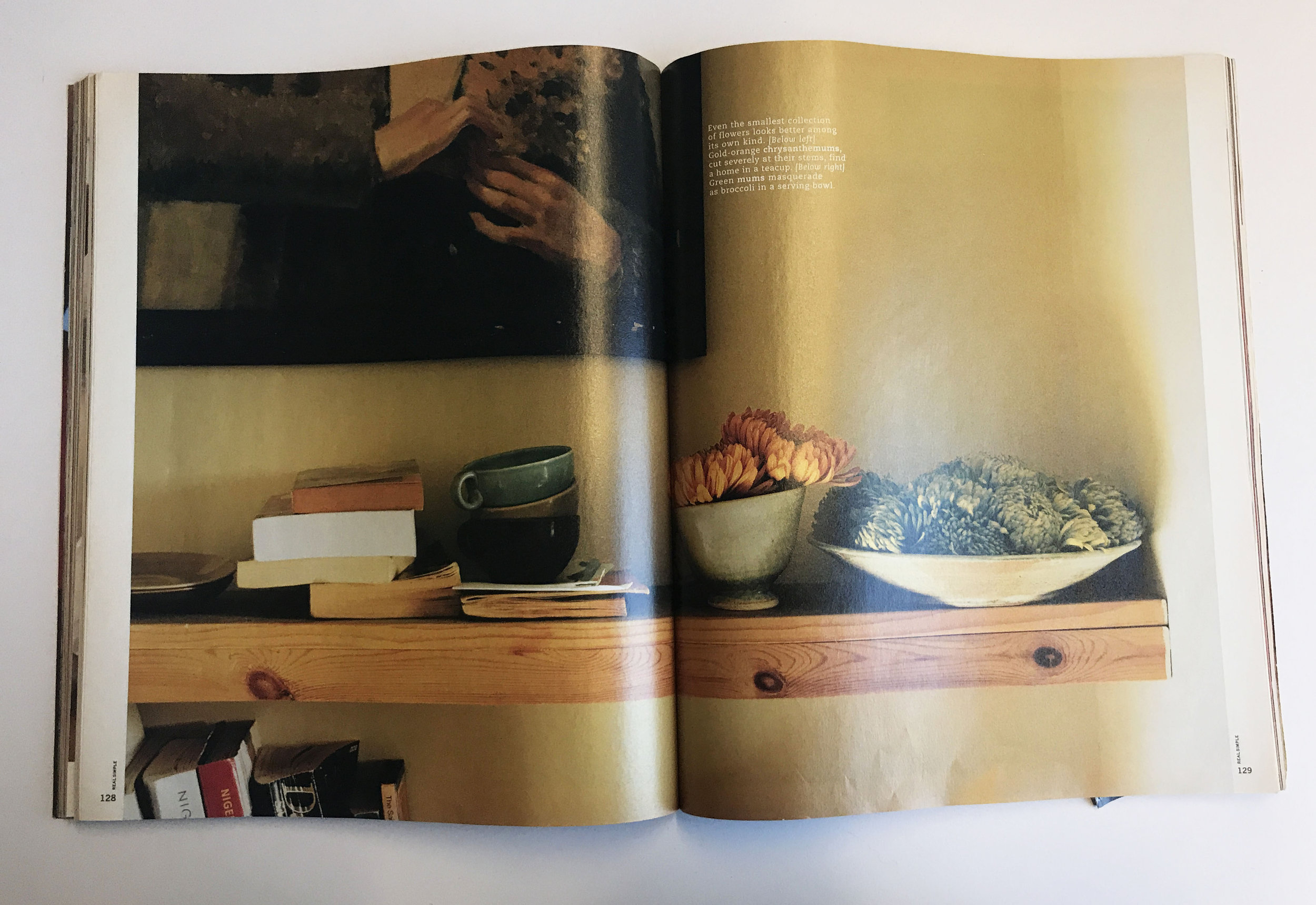
The launch of Real Simple Magazine

SPD: What were you up to?
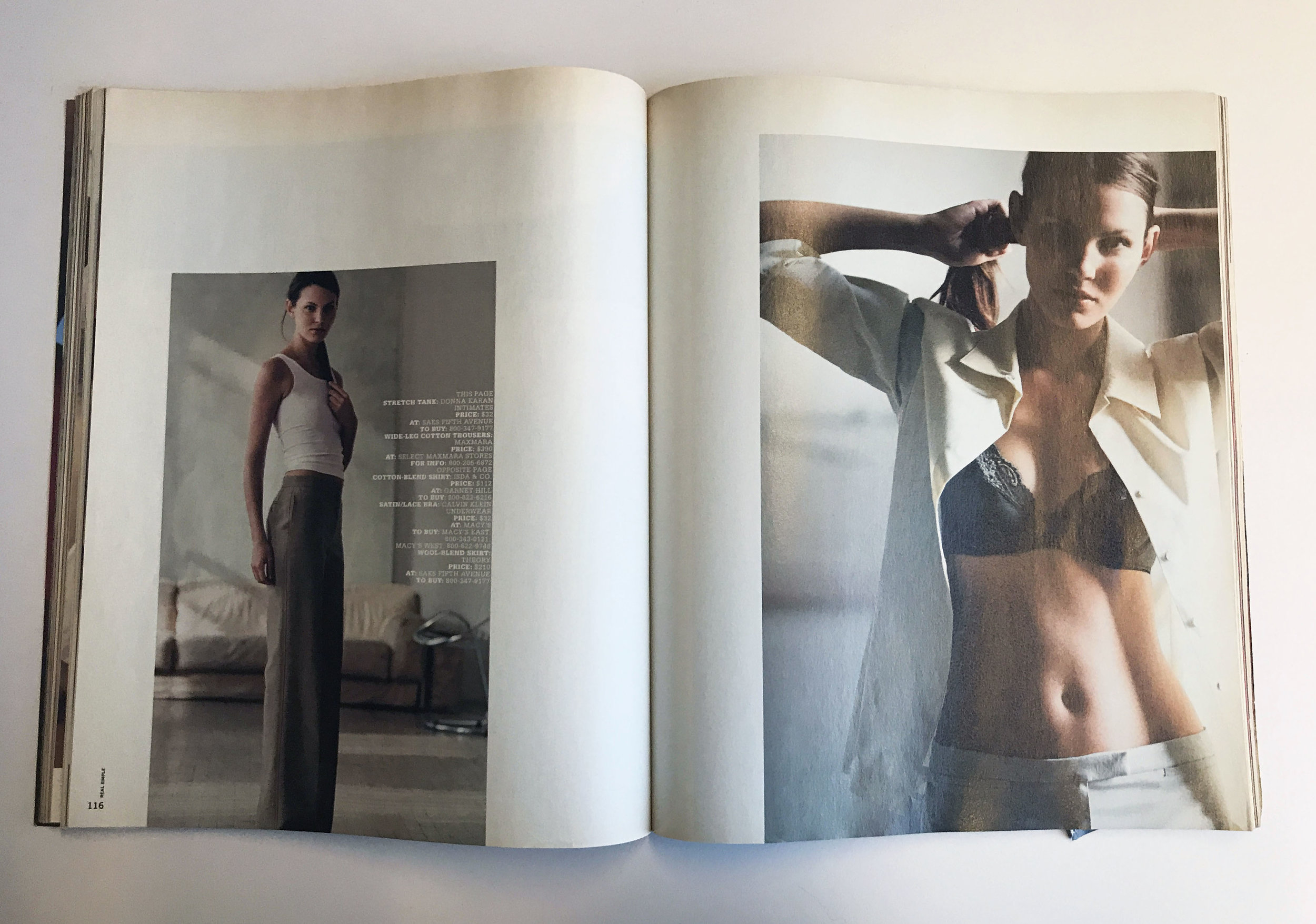
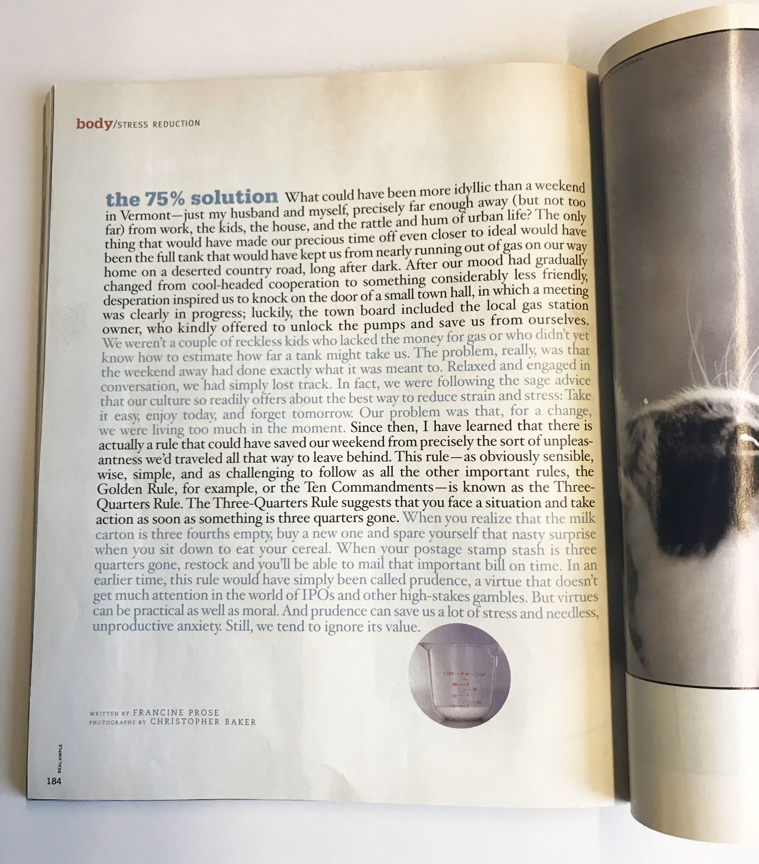
AKP: Truth: I never set out to be an editorial designer. I moved to NYC in 1999, and I was a young designer working for Louise Fili LTD. I was spending my days (and some nights) drawing typefaces from scratch out of vintage type books where I might only have a few characters for the entire alphabet. I was printing everything on 8.5 x 11, because that is what we had and comping it together with a waxer. Oh, how I loved the smell of that waxer. I was part of 2-person team at her studio, which was more like an apprenticeship then a job. This job, which I loved dearly, could not have been further from the glossy, glitzy world of editorial. Hence, why I didn’t know much about it. All of this changed, however, when I picked up the first issue of Real Simple magazine in the spring of 2000 and I was awestruck.

SPD: What was it that so enthralled you?
AKP: 
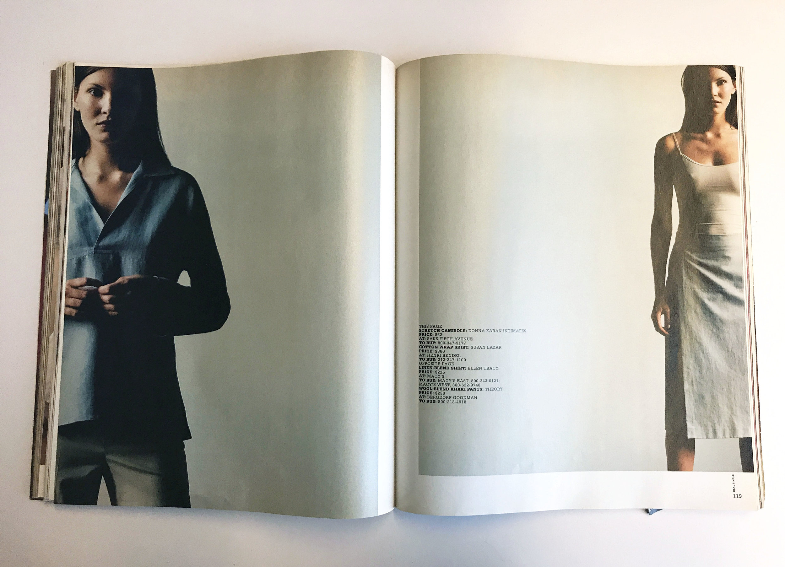
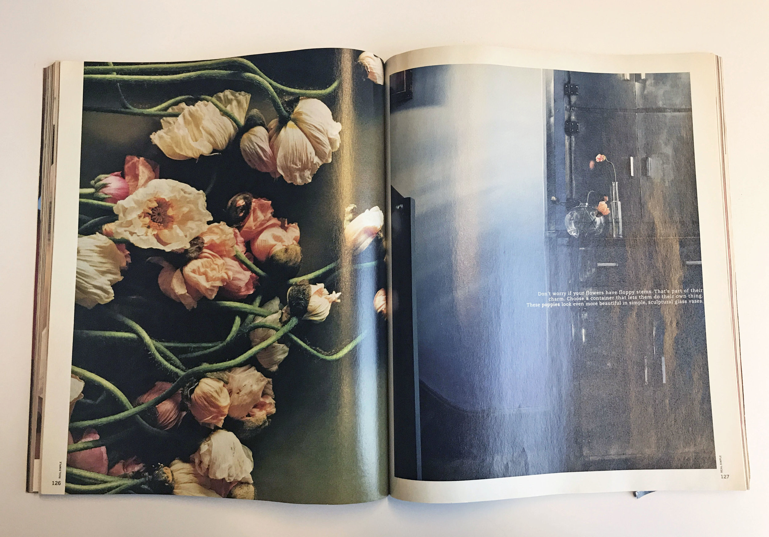
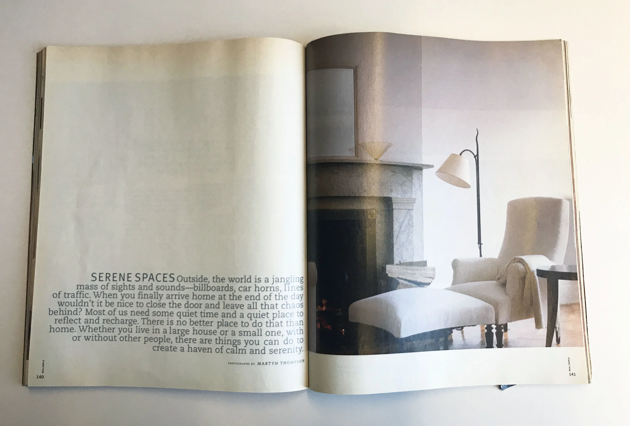
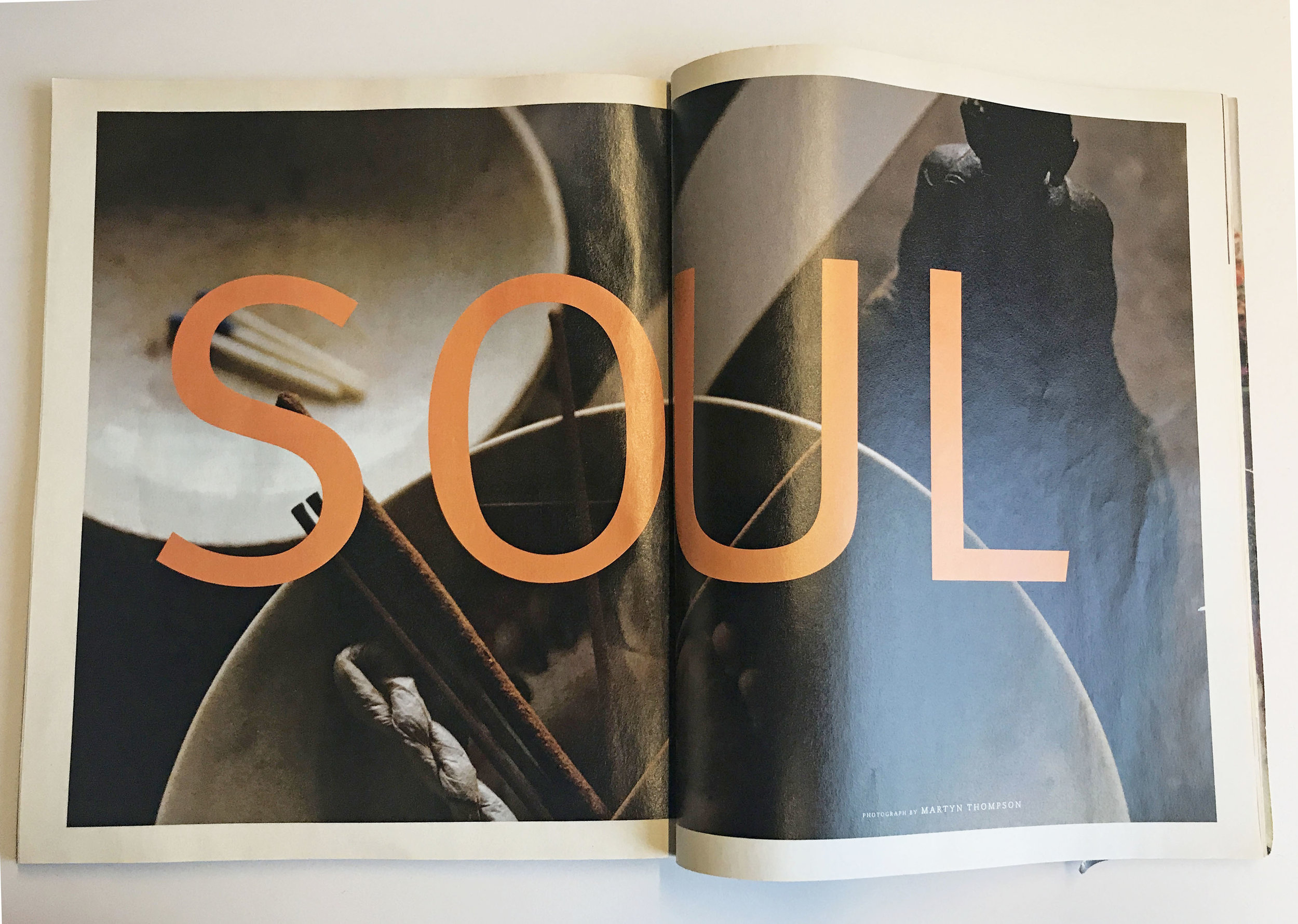
I loved the tactile quality of the matte paper and square-ish format. To me, it was a complete departure from other magazines on the newsstand, it felt more like an art book than a magazine. I fell in love with the rich, sophisticated photography. Martyn Thompson shot the entire issue, and at the time, he was a new name to me. It was like dipping my toe into a world that I had no idea ever existed. I suddenly became aware of incredibly talented photographers and the magical role of prop and food stylists.  In addition to the stunning photography, I loved the gratuitous amount of white space, the wide margins and clean, modernist design. The typography, while I would want it to be more refined today, used a slab and a san-serif, which was also a departure from what I was used to seeing traditionally on the newsstand.

SPD: Do you know now who the creatives were?
AKP:
Robert Valentine from The Valentine Group designed the launch issue and Martyn Thompson was the sole photographer for the issue.

SPD: How does that inform your creative now?
AKP:
 Clean, graphic and modern have always been guiding principles in my work. I tend to gravitate towards things that have a refined sensibility to them and I’m a sucker for a strong grid. I always try to include negative space in my work, for it allows you to focus your attention on the actual design.

Brad Ogbonna, Photographer

 
cover.jpg
 

Brad Ogbonna: I remember buying my first NYLON Magazine at the Walgreens in River Falls, Wisconsin in 2007 — my sophomore year of college. River Falls was a fun little college town nestled in a rural area outside of the Twin Cities. I really liked it there, but at the same time I felt so detached from my surroundings and had my eyes set on things happening in bigger cities like NYC, London, Los Angeles, etc...Especially the pockets of counter-culture starting to emerge. 

In my free time I would check out blogs from people in bigger cities as an escape and for inspiration. There was this great one I particularly enjoyed called "The Skullset" by this photographer Jack Siegel. I was always drawn to the tangible, so every month I would run to Walgreens to peruse their magazine aisle, and flip through everything they had to offer. I remember coming across a magazine called NYLON that I hadn't noticed before. The artwork on the cover stood out and felt so much different than the magazines next to it like Elle, Glamour, Vogue, GQ, and I even recognized Cory Kennedy on the cover from the Skullset blog. I was so excited that I immediately spent $5 on it, which may not seem like a significant amount, but at the time I was so broke I was literally splitting $5 footlongs with my roommate. 

The articles were generally geared to young women, but I was really drawn to the aesthetic and the imagery. The photos looked like the ones I'd seen on my favorite blogs and they covered a lot of unique people from cities all around the world. I don't remember who shot the cover, but I still have this copy and almost each one thereafter up until 2009, stored at my mom's house in Minnesota. 

I feel like my own work isn't that much different than a lot of the stuff I loved back then. Similar aesthetic but hopefully with my own twist. I try to focus more on the people that shape my world and what it looks like today. 

www.bradogbonna.com

Anais Maroon, Photo Director at The Future of Everything

Diana Ross-Vintage Photo.jpg

SPD: What year?
Anais Maroon: 
As long as I can remember. But maybe around 1988 I started becoming aware and absorbing it, all through the time I left home. 

SPD: What were you up to?
AM: 
Being a little girl, fascinated by all my mother's things, turning into a precocious teen. 

SPD: What magazine?
AM:
Vanity Fair

a8e466b85b7f49279fb8d4c3bde0129f.jpg
herb-kd.jpg

SPD: What was it that so enthralled you?
AM:
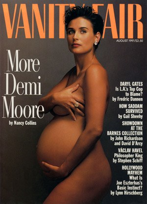
My mom had a subscription to Vanity Fair from before I can remember. Issues were a staple in the house. One or more was always either next to her bed, in the living room, or out on the deck. I was fascinated by the beautiful people, the glamour, the shocking pictures, and I was also introduced to timeless photography like Herb Ritts, Helmut Newton & Annie Leibovitz. I think I learned what being controversial meant from Vanity Fair. The exposure opened the door to an obsessive interest in wild, humorous, unrestrained beauty within all sorts of magazines. I pasted a rotating assortment of tear sheets all over my bedroom walls and discovered photography as an amazing and delicious way to push conversations and boundaries forward. I graduated to other magazines by high school, but the Vanity Fair's were always in the house, always on my mother's lap, always making an impact on my young, formidable, creative brain. 

e542078f930dd2d0ce3062eed43c2550.jpg

SPD: Do you know now who the creatives were?
AM: 
I do now from investigating later in life: Ruth Ansel, David Friend, Charles Churchward.

demimoore_vanityfair_agostinoarts.jpg
image-2.jpg
image-3.jpg

SPD: How does that inform your creative now?
AM: 
Vanity Fair tried to push the boundaries, while combining timeless beauty and humor. This was something I was exposed to through so much of my young life, which occupies such a sentimental place in my memories. I'm always striving to create work that is beautiful, dynamic, thoughtful and timeless *which is the extremely difficult trick*.

www.anaismaroon.com

Jackie-Collins-Joan-Collins-disco-London-Sheen-Resistance.jpg

Mike Schnaidt, Creative Director

 
656- Summer Music Preview.jpg
 

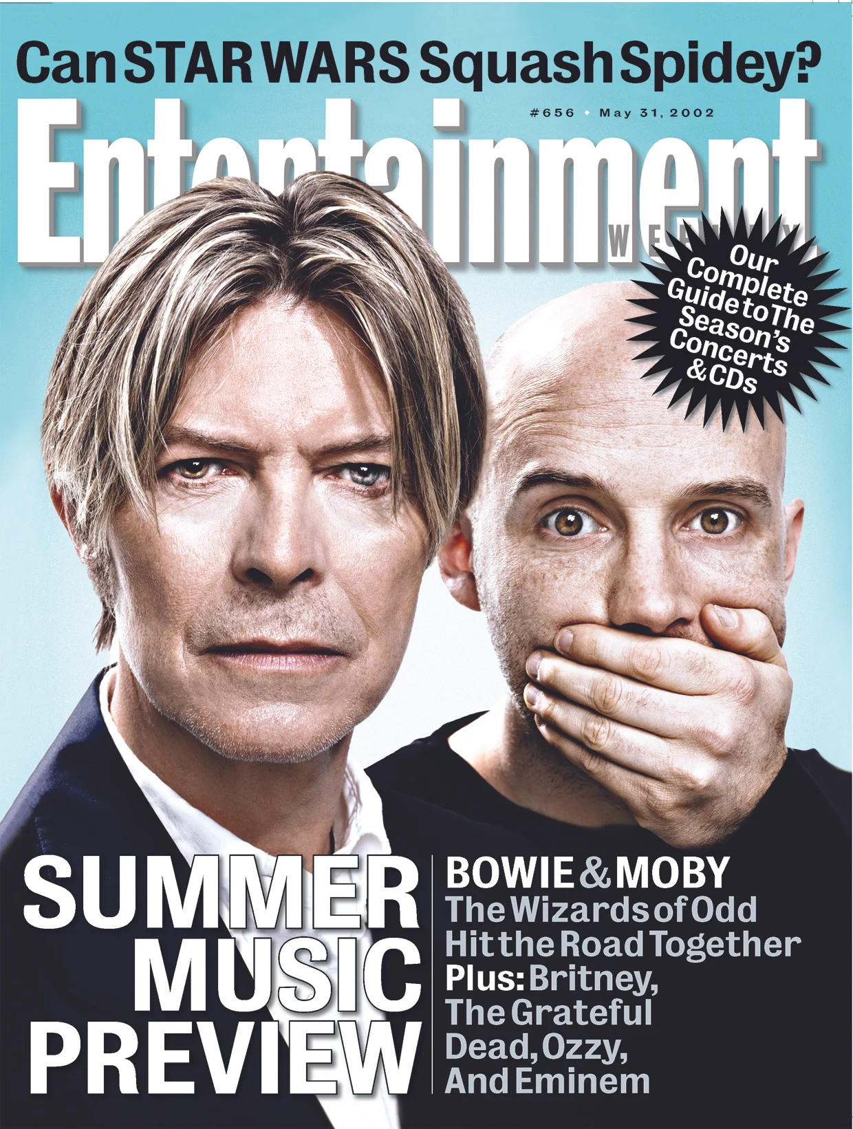
Mike Schnaidt: I fell in love at my dentist’s office. No, not with Dr. Bernstein, but rather with a copy of Entertainment Weekly.

It was 2002, and I was pursuing a B.F.A. in graphic design at C.W. Post. My parents were grateful that I even went to college, as I was a bit thick-headed in high school. But, by studying design, I was able to knock down a few walls in my brain. When I discovered Entertainment Weekly, it shed light on which direction to go.

The treasure I found at Dr. Bernstein’s office was the Summer Music Preview issue. David Bowie and Moby were on the cover. The photography pinched your cheeks, and the design smacked you in the face. The gestalt: a magazine cover that felt poster-size. Open it up, and every square pica was designed to maximum volume. As a fanboy of comics, music, and movies, I understood why. EW’s design had to express the content with the same geeky excitement as readers would consume it. Once I came to that conclusion, I came to understand a larger lesson in graphic design: form follows function.

Soon after, I ordered a subscription for my Weekly jolt of design inspiration.

Schnaidt_FirstLove1.jpg
Schnaidt_FirstLove2.jpg

As a design student, I worked at a glacial pace. It took me months to get a single magazine opener right. Therefore, I was perplexed at how the EW art department could produce a magazine at the rapid fire pace of a weekly. But what seemed like an impossible feat were EW’s packages. For each Fall TV preview, Summer Movie Preview, and IT List, the design team conjured up an intricate structure that somehow spanned across 50+ pages.

By studying these packages, I came to understand the art of larger design systems. As a whole, these magazine packages were beautiful. But like a Lego block, the ingenuity was in the design of the modular– the core design pieces of the package had to be simple enough in order to build a seemingly complex system.

Throughout college and my first job at Network Computing magazine (long gone), I made many attempts to mimic whatever design nuances I learned from EW. But one night, while up late doing work for grad school, I saw a listing for a designer position at my favorite mag. I applied to Entertainment Weekly, although I was fairly confident I wouldn’t get a call back.

Well I did.

I was totally unprepared for an interview that week, but of course took it anyway. So, I pulled an all-nighter, where I cut and mounted an oversized black print portfolio (remember those?) to perfection. I’m pretty sure I was high off 3M spray adhesive during my interview.

The rest is history. I was hired by my design heroine, Geraldine Hessler, and was put through bootcamp. I learned how those packages were put together: teamwork from some of the most talented designers out there. Geraldine’s direction was tenacious, and I’m grateful I had the opportunity to learn from her, Brian Anstey, and Amid Capeci.

Today, I exercise what I was taught at the breakneck pace of a weekly. And it wasn’t until I finally became a Creative Director that I fully understood those lessons.

I wonder what magazines Dr. Bernstein has in his office today?

Schnaidt_FirstLove3.jpg
Schnaidt_FirstLove4.jpg