Sam Cannon, Artist and Director

 
1.jpg
 

Sam Cannon: As a kid, I would spend every summer with my grandma (Mema) in South Carolina. Mema was my favorite person in the entire world, and her hobbies included chain-smoking, vehemently denying her age, and watching Days of our Lives. By the time I was 8 I knew I wanted to be an artist, and Mema had offered a jump start by getting me addicted to coffee. I remember she had this huge stack of supermarket tabloids that I used to sift through when I was bored. 

SPD: What year?
SC:
1999

SPD: What were you up to?
SC
: Making unintelligible movies with my first compact VHS camera and getting on Mema’s “last nerve”. 

SPD: What magazine?
SC: 
Weekly World News

 
4.jpg
 

SPD: What was it that so enthralled you?
SC: 
I was a very imaginative kid, and I had this fear that when you grow up your imagination dies. I remember wondering what my life would be like when I was no longer able to play or make-believe and it caused me a lot of anxiety. I was old enough to understand that the stories in Weekly World News were fictional, but it didn’t offer any kind of disclaimer which I loved. It was silly and fantastic but most importantly it was made by and purchased by adults. It made me less scared of growing up. 

 
2.jpg
 

SPD: Do you know now who the creatives were?
SC:
At the time the editor was Eddie Clontz, a 10th grade dropout from North Carolina. WWN was only created to make use of the black-and-white presses after its sister publication, The National Enquirer began being printed in color. It started out as another source of celebrity gossip but began running stories about alien abductions, merfolk, and Elvis still being alive. It was the OG of fake news. 

 
3.jpg
 

SPD: How does that inform your creative now?
SC: 
It was the first time I realized images could be doctored, which had a big impact on the way I understood photography from a young age. I think a lot of people see a camera as a way to capture and reflect the world but for me it was just a way to gather the footage I needed to make something new.  

sam-cannon.com | instagram.com/samcannon

Chin Wang, Creative Director at ESPN.com and ESPN The Magazine

BigWig.jpg

SPD: What year?
Chin Wang: Around 1998 

SPD: What were you up to? 
CW: My first job was at a newspaper in Florida doing mundane production work (coloring in the Sunday comics!).

SPD: What magazine?
CW: 
Entertainment Weekly

FallPreview.JPG
ItList.JPG

SPD: What was it that so enthralled you?
CW: 
Back then, I found anything on nice paper glamorous and loved so many magazines, but especially Entertainment Weekly. Every page was a treat and I devoured everything – from the bold illustrations to the expressive typography. One particular layout I remember: Jennifer Aniston's disembodied head set up like a mannequin in a row of dummy heads, opposite the headline “Big Wig” on an illustrated can of hairspray. All the elements seemed to work so harmoniously together: the image, the design, the words. Even now, I wonder about the editor who wrote the headline and imagine that person saying, “Oh yeah? You've got an amazingly styled photo of a breakout star with a cult haircut? And you came up with a hairspray can design and want me to come up with a headline that’s six letters or less? (Dramatic pause) Yup, I got it! It’s … BIG WIG!” 

AlGreen.jpg

SPD: Do you know now who the creatives were?
CW: Robert Newman, then John Korpics. I am such a huge fan of both. Years later, when John offered me a job as the art director at ESPN the Magazine, I jumped at the chance. Working for him was equal parts inspiration and hilarity. When I expressed some trepidation about taking over the magazine after he got a bigger job at the company, he shooed me away and laughed, “Chin, get the f*ck out of my office!” It was exactly the kind of Tiger Boss vote of confidence I needed.

SPD: How does that inform your creative now?
CW: 
Well, I stopped doing text on a curved path years ago, but haven’t forgotten that all the things on a page have to speak to each other and that everyone on the masthead has a job to do. It’s nauseatingly sentimental, I know, but I really do believe creativity doesn’t happen without a good mix of people who champion one another.

Travolta.jpg

Casey Stenger, Photo Strategist at MetLife

cover_premiere.png
unnamed-4.png

SPD: What year?
Casey Stenger: 1998-ish

SPD: What were you up to? 
CS: I had just moved to New York and was lucky enough to land a gig at Men’s Journal, my first bona fide publishing job. I was green as green could be—more of a chartreuse.  Magazine baby skates days. I was working in the hallowed halls of Wenner Media and could not be happier (or poorer).  There was the occasional celebrity parading through to meet with Jann, you could get buds from the mailroom guys and I worked with the best bunch of pre-“bro” editors of all time. The soundtrack of the day was some mix of Beth Orton, Elliot Smith, Air and Massive Attack.  Get the picture? Oh, and there was Fred. I never did work with the man but working down the hall from him made me feel kinda special. 

unnamed-2.png
unnamed-3.png

SPD: What magazine and what was it that so enthralled you?
CS: A little preamble here. YM was my first childhood magazine subscription, which was my bible. In college I graduated to Rolling Stone and The New Yorker which made me feel both cool and smart, respectively. Then I joined the industry. Magazines were new. New York was new.  And SPD was this new wonderful family I had discovered.  All first loves, indeed. In those days I digested every magazine I could get my hands on. Mining and learning and discovering and, I see now, developing my voice as a nascent Photo Editor.
I came upon Madison one day and fell hard. Restrained, minimalist thoughtful design and photography. And a shit-ton of black & white. Was there anything more satisfying to see in a magazine (or on the cover, gasp!) in the late 90’s?? I don’t have my copies anymore but I remember Helena Bonham Carter looking badass smoking a ciggie on the cover, Robin Wright (Penn then, maybe?) in perfect icy blueness and Samuel L. Jackson looking smooth as ever. It was both graphic and soft. Edgy but gorgeous and so clean and modern in that moment of time. I think I also liked that it was an indie find. It had a short life but I cherished those deliveries and hoarded my little collection for many years. 

unnamed-5.png
unnamed-1.png

SPD: Do you know now who the creatives were? 
CS: 
I reached out to Antonia Ludes who was the Creative Director of Madison and Wolfgang Ludes, photographer, and thankfully they got back to me. Antonia was generous enough to share some of her favorite layouts with SPD which you see here.

Of her time making Madison Antonia says, “We created 10 issues per year with a very small team - a labor of love and hard work, but we had the best time.”  Love.

SPD: How does that inform your creative now? 
CS: I learned a lot about editorial photography during this time and Madison is one of many examples. Your pictures have to work hard on their own.  You can’t rely on design to prop them up.  I also find I’m drawn to simplicity and negative space…and black & white!

unnamed-6.png
unnamed-9.png

Parker Day, Photographer

Screen Shot 2017-11-16 at 10.48.36 PM.png

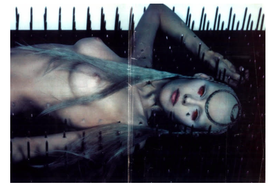
Parker DayIn 1997, I was 13 years old and I lived for a British magazine called The Face. I would make my monthly pilgrimage to my local Tower Records and bask in the glory of its large, glossy pages. It gave me a look into a world that was sexy, alternative, cheeky and strange; a world I wanted to step into. I had just moved to a new town, was a home-schooled only child, and the internet wasn't a thing yet so having magazines like that gave me a sense of connection to something greater. My room was literally bordered in pages I ripped out of The Face. My favorites were anything by David LaChapelle, Nick Knight's portrait of Alexander McQueen and a model impaled by nails, and the raucous Diesel ads. I didn't know the names David LaChapelle or Nick Knight back then but I do believe my exposure to art like theirs inspired me to pursue photography. LaChapelle was my idol throughout art school. I still don't know who the art director or photographer of those Diesel ads were but I wish I did. Diesel was the absolute height of aspirational cool in my mind because of those ads. I learned the power of images at that tender age and it's my hope that decades from now someone looks back on my work as having inspired them to create. 

Screen Shot 2017-11-16 at 10.48.22 PM.png
Screen Shot 2017-11-16 at 10.48.27 PM.png
Screen Shot 2017-11-16 at 10.48.17 PM.png

Anna Alexander, Director of Photography at WIRED

DVF Mar 1977.jpg

Anna Alexander: As a teenager, I had a magazine obsession like anyone else, but I was not the girl who thumbed through every monthly fashion magazine of her mother’s. I know that’s a shock for anybody who knows me now (that’s sarcasm if you don’t know me). Fashion is not what drove me to loving magazines. I liked portraiture.  I loved portraiture. Beautiful, black and white editorial portraiture.

My aunt JoJo had a gigantic collection of Interview magazines dating back to when it was first released. Whenever I went over to visit, I would dive into them. I started to visit her just for the Interview magazines and she caught on. Aunt JoJo gave me every single issue of her entire stash. Should I keep them precious and in plastic sleeves forever? Hell no. I ripped them all up and plastered them all over my wall (see below). Other teens had The Sex Pistols & U2 on their wall but I had Greg Gorman and Barry McKinley.

Anna's Teen Room Decor 1.JPG
Anna's Teen Room Decor 2.JPG

SPD: What year?
AA: 
1989

SPD:What were you up to?
AA:
[I was a] teen artist sulking & hating the world most likely.

SPD: What magazine?
AA: 
Interview

Grace Oct 1984.jpg
Tom Cruise May 1986.jpg

SPD: What was it that so enthralled you?
AA: 
My reasons for loving Interview were not because of its famous pop-art creator, but because it was strictly Q&A’s and the only editorial art that came with each story was a portrait.  I knew back then that I had to have a career in photography but I knew that I did not want to be a photographer. I had to be involved with making magazines and making portraiture.

SPD: Do you know now who the creatives were?
AA: Andy Warhol
(though Publisher) and Richard Bernstein (did the iconic painted on photo covers), also the photographers who they used.

AndyWarholMuseumInterviewDisplay.jpg

SPD: How does that inform your creative now?
AA: 
Having had a love for Interview magazine helps me now because I strive to commission artists who want to make an iconic photograph. Not just a close-up black & white headshot, but something that is meaningful on its own, without the support of a hed & dek or caption. It’s quite difficult to get that kind of result with WIRED subjects, but you always have to believe that a meaningful portrait can be accomplished under any situation.

Cher May 1982.jpg
Sting Jan 1983.JPG

Ash Gibson, Creative Director

s-l640.jpg
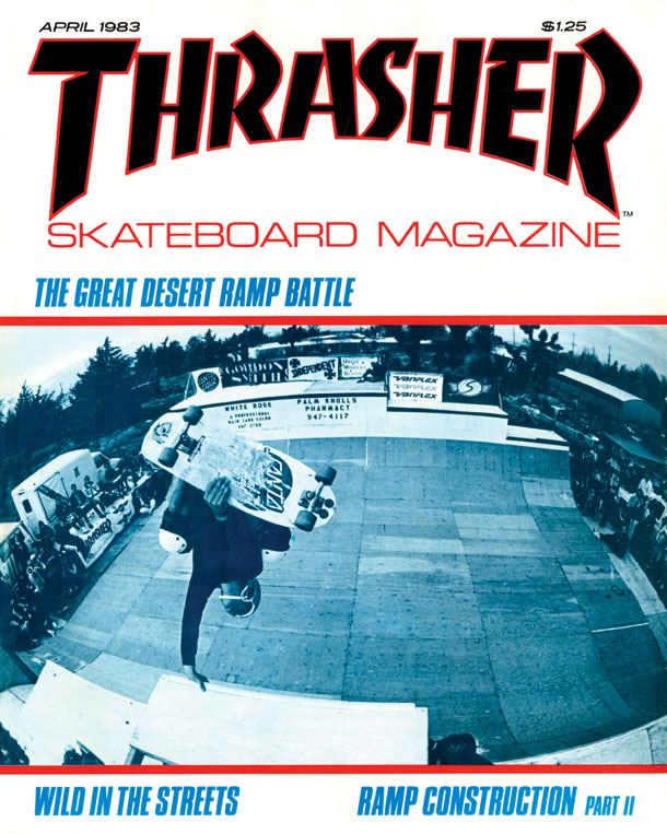
thrasherimg.jpg
tumblr_inline_mmpotcprje1qz4rgp.jpg

SPD: What year?
Ash Gibson: I am guessing it was 1982 and 83. 

SPD: What were you up to?
AG:
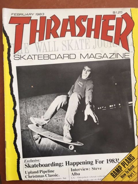
I had been at secondary school for a couple of years. I didn’t like it much except for Art and English. I had discovered music at home and I had always liked drawing and books. I had been riding BMX for a while and had just moved to skateboarding too. Looking back on it I think that those were the things I did that made up who I was - as oppose to anything at school.

SPD: What magazine?
AG: 
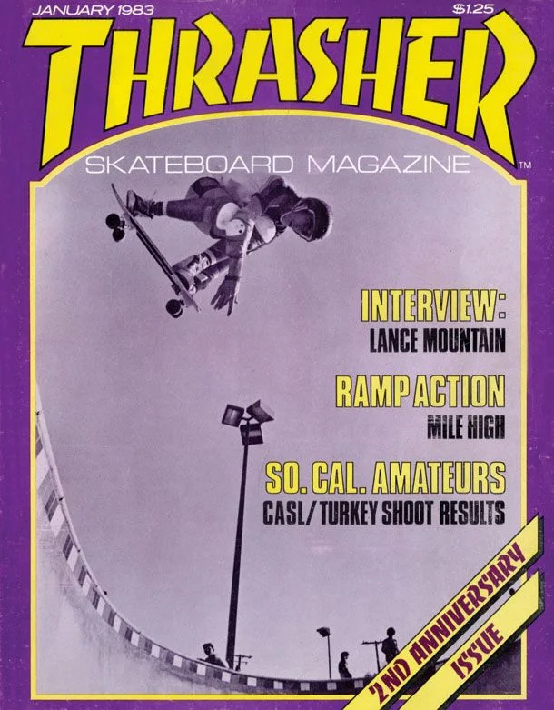
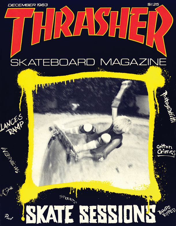
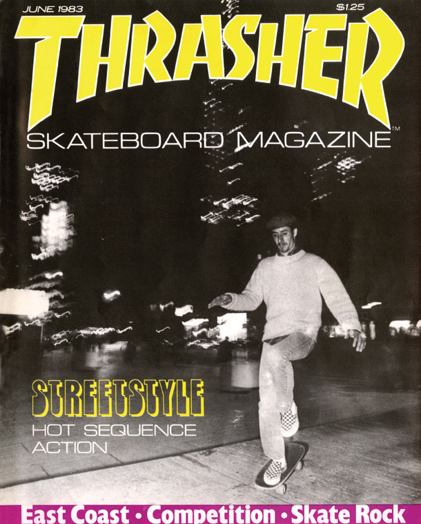
Thrasher Skateboard Magazine

00395469f5ca21927c26e8eaf920d7d7.jpg
TH8306.jpg

SPD: What was it that so enthralled you?
AG: 
In terms of stories - the collection of words and pictures - it was about a way of life that was impossibly interesting to me. Skateboards and punk bands in different parts of America. Driving places to hidden pools or legendary skateparks or just making something of your own in the street where you lived. On top of that every page was visually interesting - even the ads. Because the culture was so driven by its own fashions and innovations all the products were integrated with fascinating graphics and imagery. As a whole it could not of been further from my dreary and threatening Camden state school. 

I only knew one place where you could buy a copy - a skate shop in Notting Hill. So even getting a copy came with its own thrill. It wasn’t somewhere you could get to very often so when you went a copy of Thrasher was definitely on the list - if they had one you didn’t own already.  

SPD: Do you know now who the creatives were?
AG:
No - but the names in it were poured over at the time. I would recognise them if I opened a copy…along with all of the pages individually. Later - when I had moved on from ‘boarding and bikes - I had bought a copy of Transworld Skateboarding that was art directed by David Carson. I kept it for ages and looked back at it when he became quite prominent and I was a young editorial AD in London. 

SPD: How does that inform your creative now?
AG: It was a magazine that connected with its audience by making something exciting for them. It knew how to be real, charming and was about what was happening in its scene at that time. I could also tell it was for the people who were in that world - that lived that life - and they were very different to me. I was thousands of miles away and just a fan really. Strangely, it is the opposite of a lot of publishing and large websites now and similar to specialist feeds and blogs. There is no charm in the churn. 

Beyond the general hipness to their scene I can see now that they were just brilliant at picture usage. Their bold and fast layout style gave them a great tone. Years later I read that Alexey Brodovitch used to tell his designers to surprise him with their layouts, As far as they are from classic Harpers I can now see this is what I loved on these pages.

TH8304.jpg
TH8312.jpg

Piera Gelardi, Executive Creative Director and Co-Founder of Refinery29

b0f5c6d1c922a572e0cf2d1ed9f2494d.jpg
Sassy_Sept92_Cover.jpg
a8baf720e9e89f3d8abeba4acaa49f04.jpg

SPD: What year?
Piera Gelardi: 1995

SPD: What were you up to?
PG: I was looking to find myself, a creative alt-teen in a small town in Maine, feeling a bit out of place and searching for inspiration and my tribe. 

SPD: What magazine?
PG: Sassy Magazine

SPD: What was it that so enthralled you?
PG: I remember the first issue had Jennie Garth from 90210 on the cover and in the inside spread there was a photo of her wearing a pretty dress and clogs. Her feet were in the foreground turned to the camera and the price was written in Sharpie on the soles...they were from a thrift shop. I was enthralled by that mash-up...thrift shopping with fancy New York brands. I also loved the way they did product reviews. The staff would review them (didn't have to be a beauty expert) and give really honest feedback using colloquial language. I felt like I knew the people who made the magazine and I wanted to be part of their cool girl world. 

SPD: Do you know now who the creatives were?
PG: Of course I know Jane Pratt and that Chloe Sevigny was an intern...I don't know beyond that I'm embarrassed to say. (Googling around now...)

SPD: How does that inform your creative now?
PG: I'm still inspired by the independent spirit that Sassy embodied and how relatable it was...how it gave me a sense of belonging to a special sisterhood. How it inspired me to be unabashedly myself, to keep it weird, to have fun with style. The sense of inclusion, self expression, and having fun with feminism are still alive in my work today!

8e3aa7aa50402f12e5a5aa09fc2d65e3.jpg

Krista Prestek, Photo Director at Apple

unnamed-2.jpg
unnamed-9.jpg
unnamed.png

SPD: What year?
Krista Prestek: 1990ish

SPD: What were you up to?
KP: I was wading my way through junior high in suburban Seattle.  

SPD: What magazine?
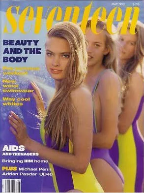
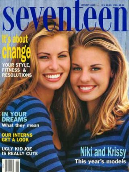
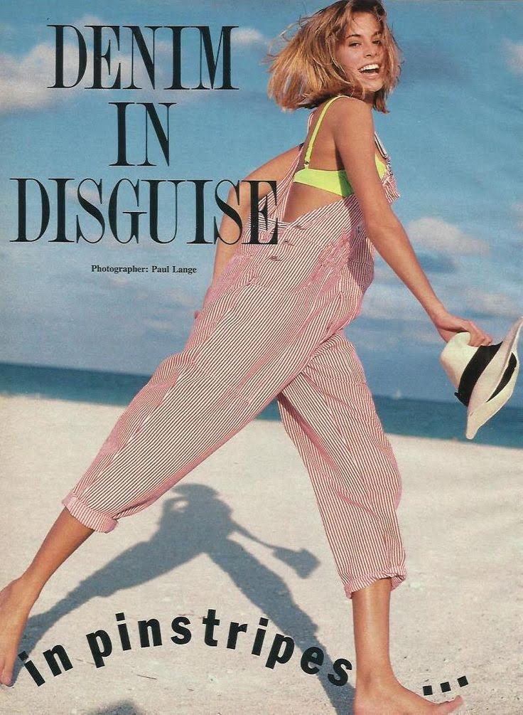
KP: Seventeen

 
unnamed-1.jpg
 

SPD: What was it that so enthralled you?
KP: This is probably stating the obvious, but middle school in the early 90’s was a wasteland. You know things are bad when stirrup pants are one of the more progressive fashion choices available. So I was casting around for a lifeline and I found magazines and just fell in love. Here were people who knew how to deal with love and family and makeup and the weird social politics of being 14 – all of the BIG ISSUES.

I was reading a lot of different titles – YM, Cosmo, Sassy – but of all of them, Seventeen was like a beacon. The photography was really a cut above and there was one cover in particular that I think hooked me -- July 1990, Cameron Diaz, before she was an actress. She had a red, white, and blue shirt and big American flag earrings and a HUGE smile. I mean, she was radiant. It was mesmerizing. I found that reading Seventeen was like getting a peek of what might exist on the other side of 9th grade and it gave me hope.

unnamed-8.jpg

SPD: Do you know now who the creatives were?
KP: I’d love to know. I haven’t been able to find a masthead.

SPD: How does that inform your creative now?
KP: The covers they were doing really hold up in my opinion. Looking at them again for the first time in more than two decades, I remember a lot of them vividly and I can see why -- the spirit, the color, these amazing models telegraphing happiness. I’d be proud now to have had a hand in work like that.