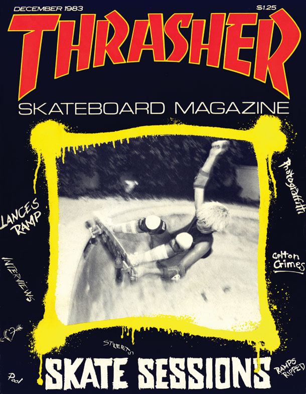
Ash Gibson, Creative Director
/SPD: What year?
Ash Gibson: I am guessing it was 1982 and 83.
SPD: What were you up to?
AG: I had been at secondary school for a couple of years. I didn’t like it much except for Art and English. I had discovered music at home and I had always liked drawing and books. I had been riding BMX for a while and had just moved to skateboarding too. Looking back on it I think that those were the things I did that made up who I was - as oppose to anything at school.
SPD: What magazine?
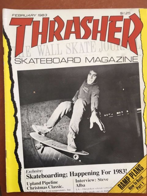
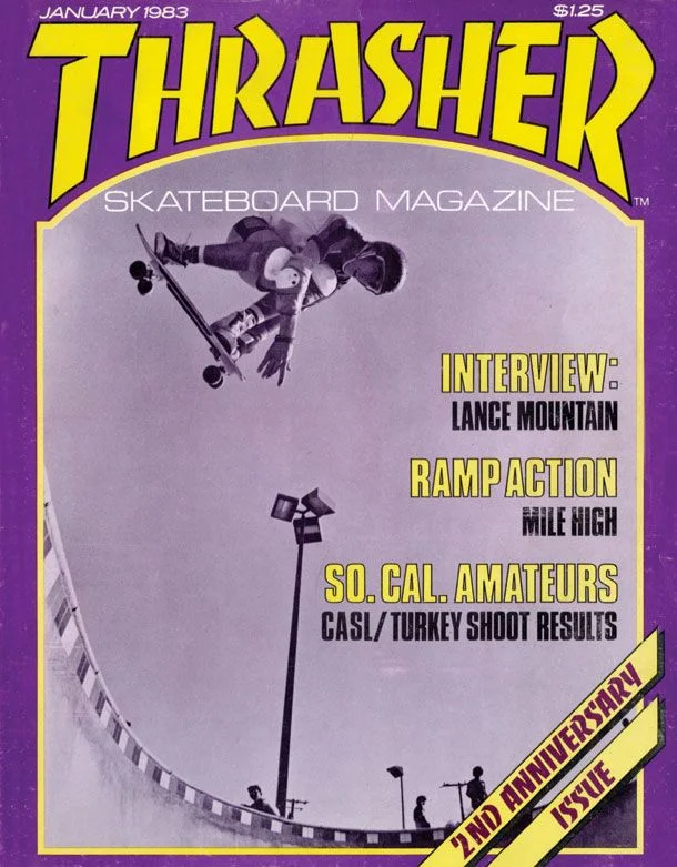
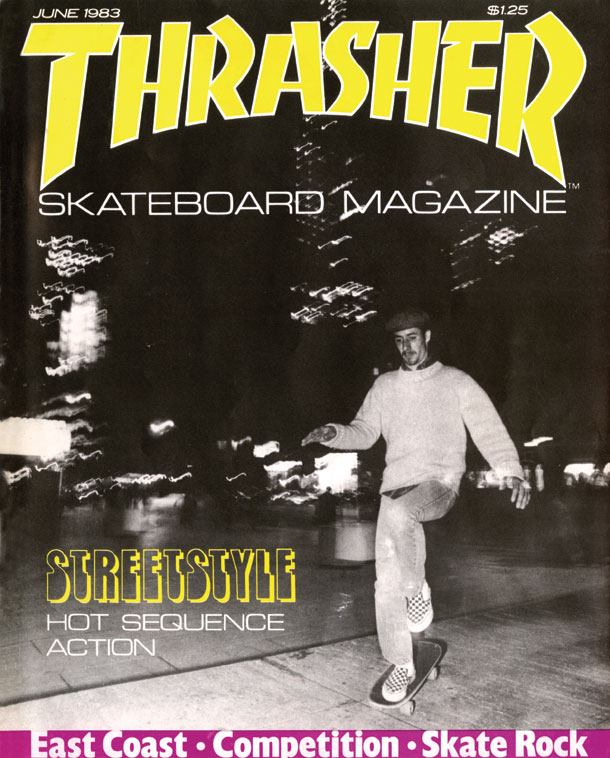
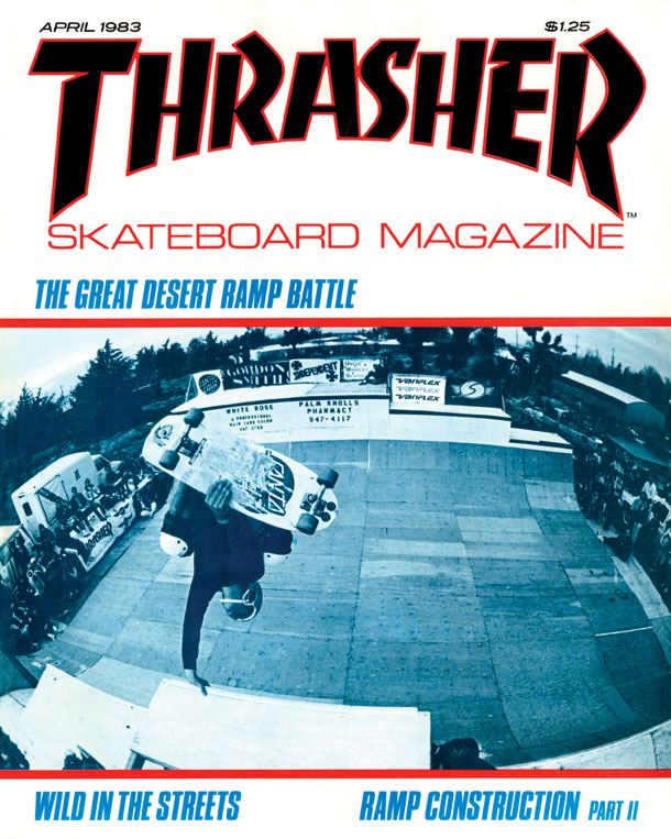
AG: Thrasher Skateboard Magazine
SPD: What was it that so enthralled you?
AG: In terms of stories - the collection of words and pictures - it was about a way of life that was impossibly interesting to me. Skateboards and punk bands in different parts of America. Driving places to hidden pools or legendary skateparks or just making something of your own in the street where you lived. On top of that every page was visually interesting - even the ads. Because the culture was so driven by its own fashions and innovations all the products were integrated with fascinating graphics and imagery. As a whole it could not of been further from my dreary and threatening Camden state school.
I only knew one place where you could buy a copy - a skate shop in Notting Hill. So even getting a copy came with its own thrill. It wasn’t somewhere you could get to very often so when you went a copy of Thrasher was definitely on the list - if they had one you didn’t own already.
SPD: Do you know now who the creatives were?
AG: No - but the names in it were poured over at the time. I would recognise them if I opened a copy…along with all of the pages individually. Later - when I had moved on from ‘boarding and bikes - I had bought a copy of Transworld Skateboarding that was art directed by David Carson. I kept it for ages and looked back at it when he became quite prominent and I was a young editorial AD in London.
SPD: How does that inform your creative now?
AG: It was a magazine that connected with its audience by making something exciting for them. It knew how to be real, charming and was about what was happening in its scene at that time. I could also tell it was for the people who were in that world - that lived that life - and they were very different to me. I was thousands of miles away and just a fan really. Strangely, it is the opposite of a lot of publishing and large websites now and similar to specialist feeds and blogs. There is no charm in the churn.
Beyond the general hipness to their scene I can see now that they were just brilliant at picture usage. Their bold and fast layout style gave them a great tone. Years later I read that Alexey Brodovitch used to tell his designers to surprise him with their layouts, As far as they are from classic Harpers I can now see this is what I loved on these pages.
