Anton Ioukhnovets, Creative Director at Ioukhnovets Studio

Screen Shot 2017-11-16 at 10.36.08 PM.png

Anton Ioukhnovets: I fell in love with IT while standing in line at the very first McDonalds in Moscow.

This was 1990 and it was not an ordinary line. It wrapped around one of the squares in the center of the city, and it took you an hour and a half to get to the counter to order a piece of the American dream.

Local vendors seized this commercial opportunity and supplied hundreds of people waiting with everything from bubble gum to whisky cocktails in the can. 

This is where I first picked up a copy of Rolling Stone.

I don't recall what issue I bought, but I remember that the cover caught my eye right away. And when I opened the magazine I was stunned. 

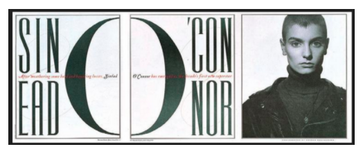
No exaggeration. I didn't even know what graphic design was, or what the term "typography" meant, and I could not imagine that it was possible to use "letters" in this beautiful way.

I believe it was a feature on the Beastie Boys, or something (can't be positive now). I was leafing through it while standing in line. And it had the headline and deck on its side, placed in these yellow and orange color boxes running up the side of the page. The whole thing was just not normal, it was daring, it was reaching out and grabbing you by the balls! 

And I remember thinking "HOW THE FUCK DID THEY COME UP WITH IT?!  HOW THE FUCK..."

And that's how my love affair with magazines began :)

A few weeks later, after my initial excitement percolated from my heart into my brain, I took to practical matters. I found the names of people responsible for such unorthodox design. The name Fred Woodward did not have a lot of meaning for me at the time, but since he was at the top of the masthead, I figured he was THE GUY in charge. I wrote a letter of admiration, included a few samples of my "collages" (made from other western magazines) and let the Soviet post office do the rest. Chances are this letter never left the borders of CCCP.

But no matter, looking back now, I can say that this encounter with Rolling Stone taught me to push my visual vocabulary, explore and dream. 

And it worked.

Screen Shot 2017-11-16 at 10.36.16 PM.png

Leo Jung, Creative Director at The California Sunday Magazine

SatNight_menshair.jpg
d34fcf4db2542b8d71f85706ab3d770b.jpg
SatNight_rockets.jpg

SPD: What year?
Leo Jung: It was 2001, Madonna was going through her cowgirl phase while I was going through a plaid-shirt phase. I was visiting the DX (aka, more formally, the Design Exchange), a cool design museum in Toronto, where they were showcasing some of the recent winners of a Canadian graphic design competition. 

SPD: What were you up to?
LJ: I was fresh out of design school armed with zip drives and mad skillz in QuarkXpress 3.3. Coldplay’s debut album, Parachutes, was on repeat. When I wasn't busy looking for a new plaid shirt at Winners (that’s Canadian for TJ Maxx), I would scour through design-awards annuals like Communication Arts, HOW, and Applied Arts (also Canadian) for inspiration and longing to be in those very pages myself one day. Back then the internet existed, but it was long before the plethora of curated design blogs that are around today. Exhibitions of award-winning work were always a bonus because you could see and feel the actual printed pieces. 

SPD: What magazine?
LJ: As an eager beaver trying to keep an eye on who and what firms were doing the best work, I was familiar with most of the winners already. That is, until I came across a magazine called Saturday Night. (I should preface this by saying that back then I wasn't a magazine junkie like many of my colleagues. I was all about the branding and corporate identity work — or at least, that’s what I thought I liked most at the time.) Saturday Night racked up an obscene number of awards for design and art direction, and I had never seen it before. Imagine my embarrassment when I found out that it was Canada’s longest-running general interest magazine (founded in 1887). Saturday Night was a weekly supplement in the weekend edition of the National Post, a highly respected Canadian newspaper. 

SPD: What was it that so enthralled you?
LJ: I didn't pay attention to magazines, but this one demanded to be seen. It was completely atypical from what I knew a magazine to be; the masthead logo was never in a fixed place and its coverlines were minimal and compact. Every issue was different; some covers would be beautifully photographed and others were cleverly illustrated. It made use of an all-caps, condensed sans display that seemed unique at the time, and now, with its prevalence today, looks like it was years ahead of its time. It was a magazine of ideas, and you could tell there were a lot of smart and talented people behind it.

Love-and-Marriage-Saturday-Night_525px.jpg
LOGAN_saulbellowLJ.jpg

SPD: Do you know now who the creatives were?
LJ: It was led by Art Director Leanne Shapton, whom I've always admired. She has since done wonderful work as an author, artist, and publisher. Consulting on the design were (and still are) also heroes of mine: Paul Sahre and Nicholas Blechman. The rest of the team included other brilliant minds: Ken Whyte, Antonio DeLuca, Jason Logan, Bryan Gee, Jemal Hamilton, Alicia Kowalewski, Dorothy Hyrk, Dianna Symonds, Christine Dewairy, Jessica Johnson, Sarmishta Subramanian, Adam Sternbergh, Craig Taylor, and Paul Wilson. (Major props to Jason Logan, an original member of the award-winning team, for documenting some work and listing the folks he worked with on his website. Unfortunately, there isn’t much archival imagery on the internet of this brilliant time in magazine-making.)

SPD: How does that inform your creative now?
LJ: Its design was deceptively simple. As a naive and inexperienced young creative, I was less reliant on imagery and preferred design that was much more expressive and communicative with layout and typography. 

Nevertheless, I still found it striking, engaging, smart, and beautifully crafted. It’s only years later that I’ve fully come to appreciate how effective the right imagery can be to convey information and tone. There is a subtlety and beauty a straightforward design can have and yet still be completely surprising. It was that confidence in letting imagery and art direction lead and letting design be ever present — but nearly invisible — that has always stayed with me. It made me realize that the design of a magazine need not always be seen for it to have personality. 

Screen+shot+2013-11-06+at+11.08.01+AM.png

A fine example is this story on pressuring kids to be successful. The decision to commission Canadian fine artist Marcel Dzama was an unconventional choice, but an incredibly effective one that still looks distinctive and modern today. This was 16 years ago, folks. 

Now that I am a magazine junkie, I only wish I had samples to flip through today so that I could fully appreciate all of the details. If you’re ever in a used book store in Toronto, keep an eye out for issues from 2000–2001. You might find some real gems. And if you do, share them with the world. The internet needs them for posterity.