Mike Schnaidt, Creative Director
/Mike Schnaidt: I fell in love at my dentist’s office. No, not with Dr. Bernstein, but rather with a copy of Entertainment Weekly.
It was 2002, and I was pursuing a B.F.A. in graphic design at C.W. Post. My parents were grateful that I even went to college, as I was a bit thick-headed in high school. But, by studying design, I was able to knock down a few walls in my brain. When I discovered Entertainment Weekly, it shed light on which direction to go.
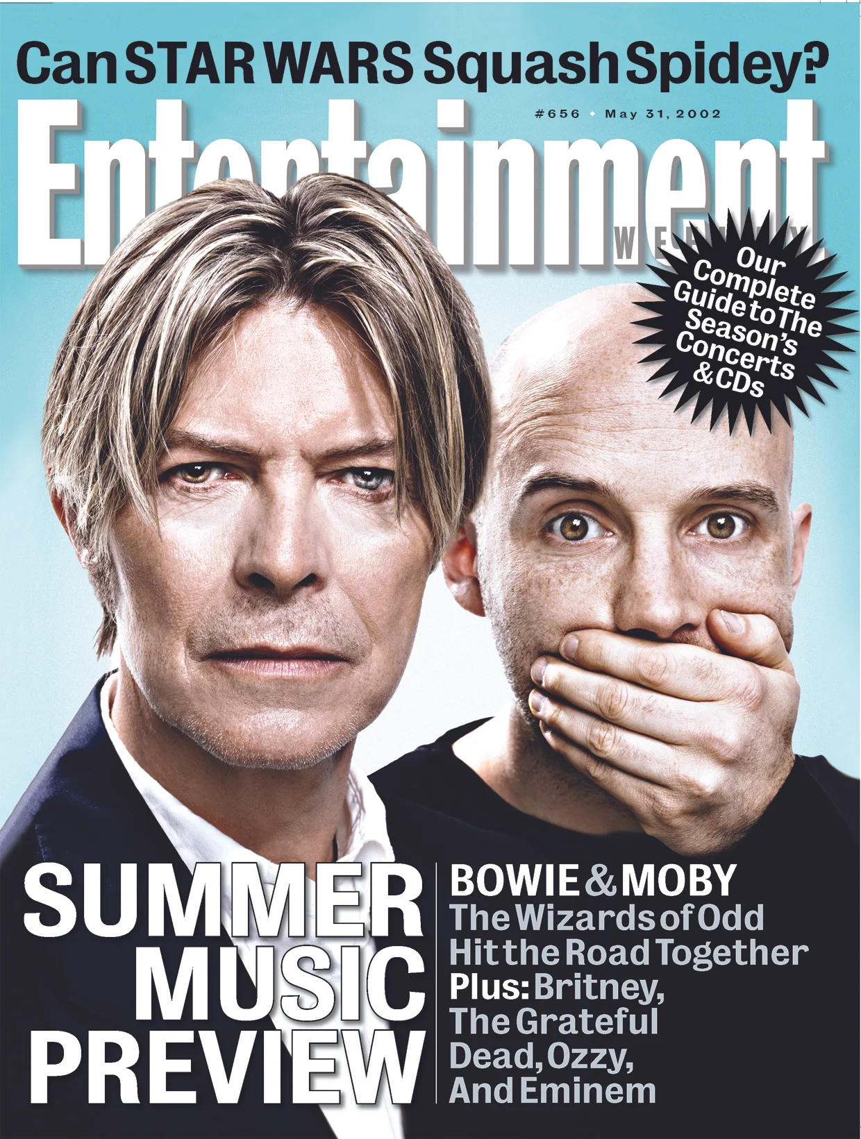
The treasure I found at Dr. Bernstein’s office was the Summer Music Preview issue. David Bowie and Moby were on the cover. The photography pinched your cheeks, and the design smacked you in the face. The gestalt: a magazine cover that felt poster-size. Open it up, and every square pica was designed to maximum volume. As a fanboy of comics, music, and movies, I understood why. EW’s design had to express the content with the same geeky excitement as readers would consume it. Once I came to that conclusion, I came to understand a larger lesson in graphic design: form follows function.
Soon after, I ordered a subscription for my Weekly jolt of design inspiration.
As a design student, I worked at a glacial pace. It took me months to get a single magazine opener right. Therefore, I was perplexed at how the EW art department could produce a magazine at the rapid fire pace of a weekly. But what seemed like an impossible feat were EW’s packages. For each Fall TV preview, Summer Movie Preview, and IT List, the design team conjured up an intricate structure that somehow spanned across 50+ pages.
By studying these packages, I came to understand the art of larger design systems. As a whole, these magazine packages were beautiful. But like a Lego block, the ingenuity was in the design of the modular– the core design pieces of the package had to be simple enough in order to build a seemingly complex system.
Throughout college and my first job at Network Computing magazine (long gone), I made many attempts to mimic whatever design nuances I learned from EW. But one night, while up late doing work for grad school, I saw a listing for a designer position at my favorite mag. I applied to Entertainment Weekly, although I was fairly confident I wouldn’t get a call back.
Well I did.
I was totally unprepared for an interview that week, but of course took it anyway. So, I pulled an all-nighter, where I cut and mounted an oversized black print portfolio (remember those?) to perfection. I’m pretty sure I was high off 3M spray adhesive during my interview.
The rest is history. I was hired by my design heroine, Geraldine Hessler, and was put through bootcamp. I learned how those packages were put together: teamwork from some of the most talented designers out there. Geraldine’s direction was tenacious, and I’m grateful I had the opportunity to learn from her, Brian Anstey, and Amid Capeci.
Today, I exercise what I was taught at the breakneck pace of a weekly. And it wasn’t until I finally became a Creative Director that I fully understood those lessons.
I wonder what magazines Dr. Bernstein has in his office today?


