Southern Poverty Law Center Rebrand with Chris Mihal
/In this episode of Rebrand, Creative Director and Founder, José Reyes of Metaleap Creative, a brand and publication design agency based in Atlanta, talks with Chris Mihal, Director of Creative at the Southern Poverty Law Center, about their rebranding of the 52-year-old organization based in Montgomery, Alabama. The Southern Poverty Law Center is a civil rights and advocacy organization whose history has largely been known for litigation and combatting hate groups, most significantly known for bankrupting the KKK.
Whether or not you are drawn to working for a non-profit, seasoned designers can see the need and potential for the impact of bringing their experience, story-telling, craft, leadership, brand stewardship, and more to these organizations.
This conversation, then, will interest anyone curious about what goes into rebranding in general, what rebranding a beloved institution like the Southern Poverty Law Center looks like, and try to answer a few questions about the role non-profits serve in an ideologically shifting world.
Research and Strategy
Formed in 1971, the mission of the SPLC is to be a catalyst for racial justice in the South and beyond, working in partnership with communities to dismantle white supremacy, strengthen intersectional movements and advance the rights of all people.
The team partnered with Champions Design to reimagine the SPLC brand to be grounded in the South and represent the broader work that the organization was doing. Image and asset research came together through interviews and working with the SPLC’s internal creative team. Champions, over the course of 90 days, worked to develop a new strategy that would focus on developing a new brandmark as well as design system to reflect the organization’s shift in work. Ultimately four directions were proposed to leadership with the team deciding to lean into its acronoym, SPLC.
Brandbook and Guidance
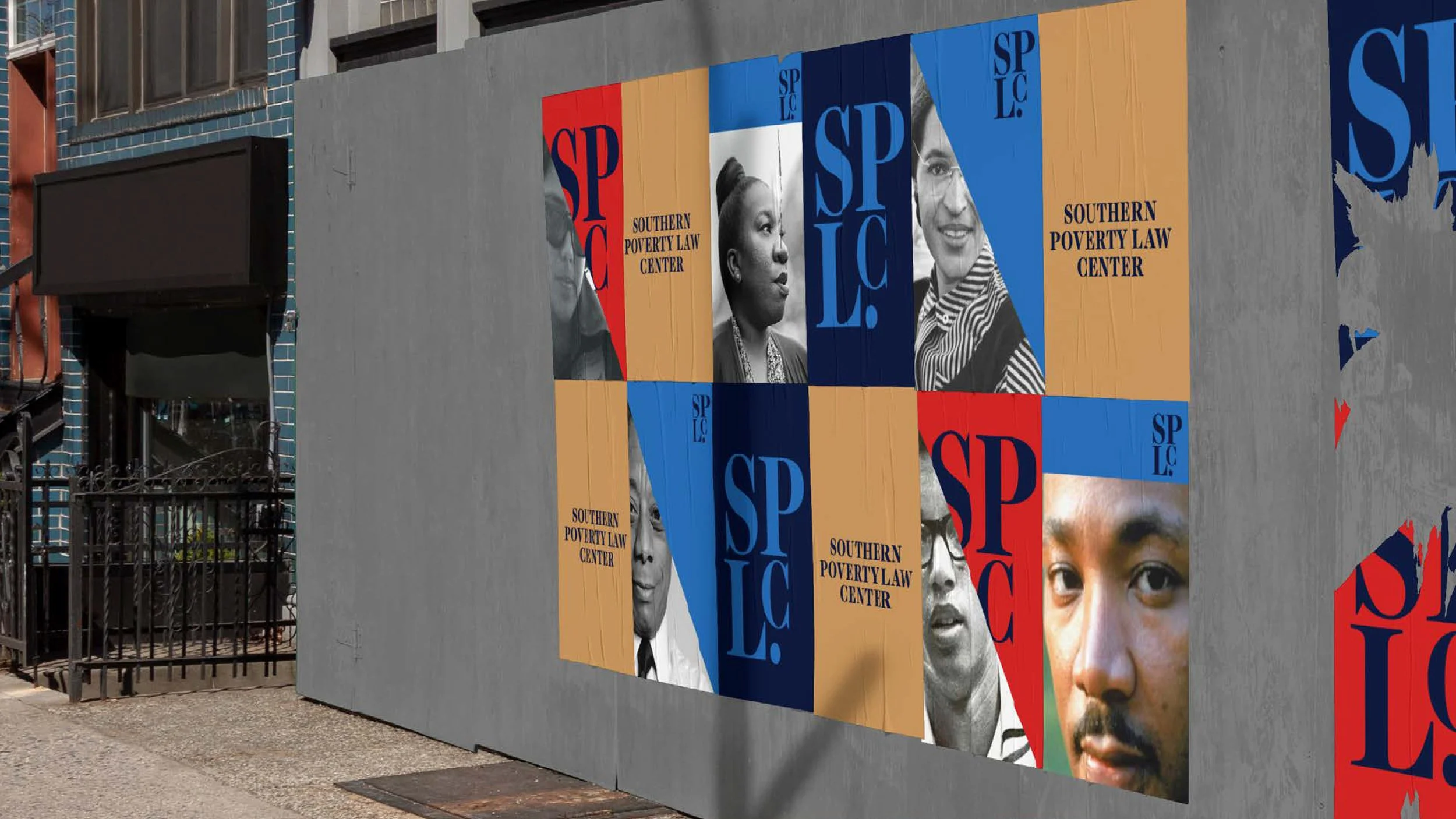
Our monogram says SPLC, period. Adopting our acronym as our primary branding element is a deliberate departure from the scales of justice. It gives space to our work beyond the courts.
The visual research for the SPLC brand drew from several examples of resilient Southern culture, including Southern Gothic architecture, Black churches and the covers of Southern Gothic novels.
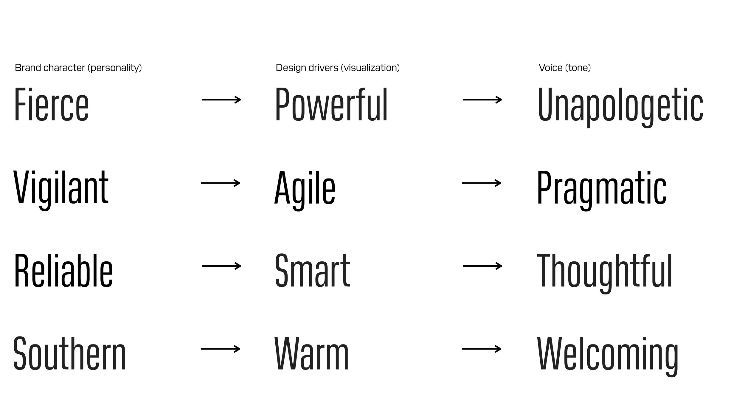
Southern resilience birthed the civil rights movement and is the true Southern legacy that the SPLC is proud to uphold. The center was founded in a moment during the Early ’70s when the progress of the movement was in danger of being thwarted, and is proud to be known for taking on the most hateful individuals and factions in the South and meeting hate with vigilance, resilience and joy. The SPLC drew from the craft of Southern Gothic architecture and the resilience of Southern Gothic literature.
The flexibility of the color system allows for a range of tones, from sober to celebratory. Color palettes may also utilize only two or three colors, depending on the application and tone of voice.
The tile is the core brand element in the system. The shape captures the essence of Southern Gothic architecture.
Implementation
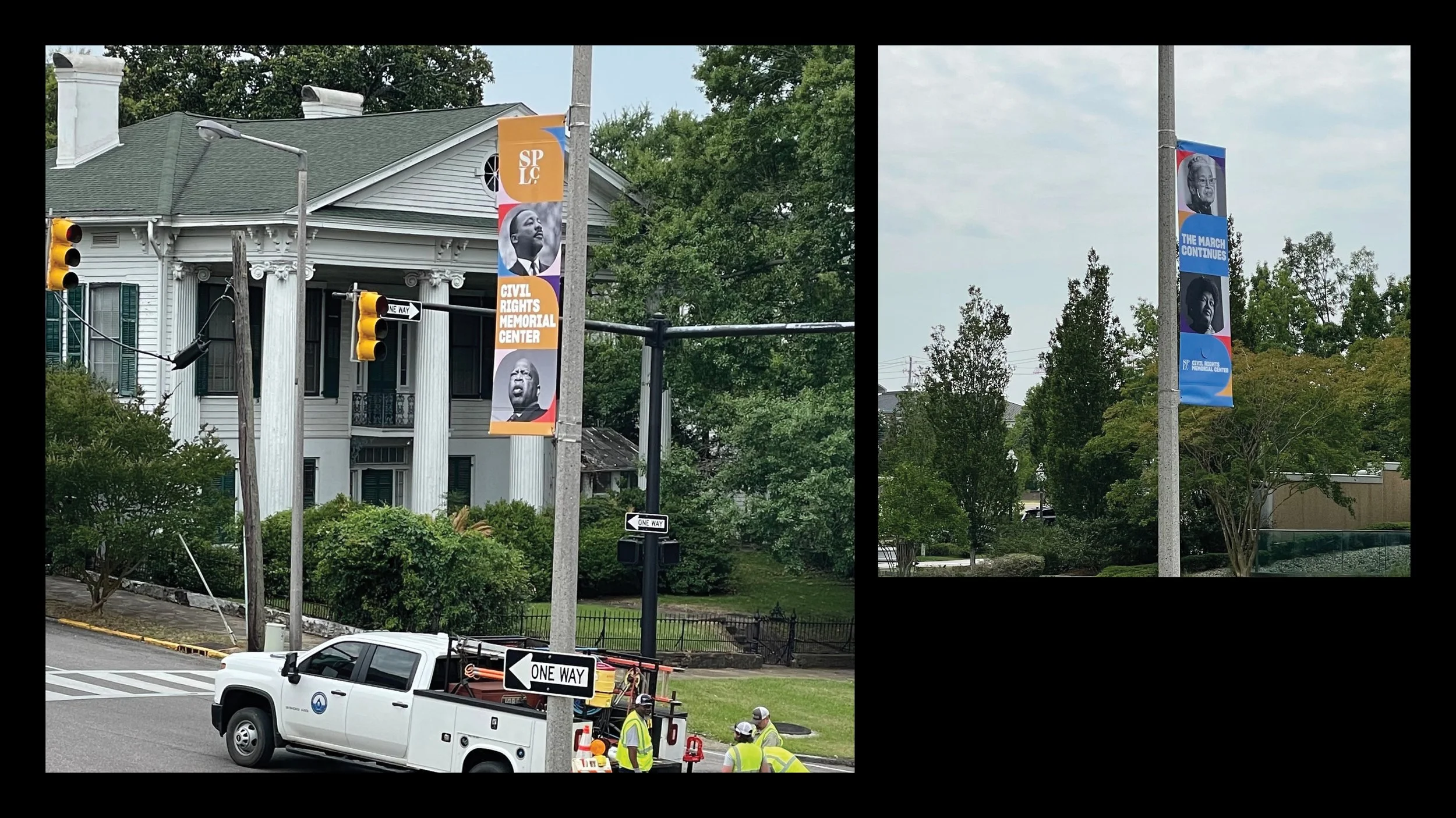
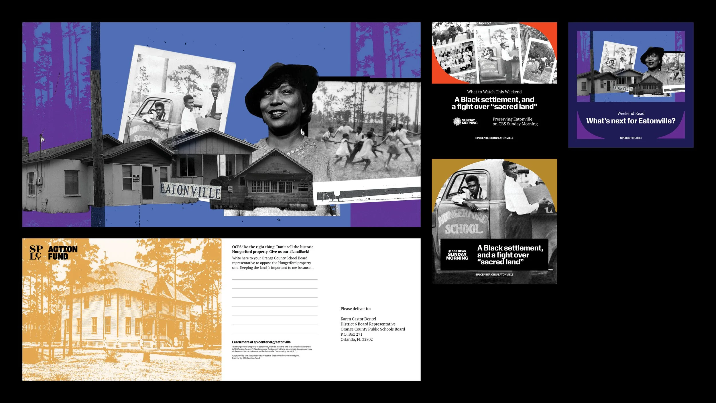
The organzation deploys any number of forms to communicate it’s message to the audience. The internal creative team works on many different reports; magazines; direct mail; digital stories and publications; phyiscal items like signage, calendars, billboards, apparel; social media; video and photography production.
Credits
Director of Creative: Chris Mihal
Deputy Director of Creative, Photography & Video: Hernan LaGreca
Deputy Director of Creative, Design: Meagan Lily
Deputy Director of Creative, Operations: Scott Phillips
Senior Creative Lead: AJ Favors
Senior Designers: Cierra Brinson, Sunny Paulk, Alex Trott
Senior Video Producers: Hillary Hudson, Jacob Saylor
Designers: Claudia Hong, Trey Vanterpool
Video Producer: Lamont Baldwin
Project Manager: Angela Greer
