Redesigning Rolling Stone with Joseph Hutchinson
/Joseph Hutchinson is the creative director extraordinaire for Rolling Stone, where he oversees design and visuals for print, digital, and the overall brand portfolio. In 2018, he led a major redesign to refresh the content strategy and modernize the brand’s design, photography, and illustration while retaining its distinctive heritage and feel. More recently, Joseph led a redesign of Rolling Stone’s website that launched last summer while co-chairing SPD’s 57th annual competition. He spoke with Lan Yin Bachelis, Creative Director and Designer, Dotdash Meredith Premium Publishing about the why, how, and wow of this redesign in the video above and selected work samples below.
Logo Refresh
Click to enlarge.
From Hutchinson: “One thing I didn’t expand upon in the [video] was a challenge we faced by bringing back detail and dimension to the RS logo and moving away from a flat logo. The previous flat logo worked everywhere, but a single dimensional logo looks great on the cover and at the top of the homepage on your laptop, but not great on mobile or in small positions like the compressed navigation bar on desktop website. So Jesse, Roger and I came up with a small version of the Rolling Stone logo, with simpler shapes and less detail, that reads better in small or challenging positions. That simpler version still has dimension to echo the ‘big’ cover logo, so the identity is still there, but the small version reads well at small sizes.”
Social Media Samples

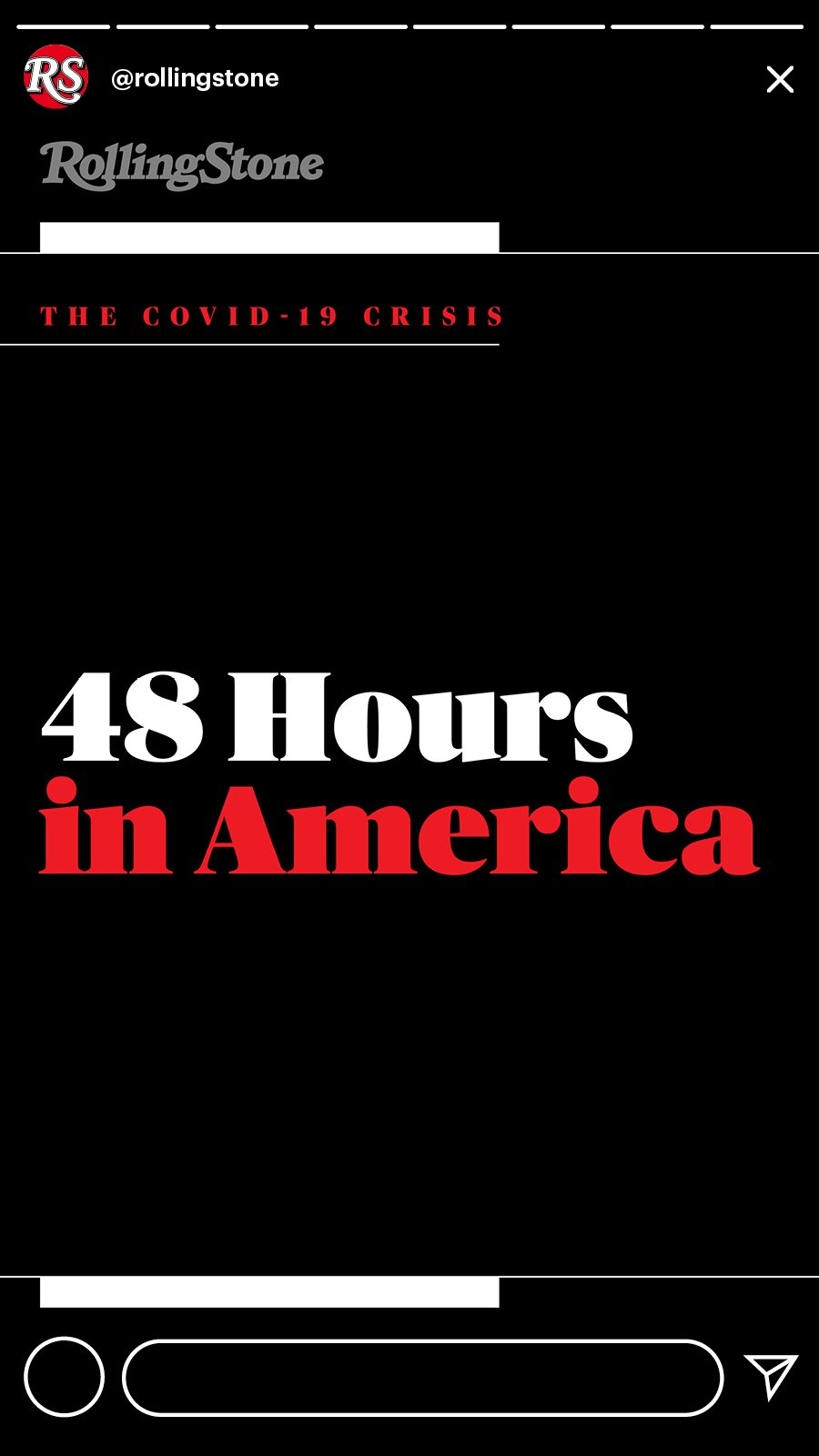
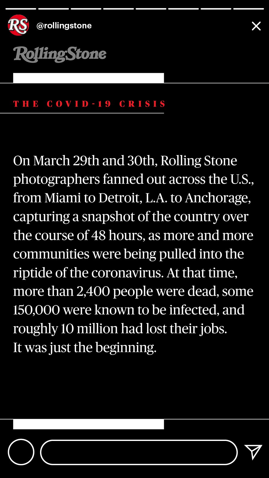


Click to enlarge.
Harry Styles Covers the World
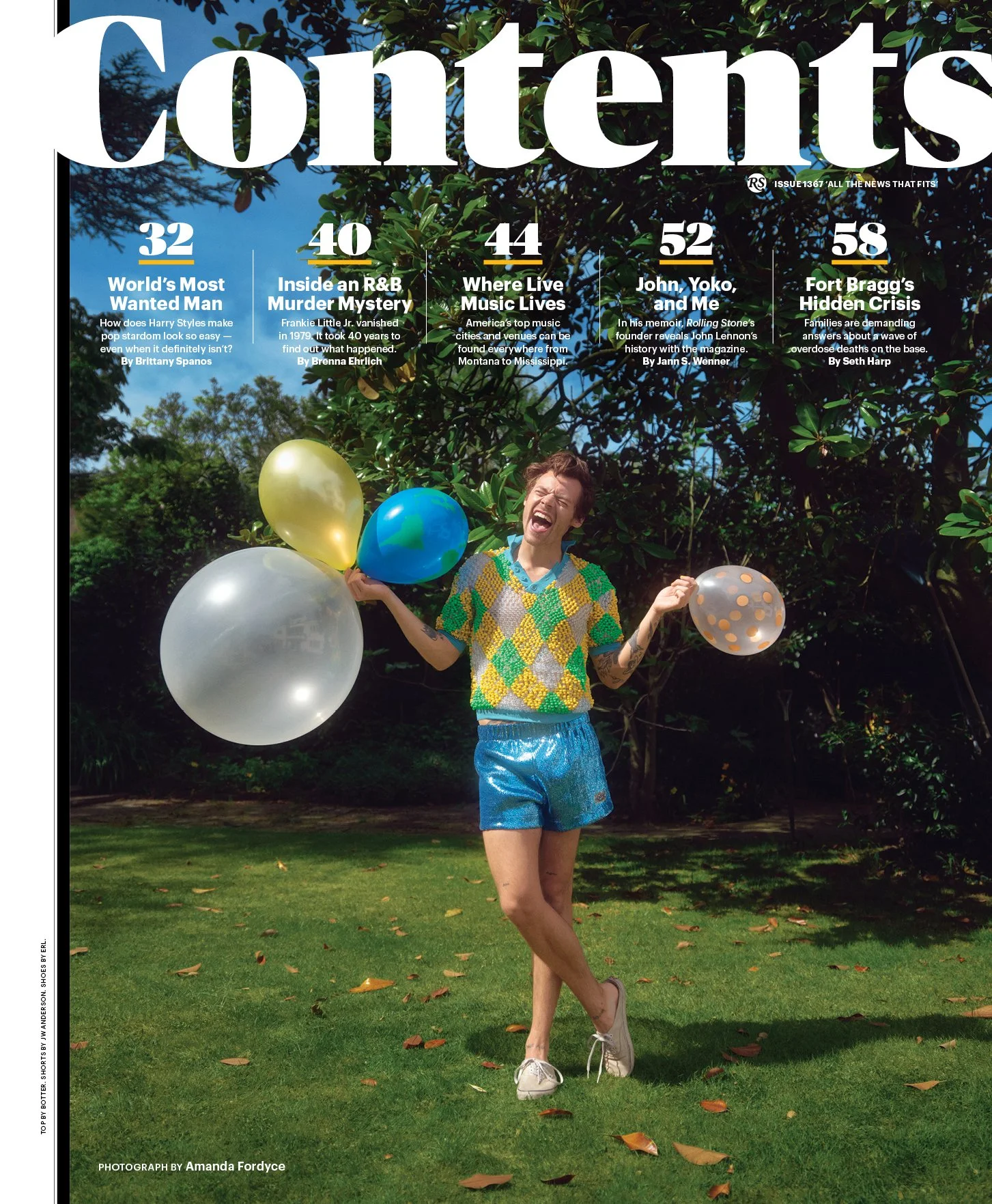
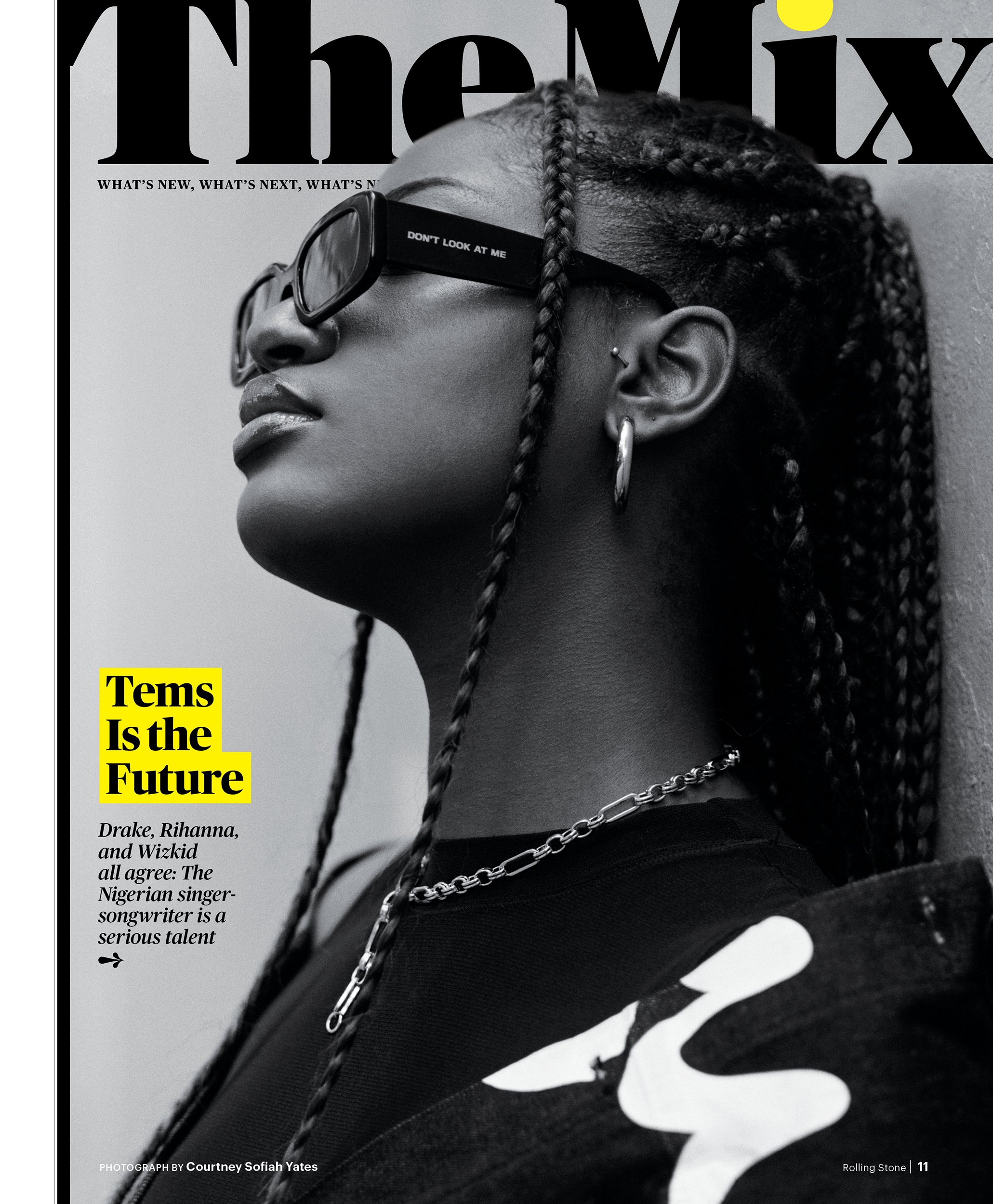
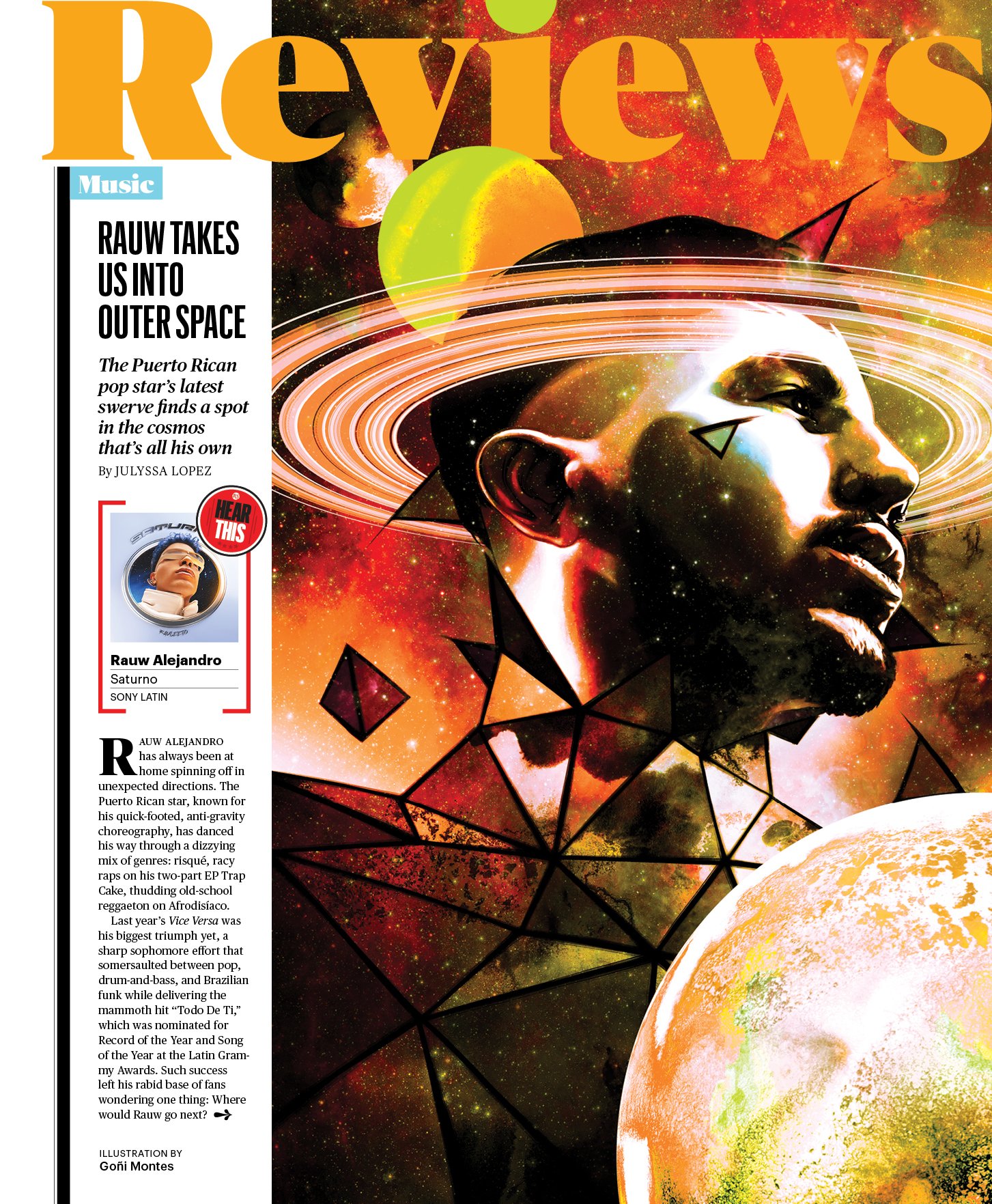
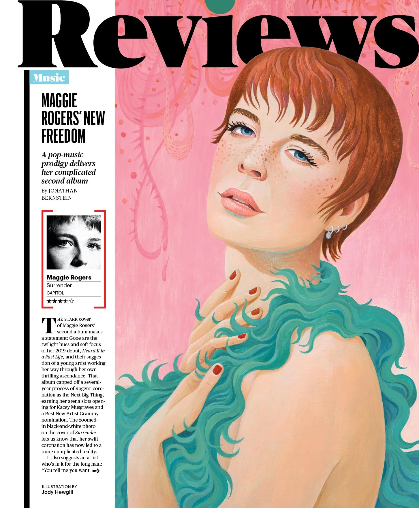
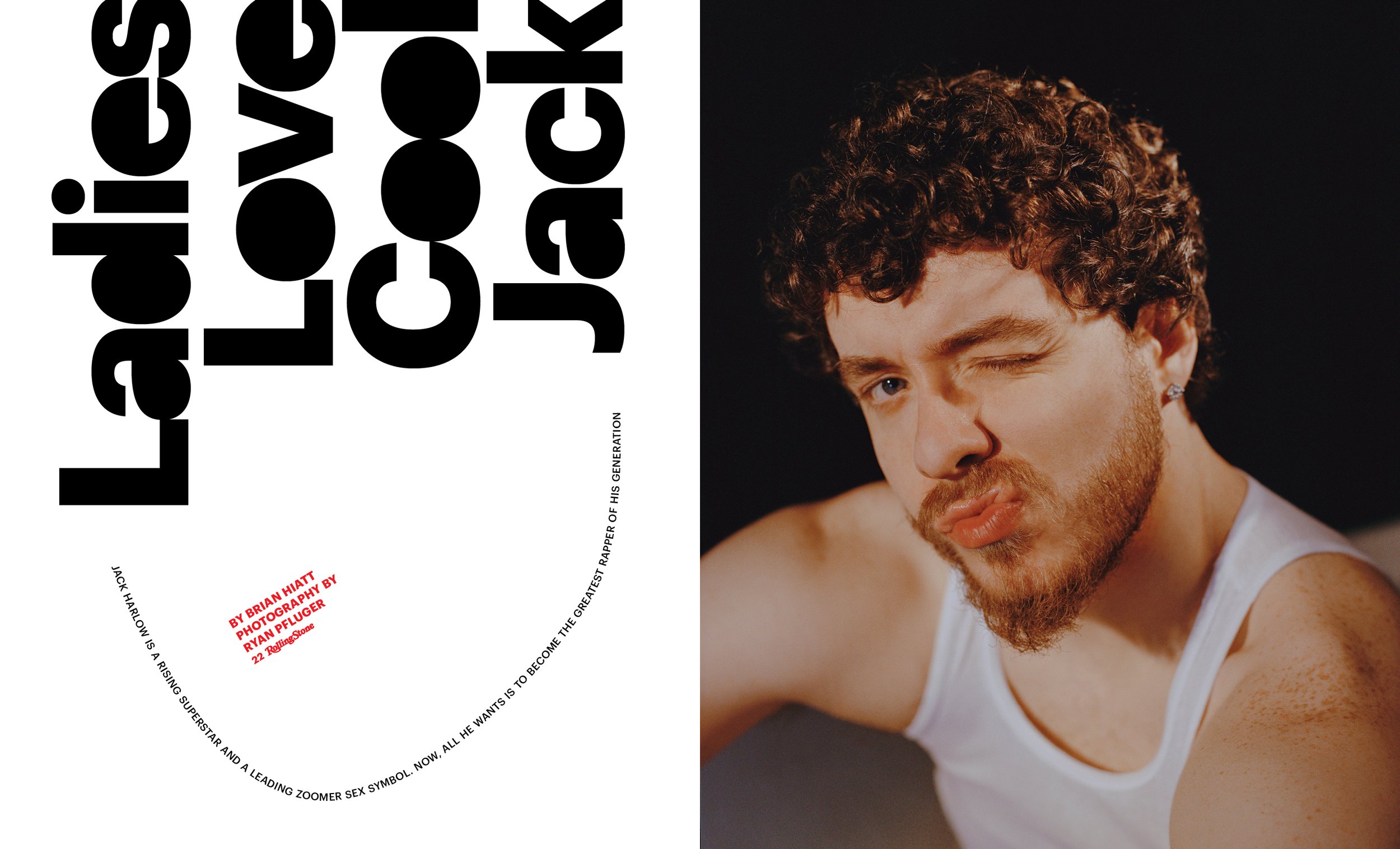
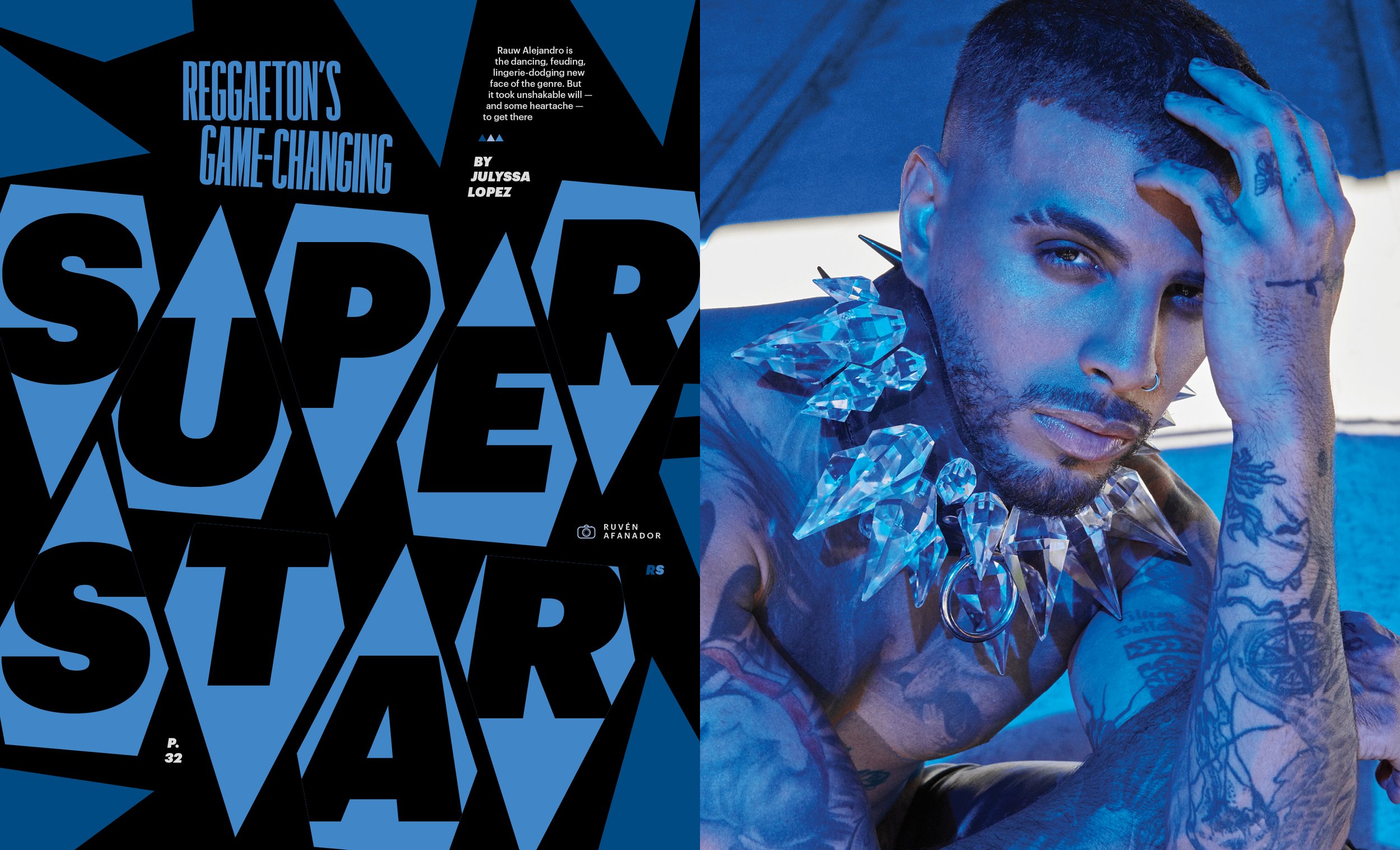
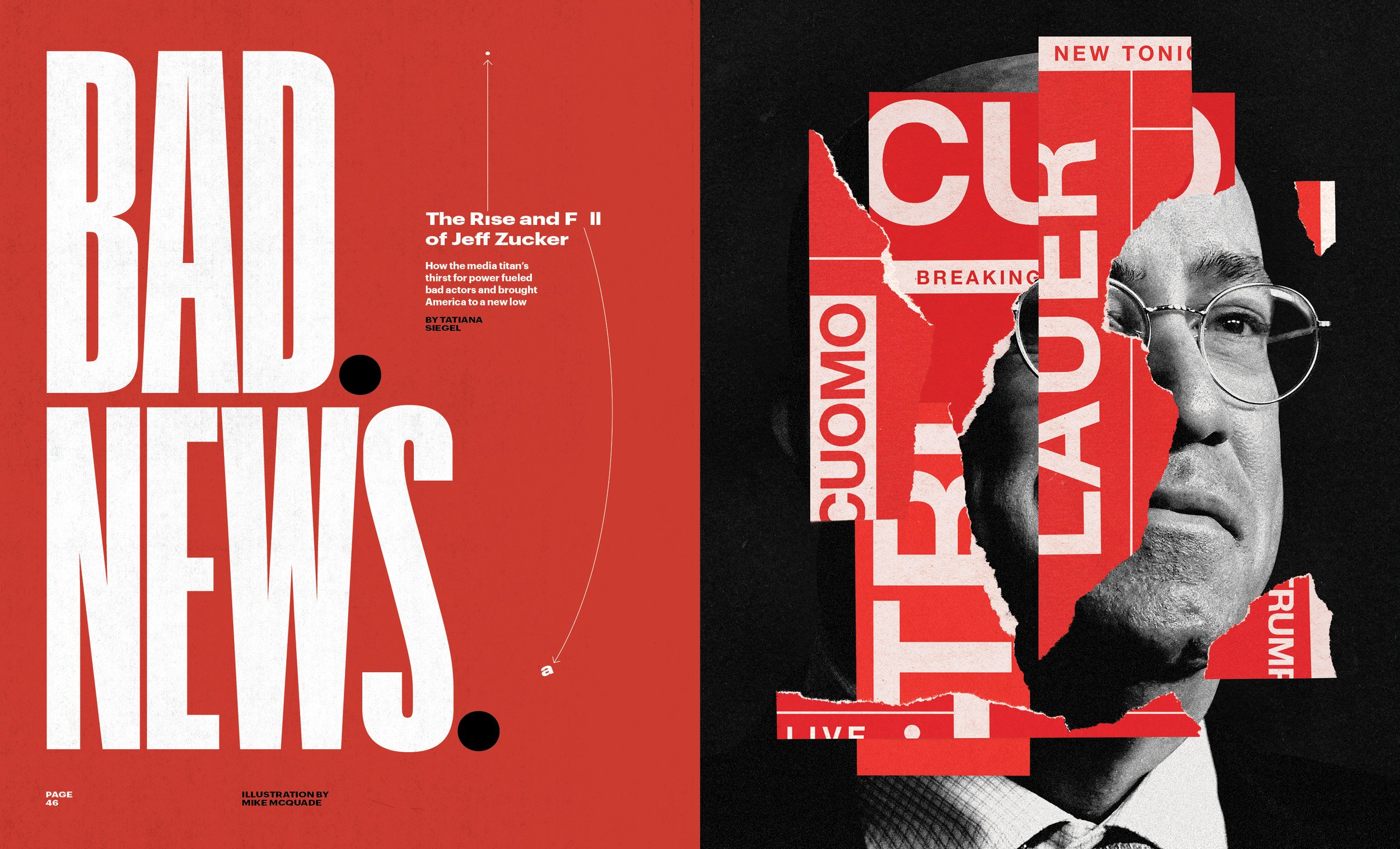
Selected Print Pages
Click to enlarge.
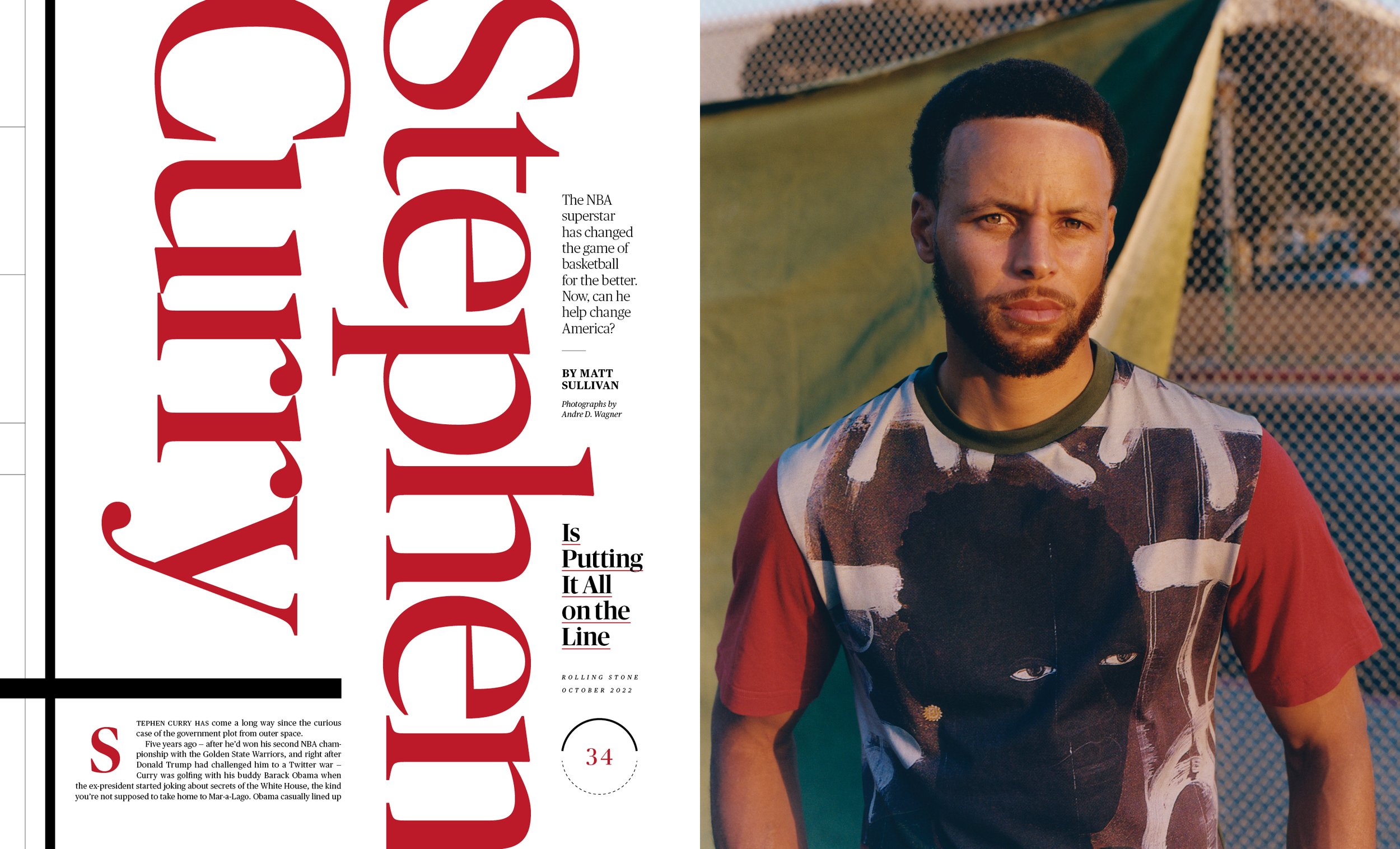

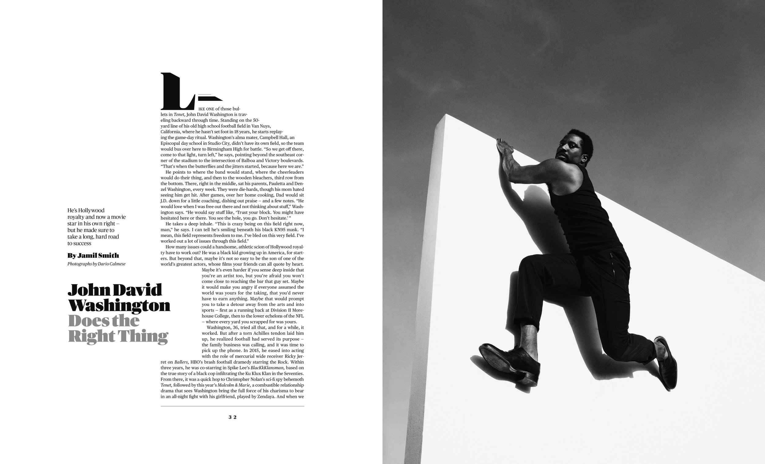
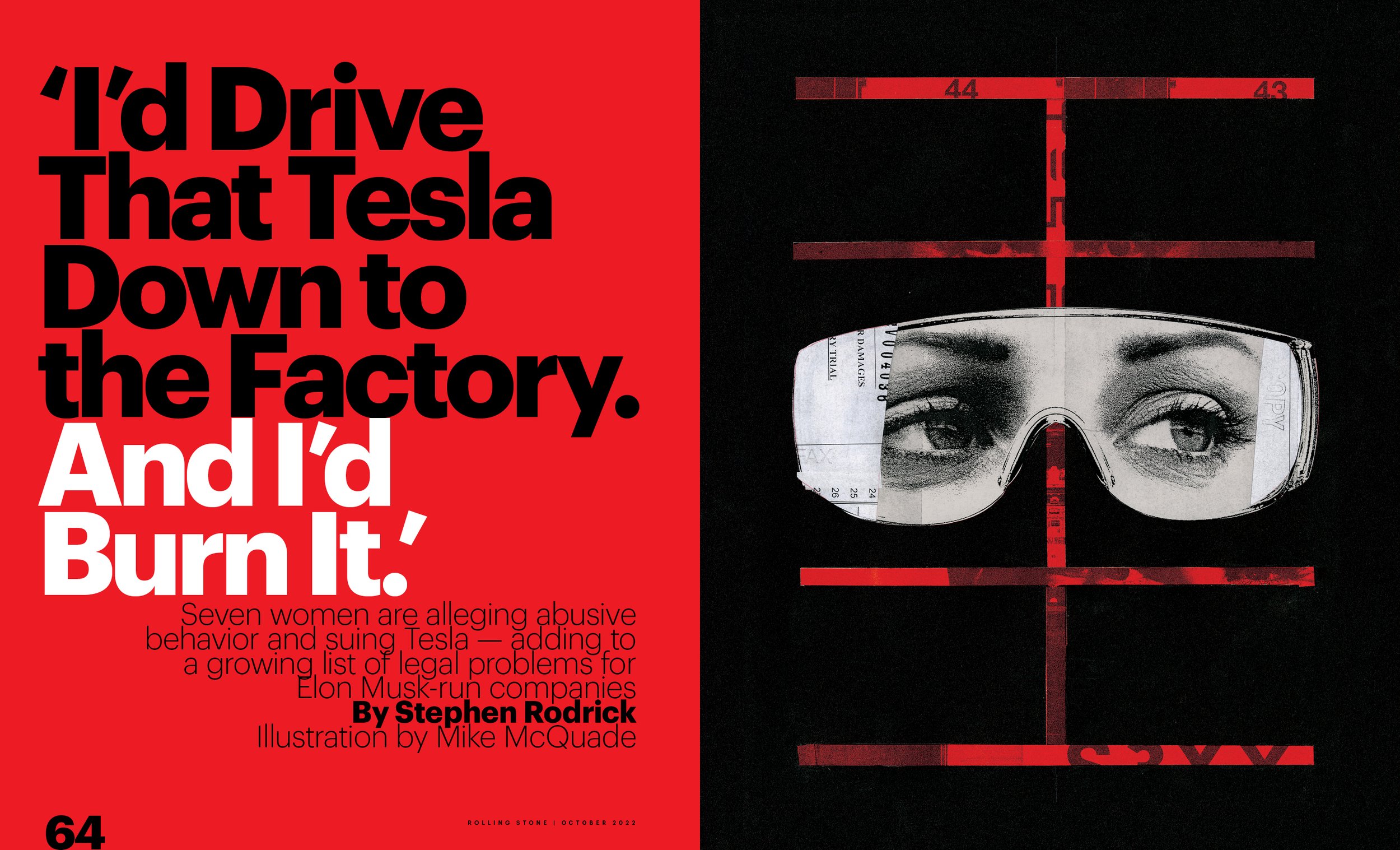
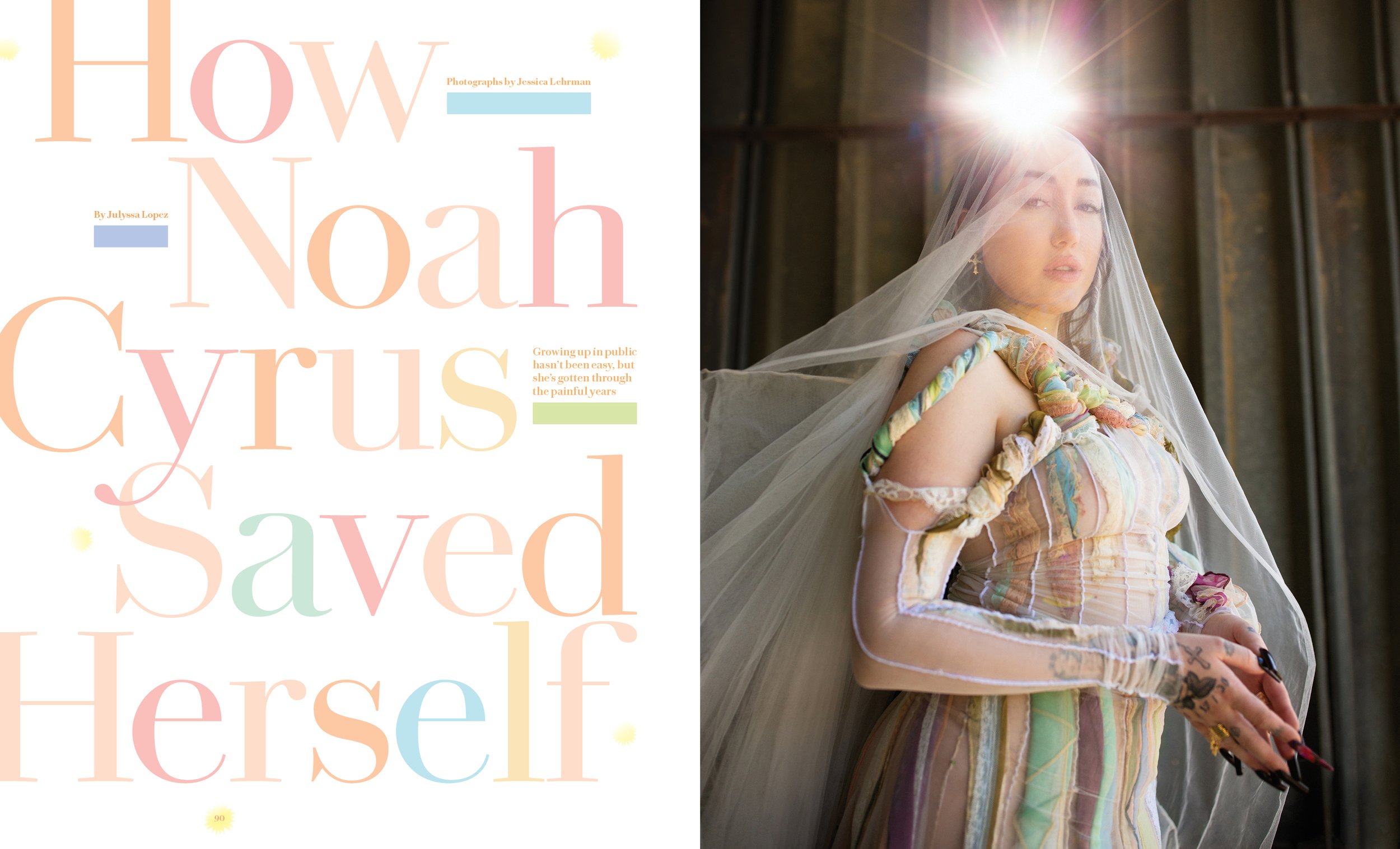
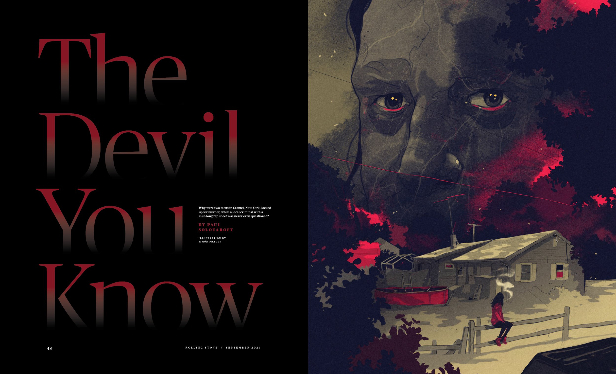
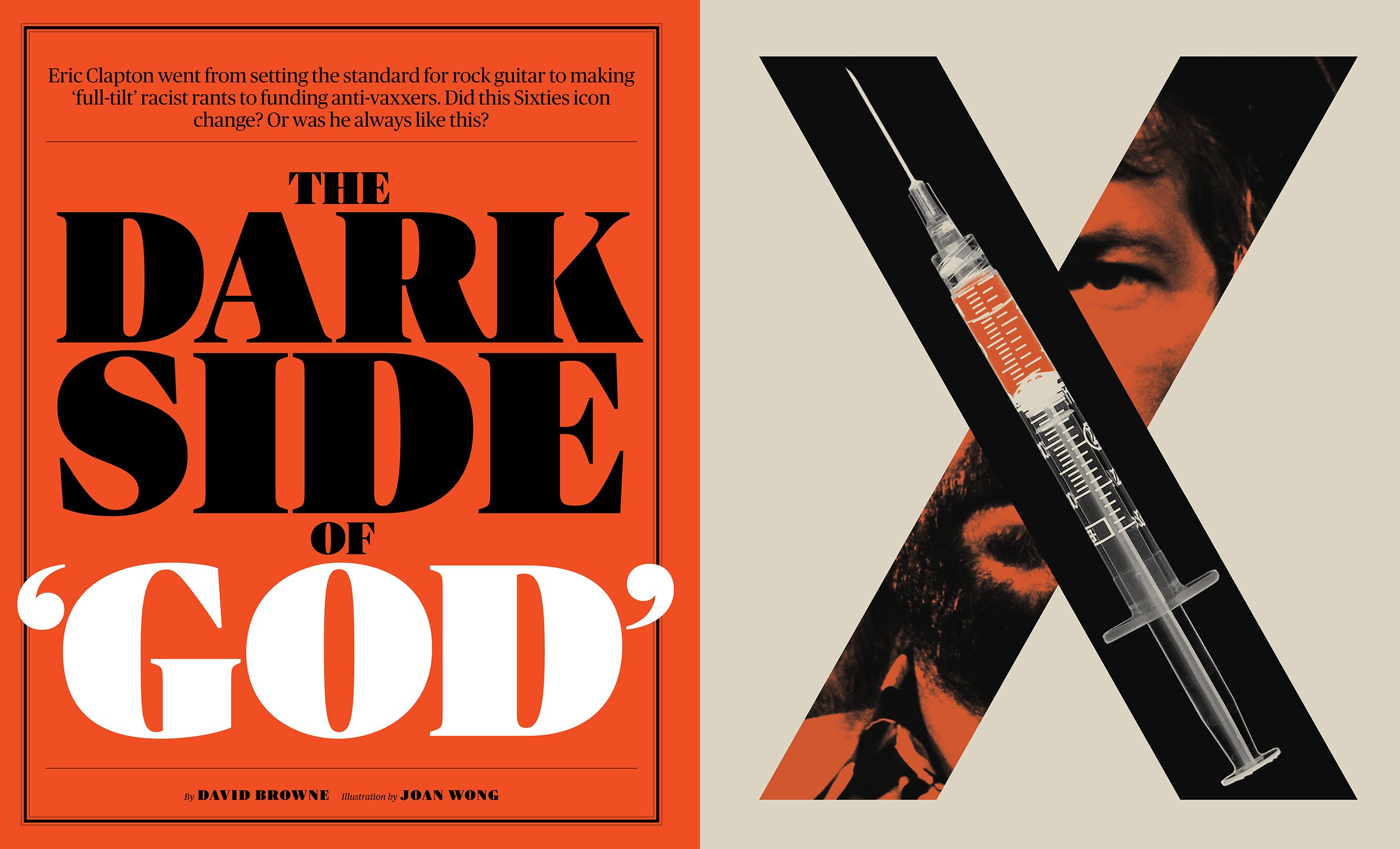


RollingStone.com Samples
To see more Speaker Series videos and other exclusive members-only content, join SPD here.
