Field & Stream's Redesign with Design Director, Russ Smith
/Celebrating its 125th anniversary this year, Field & Stream recently became a quarterly publication and debuted a redesign. SPD spoke with Design Director Russ Smith about Field & Stream’s new look and the major changes.
SPD: Tell us about the redesign process.
Russ Smith, Design Director: It began in a somewhat unorthodox way. Initially, Colin and I had an informal conversation about ways we could balance the vintage aesthetics of hunting and fishing with designs we see in magazines today. Then (now former) Group Creative Director Sean Johnston, Associate Art Director Robert Dominguez, and I all had separate brainstorms about what we wanted to see in the redesign. Then we put our heads together with the editorial department and our immensely talented photography director, John Toolan, about changes they wanted to see. Colin talks a lot about Field & Stream’s mission of being “the soul of the total outdoorsmen,” and that’s something we all kept in mind as we were going through the process. From there, we all got together and honed the final product.
Field & Stream has gone through a number of changes in recent years, from editorial and design tweaks to frequency and staff changes. Colin Kearns has been Editor-In-Chief for more than three years, and while we’ve made smaller changes to sections or layouts, we haven’t done a full refresh like this with him yet. We wanted to reflect Colin and his staff’s editorial vision as much we wanted to balance this brand’s historical significance with its new hefty quarterly look. Furthermore, the switch to a quarterly publication in the magazine’s 125 years afforded us the time and opportunity to put some real weight and significance behind this redesign.
SPD: How long did the redesign take to complete?
RS: It was an ongoing process. The design team behind Field & Stream currently works on three titles for Bonnier, so there was not a separate time when we were only working on this, but it was always moving. I can say that we were a good way into the first issue of 2020 and working out all the kinks when COVID-19 hit the US and produced another layer of challenges to completing the redesign.
SPD: What are the major changes?
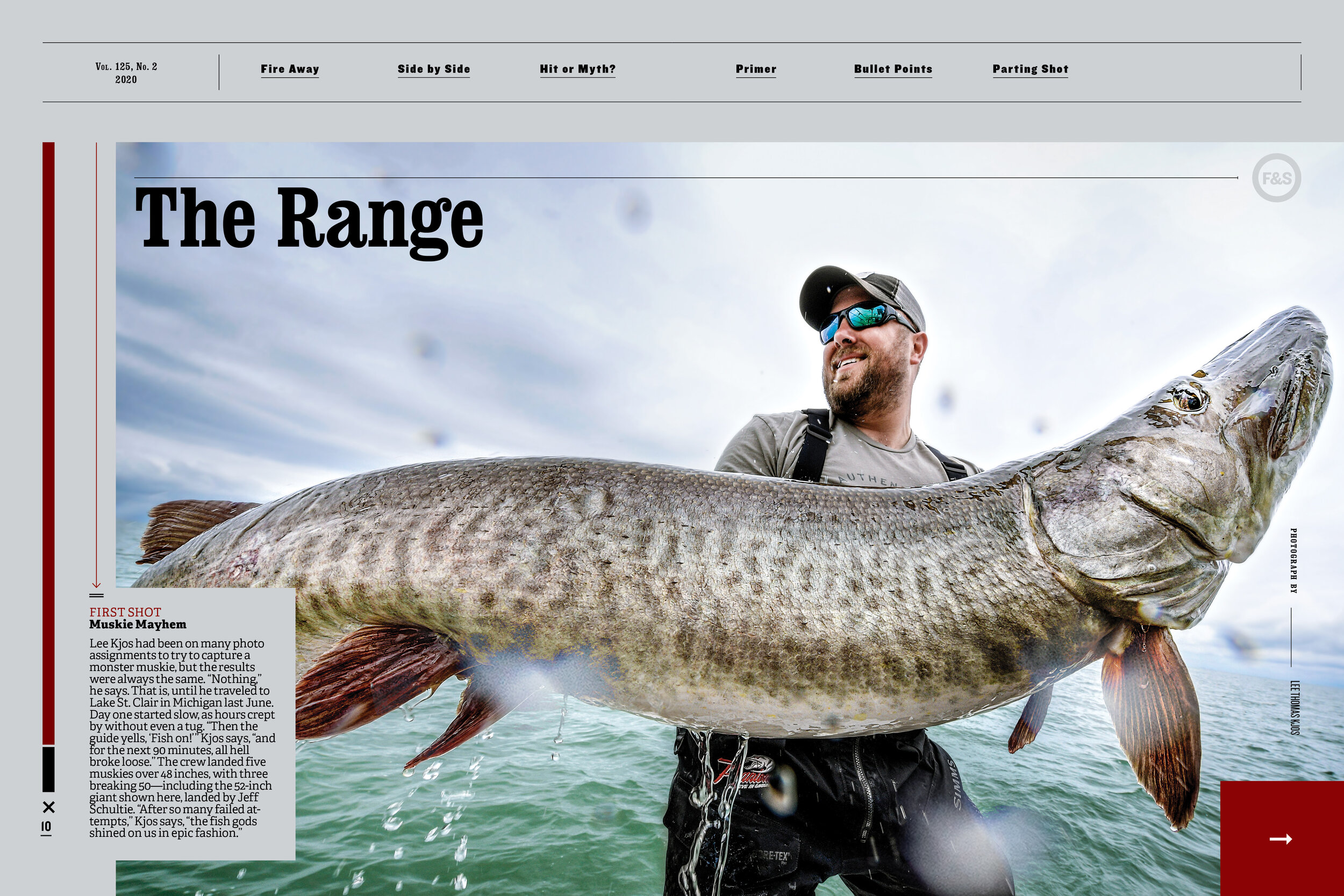
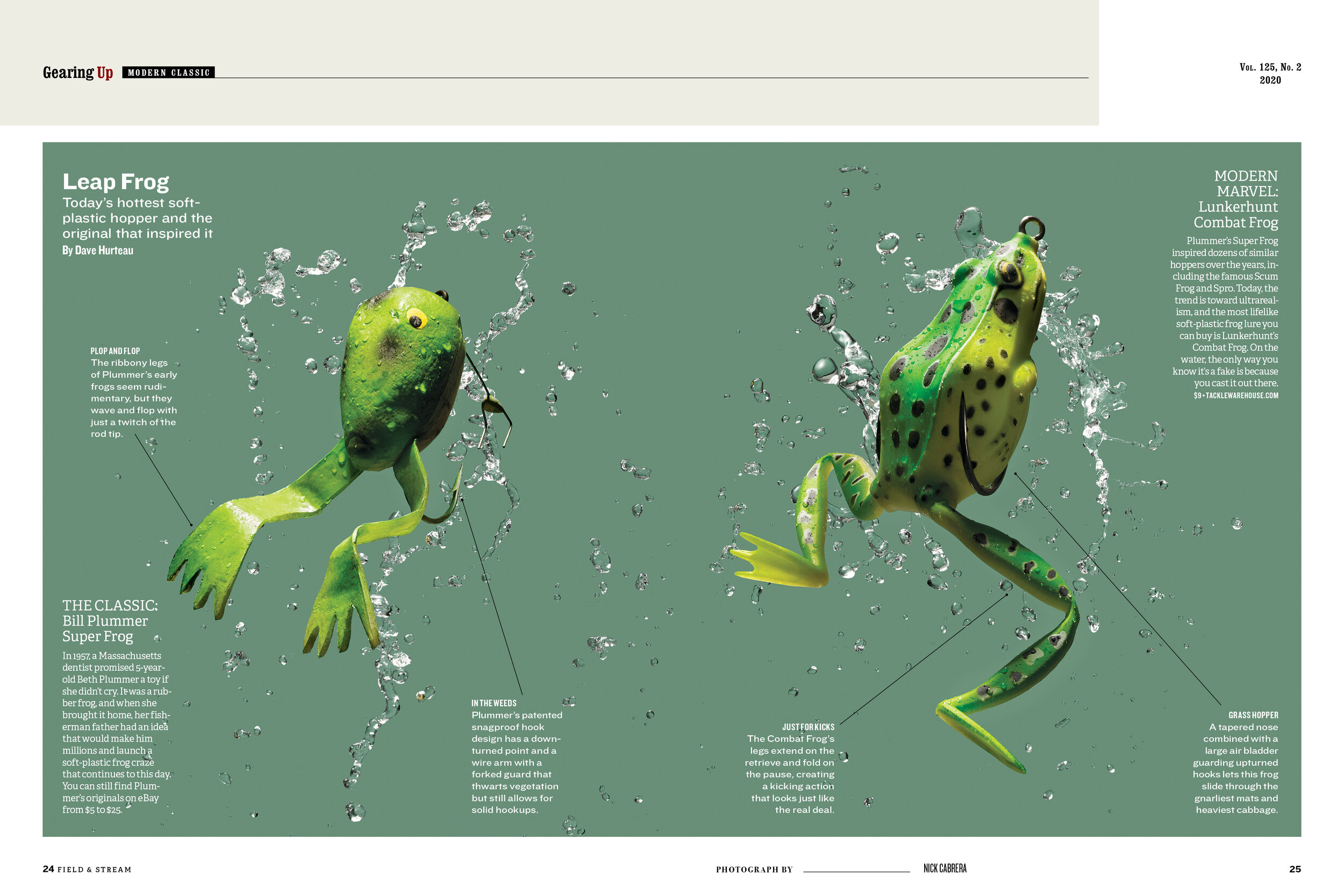
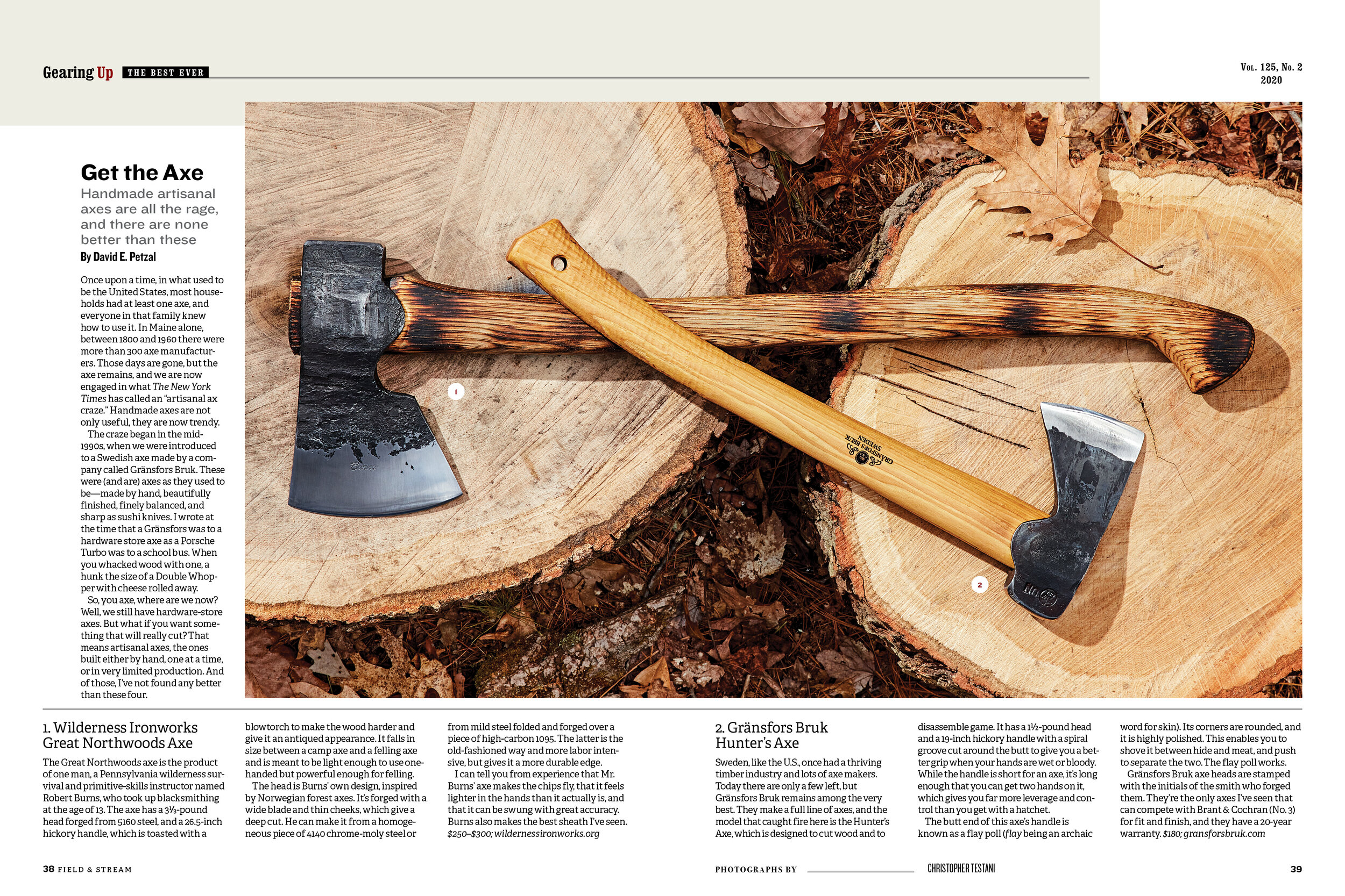
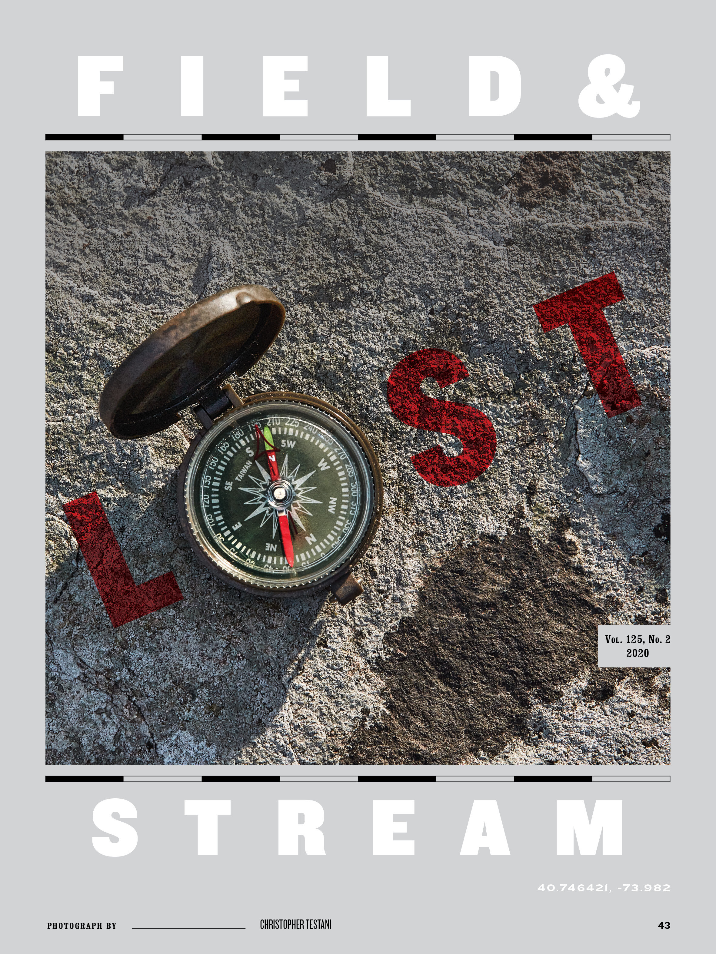
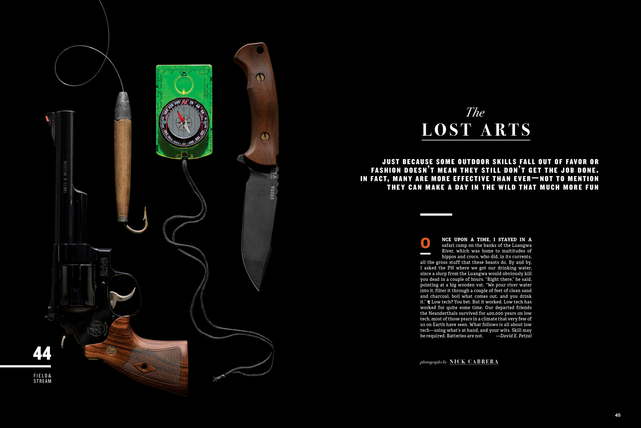
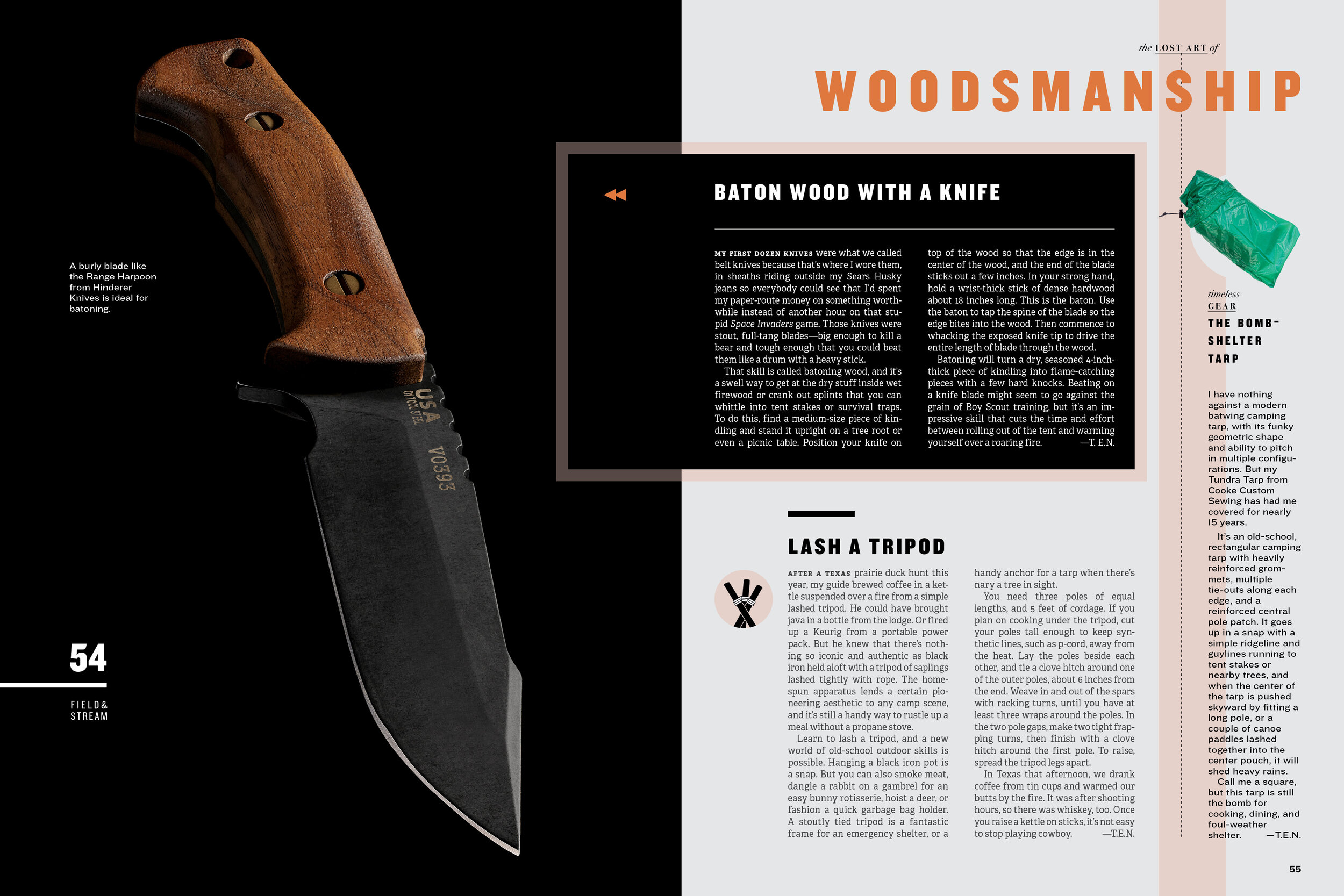
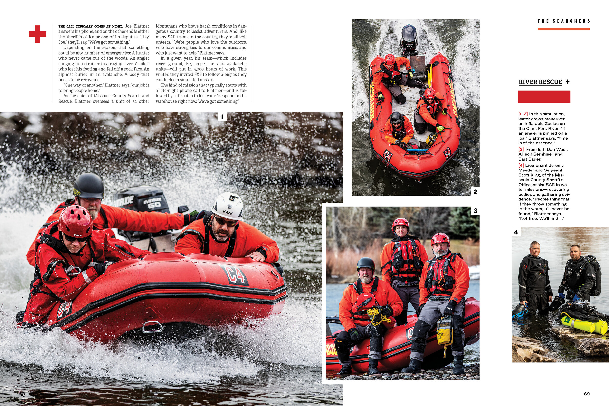
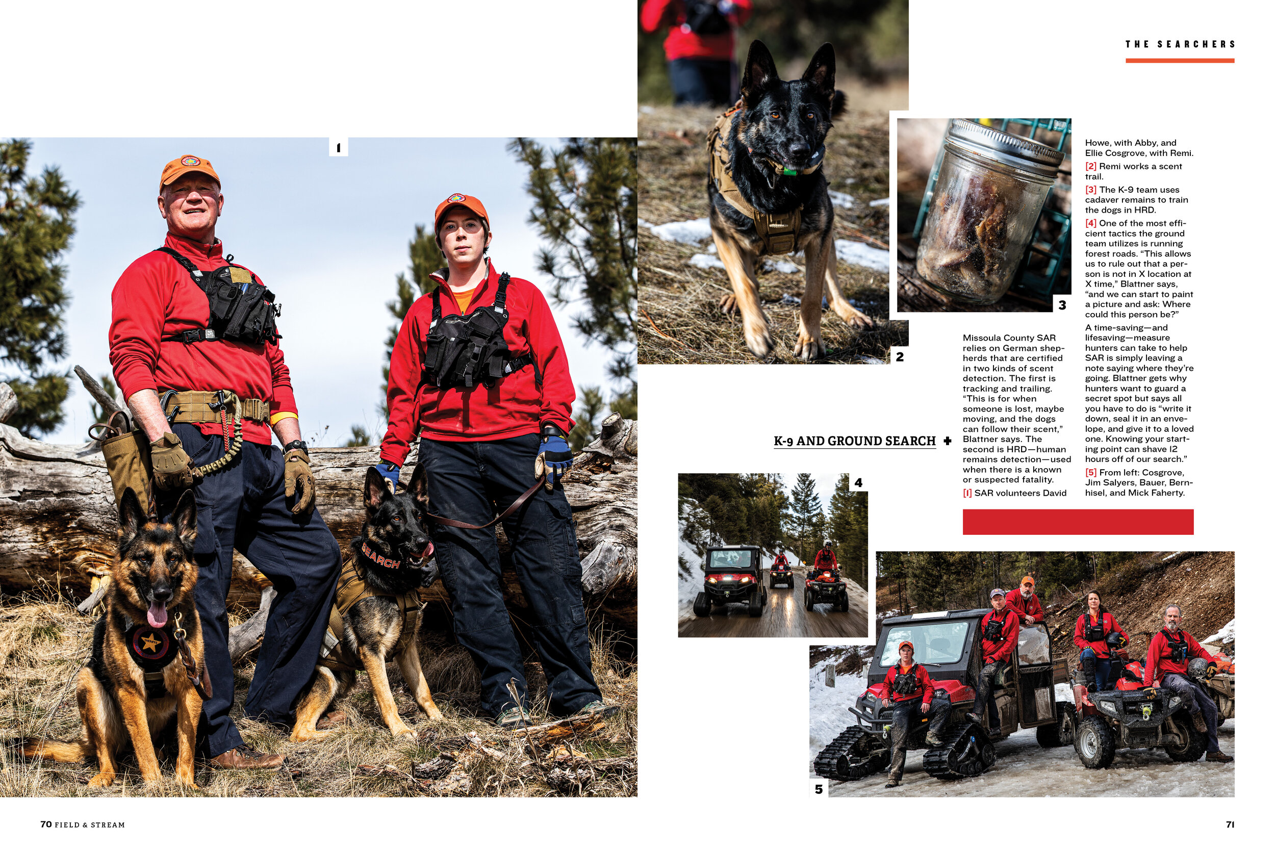
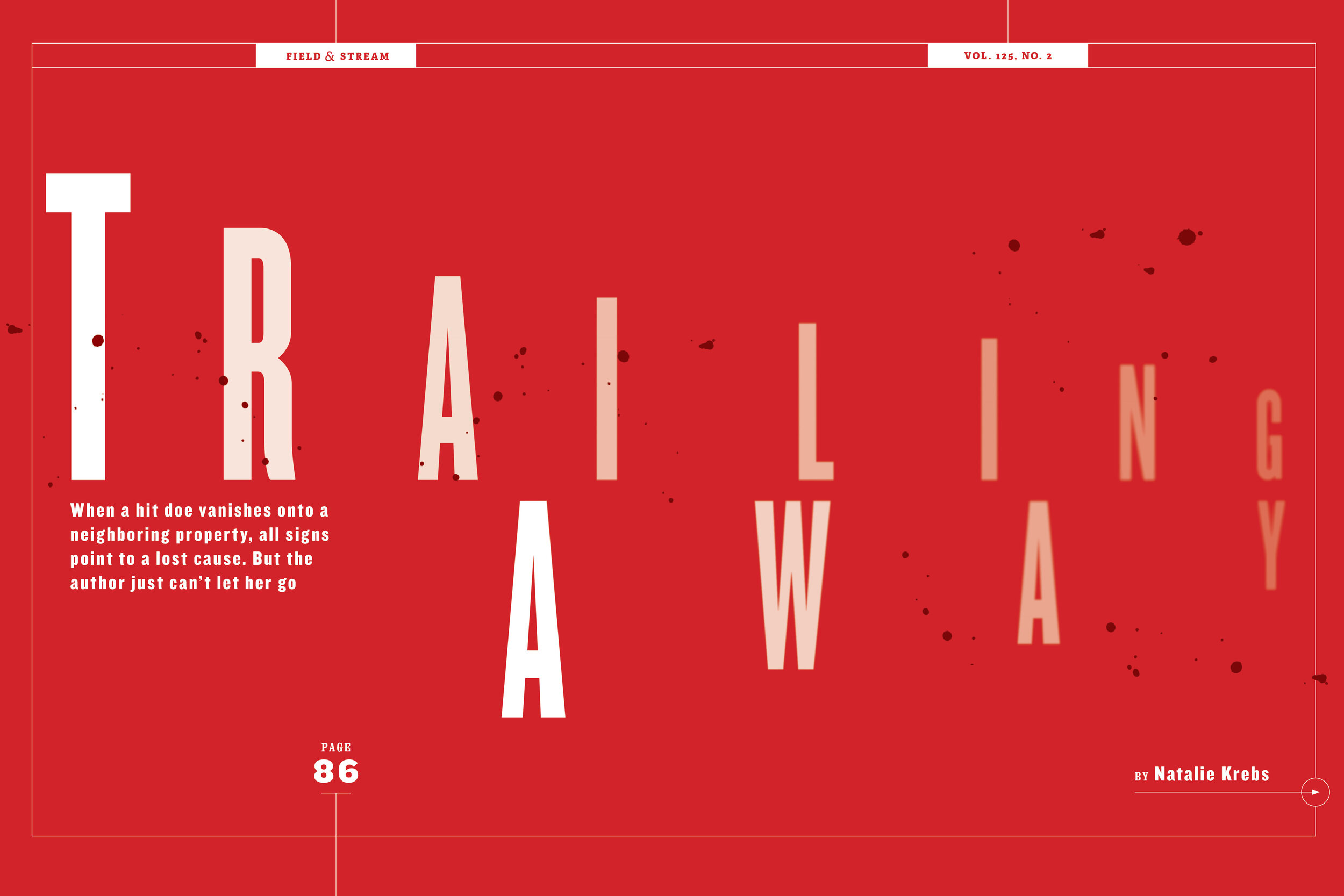
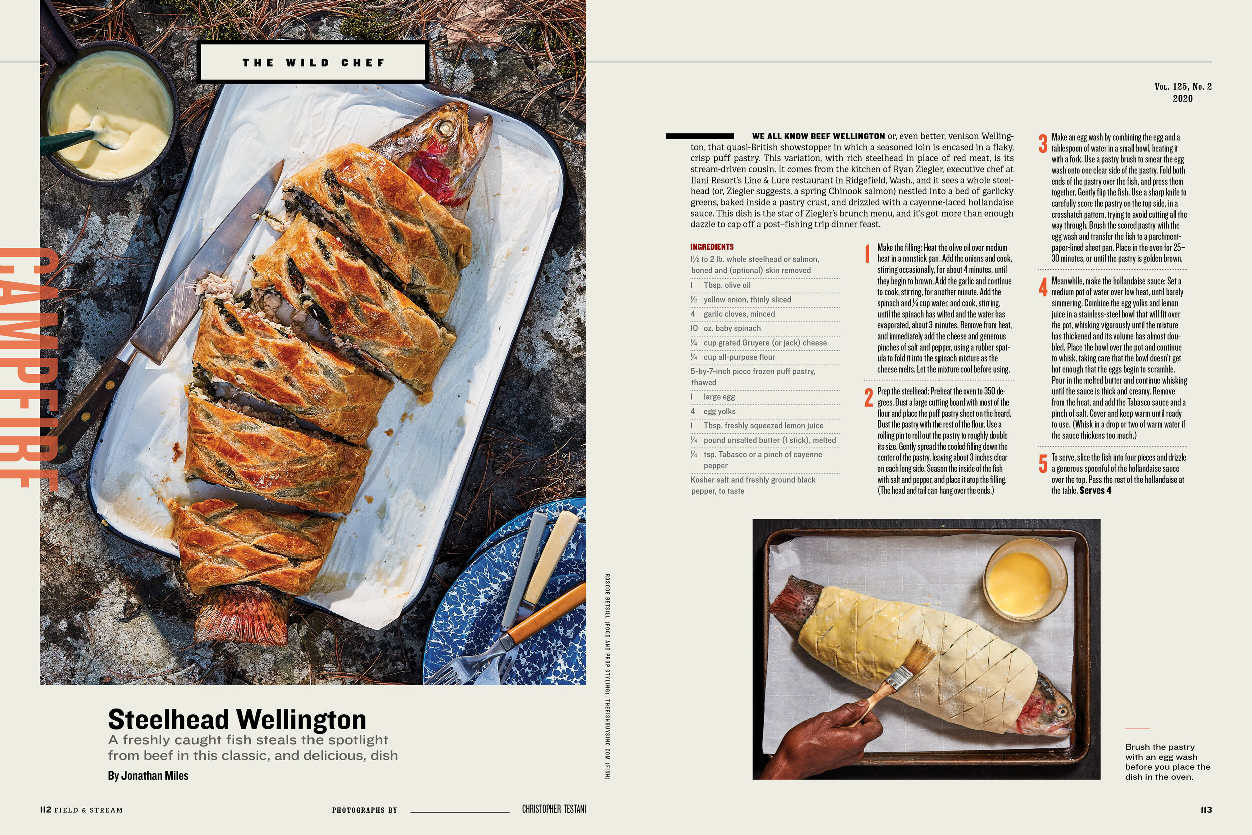
RS: One of the biggest changes was not just a visual one, but also a mental one. We wanted the magazine to be structured like an actual outdoor adventure, going from range skills, and tips and tricks, to gearing up, adventures, and campfire tales. Additionally, now that the magazine is quarterly, we could give more consideration to quality, instead of weighing quantity and quality equally. Due to the changing magazine landscape, we’re all dealing with different limitations. What I want to do is turn those limitations into an opportunity to be more creative, and to think more strategically about what we do. The redesign meant we could be really thoughtful about the new layouts, photography, designs, and fonts. For example, with the “Trailing Away” feature, we tried out an all-type opener because we wanted to take a new visual approach to an opener versus our traditional, photographed opener. With the cover, we’re reacting to the evolving role of newsstands. We wanted to simplify the cover and give it a clean yet impactful visual, complete with a white border and fewer cover lines, to make it bolder.
SPD: What did you use as inspiration for the new look?
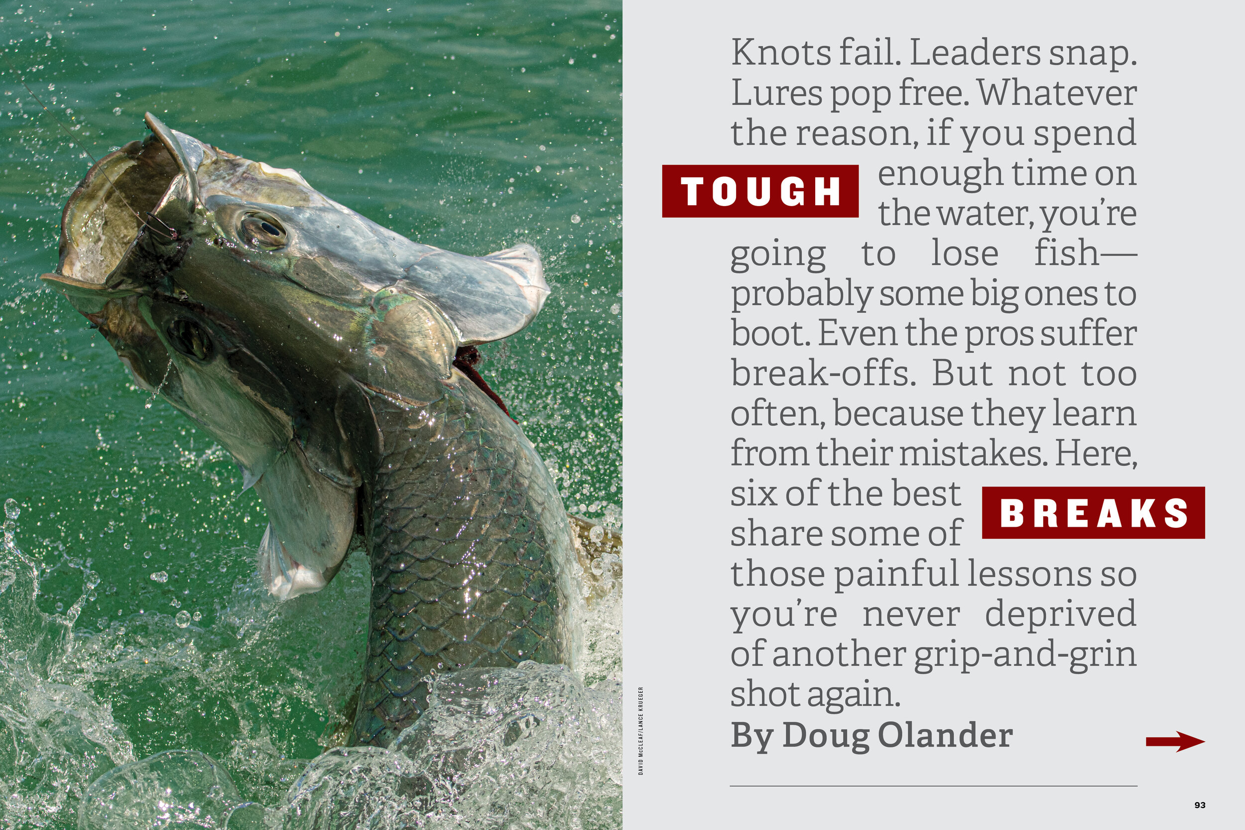
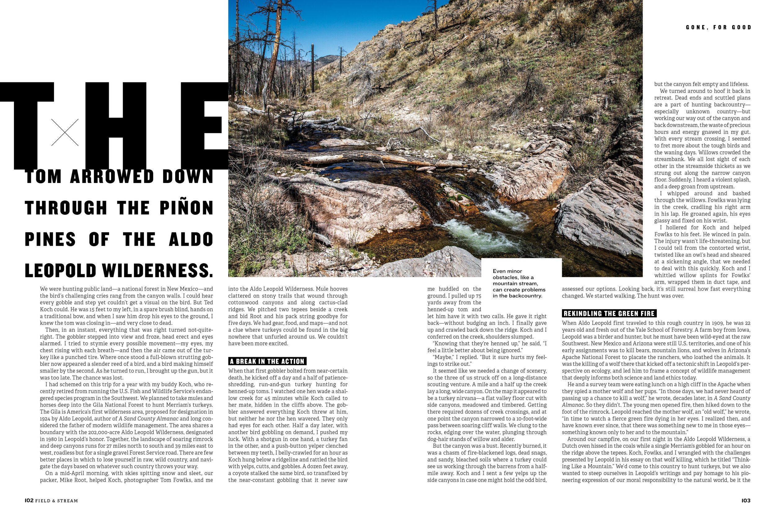
RS: Classic Americana design. One new typeface we’ve introduced is Knockout, a wood-type font with a large family that was inspired by old boxing posters, and our new body copy is a slab serif. Those are obviously a nod to both America’s past and Field & Stream’s legacy, but we found ways of using them in a modern way.
SPD: What’s your favorite part about the redesign?
RS: My favorite part is the renewed enthusiasm it brings to the team, and the excitement of the new design possibilities it opens up.
SPD: What’s next for Field & Stream?
RS: What’s next is continuing to improve, challenge, and change our work. With the redesign, we set up the rules and standards for Field & Stream’s new design. Now we can go back to the fun of finding when and where we should break those rules.
