Dennis Huynh
/“SPD holds a special place in my heart.”
-Dennis Huynh, Creative Director
SPD: Since Cincinnati Magazine was your first industry job, what was the best thing about working for a regional magazine and what is the most important thing you learned from that experience?
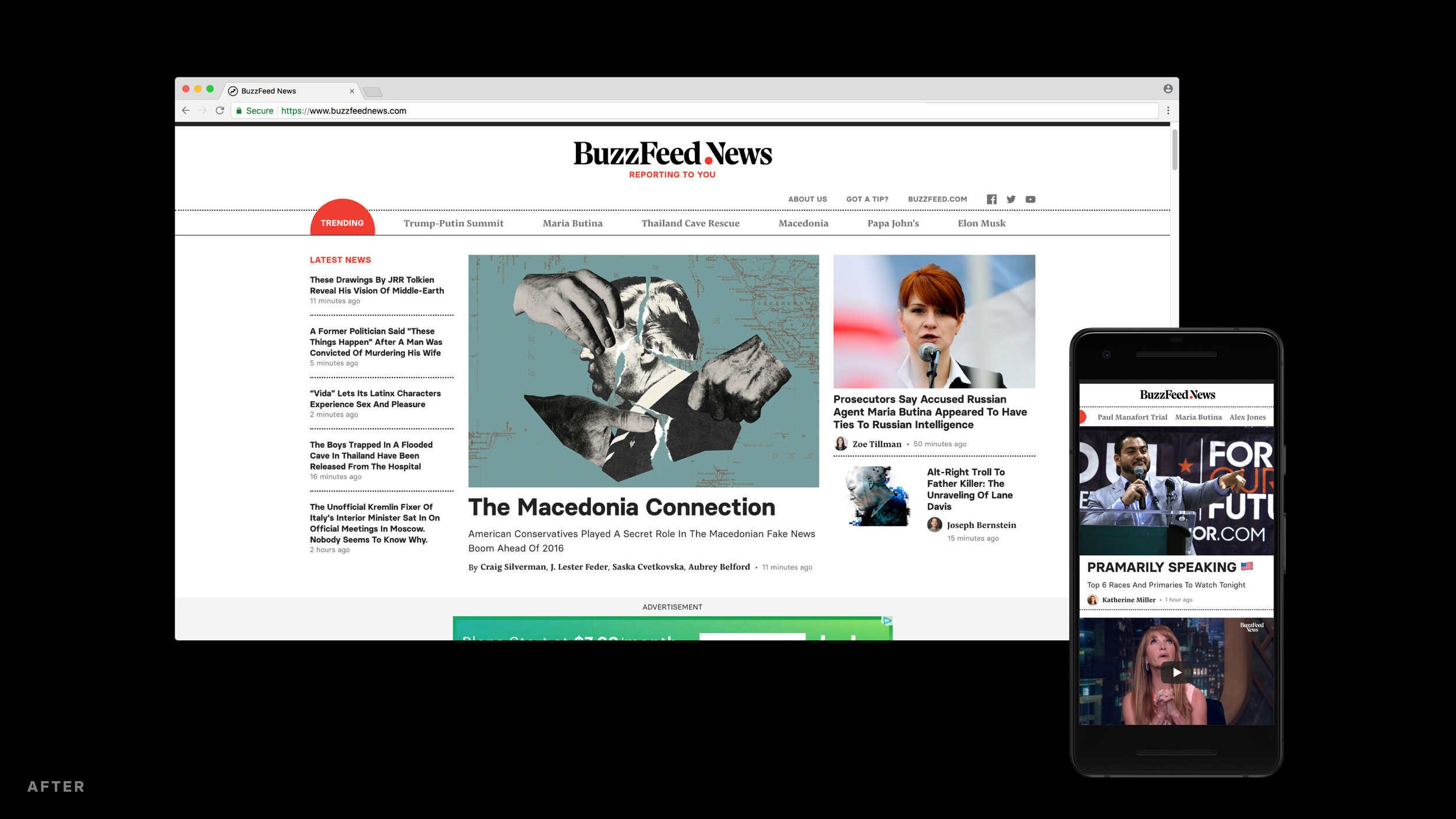
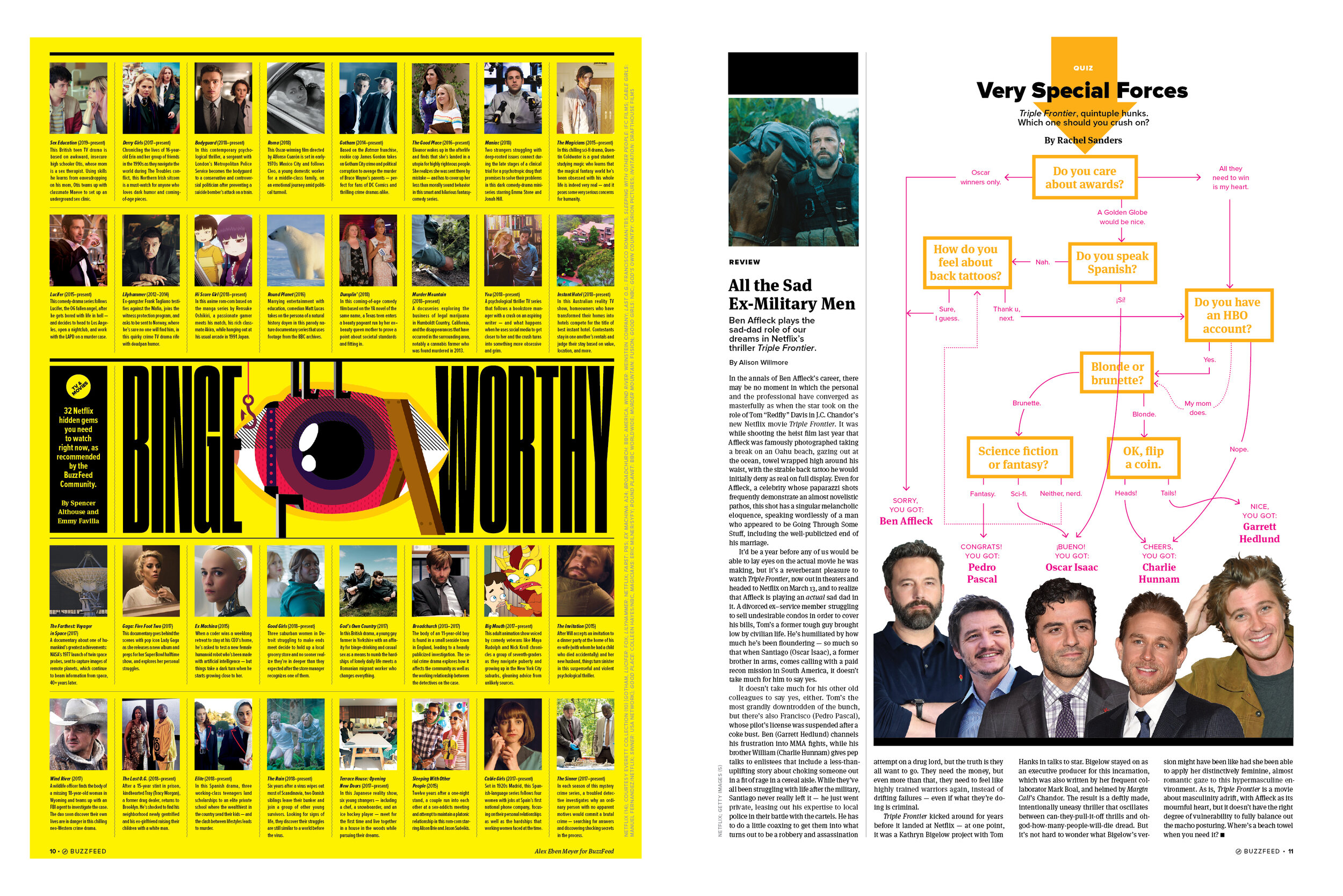
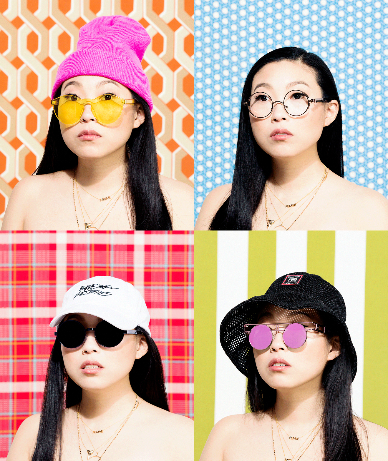
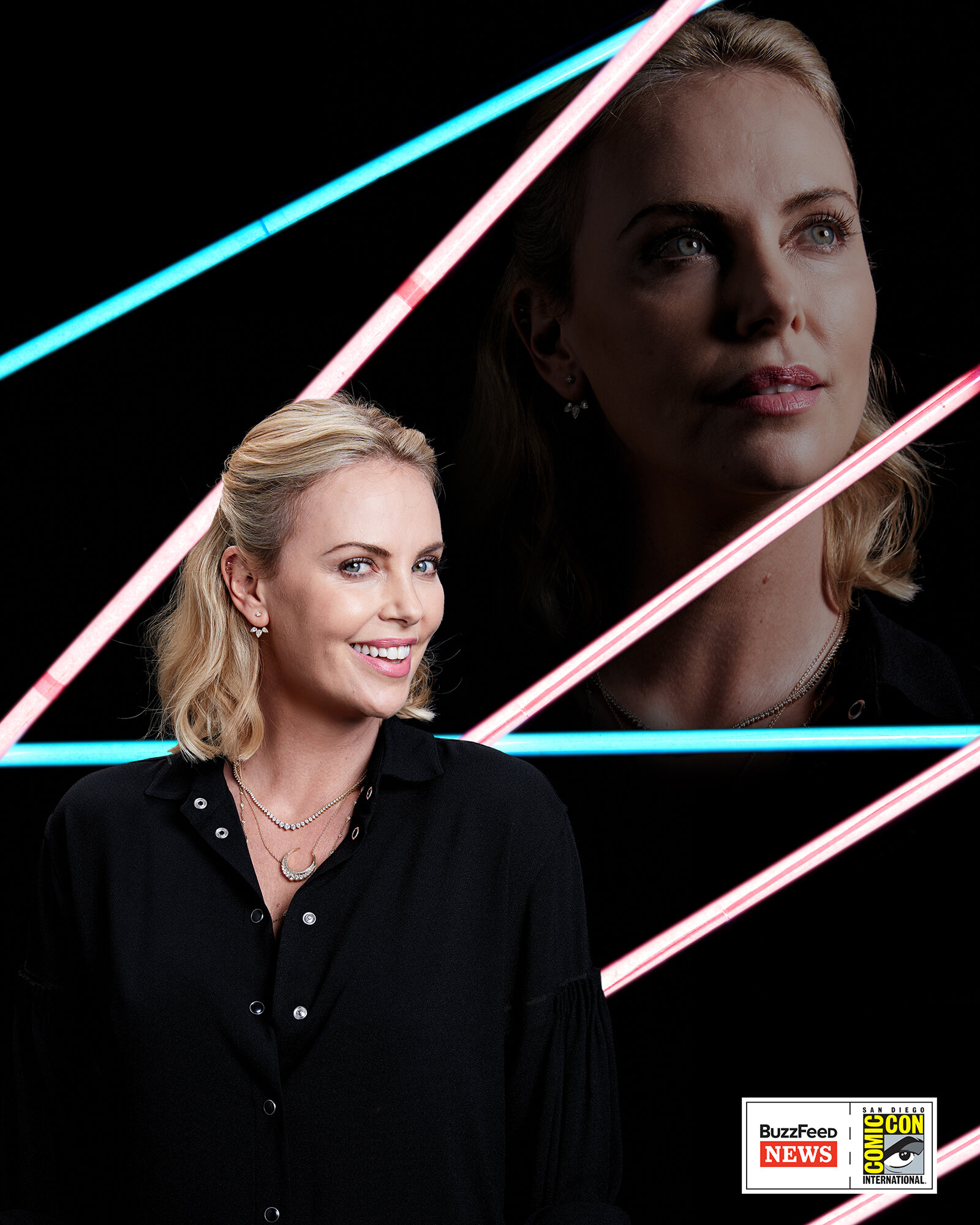
Dennis Huynh: To not be afraid to do it yourself. The art department only had two designers and we didn’t have a photo editor, so I spent lots of time designing pages, but also working on how to source images and collaborate with talented local photographers (like Ryan Kurtz and Jonathan Willis). I learned so much out of necessity like how to style products and work with subjects. All of these early experiences really helped prepare me for the many forms beyond the page needed for a digital-native publication like BuzzFeed News.
SPD: When you say the content you produce at BuzzFeed News takes “many forms beyond the page”, what do you mean by that exactly?
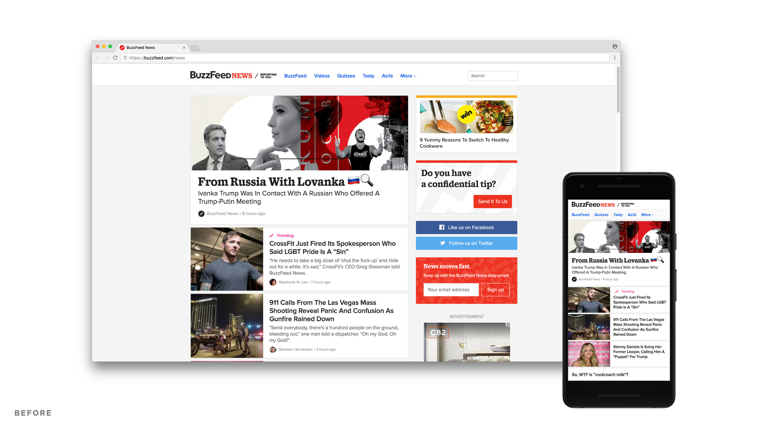
DH: My team touches on nearly every part of the BuzzFeed News brand. So in addition to creating the art for BuzzFeedNews.com, similar to a magazine’s art department, we also work on projects like the branding and graphics for our original streaming shows like Follow This on Netflix, That Literally Happened! on Facebook Watch, and AM to DM on Twitter. We also help with the set and production design for the shows.
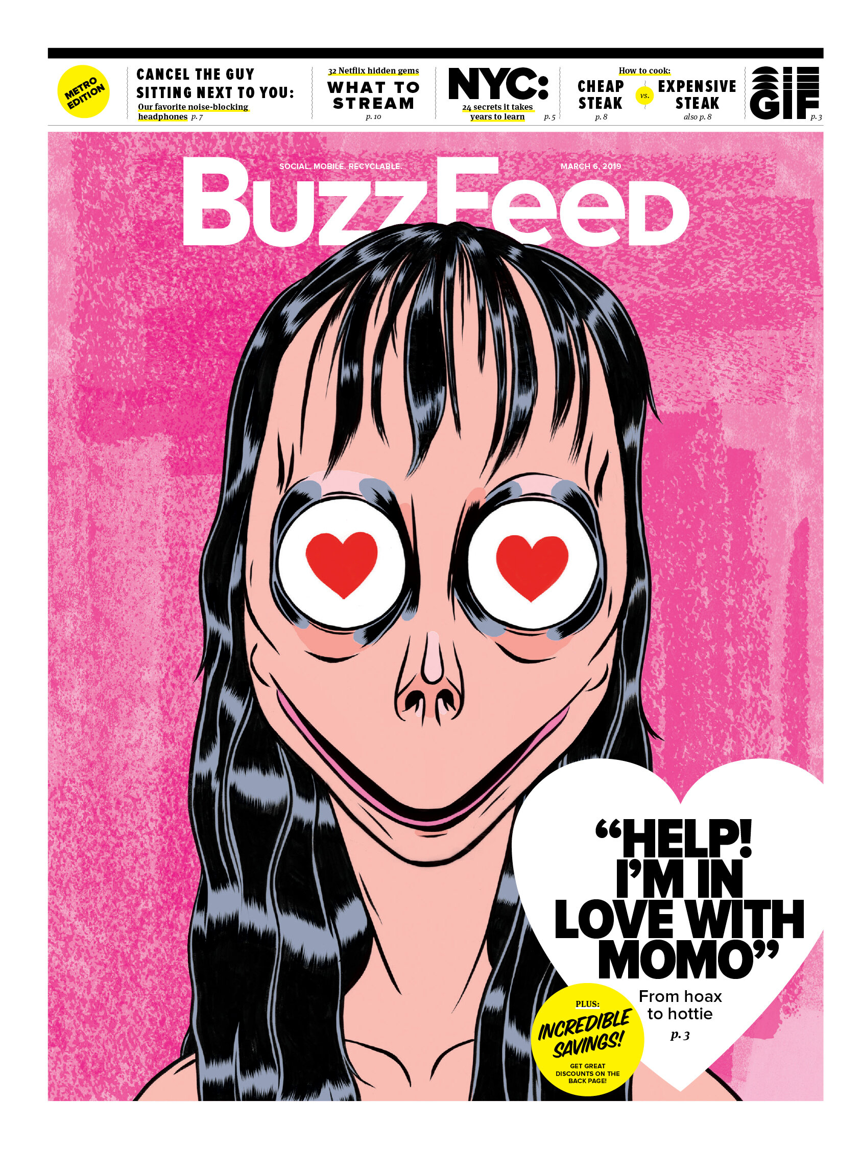
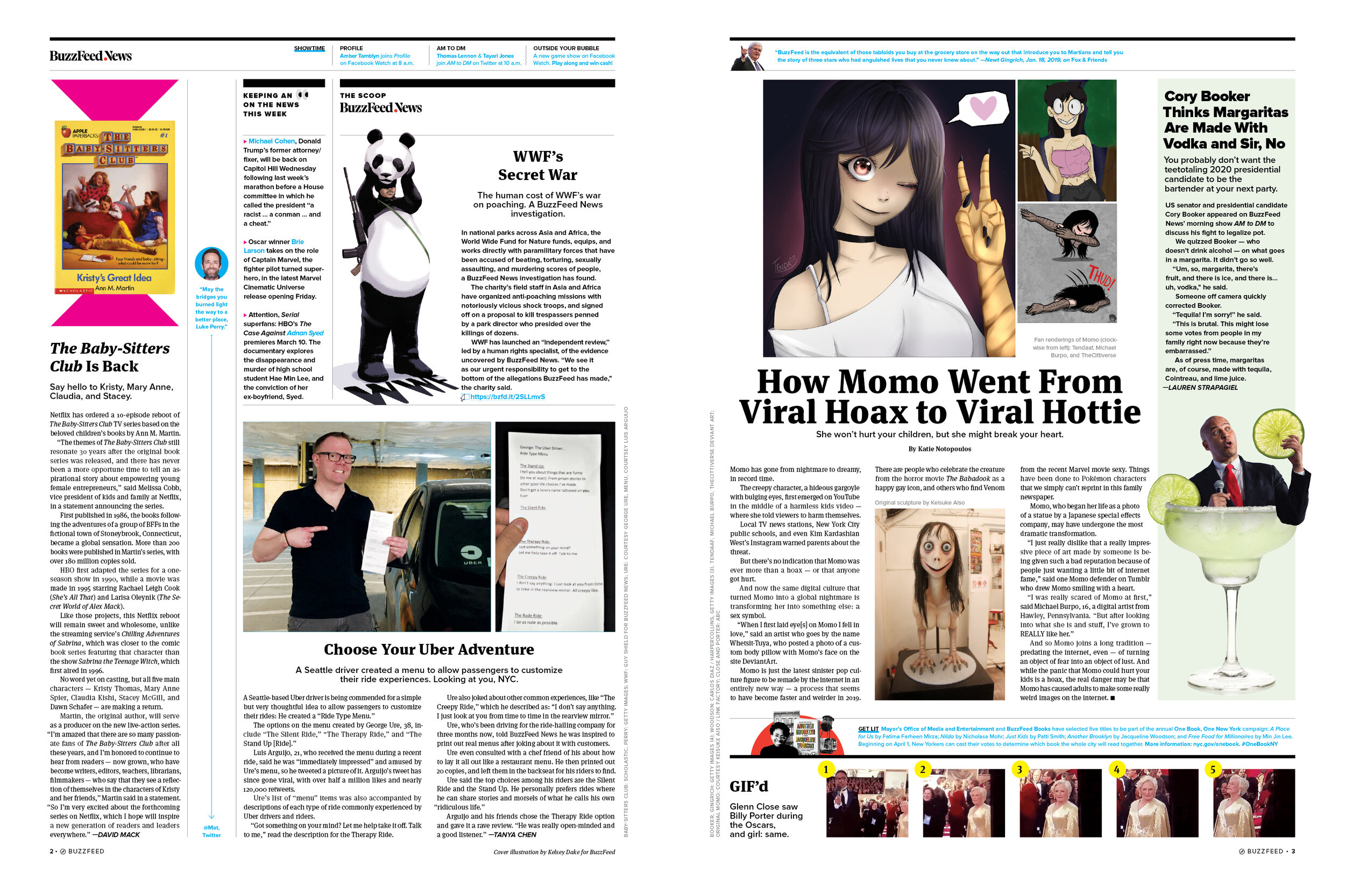
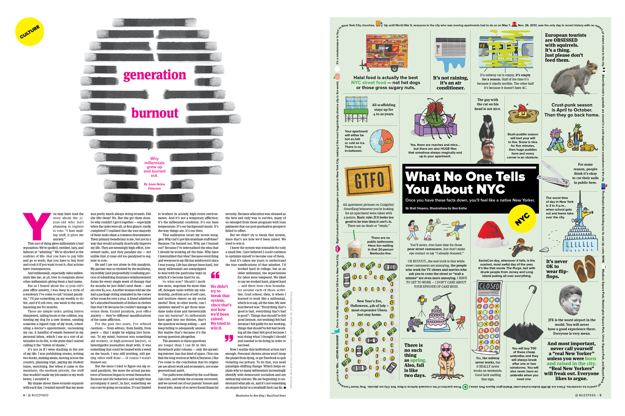
We also do fun marketing stunts like this one-off newspaper that was handed out to people as they came out of the subway, or by helping to do the interior design work for our NY newsroom.

SPD: What are the main differences from working for a print publication and a digital one? Is the process of commissioning art and designing a story similar, or very different?
DH: The process is very similar, just a lot faster. A lot of times we’re looking at early first drafts and outlines — and sometimes just a quick discussion with an editor and the writer — to get as much information as possible so we can execute and create a compelling visual in the time allotted.
The differences come in that [we] have to consider where the largest percentage of the audience will experience the story (i.e. mobile) and how to make that a compelling reading experience.
SPD: What about budgets for photography and illustration? How much is original and how much is existing imagery?
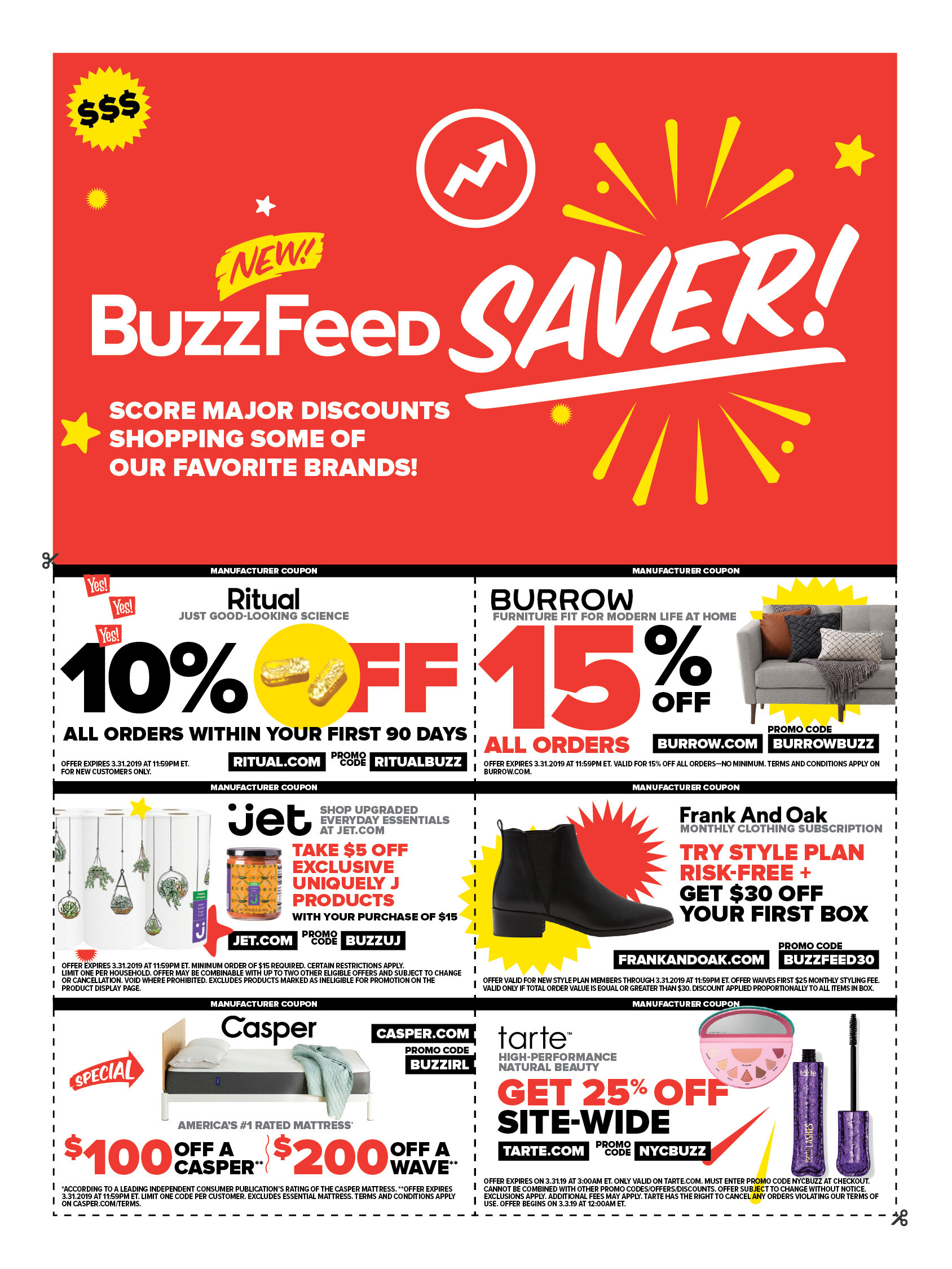
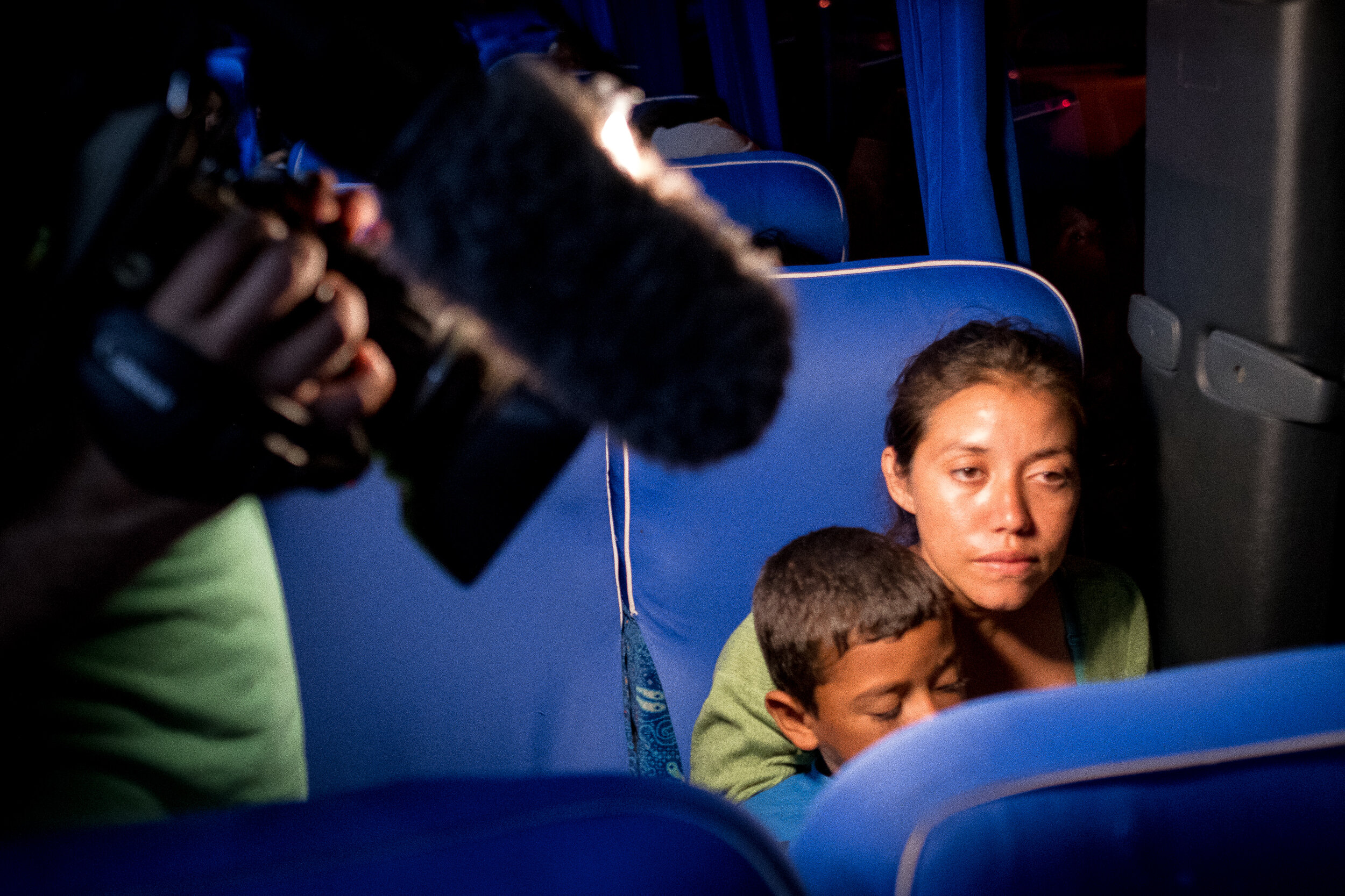
DH: We try to commission original photography and illustrations as much as we can given the limitations of today’s climate. We take our reporting very seriously and our audience really pays attention to aesthetics, so if they’re not drawn in by the visuals then they’re not engaging with it.
SPD: Tell me how working with type and typography is different on a digital product as opposed to when you worked in print. How much can you control and are you allowed to nitpick details?
DH: We have to be on so many different platforms all at once that we don’t really have the luxury of being really precious. For our longer feature pieces or packages we have to be very judicious about how we spend our time and our product and engineering team’s time.




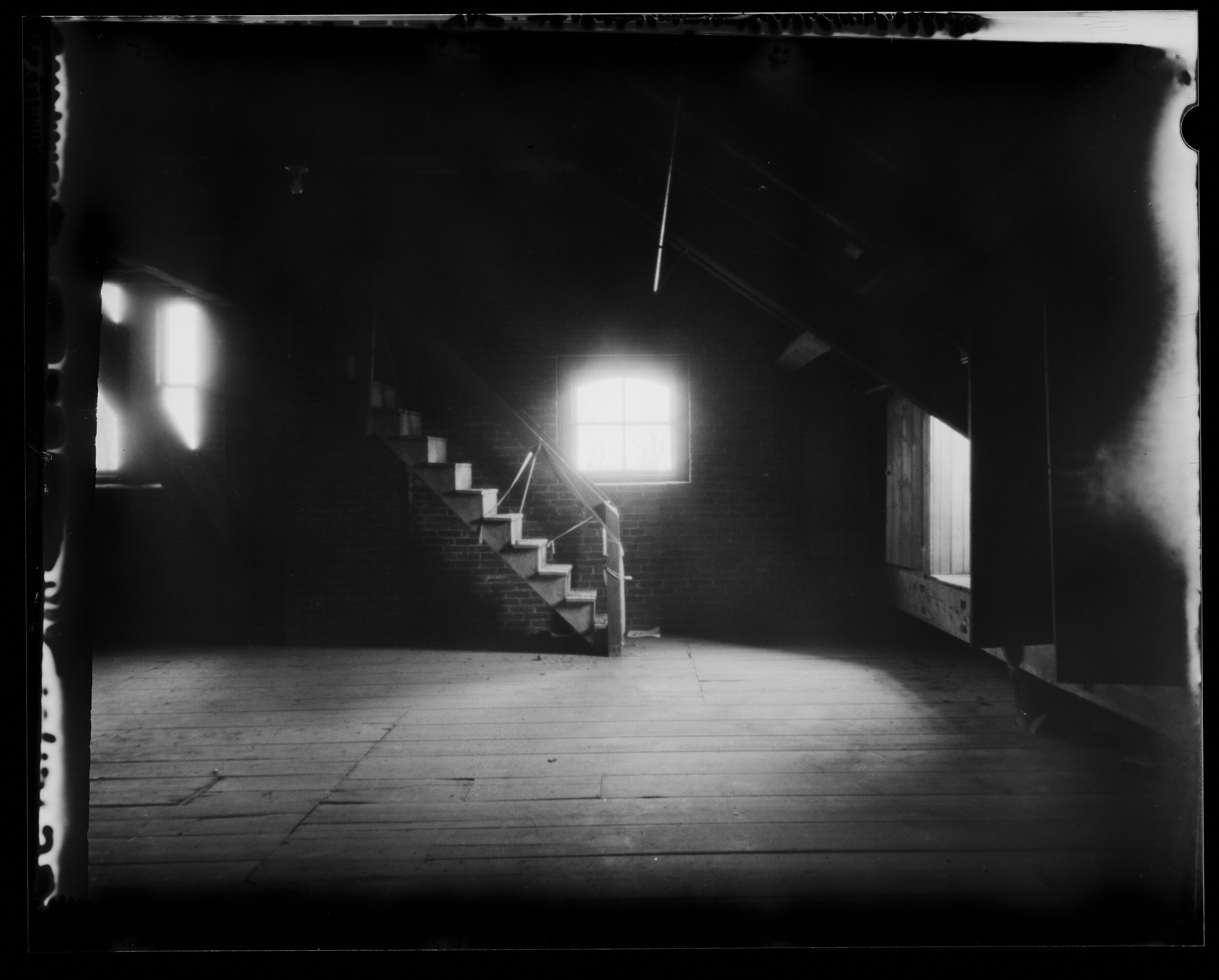
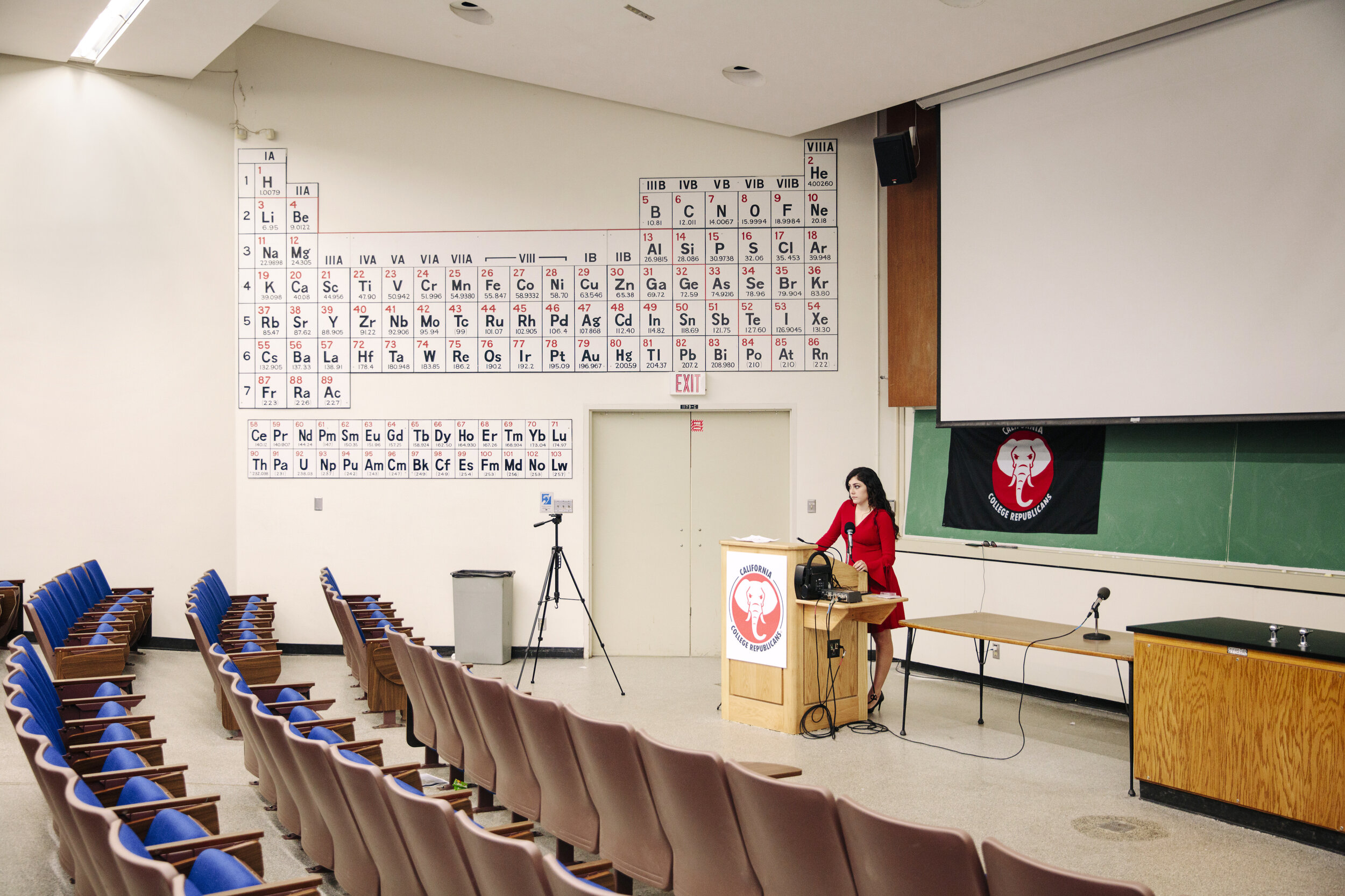
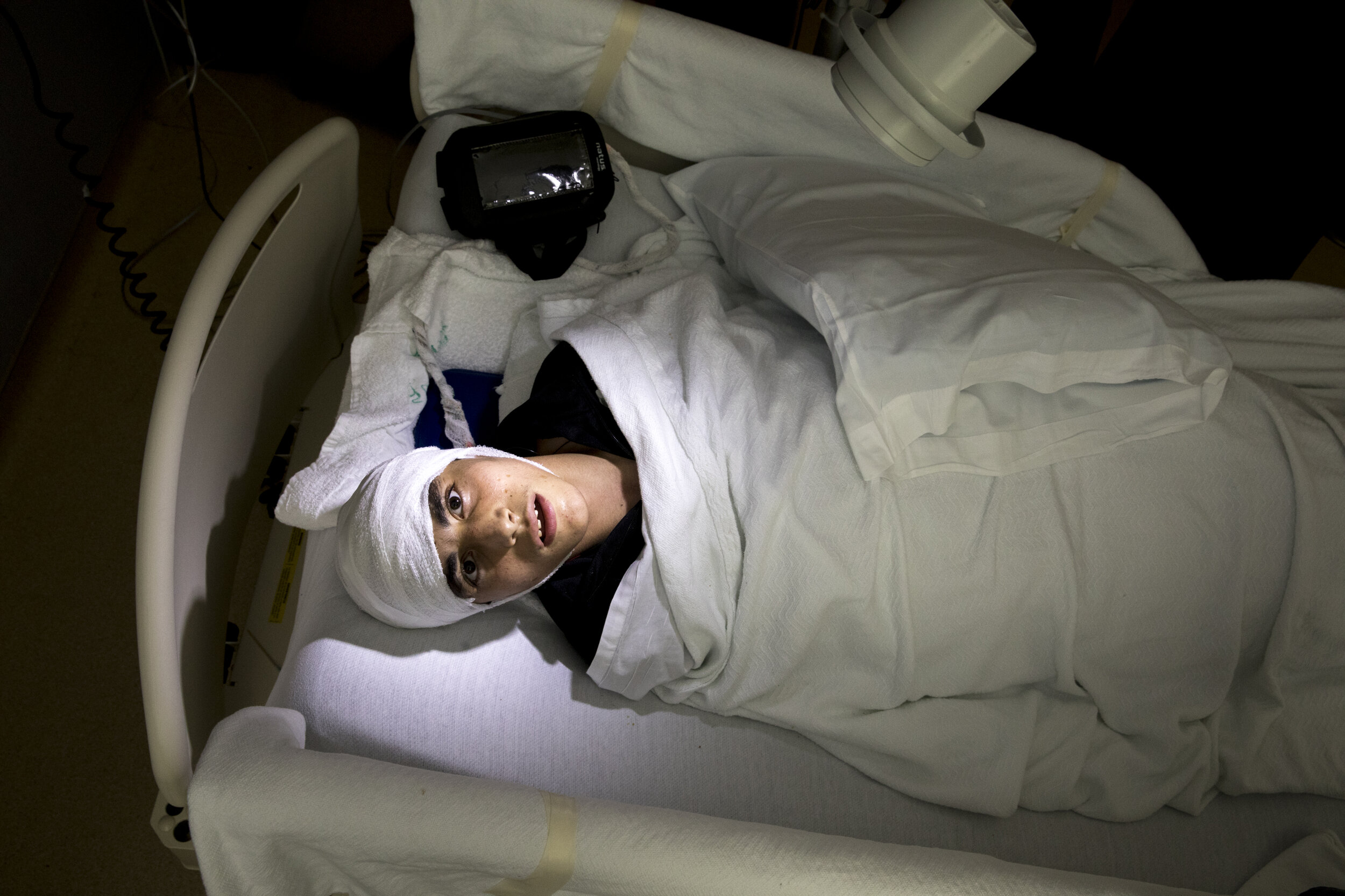
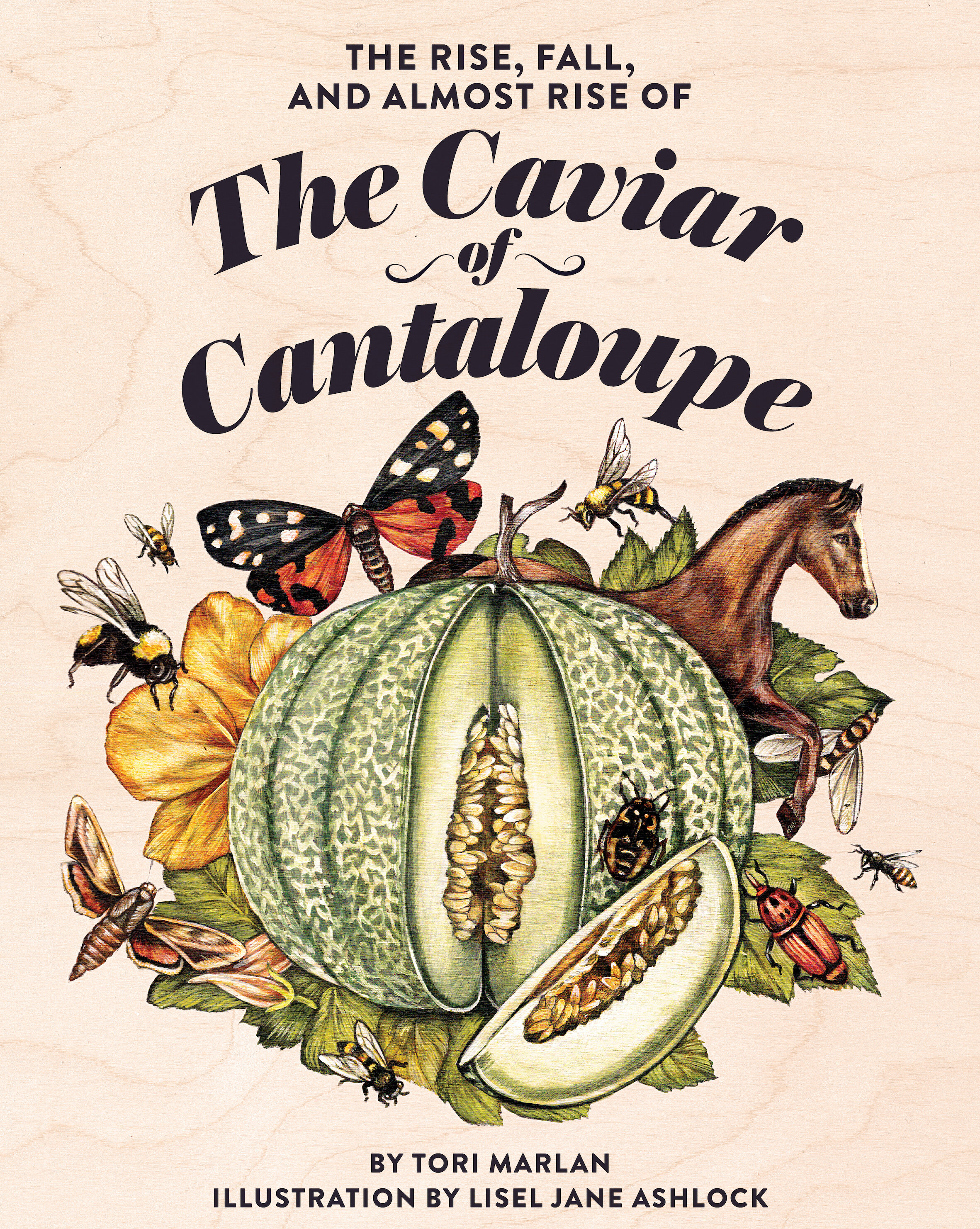

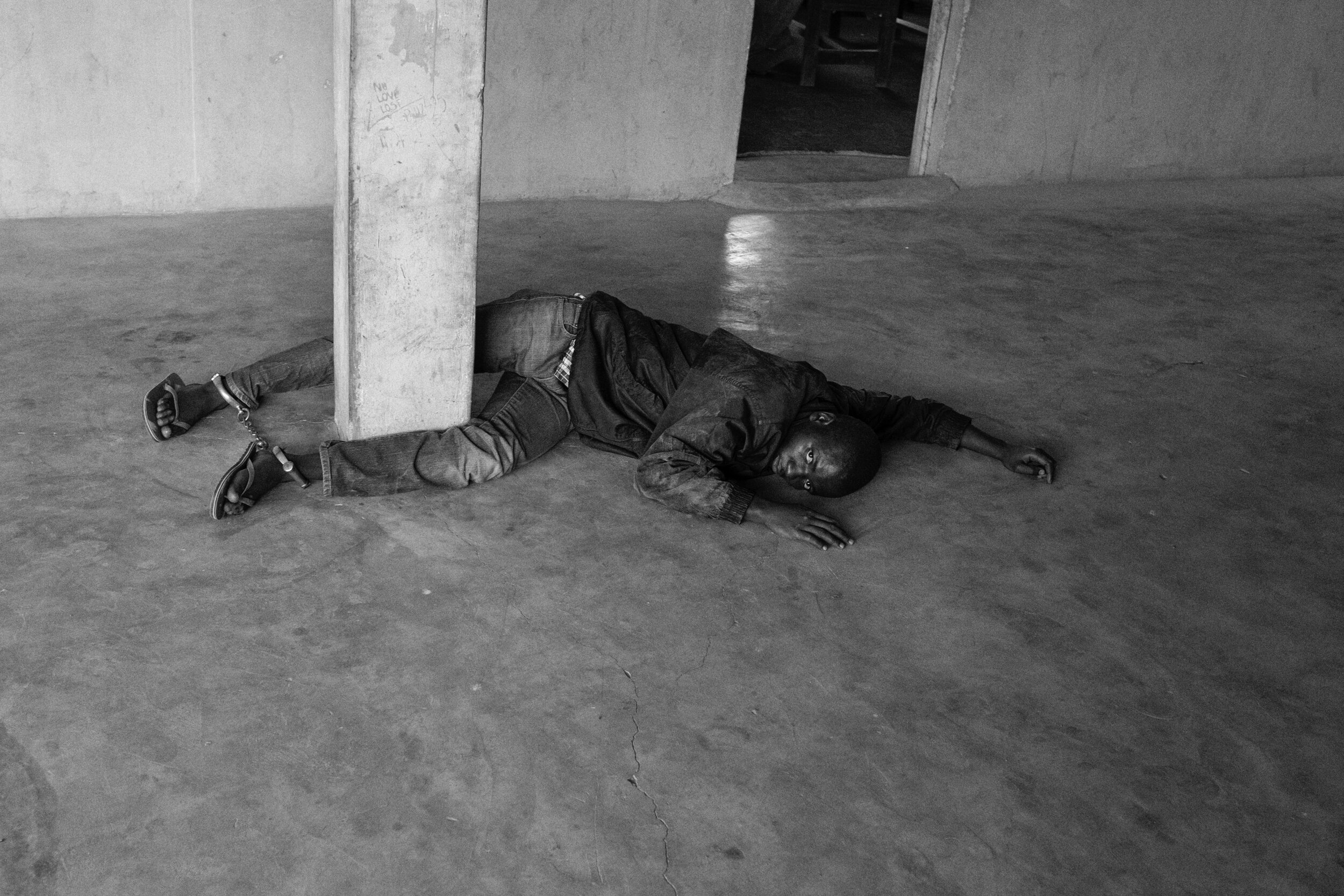
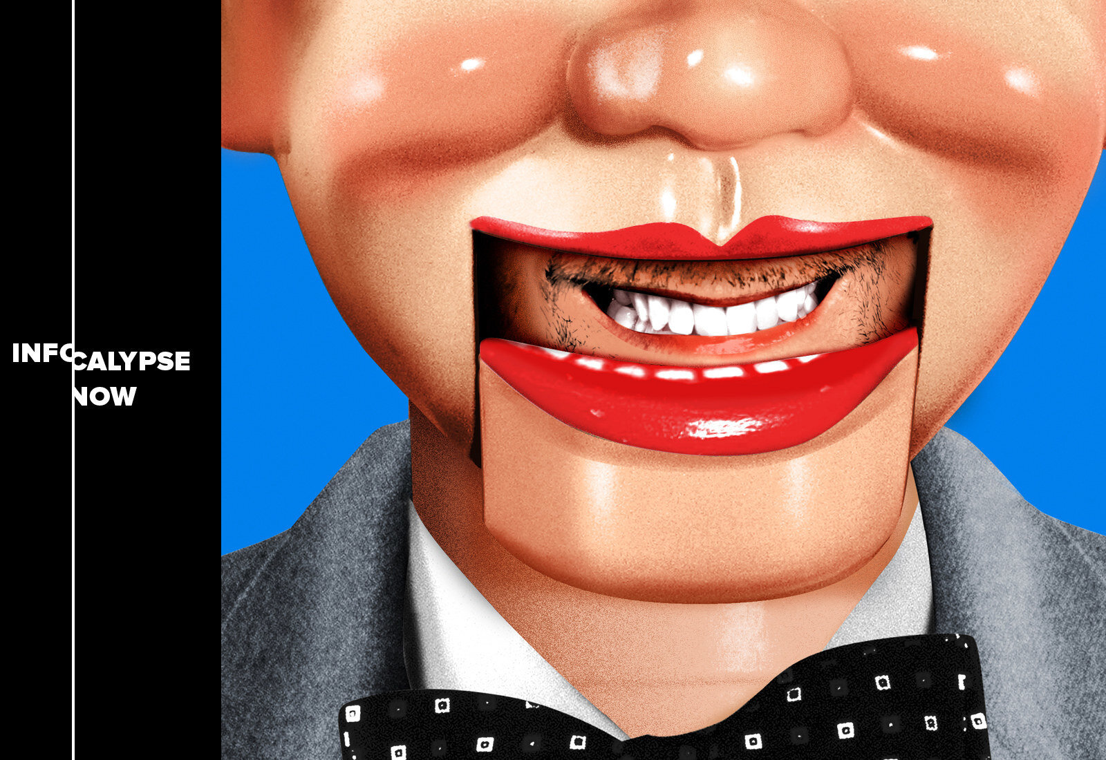
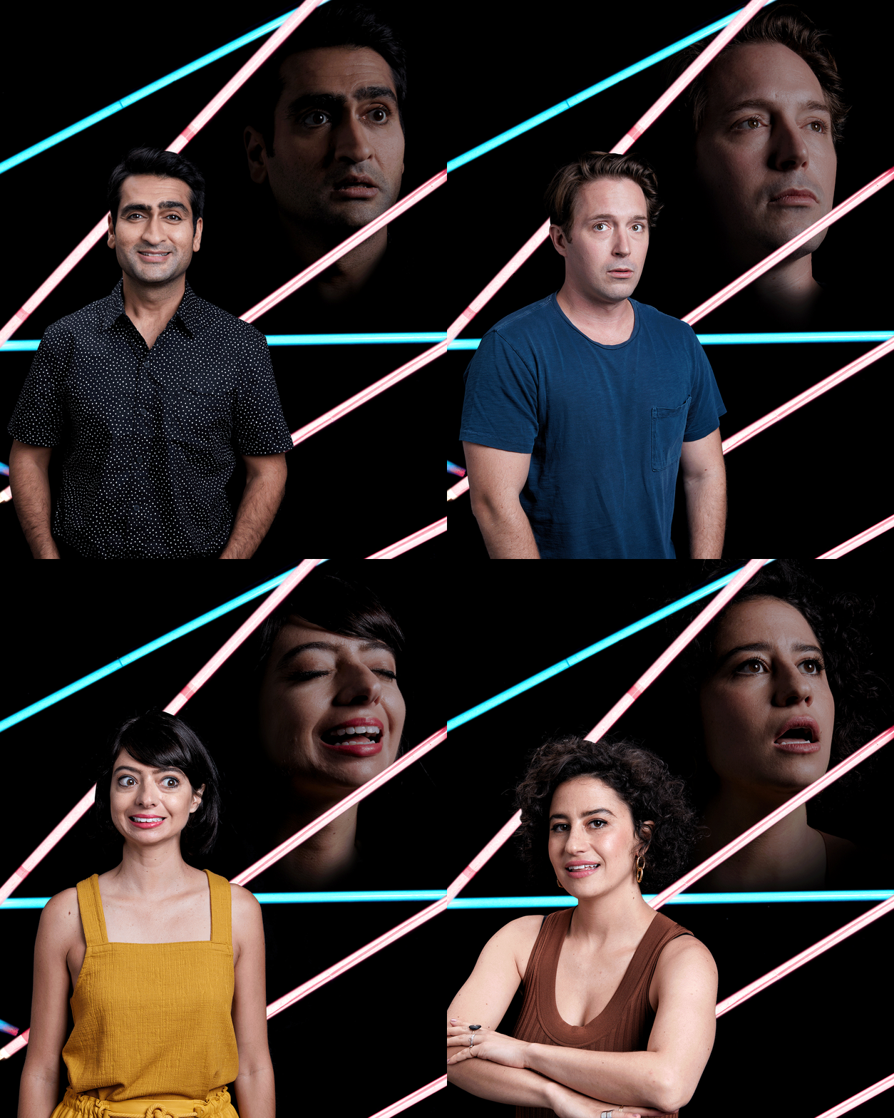
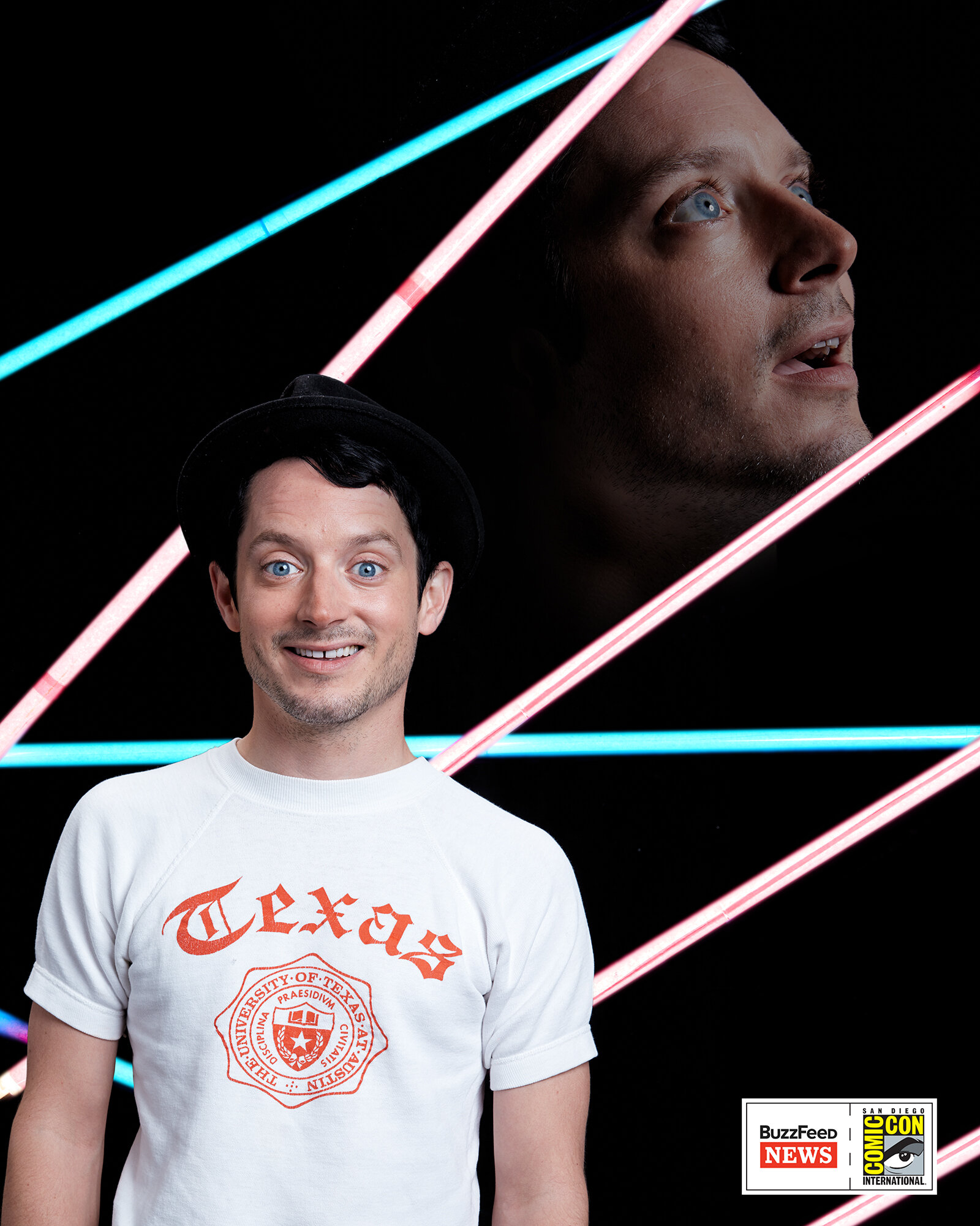

SPD: How do you think the SPD community can help represent digital and video creatives in addition to print designers?
DH: I would love to see the SPD community really embrace their fellow creatives in the digital-only space as peers. It feels like there’s still a print vs digital split and that’s not reflective of the world we live in unfortunately. Good art direction is good art direction regardless of the output medium.
So I would love to see the community open their arms so SPD doesn’t miss out on potential members just because they’re not print designers. Additionally to recognize through the competition that there are those who are doing the same level of art direction for web and video as they are for print.
I was so fortunate to be a digital co-chair for this year’s SPD 55 competition (with the amazing Sandra Garcia from Twitter) where we tried to add new categories to reflect the work we were seeing out in the industry like digital covers, digital redesigns, non-commissioned photo editing, and branding for videos.
SPD: How did you first get involved with SPD?
DH: I first got involved in SPD as a volunteer at a gala about a decade ago—I had just moved to New York and a colleague suggested I reach out to SPD and get involved. Getting to see all the work and meet some of the people was very inspiring to me as a young designer.
SPD: What does SPD mean to you?
DH: SPD holds a special place in my heart. The annuals had a huge influence on my career choices when I was in school. And now it’s still just as inspiring to see them, participate in the competition, and actually get to know the people doing all this great work.
BuzzFeed News
Art Department
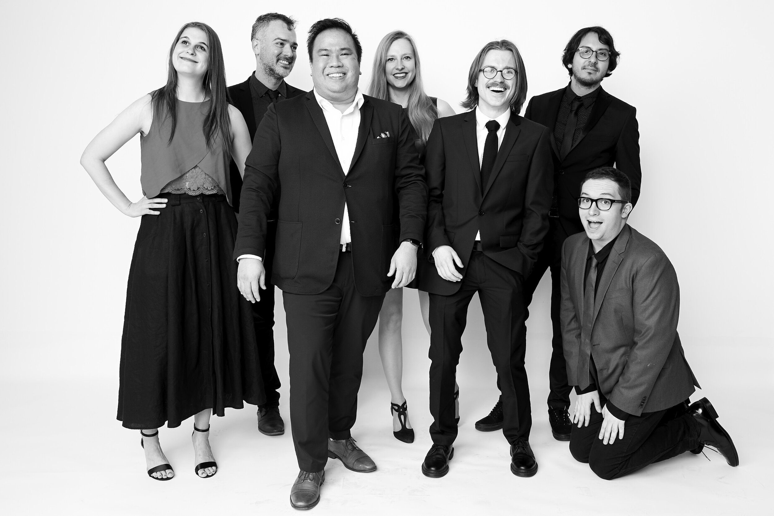
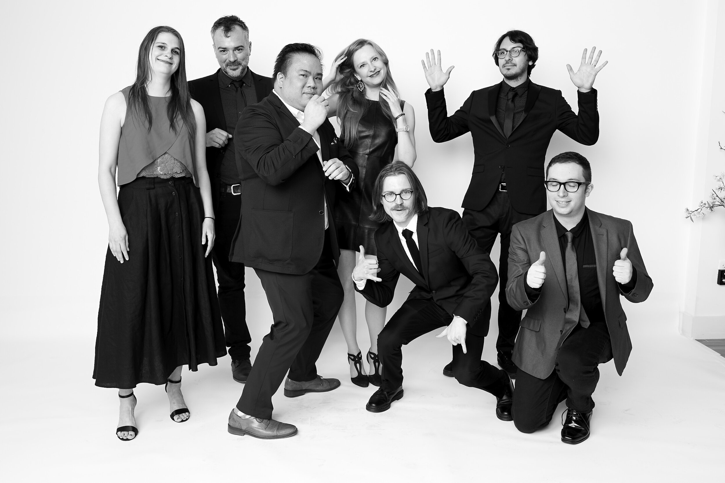
Creative Director: Dennis Huynh
Design Director: Ben King
Photo Director: Kate Bubacz
Sr. Photo Editor: Laura Geiser (emeritus)
Sr. Photo Essay Editor: Gabriel H. Sanchez
Art Director: Lixia Guo (emeritus)
Motion Art Director: Idil Gozde (emeritus)
Sr. Motion Designer: Zachary Ares
Graphic Designer: Ben Kothe
Motion Art Director: Elise Ogelle
Motion Graphic Artist: Austin Stone
