Michael Mrak
/Tackling the design challenges of showcasing "big ideas" at Scientific American
Michael Mrak: This was a very difficult thing to choose because I have had good memories at almost all the publications I’ve worked with. So, I am going to go with my current staff and publication.
When I started at Scientific American, while being pretty awesome, we really wanted to make a dent in its visual identity. With Roger Black’s help, we reconfigured the overall design. And with my staff we rebuilt the visuals around the smart, fun and ever-changing world of science. I am proud of all the work we do, but we constantly have challenges to solve.
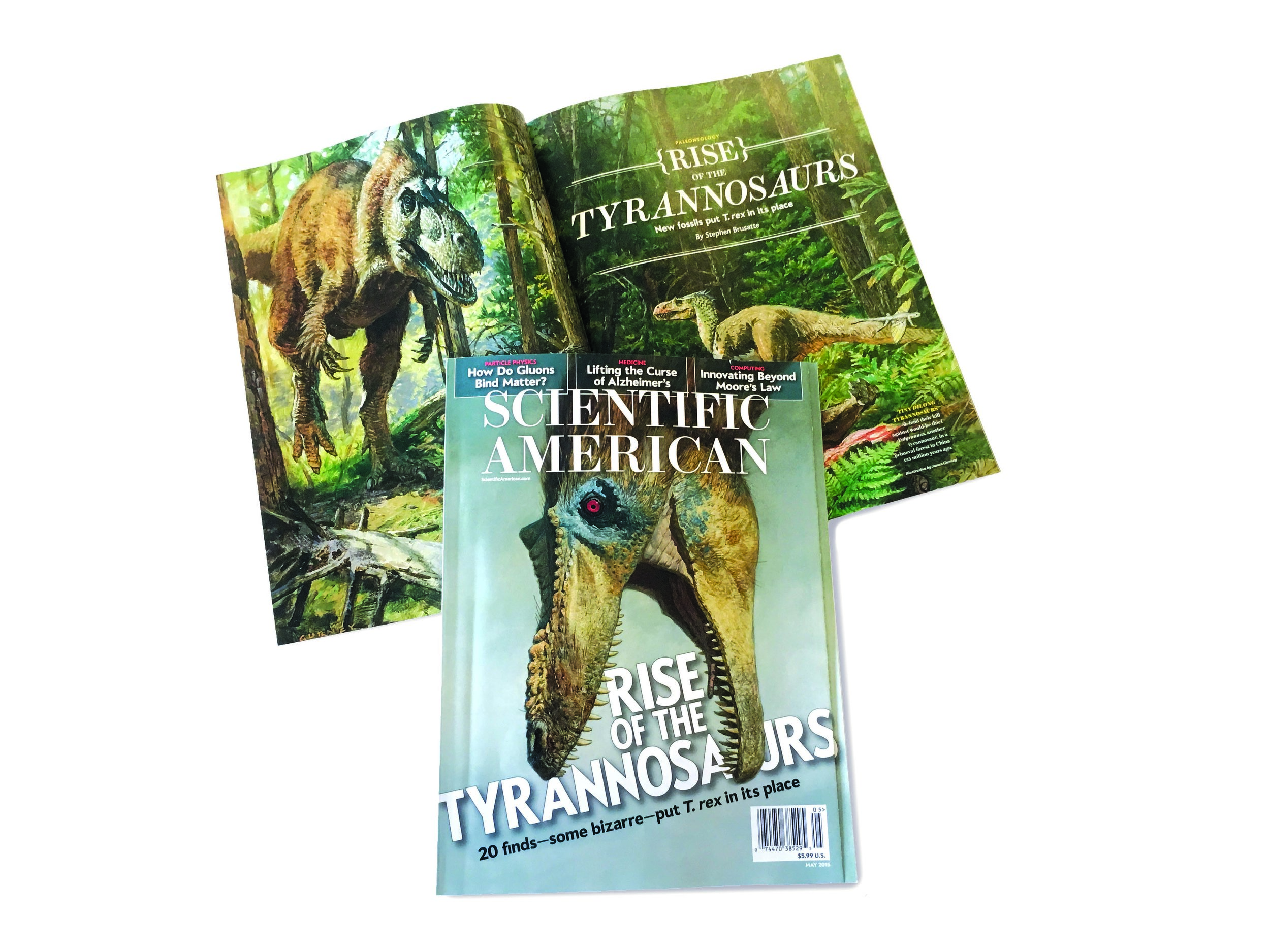
My favorite challenges for print have been finding new ways to show dinosaurs, black holes and other ‘big ideas.' We always seem to come up with new ways to depict them all, with illustration, photography or information graphics. There never seems to be a “go to” way to do things, so it is always fun and collaborative.
This cover depicting a relative of a Tyrannosaur called Quianzhousaurusor ‘Pinocchio Rex’, was painted by the great James Gurney. We went back and forth on ideas, but this one, where the image is really interacting with the cover line felt like the way to go. It was an interesting problem because at the time, there weren’t a lot of good descriptions to work from. James worked from a model he made himself using a scan of this creature’s skull to make this image. It isn’t a surprise that he is able to bring this to life. Here’s a great video by James on the process behind these pieces: https://www.youtube.com/watch?v=3jRmyRoLQWU
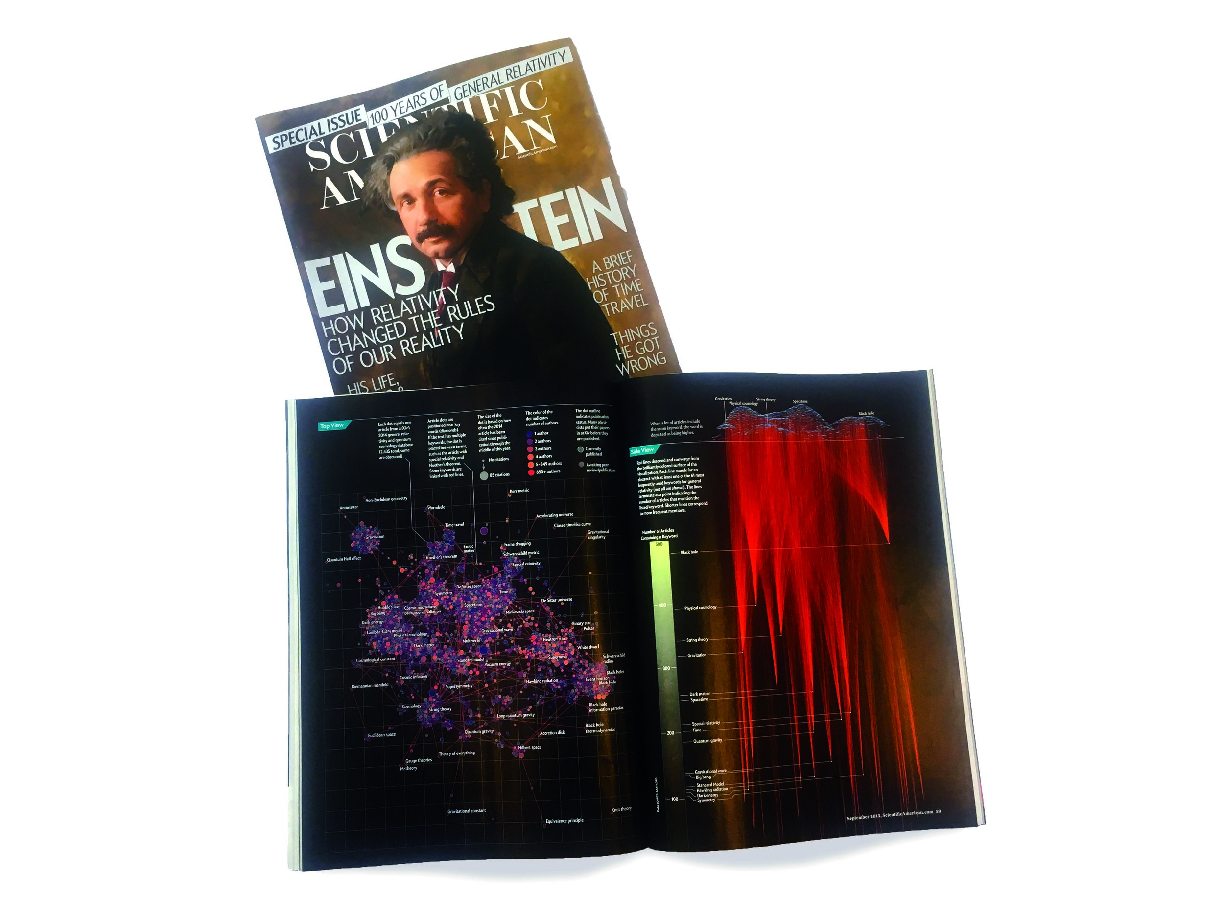
In our Einstein Issue, Jen Christiansen and the Office for Creative Research (OCR) came up with the great idea to mine the literature in physics that links back to Einstein’s Theory of General Relativity. The resulting print graphic is awesome, but then the interactive piece really allows one to comb through the data and see some really great pieces of information, like there are some papers with more than 850 authors. Sadly, this interactive is no longer working on our site or OCRs, but the magazine piece is definitely still functioning fine. It shows how great data visualization can be.
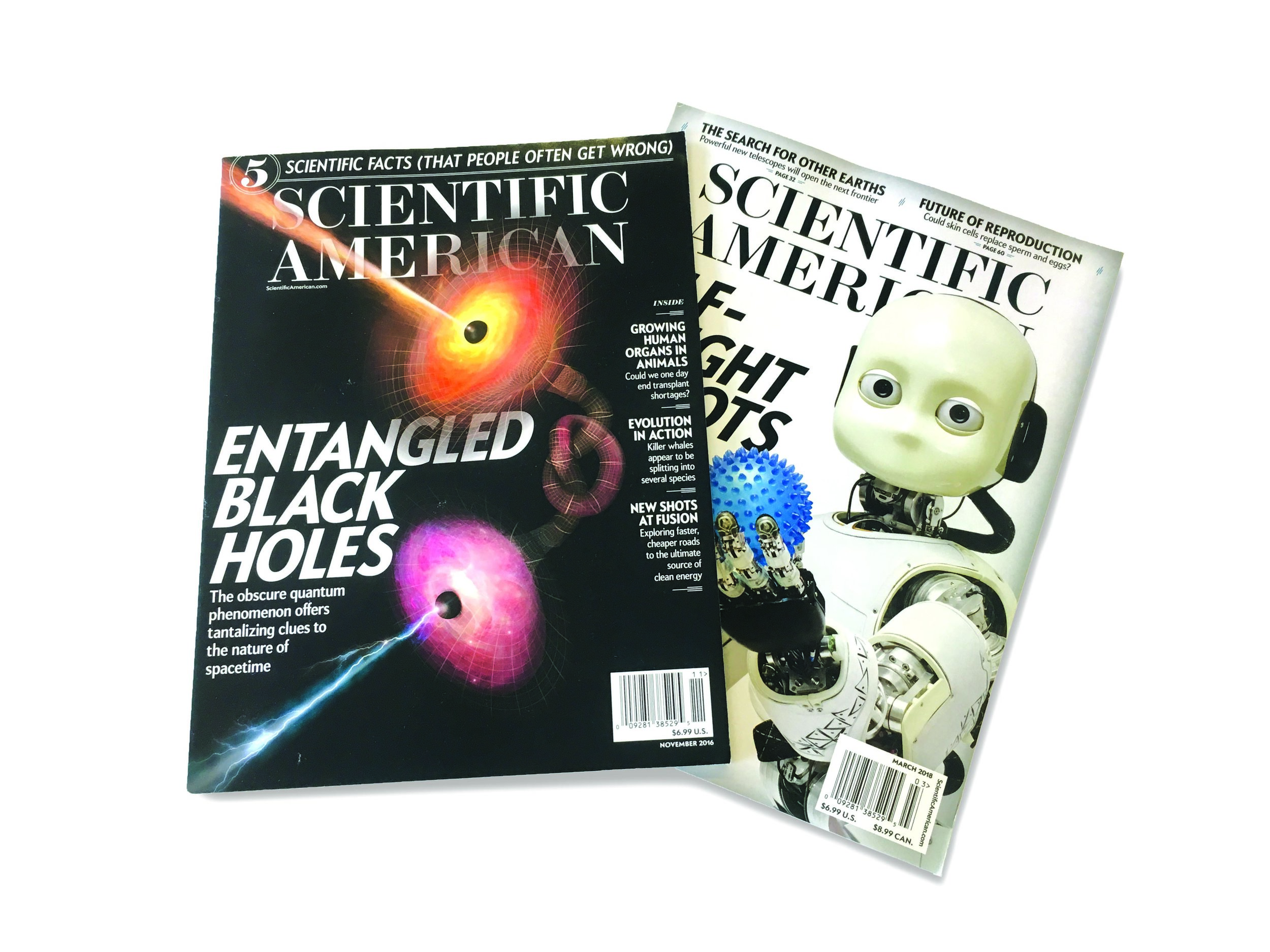
Lastly, we get to do black hole covers seemingly all the time, I feel like they are my personal nemesis, but we always come up with good ways to show them. Someday, I would love to see an actual photo of this type of event, but I suspect that will never be. I guess I will have to settle for photographing robots instead.
I am thankful of the team I have (and have had) here they make it fun to come in every day and I couldn’t get this all done without them.
Monica Bradley (Photo Editor), Jen Christiansen (Senior Graphics Editor), Jason Mischka (Art Director), Amanda Montenez (Associate Graphics Editor), Ryan Reid (Online Art Director), Liz Tormes (Assistant Photo Editor), Ian Brown (ex-Art Director) and Annie Chin (ex-Assistant photo editor).
ILLUSTRATION & PHOTO CREDITS
Tyrannosaurs: James Gurney
Einstein: Inside spread by Office of Creative Research; Cover by Dan Adel
Robots and Black Holes: Black Hole by Malcolm Godwin, Moonrunner Design; Robot by Sun Lee


