Martha Stewart Weddings with Creative Director, Michael McCormick
/Earlier this summer, Martha Stewart Weddings ended its quarterly print edition. After 24 years in print—first as an annual publication before moving to a quarterly—the brand will still continue online and will publish an annual Wedding Guide. We asked the quarterly’s final Creative Director, Michael McCormick, who spent the last 6+ years there to share his MSW experience.
The MSW Experience
Michael McCormick: I had the great fortune of working on the Martha Stewart Wedding brand from October of 2011 until this past June, first as the Design Director and most recently as Creative Director. I have been a huge fan of MSW and all things Martha my entire professional career, so it was definitely a dream job for me. People would always ask me, “didn’t you get burned out working on weddings and the content of themagazine?” And I can honestly say I didn’t. When you are surrounded by the endlessly creative team of stylists, editors and art directors as I was each day and not to mention Martha herself—you couldn’t help but be taught and inspired by them. Was it hard work? Of course. But, it was such diverse, interesting work (even within the niche of weddings) you could always find a place to invest your creative energy. Every day was different. And, it was a really non-traditional job. One minute I would be art directing a photo shoot or designing a feature story and the next minute I would be on my hands and knees helping to build a ceremony backdrop for an actual wedding. And the fact we were creating these inspirational and aspirational worlds meant you could (and wanted to) think big.
In the fall of 2013, I oversaw a full redesign of the magazine, where we pulled the design apart from top to bottom. Since that full refresh, I did small tweaks and expanded our font family (we used the Domaine and Alright Sans families) but because we had created a design that wouldn’t get in the way of the content, I felt it continued to work. I always thought the biggest challenge with the design was to feel related to Martha Stewart Living, but also function as its own standalone publication. We were an almost exclusively newsstand product with our own team and budgets, so I felt it important we reflected the overall MSL brand, but that the magazine had its own voice that would complement the flagship.
There was always a little push/pull (as there is at any publication) between art and other departments and I loved that part of my job—the listening, negotiating and ultimately (hopefully) bringing everyone together for a well-thought, creative piece of work. The learning curve was tough. As any Martha employee will tell you, it takes awhile to understand working on the brand and executing the vision at the expected level. But, I am sure my co-workers and all of the many creatives before me whom I call mentors would agree with my assessment that the knowledge and expertise you carry with you carries you far. And my true hope is that MSW continues on—both online and in its annual print edition. It’s an unbelievable, inspirational brand. And I’m really proud to have contributed to it.
SPD asked me to gather few of my favorite projects from my time at MSW and speak about what made them special.
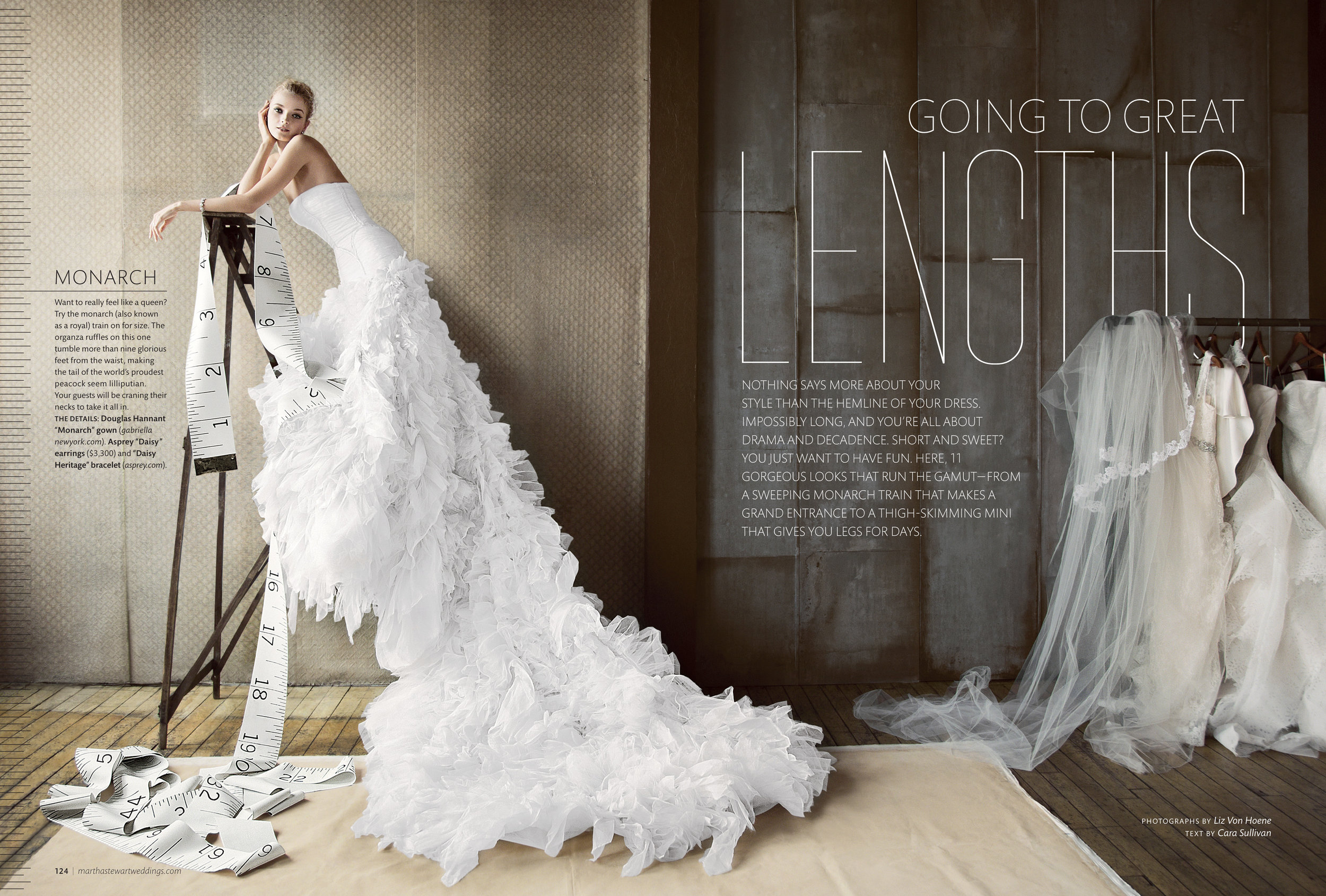
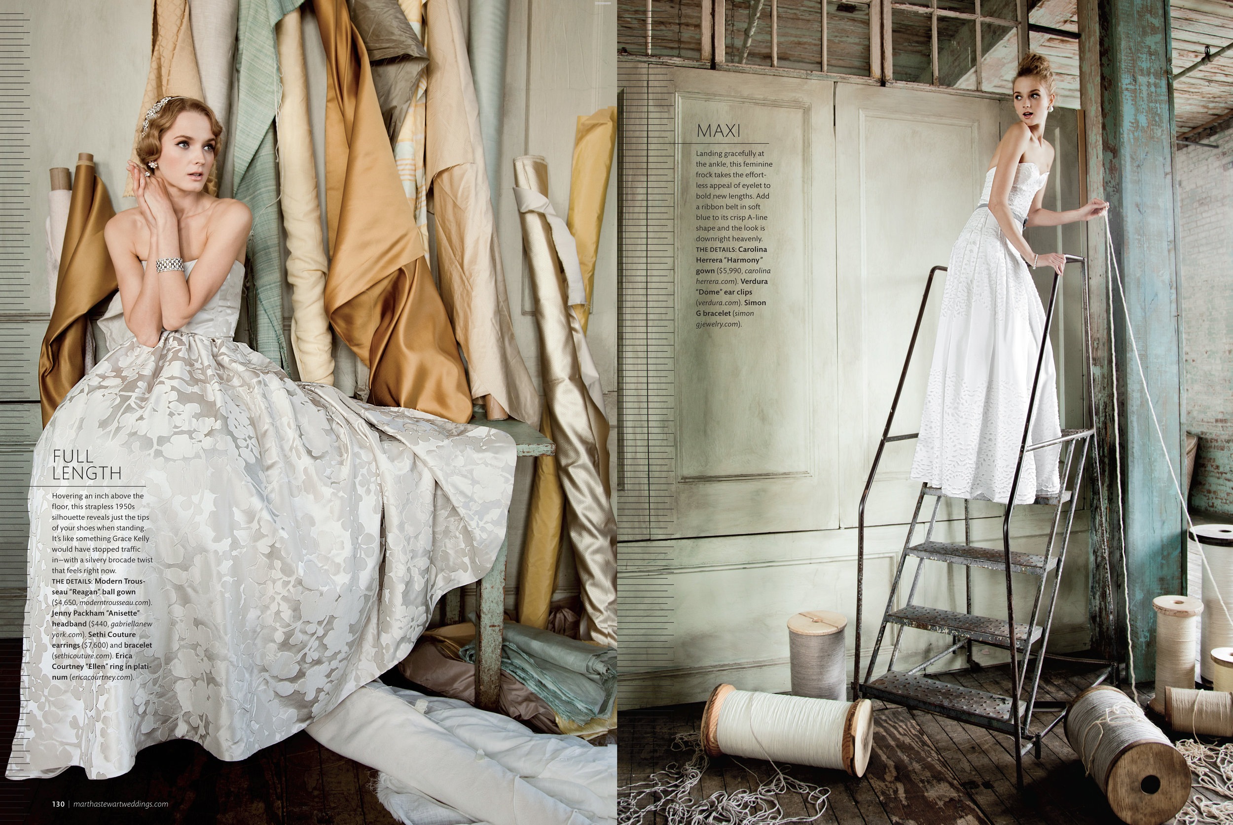
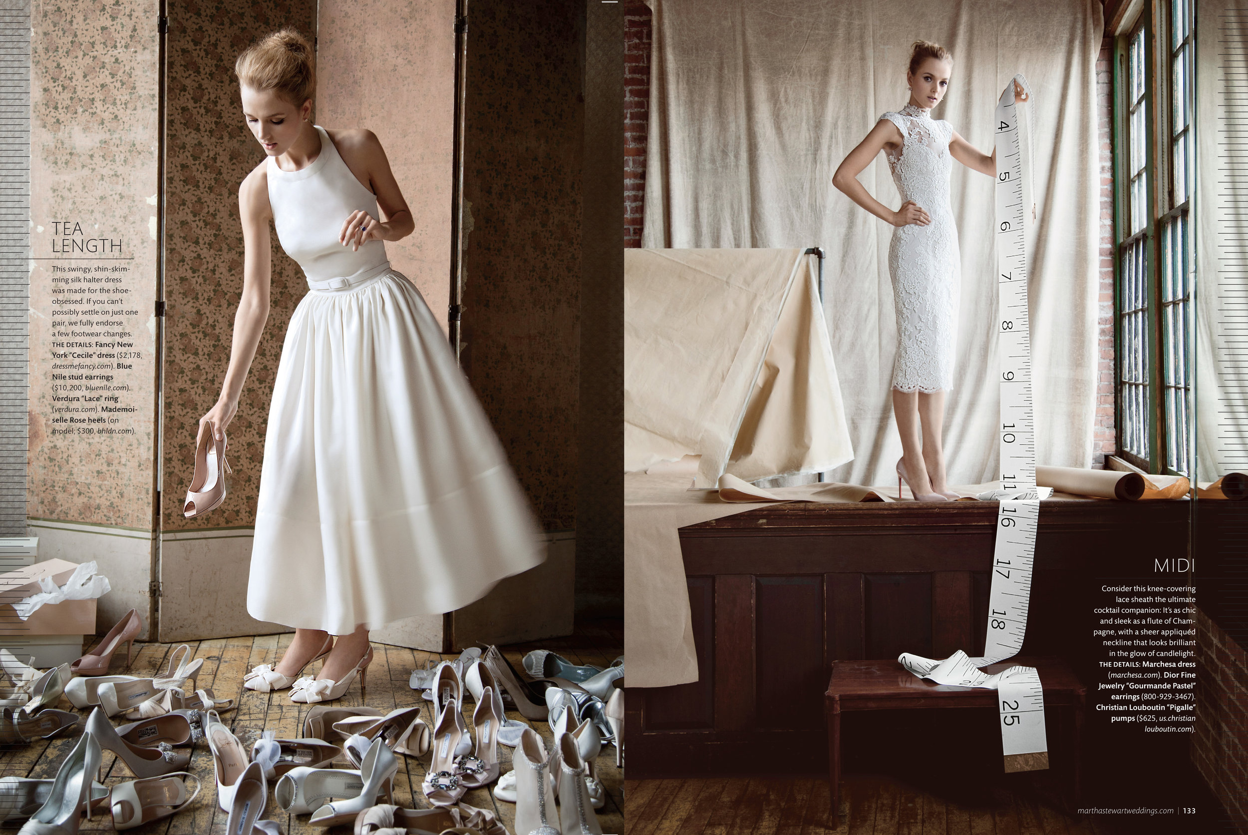
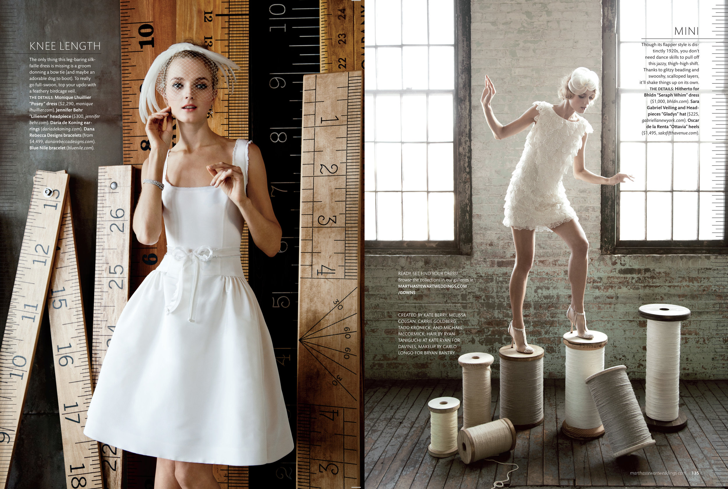
Going To Great Lengths - Spring 2012
This was one of the first MSW fashion stories I worked on and I feel it really reflects the contributions of the entire team at the time and us using the amazing resources we had to create something really special. From the editorial concept and creative direction to the fashion styling, set pieces (those giant rulers sat in our offices forever) and photography, it remains one of my favorite pieces for the magazine as well one of my fondest memories of collaboration with my co-workers.
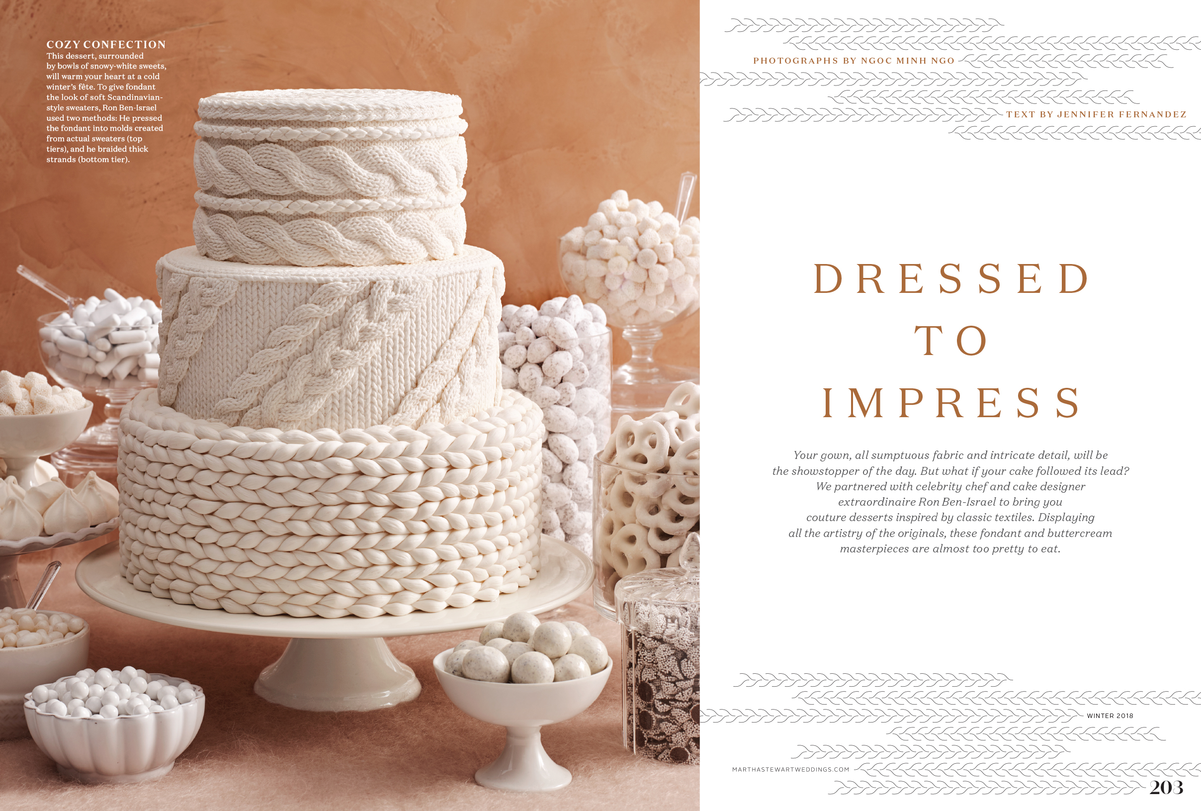
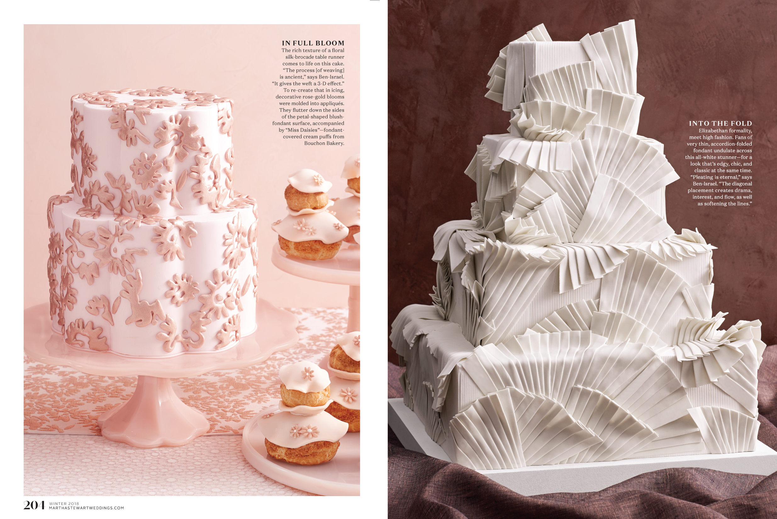
Cake Stories
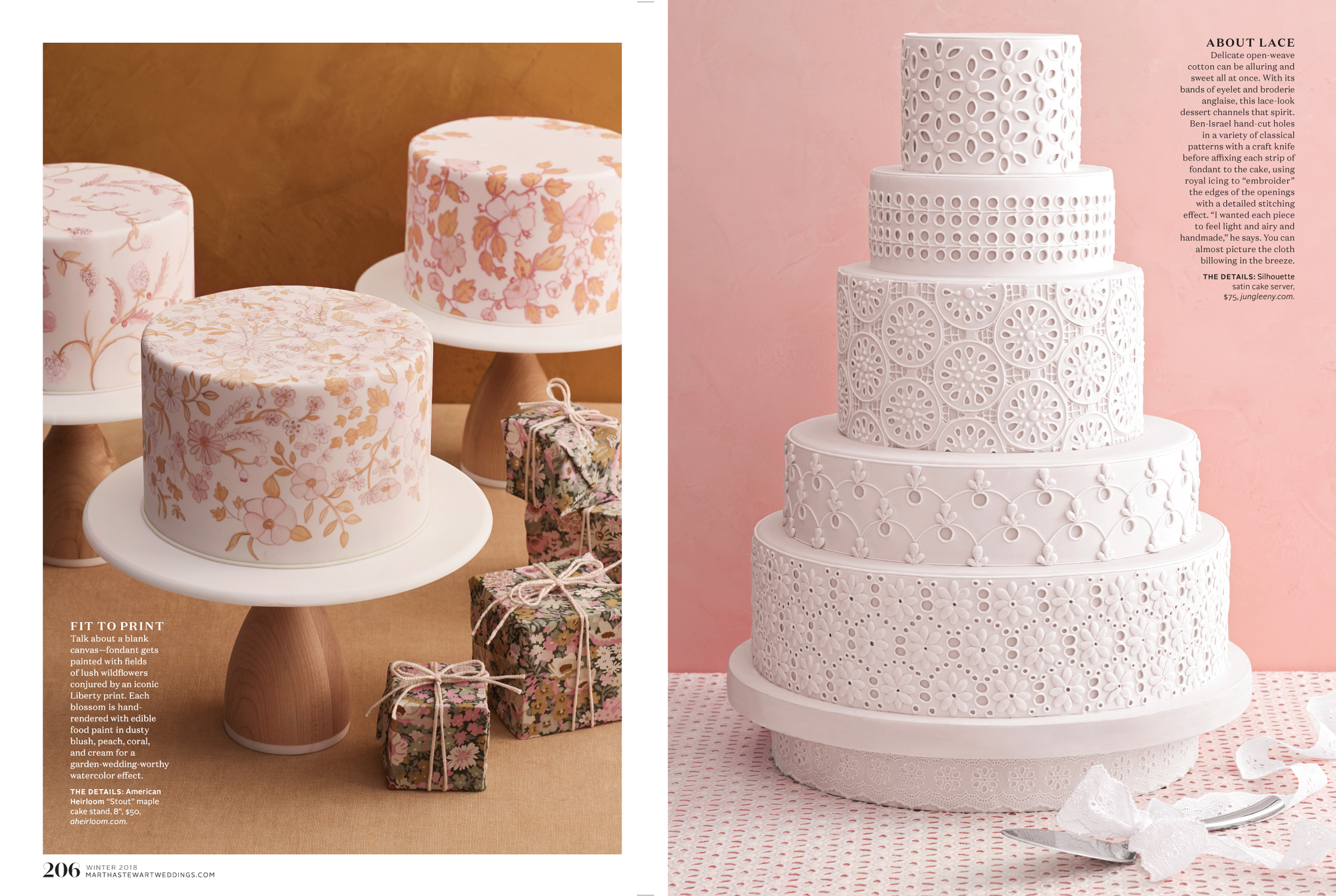
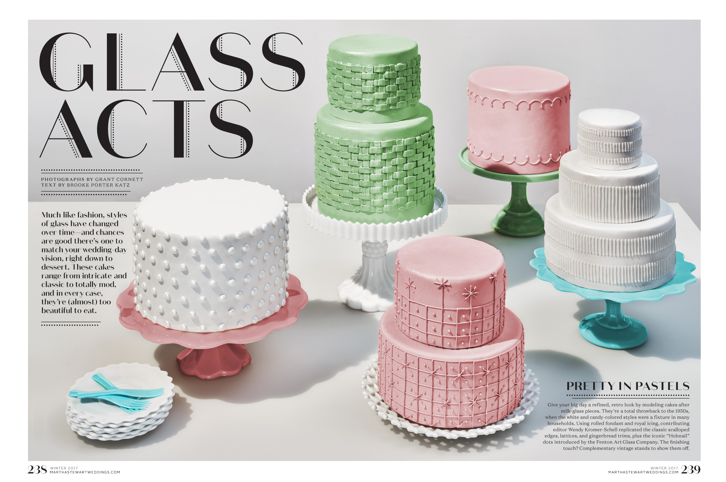
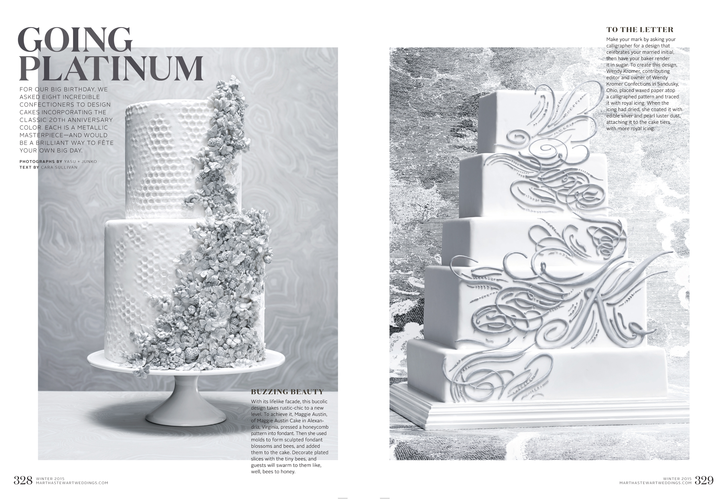
My favorite stories for the magazine were the cake stories. We have a stable of incredible pastry chefs and experts who could execute the craziest of ideas. I loved sketching and concepting and dreaming up interesting designs and then seeing how they could come to life in sugar. This is a sampling of the last few cake stories I produced and I loved how the cakes turned out (Knit me a sweater! Make it calligraphy!) and the styling was top notch.
Heavenly Days - Winter 2014
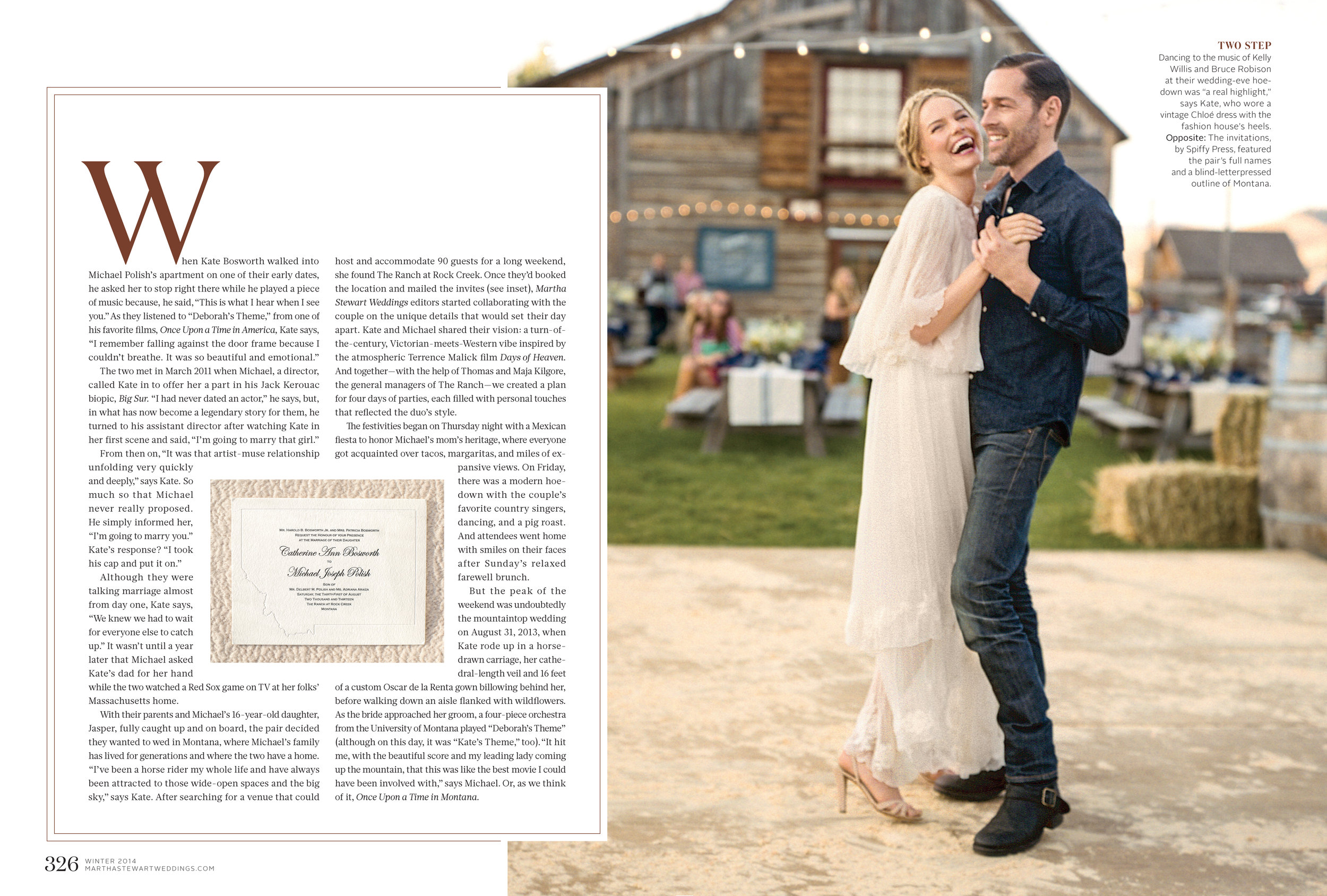
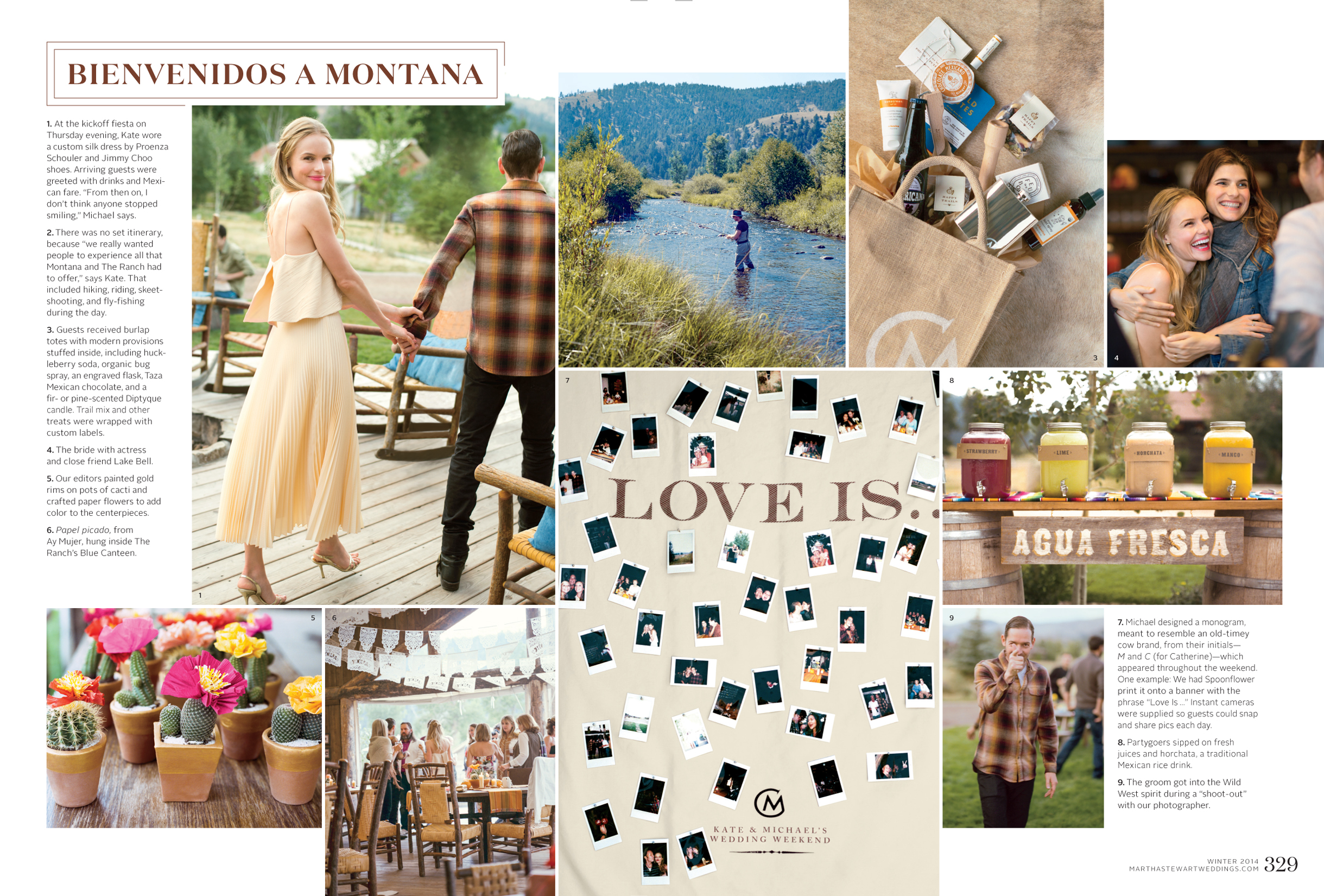
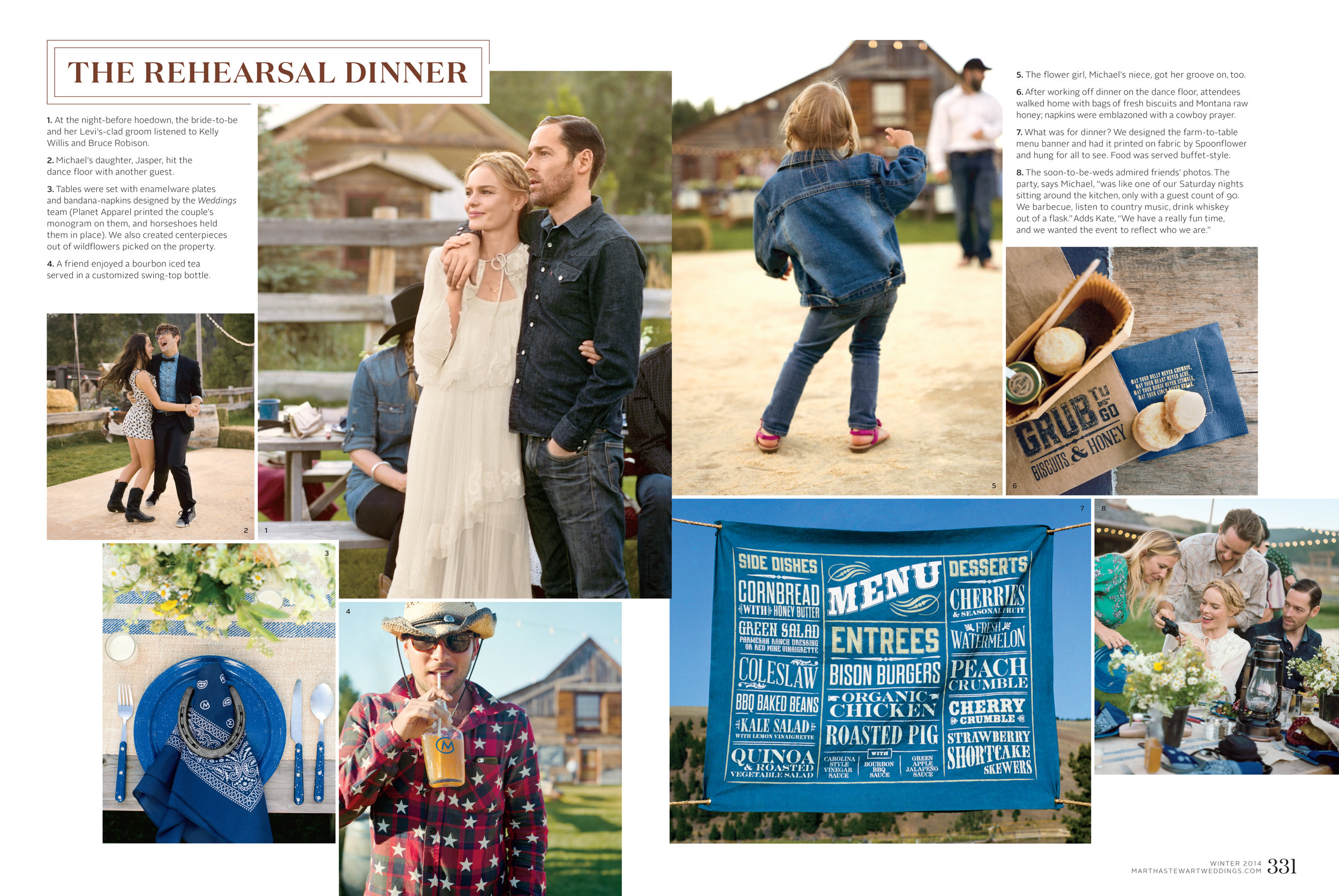
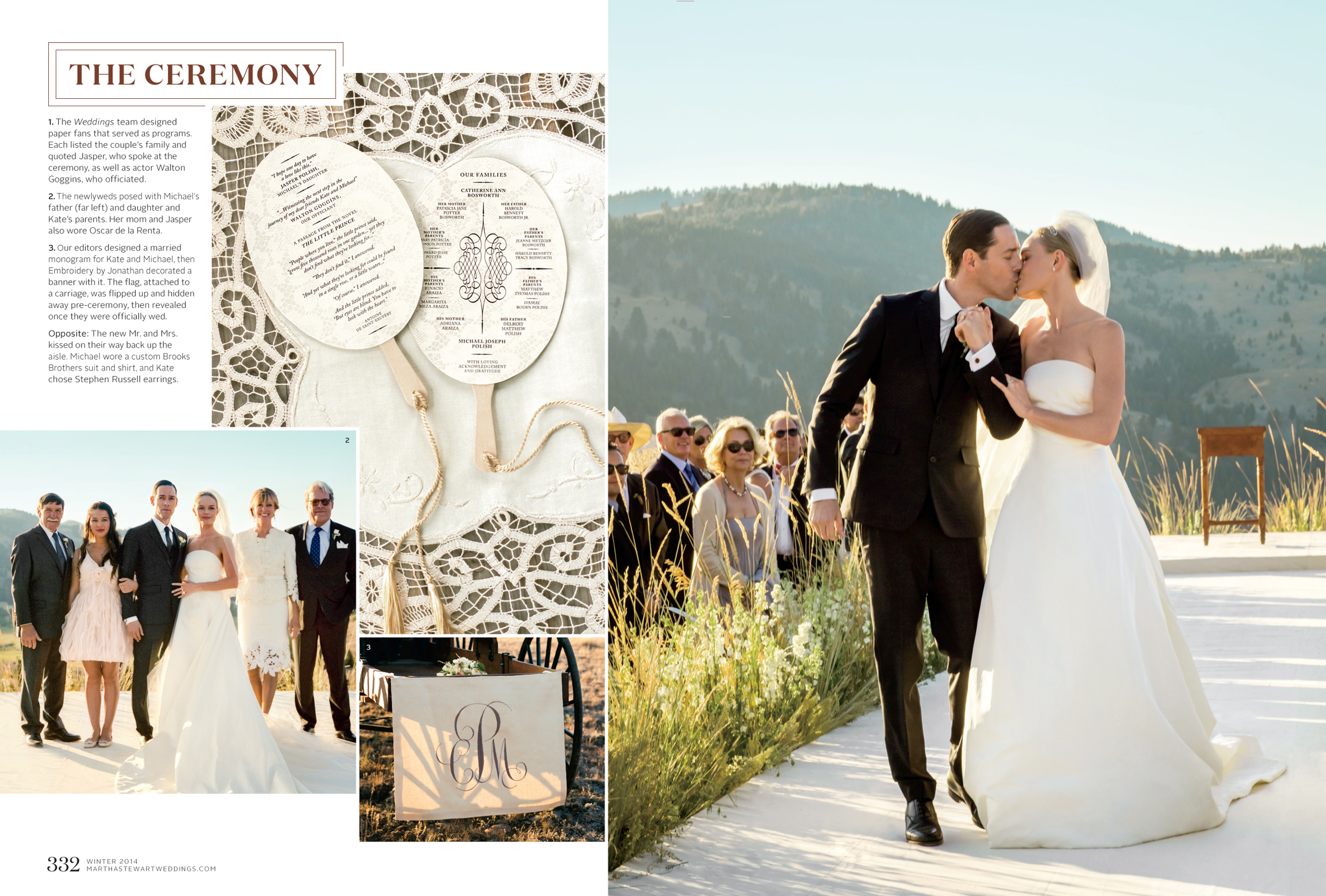
Every member of the art and style departments spent quite a bit of time working on weddings for actual couples getting married (as opposed to conceptual stories we were creating for the magazine). These weddings would range in involvement from just showing up and documenting the event to helping craft and create elements for the couple. This one in particular was a big undertaking for the staff, which took a number of us to Wyoming to produce the events. It was definitely an all hands on deck experience—the team out West working with a huge range of materials (including a great deal of fresh-cut sage from the hillside) to create and then photograph the celebrations, and then a team back in New York writing and editing online content to report and post the details. I love how everything turned out—from the online announcements to the eventual cover and feature in the magazine—and how everyone involved brought their own brand of expertise to create something special.
Designed to Last - Fall 2015
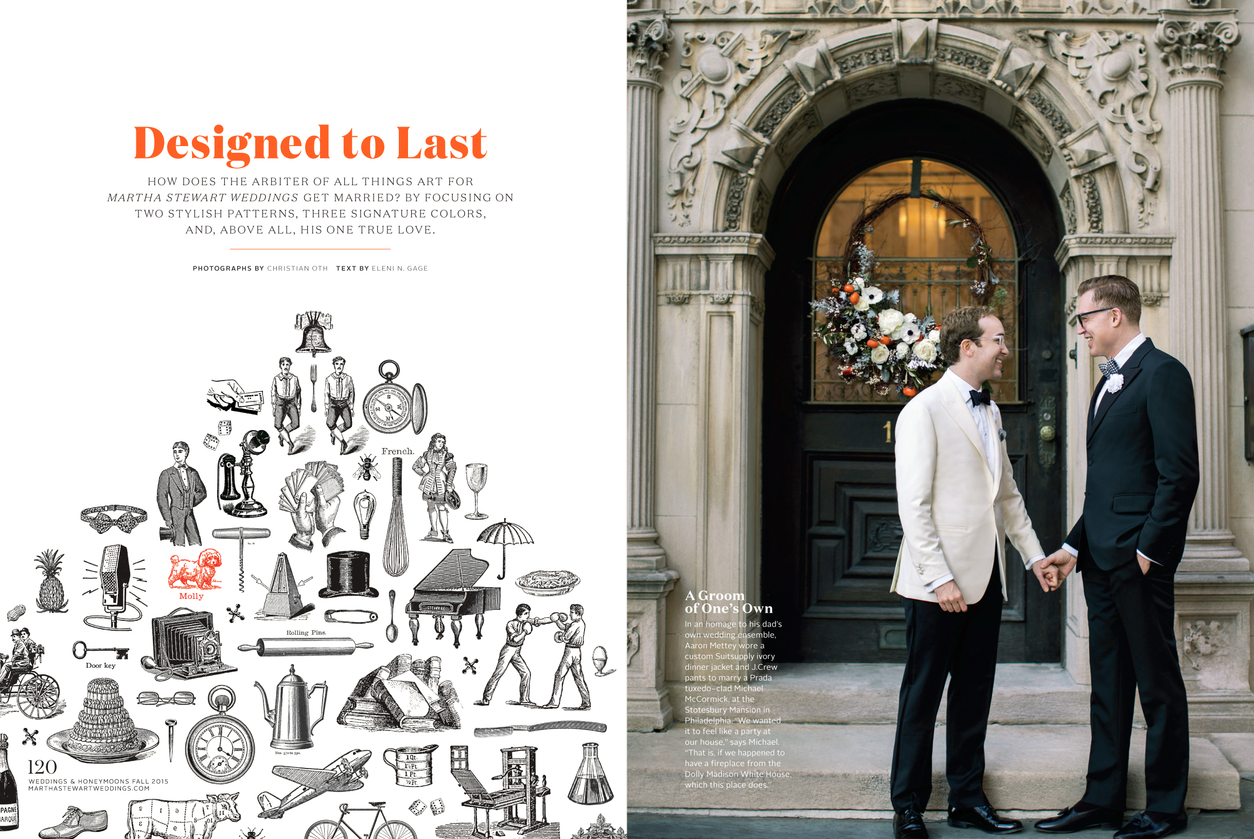
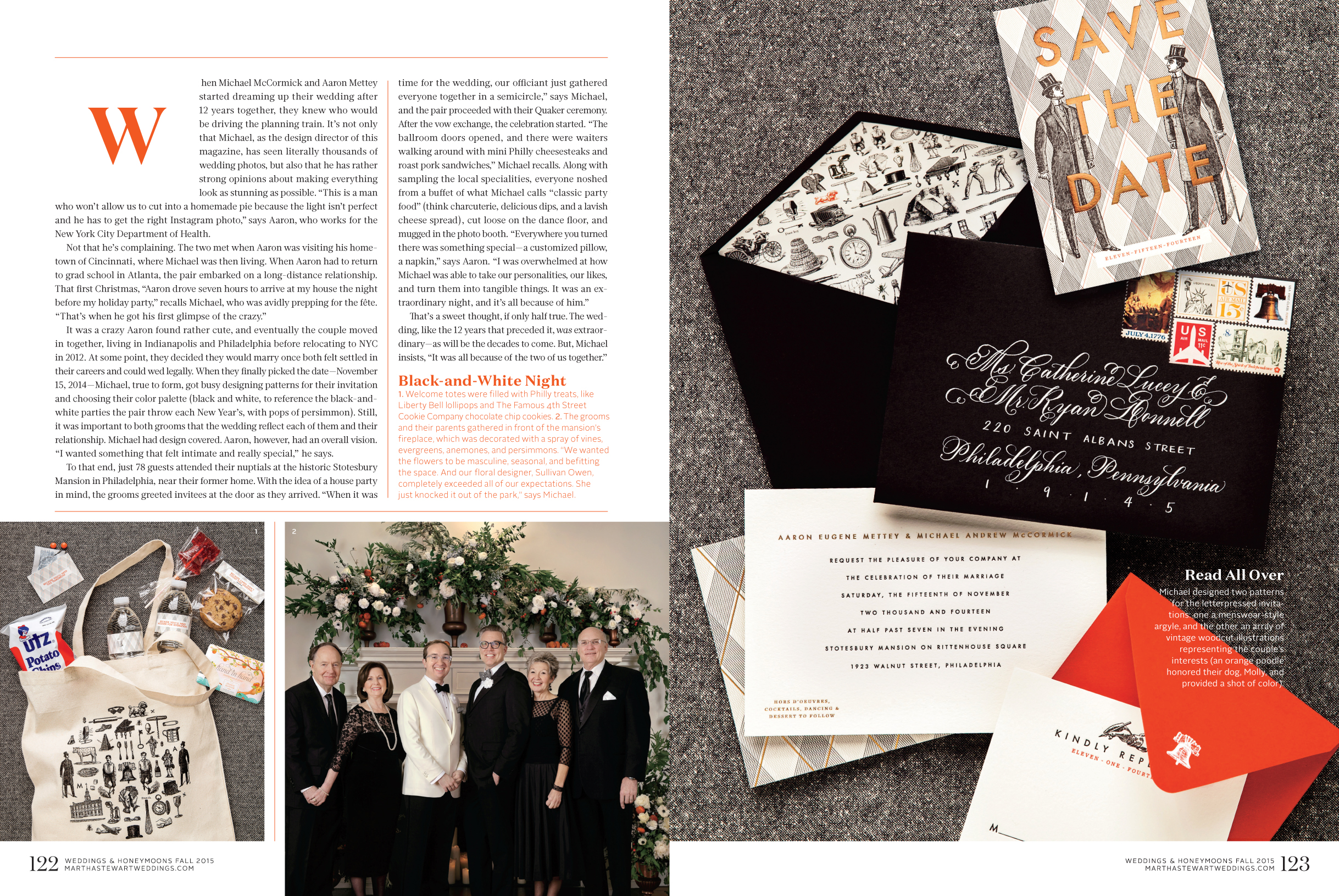
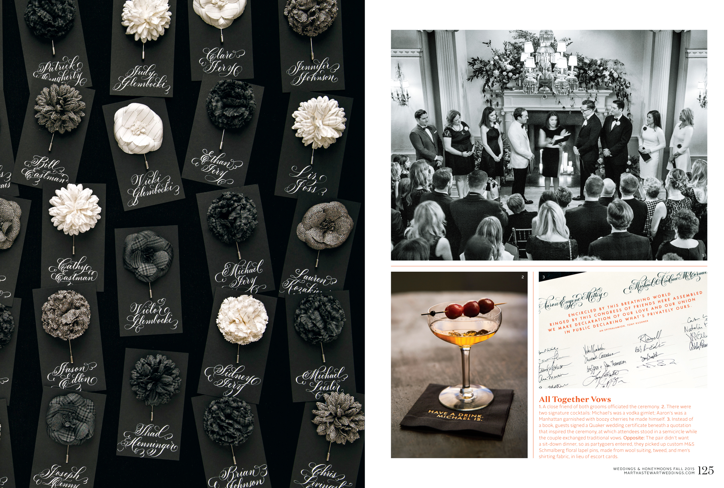
Of course, I am biased, but this wedding (my own) was my favorite one I worked on. There was a lot of pressure to create something personal and well-designed, knowing our guests would be expecting a Martha wedding. And, I was knew what was coming because I had worked on so many weddings, but my (now) husband didn’t, so making sure he was comfortable with all of the ideas and the magazine staffers being involved was super-important. But then there was the added pressure of having the details be special and unique enough to go into the magazine. Again, I’m biased, but it was a great wedding.
Flower Stories & Jewelry Stories
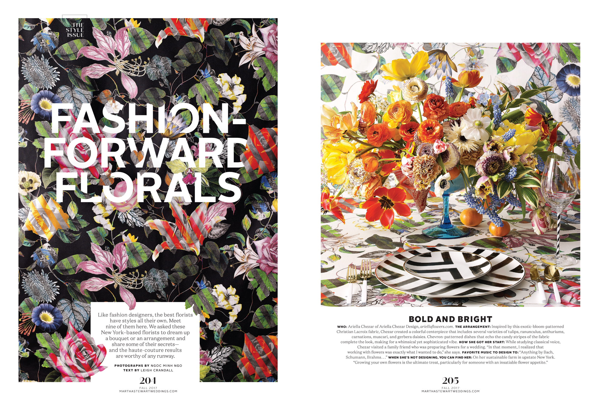
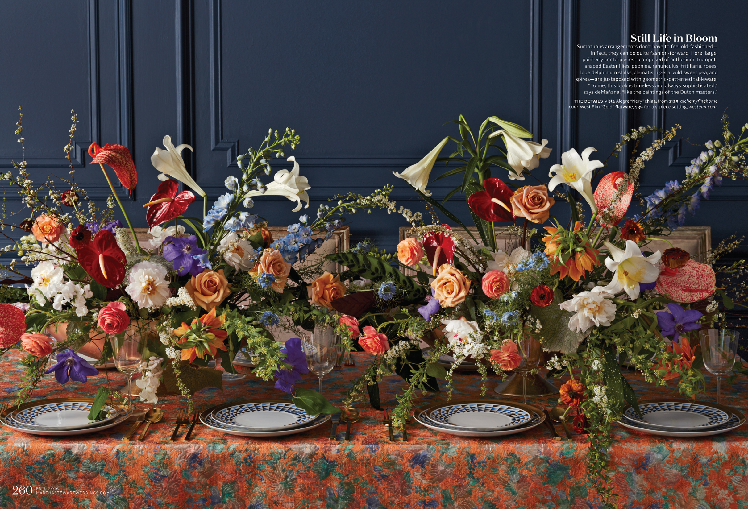
One of the things that delighted me about working at the magazine was how insanely talented the stylists on the team were. Two of my co-workers were accomplished florists. And, I was always in awe of how knowledgable and creative they were and what they could conjure after an early-morning trip to the flower market. They were also amazing curators who would recognize and encourage fellow florists. And, all of the stylists were experts in working with unexpected materials to create sets. So, working on jewelry stories was a real treat, as they always dreamed up some innovative and interesting way to present the pieces.
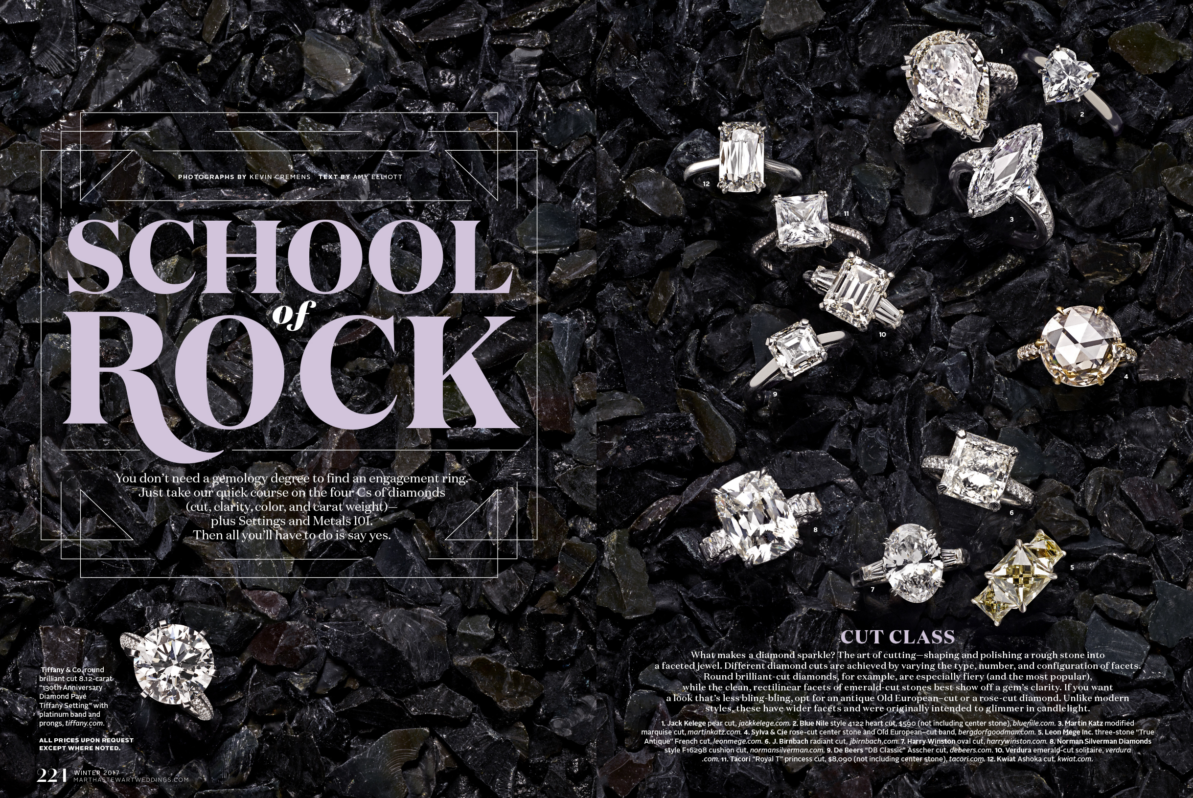
Take a Bow - Fall 2017
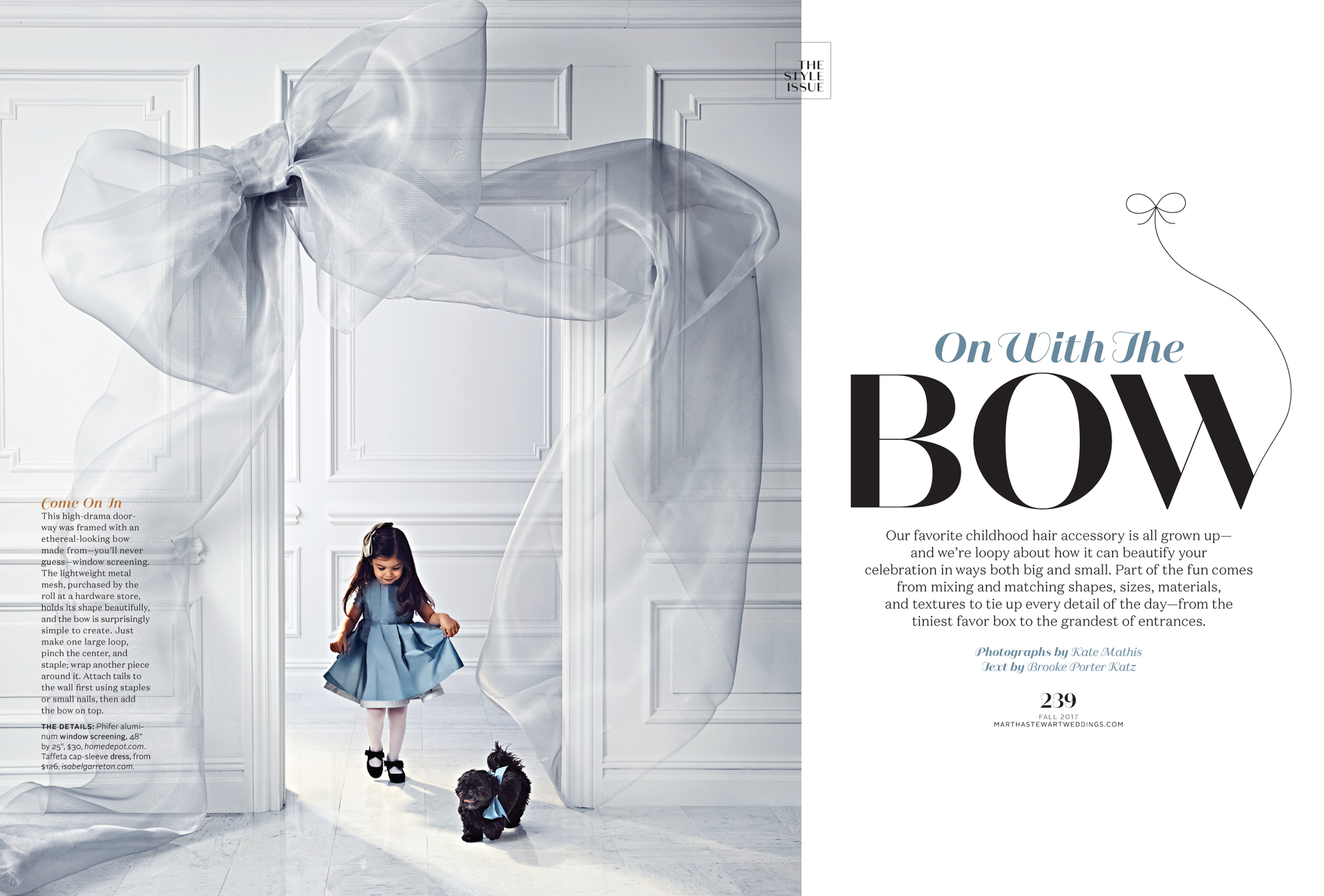
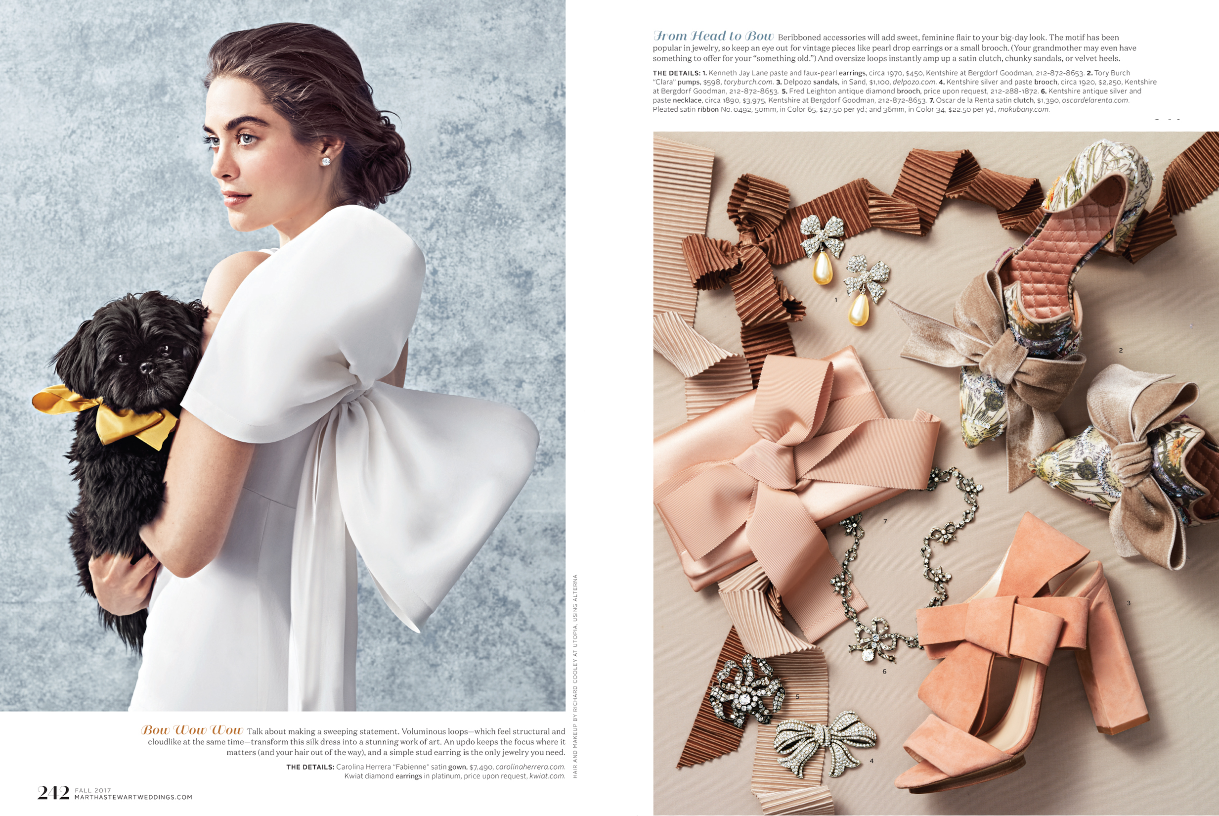
Designing the typography for the magazine was a bit of a challenge. The ideas and concepts were always so amazing, I felt it was important there was design in the type, but not so much so that it would get in the way. What I tried to do was infuse the design with little details that made sense and felt organic to each piece. And, I took any opportunity to get my dog into the book whenever I could.
Covers
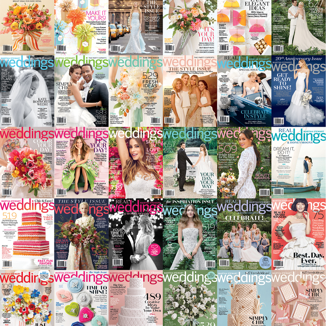
Creating covers for such a beautiful brand was a treat. But as all art directors know, covers are tough—balancing the artwork with the editorial message and then having them be commercially successfully. The covers I did definitely evolved over the years as the brand evolved. The push/pull was always how to add more lines, but still hang onto the brand and maintain newsstand sales. These are some of my favorites.
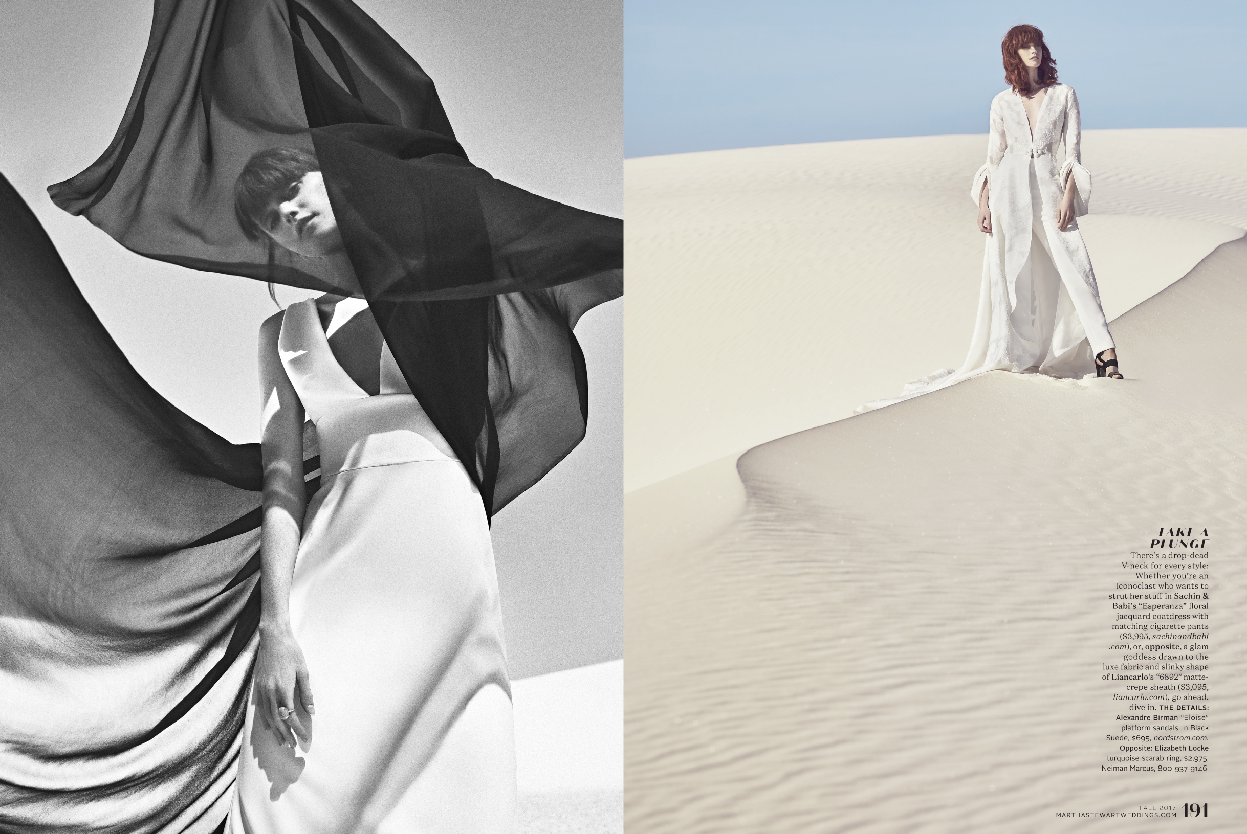
Natural Wonders - Fall 2017
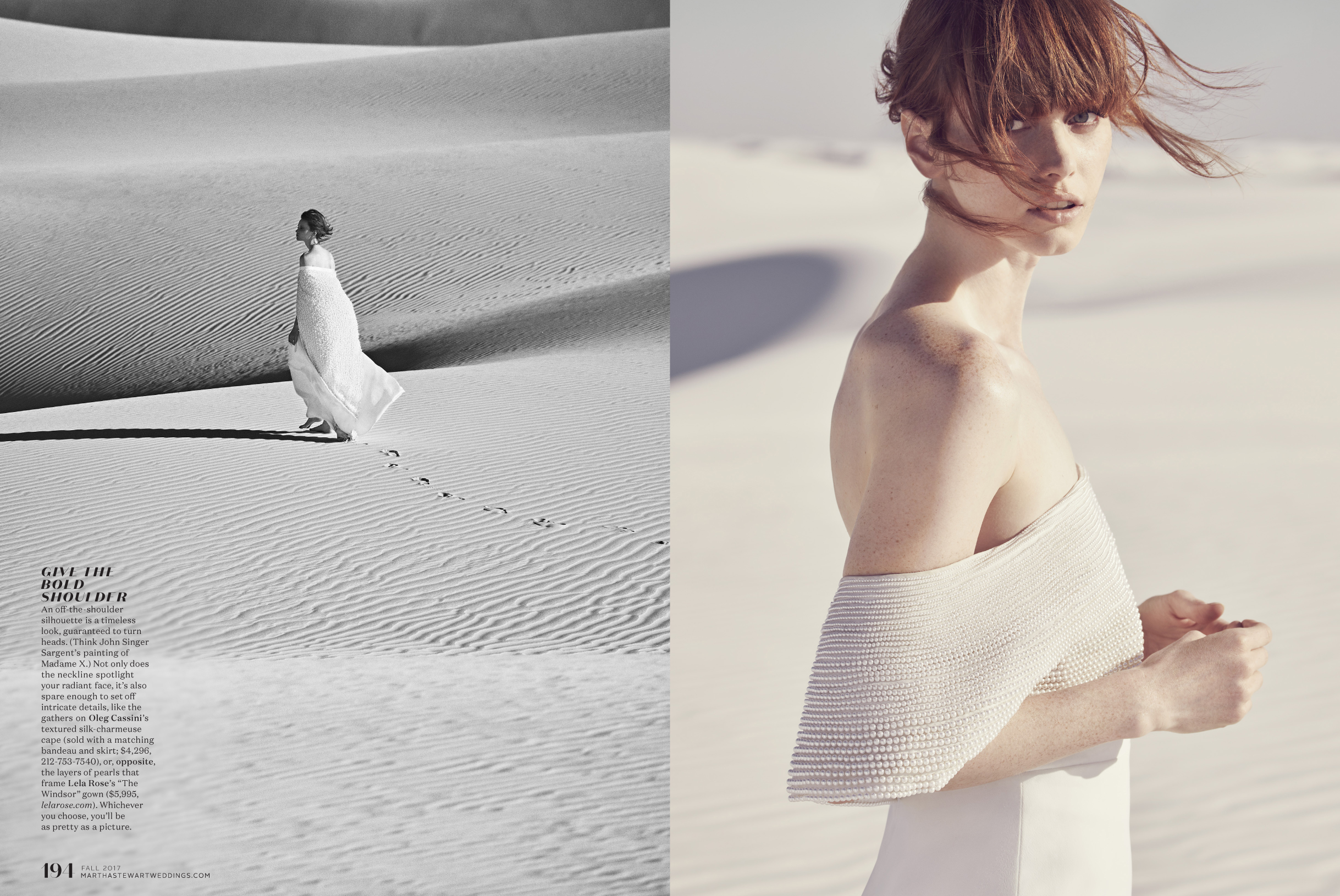
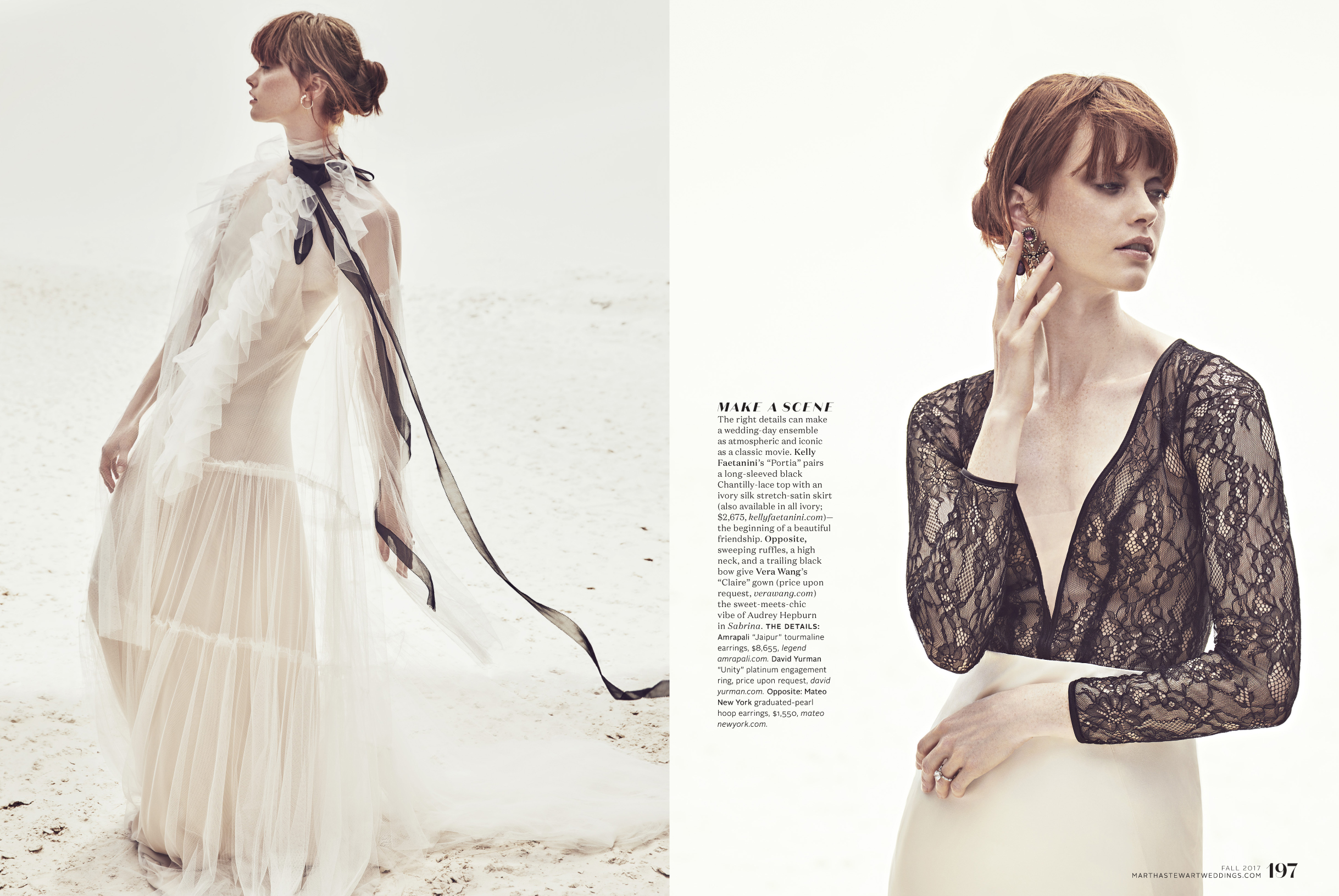
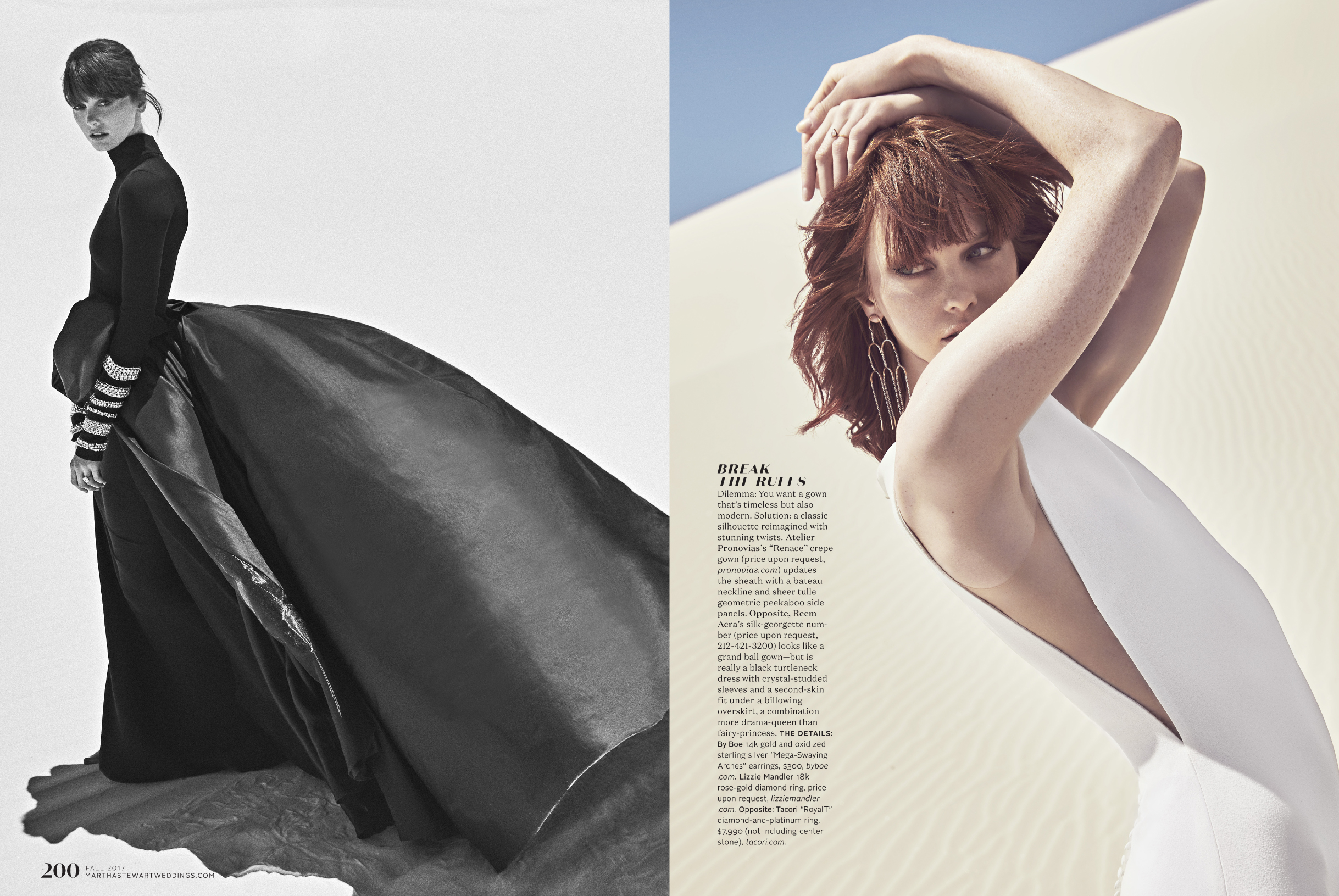
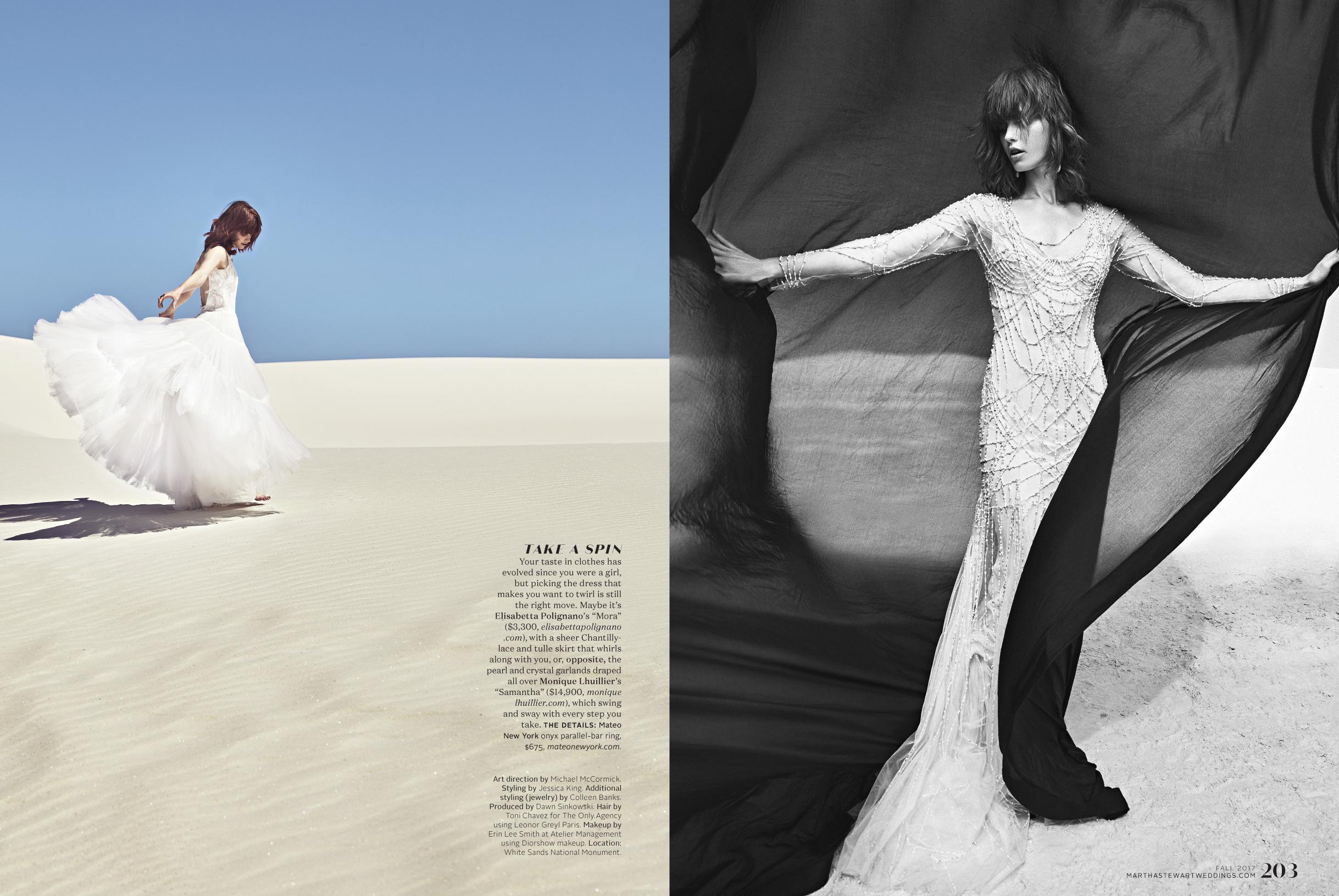
Working with amazing photographers who could help us elevate our ideas and bring another creative and collaborative voice to the projects was an amazing part of the job. And my thought on all of our photography, and especially that of our fashion stories, was that I wanted us to make photos that were unexpected and could appear in any fashion magazine. This is one of the last fashion stories I did and it’s one of my favorite pieces I’ve ever art directed. The setting, the styling, the model, the production, the photography—all top notch and I’m so proud of everyone on the team and what we created.
And now? Onward! I spent a great deal of my career working for general interest publications, so I am definitely drawn to returning to some of that content and am looking for interesting and creative projects to work on. You can find me at michaelmccormickdesign.com or on Instagram at mccormick_michael.
