Gentleman's Journal: Issue 32 with Art Editor, Joseph Sinclair Parker
/Yesterday, The Gentleman’s Journal, released its September Food & Drink Issue with cover star Ryan Reynolds. We asked the quarterly’s Art Editor, Joseph Sinclair Parker, to take us behind-the-scenes of the cover shoot.
Joseph Sinclair Parker, Art Editor: I have worked at Gentleman’s Journal for the last three years, art directing the quarterly magazine and working closely with our talented editorial team. During this time I have also been involved in a redesign of the company’s branding, and launched the Gentleman’s Journal newspaper in March this year.
Before joining the brand, I worked at Esquire UK and British GQ. Starting at Gentleman’s Journal gave me the interesting opportunity to work with editor Joseph Bullmore, and help him push the magazine in a more contemporary direction whilst maintaining its luxury, high-end origins. In order to challenge what it means to be a ‘gentleman’, we sought out well-known, diverse cover stars from around the world; from A$AP Rocky and Lenny Kravitz to Samuel L. Jackson and Jeff Goldblum.
For our September/October issue this year, we landed Ryan Reynolds for the cover shoot. Our features writer, Jonathan Wells, spent the best part of a year playing email tennis with Ryan’s team to make the New York-based shoot come together — and in early August we headed to Tribeca, where Ryan lives, to spend four hours with him.
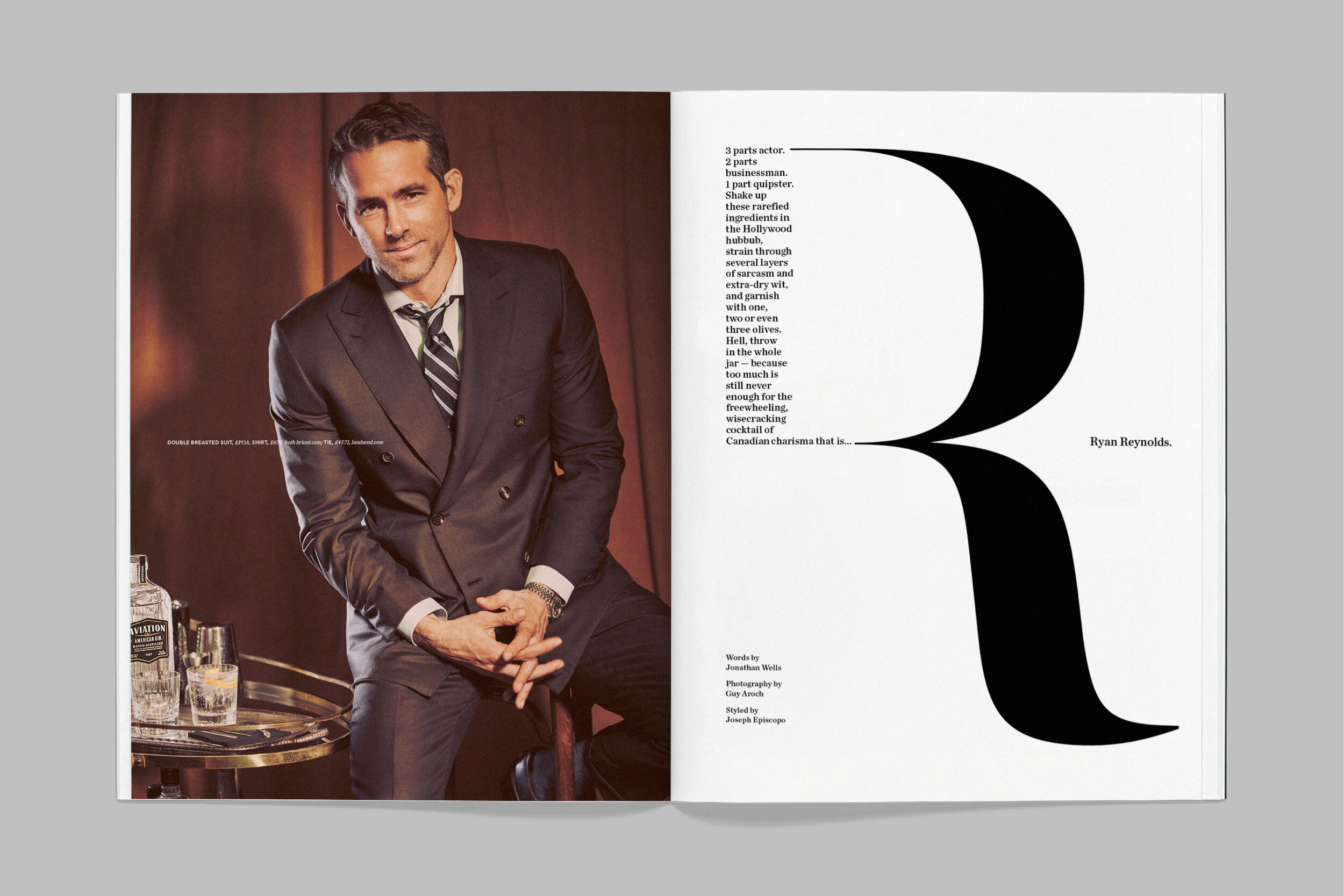
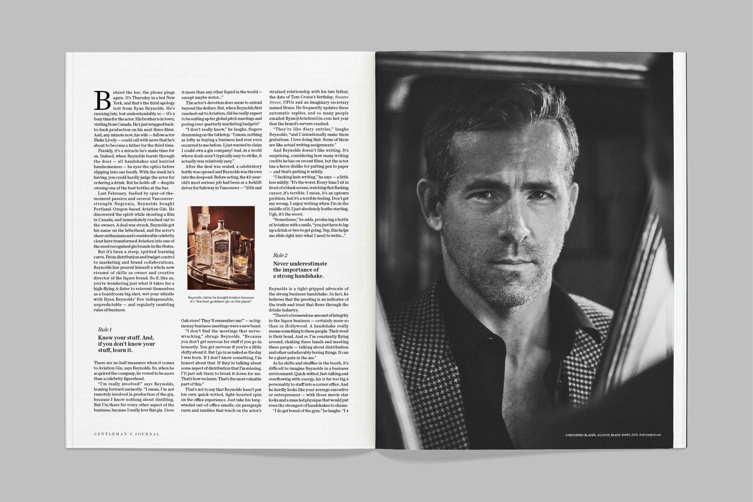
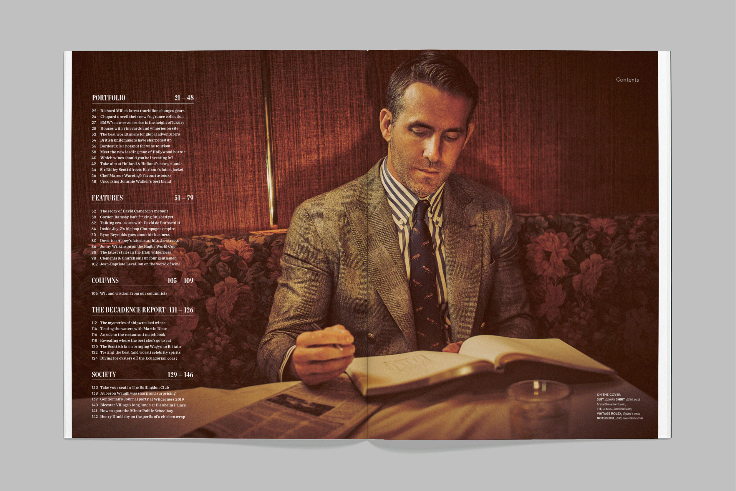
As the magazine celebrates and champions business and entrepreneurship, we were keen to approach the project from a different direction than the expected ‘A-list actor’ angle. Ryan’s latest business venture — acquiring a majority stake in Aviation American Gin — provided a natural way into the interview, and informed the direction for the shoot.
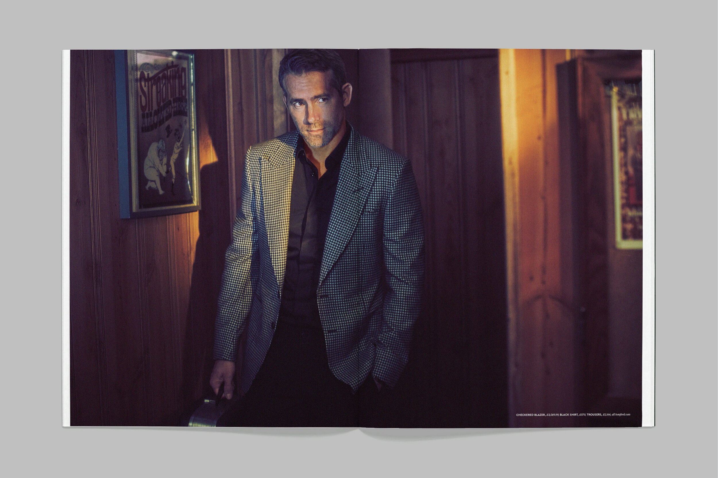
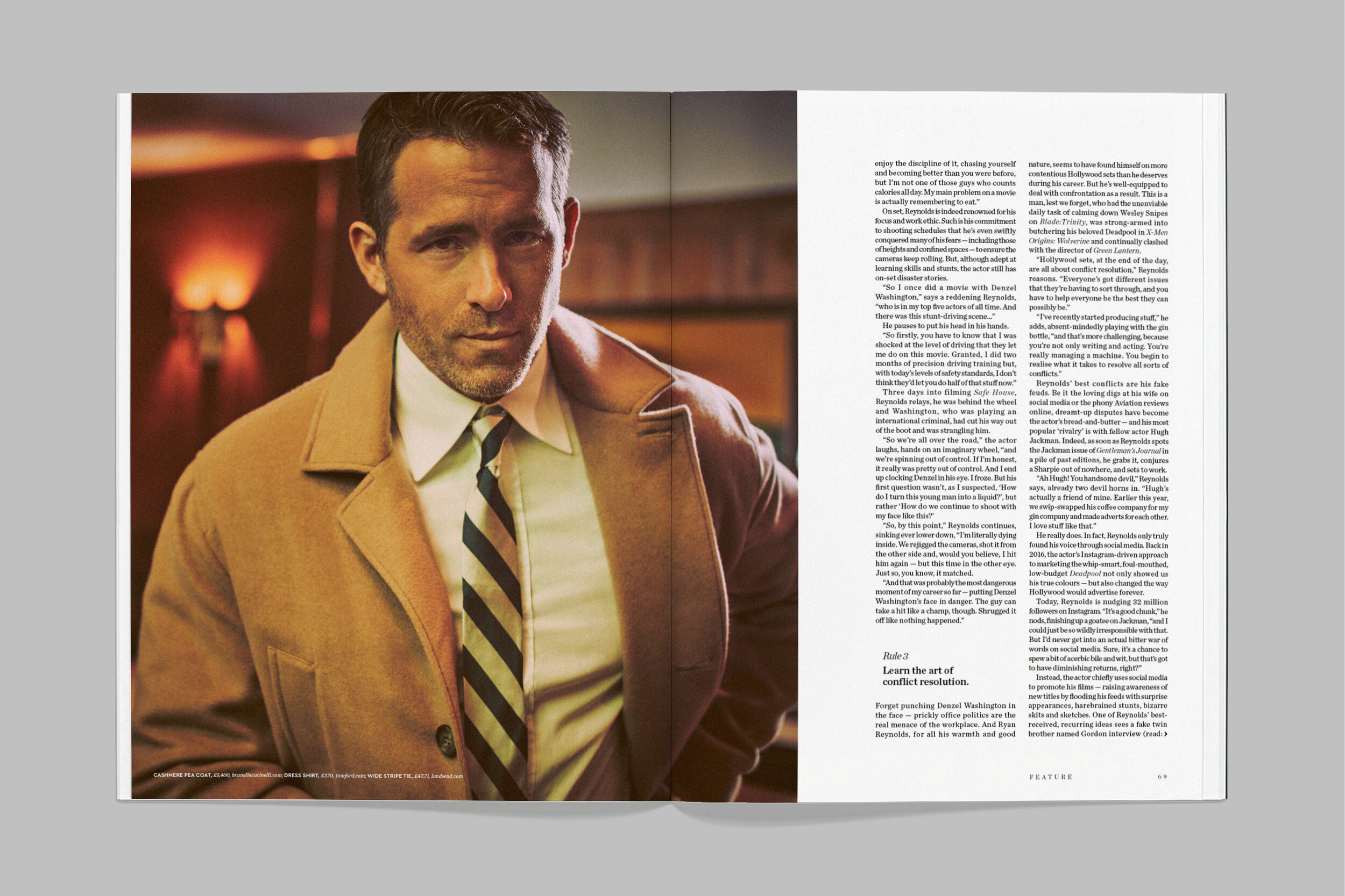
We worked through the design process, playing with lots of ideas and concepts - from Ryan as a travelling salesman in a hotel room, to him filling up gin bottles using a garden hose (interesting, but not our finest hour…). We eventually settled on the aesthetic of 1960/70s business America, but rather than the Mad Men office setting, we’d shot it ‘after-hours’ in a bar.
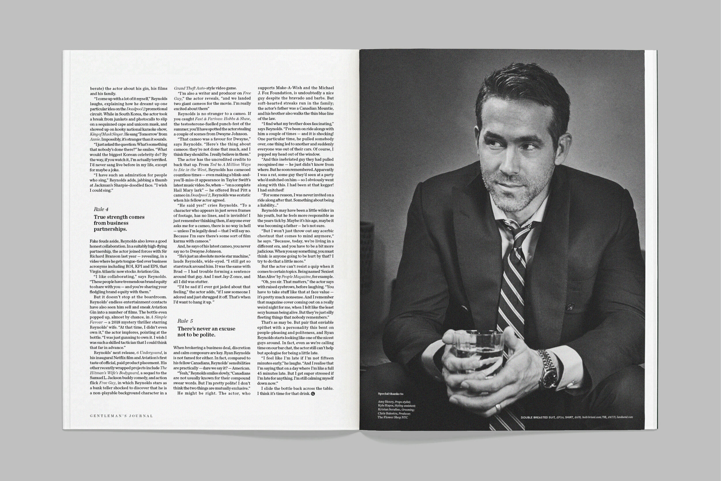
Our American producer on the project, Chris Balestra, found the ideal location in The Flower Shop — an event space by day; classic American bar by night. On the day of the shoot, we headed to Tribeca. I had heard stories about Ryan being camera-shy and preferring a quick shoot, but he turned up with his daughter (“This is her first bar…”) and, after some brief handshakes, went into the interview.
We had decided to fully embrace the larger-than-life aesthetic of this period, and brought props for Ryan to interact with; retro briefcases, vintage telephones, a drinks trolley and notepad. Each of our issues follows a theme and this was our food and drink special. Ryan’s gin and the whole jar of olives you can see in the cover shot were a nod to this.
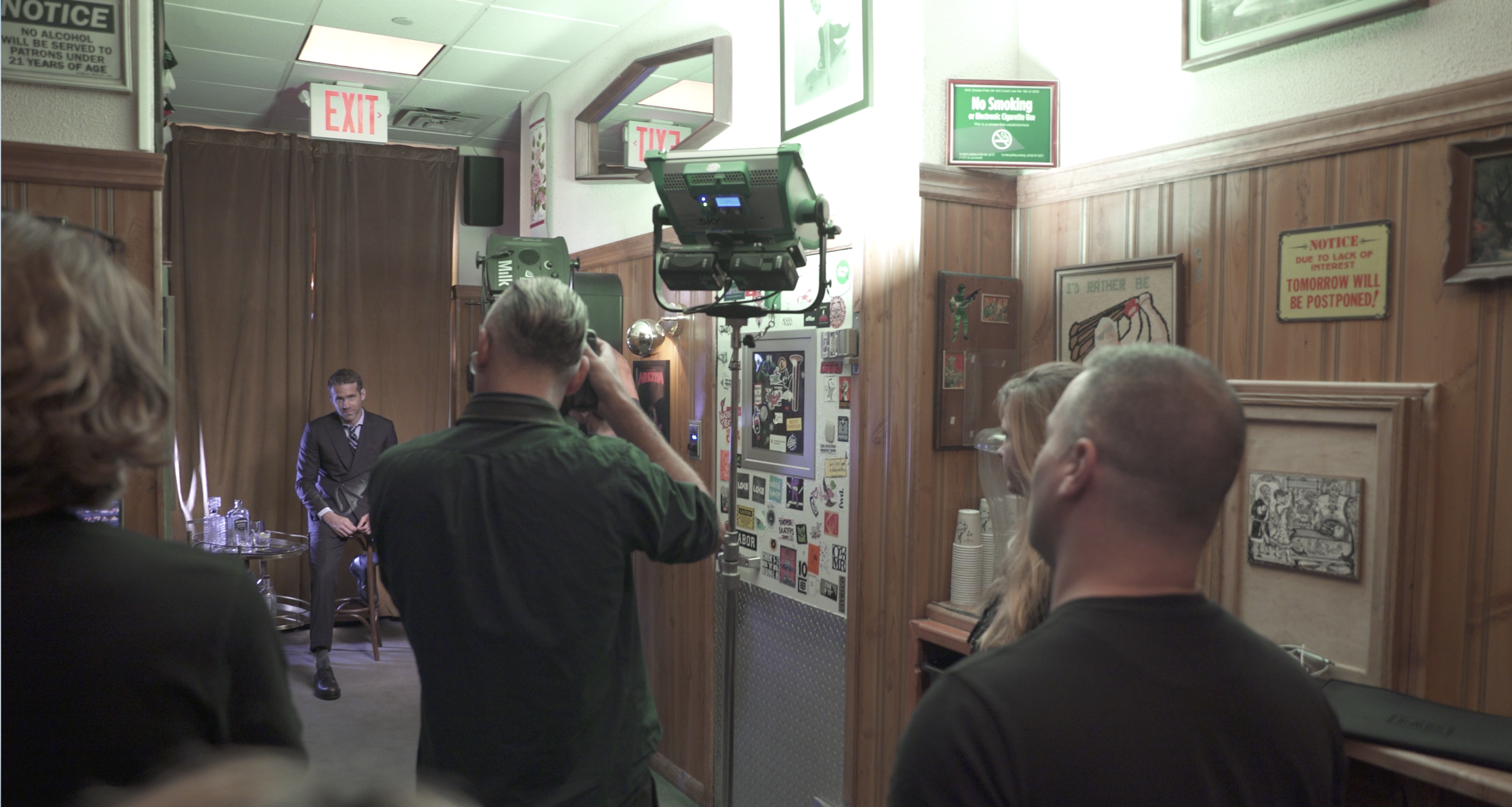
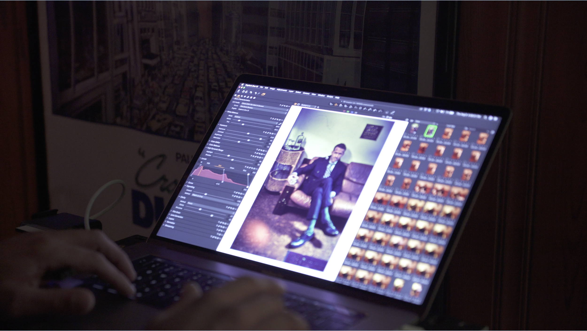
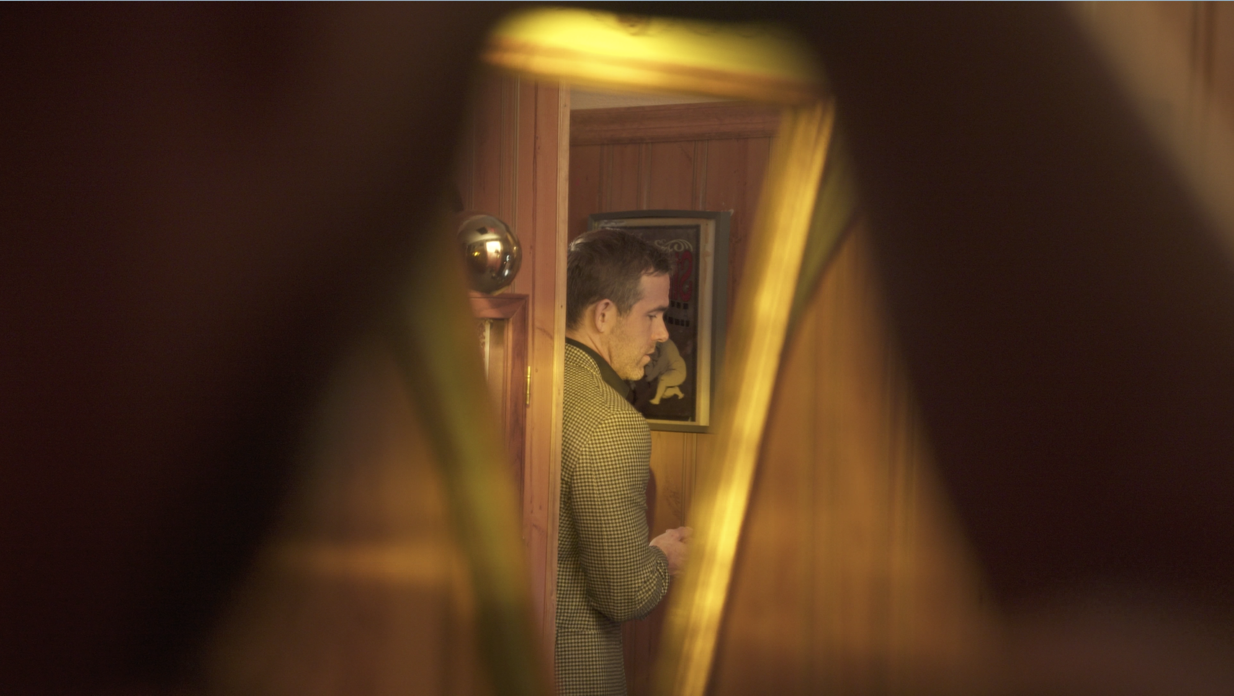
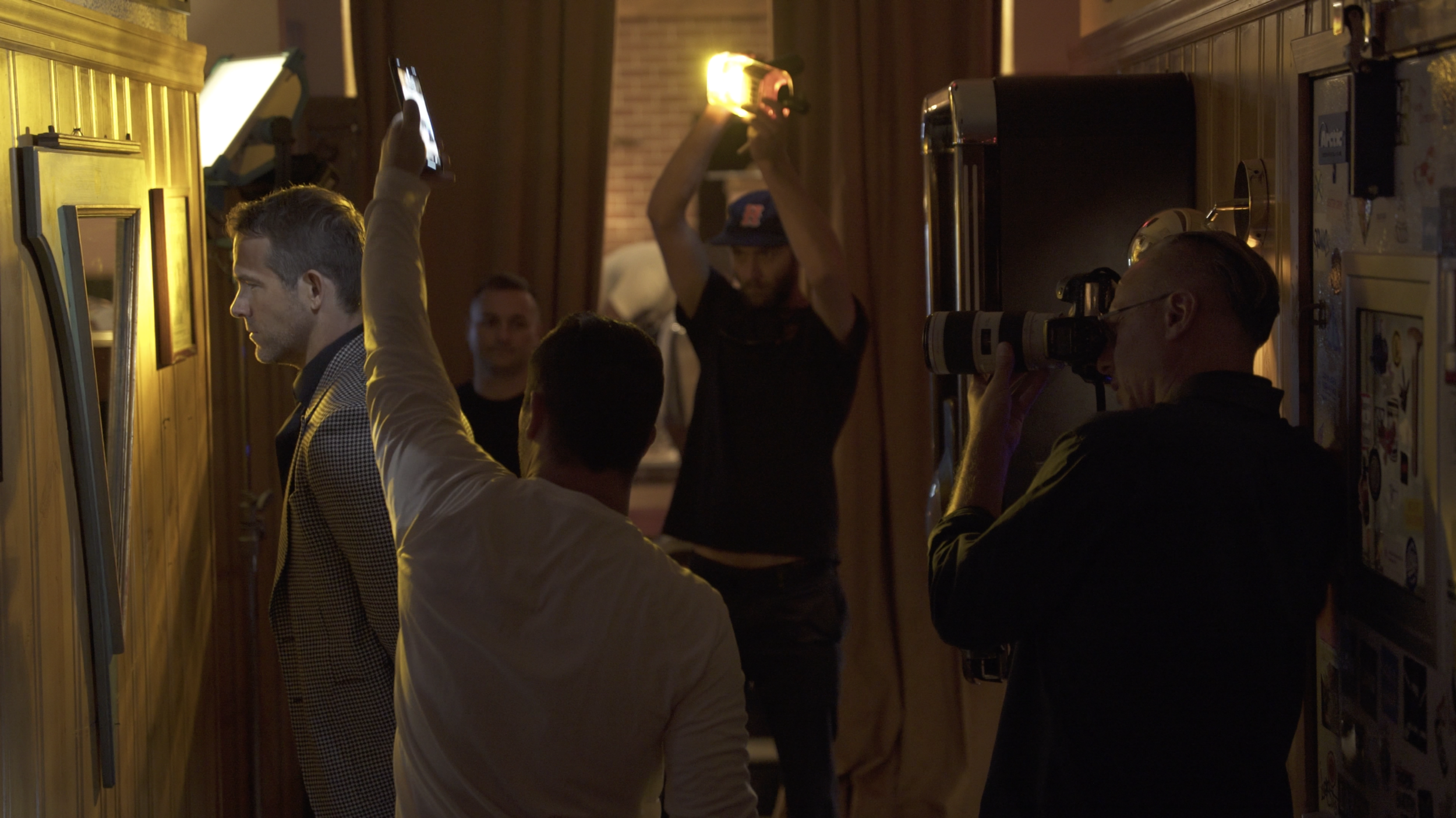
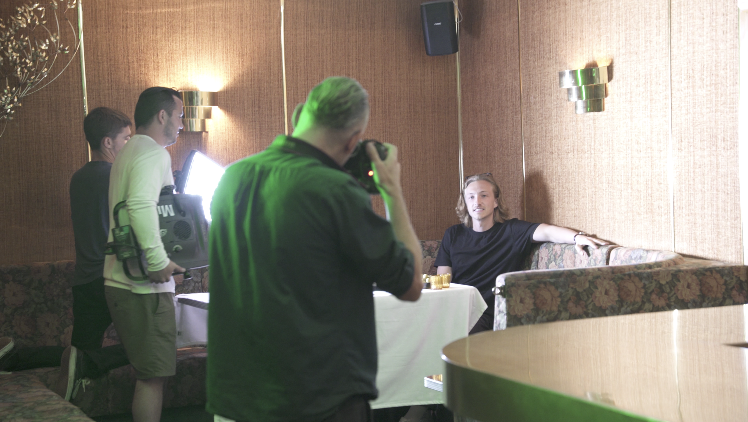
As most art directors will know, you can never predict what is going to happen on the shoot day. Working live always has its challenges. During the interview, I got the news that Guy Aroch, our photographer on the project, had been delayed in Florida and was still in the air flying to New York. He was going to be two hours late — at which point we were tempted to open a bottle ourselves. Fortunately, Guy and Ryan are firm friends, and had a great relationship when he finally arrived. Guy’s team used mobile and dynamic lighting, playing with different gels and objects around the bar (a whiskey bottle, a ashtray) to create interesting and unexpected lightscapes — such as the one you can see on the cover. After the shoot, we relaxed and all enjoyed a glass of Aviation on the rocks at the bar (best enjoyed with mixer).
It was a shoot that had its fair share of challenges. The combination of working overseas and at a New York pace made it a testing project at times. But, having the opportunity to collaborate with a talented team who all understood the same vision meant we produced a photo series which presented Ryan in an unexpected and more mature way.
We’re an independent doing some great things and I can’t recommend the issue enough. Grab a copy at www.thegentlemansjournal.com.
Art Direction: Joseph Sinclair Parker; Photography: Guy Aroch; Styling: Joseph Episcopo; Set Design: Amy Henry; Grooming: Kristan Serafino; Production: Chris Balestra
