Food & Wine's Photography Issue with Winslow Taft, Mackenzie Craig, and Eric Wolfinger
/This year marks Food & Wine's 40th Anniversary and thus a yearlong celebration that includes featuring new chefs, revisiting "milestone moments," and honoring all things food and wine. The recent March issue was also their photography issue with an emphasis not only on the food but also the photographers who capture those culinary moments. For Food & Wine's first ever photography issue, we spoke with the creative team behind the endeavor including Creative Director Winslow Taft, Photo Director Mackenzie Craig, and Guest Editor/Photographer Eric Wolfinger. Keep on reading to learn more about their collaboration process, how the issue came together, and what their ideal last meal would be.
SPD: First thing's first: why did Food & Wine decide to have a guest editor for this issue and why did you pick Eric Wolfinger?
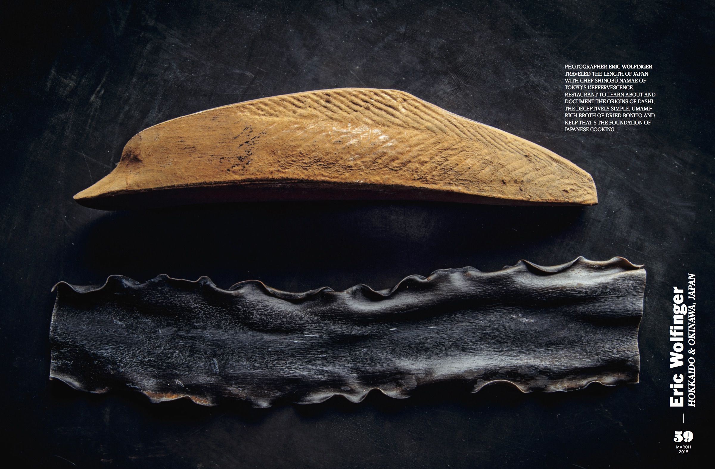
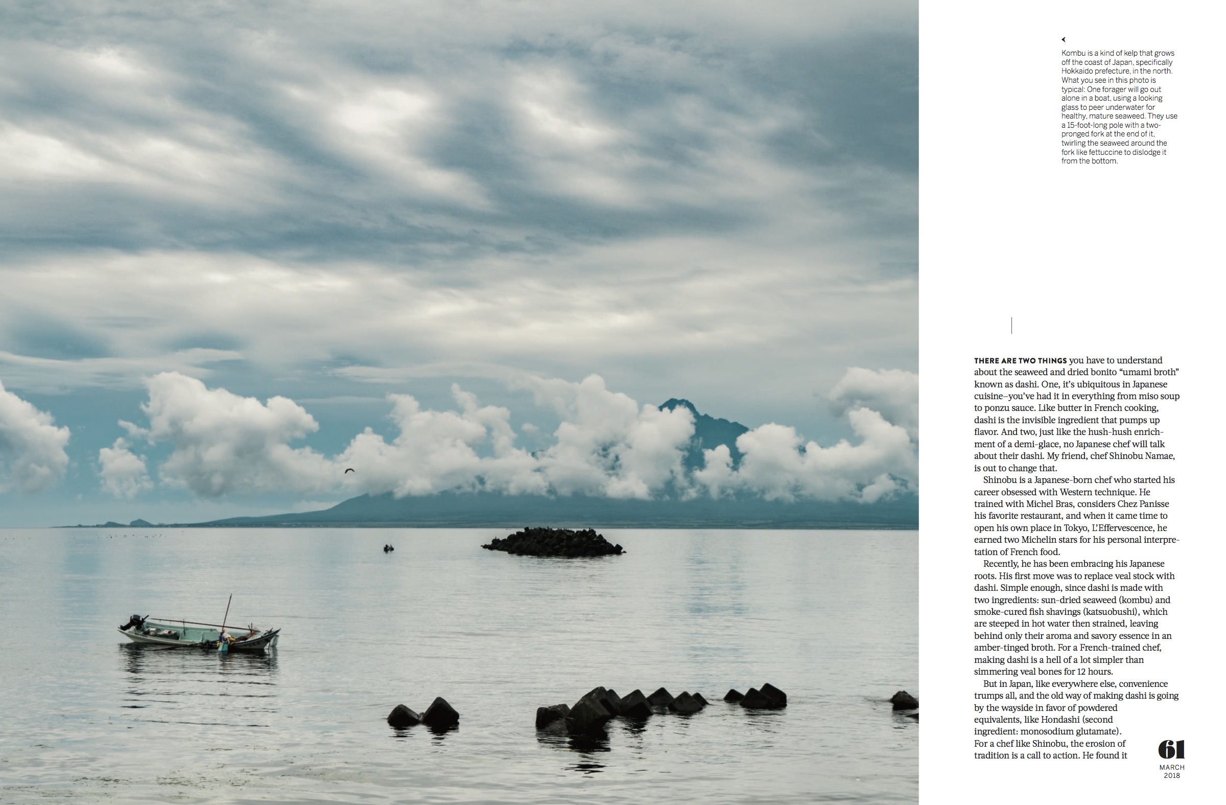
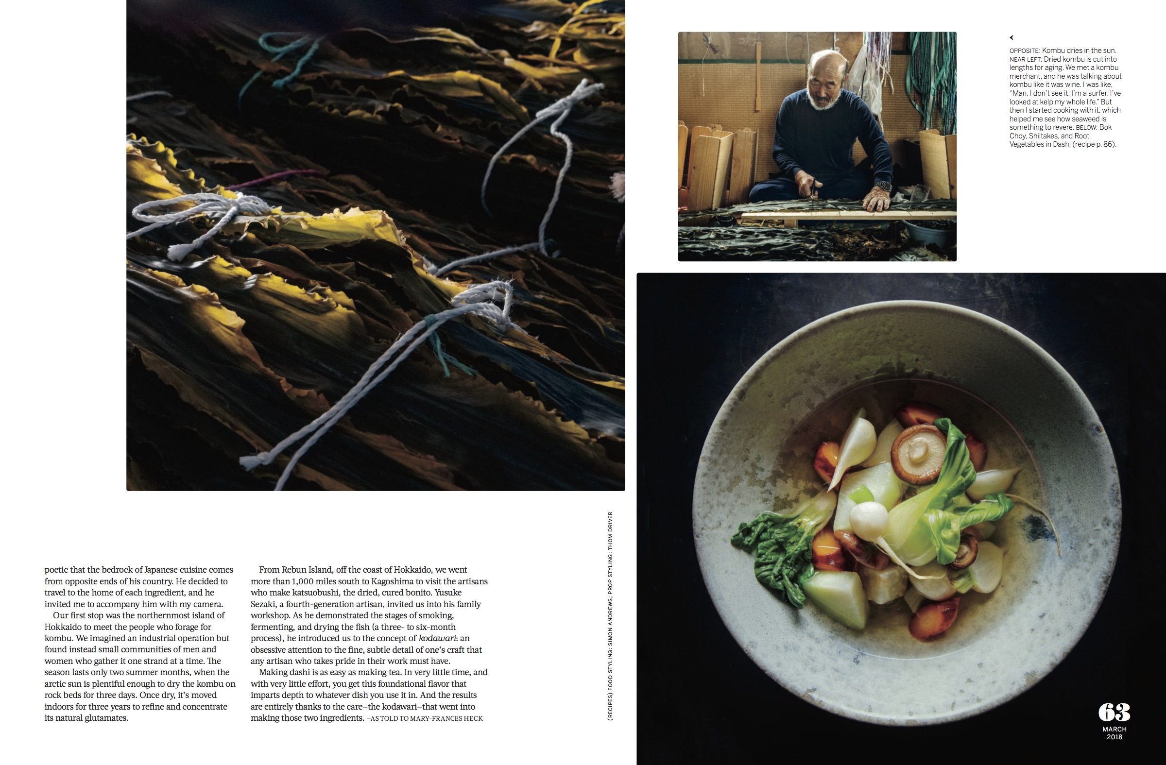
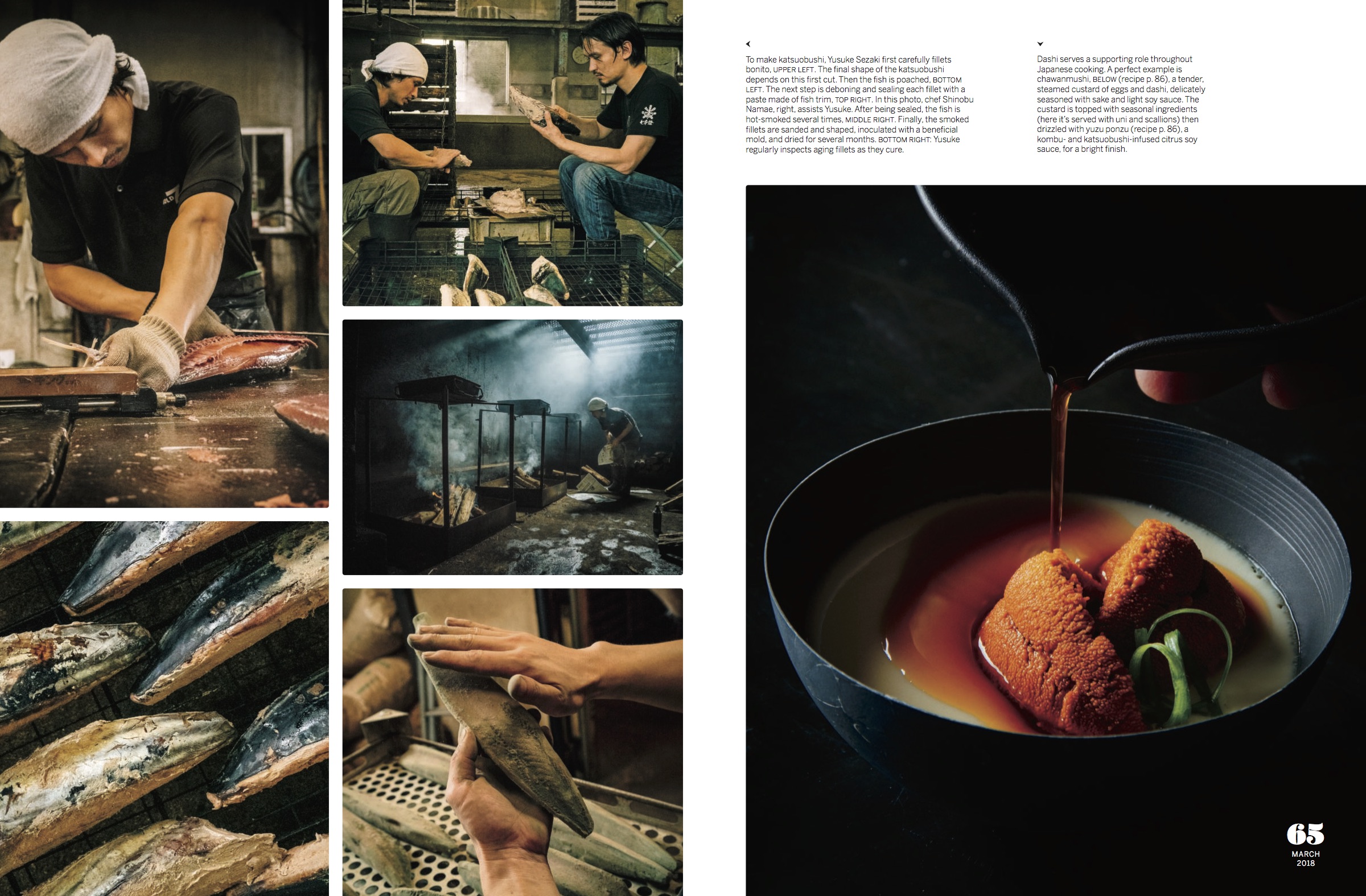
Mackenzie Craig, Photo Director: As we began brainstorming about what it would mean to have an entire issue devoted to the symbiotic relationship between cooks and shooters, food and photography, and the visceral nature of both eating food and photographing it, it seemed like a natural fit to bring in a guest editor who has built a career on the love of these two things. Eric Wolfinger is an old-school creative; we often joked about “taking the journey” as we collaborated on the March issue. To me, part of what makes Eric’s work so joyful and moving is his obvious love for both subjects. He understands food, he loves food, and his photography feels like an intimate, lovingly crafted celebration of the subject in front of his camera. Before joining us in Birmingham to help produce The Photography Issue, Eric had directed a short film titled “Dashi Journey” in which he traveled all over Japan with Chef Shinobu Namae to document the art and origins of dashi, a traditional broth at the heart of Japanese cooking. It’s a stunningly beautiful film. Eric captures a reverence and devotion here that I see reflected in his photography, and that’s what this issue was all about.
SPD: Eric, what was it like being asked to guest edit this issue? How were you asked?
Eric Wolfinger, Guest Editor: Sometime last summer, Food & Wine [Editor-In-Chief] Hunter Lewis called me out of the blue: “Hey Wolf, I'm taking over at F&W and the March photo issue is going to be the first that my team creates from cover to cover. I want you to be the guest editor.” I was blown away. At the time, the guest editor role was as nebulous and exciting as his goal for the issue, which was to “bring some of that cook's soul back to the magazine.” I was IN.
SPD: What were your responsibilities as a guest editor?
EW: Early on, I was a sounding board as Hunter developed the main concepts of the issue. For example, I loved his idea of celebrating F&W's 40th anniversary with “40 images that changed the way we eat” but sensed that actually choosing the 40 most important food images (and then licensing them) could be a fool's errand. I suggested that we think of photographs as representative of important milestones or movements in food, which would give us room to talk about issues that are bigger than photography. Hunter also solicited my suggestions for photographers, which was a first - I'm always on the other side of that conversation.
SPD: When you were first brainstorming this issue, what ideas came to mind? Were there any ideas that you loved that didn't make the final cut?
Winslow Taft, Creative Director: Unfortunately, I missed out [on] the brainstorming of the issue because I wasn’t yet working at F&W. Sadly, if I had any sketches they have been lost to the disaster of papers that is my desk.
MC: I think this issue took root in EIC Hunter Lewis’ brain long before it became a reality for the rest of us. Hunter has a profound passion for food and food media, and he is so deeply genuine. I think this issue really reflects that. From the beginning, Hunter had some pretty solid ideas about what he wanted this issue to present to the world, and while I’m sure there were plenty of ideas that didn’t make the cut, there were some obvious choices that kind of just took off naturally (like the 40 images story and this overarching theme of Cooks and Shooters). Looking back on the brainstorming portion of this project, I realize that it was kind of old-school in the best way. We talked and talked and met and talked more and just kind of let the creative process shape where we went with it. Magazine magic!
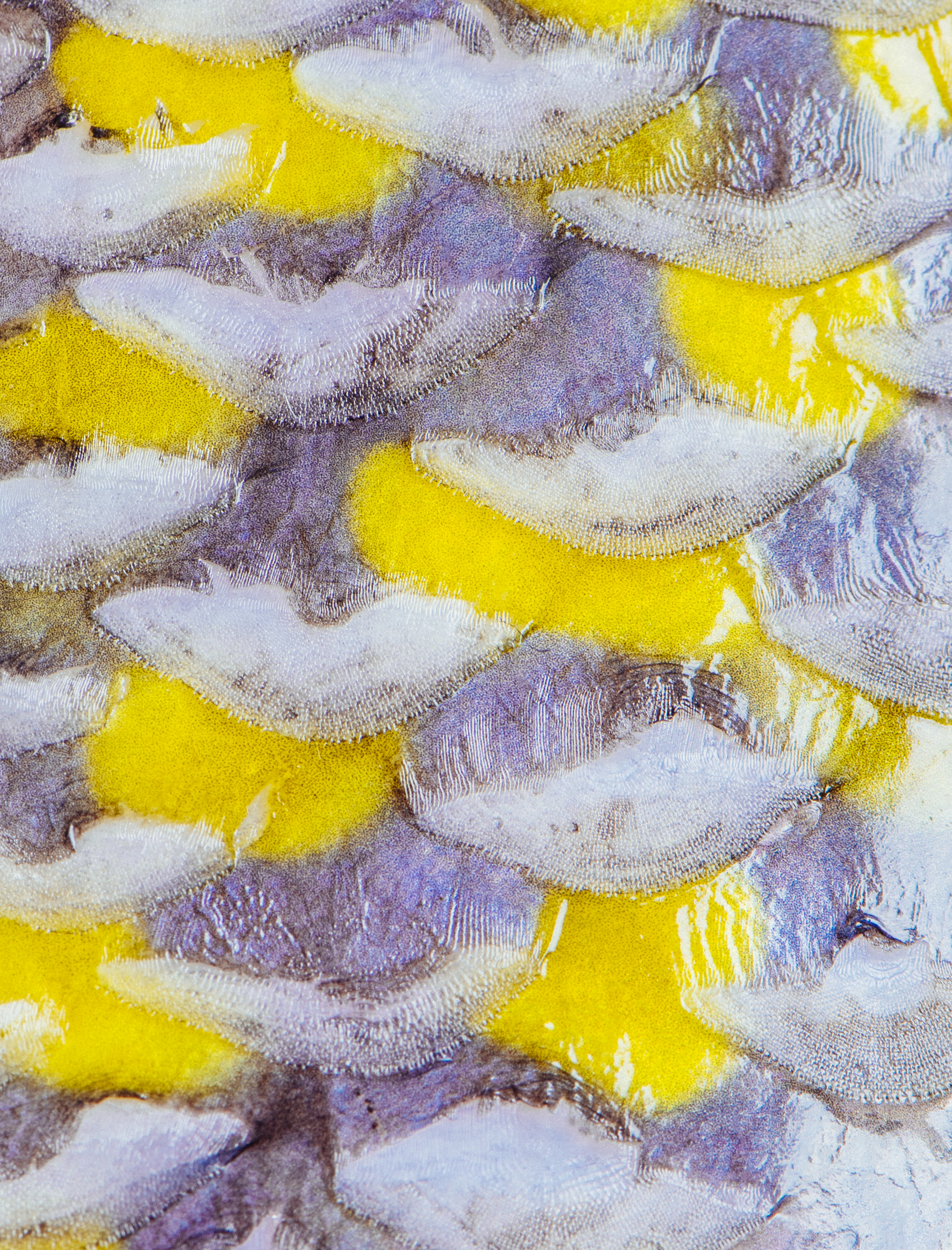
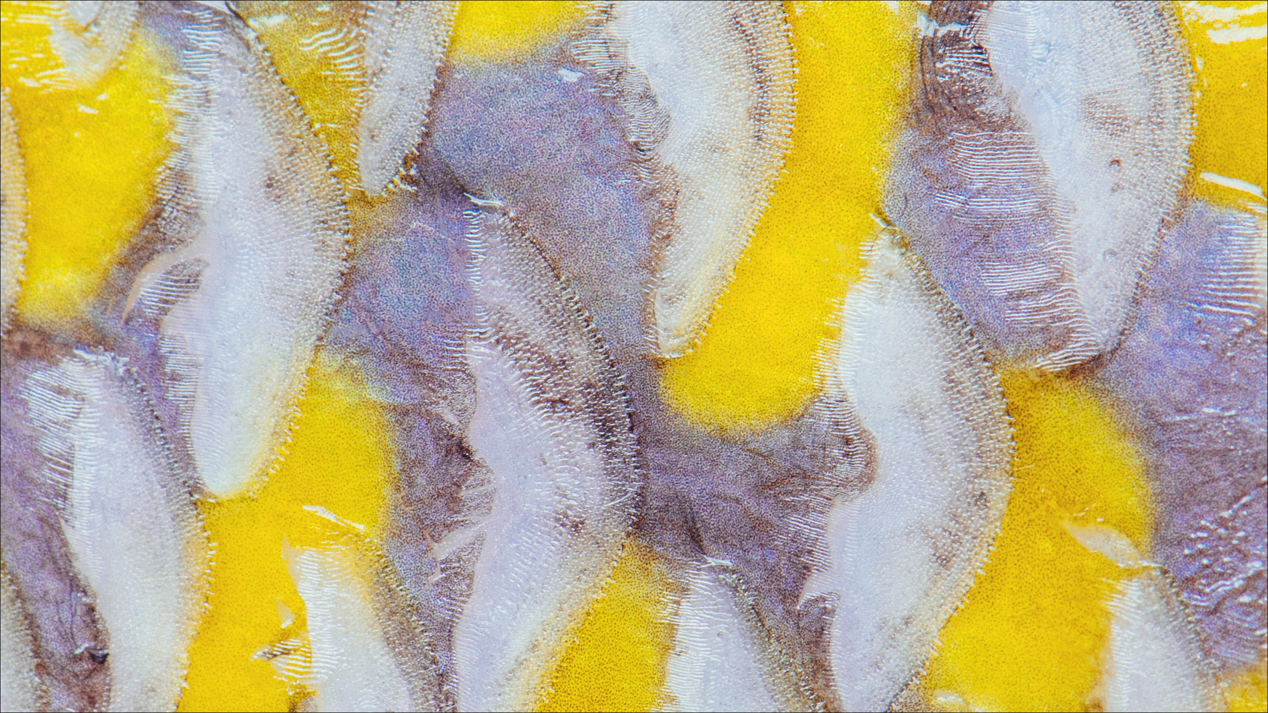
EW: I needed a Tilefish for one of the recipes in my Dashi story – the fish has the unique property of edible scales that crisp when fried. I must have called 20 seafood distributors from San Francisco to Boston to find one, but nobody could help me. Finally I found Sea To Table, an outfit that works directly with fishermen, and they managed to find and ship a huge and heartstoppingly beautiful 40-pound specimen to Birmingham just in time for the shoot. I was in awe of the creature and spent an hour shooting a whole series (I also made sure it got eaten) but in the end only one photo made it to print (below).
"He understands food, he loves food, and his photography feels like
an intimate, lovingly crafted celebration of the subject
in front of his camera."
-Mackenzie Craig about Eric Wolfinger
Besides the sheer beauty of the fish itself, what struck me was her coloration and delicate shading. I used every lens in my quiver for my 'ode to the tilefish,' but it wasn't until I got on my macro lens, shot the scales, and blew up the image 500% that I noticed something that really blew me away. To achieve that beautiful shading, mother nature was printing color using dots of single tone pigment that are imperceptible to the naked eye. In photo terms, tilefish are pixelated. Mind. Blown.
[The below image] is a screenshot of the 400% magnification of one of my macro shots.
SPD: What was the collaboration process like?
WT: Fantastic. Both [Eric and Mackenzie] are [a] pleasure to work with. It’s so nice when everyone is on the same page and trying to create at the highest level.
EW: In addition to editorial, Hunter and Mackenzie invited me to shoot a lot of the content for the issue at the Time Food Studios. With 20 kitchens and 20 photography bays, the Studios kind of seem like a maquiladora of food media production. Mackenzie paired me with a dream team - food stylist Simon Andrews and prop stylist Thom Driver – and we quickly fell into a beautiful collaborative groove. It's all about the people!
MC: Winslow actually came on board towards the end of this issue, but I think that his cover design is one of the best I have seen. There were a lot of late night emails exploring different directions and type treatments and design approaches, but I remember getting the email with the cover that ended up running and immediately replying “I LOVE IT.” I don’t know much about design, but that cover is visceral and fun and engaging and truly captures the essence of the photography issue. Eric was much more involved in the planning and creative behind the issue than you might expect from a traditional guest editor, and he was like the secret sauce. He is whip smart and loose and free and just one of the most creative people I have ever met; his energy was pervasive. We spent a week shooting together here in Birmingham with Simon Andrews and Thom Driver, and everyone on that set had vision and opinions that somehow never felt at odds. I think we ended up pushing one another to go further and do better. That’s what it’s all about, right?
SPD: Winslow, how did you decide on this cover? Can you tell us more about the cover design?
WT: Short answer? Via email between Hunter Lewis, Mackenzie and myself on a Saturday afternoon. Long answer is we had been exploring cover options from all the photos in the stories within the issue along with shooting for a cover with Eric Wolfinger, and though we had many beautiful options, none quite hit the mark. The flan photo from Romulo Yanes had been a contender since he sent it over during his shoot, but we hadn't been able to figure out how to make it THE cover. The change for that image came when I embraced it wholly as the cover and not as a photo on the cover with our logo and lines placed over it. While I struggled with the idea of manipulating a photo in this way for our photography issue, in the end it actually made the photo stronger on the cover by having the type on the same level visually and not competing with the light, texture, color, and beautiful vanilla fleck details in the flan that still steal the show.
SPD: Mackenzie, what was it like overseeing the Photography Issue? Were there any challenges you faced working on this major issue while also juggling your other position as the Photo Director at Cooking Light?
MC: It sounds a little cheesy, but The Photography Issue presented an opportunity to really reconnect with the soulful roots of the food magazine world. Especially during a major transition like the one Food & Wine experienced early last fall, it can be challenging to look beyond immediate needs at the big picture; I think working on this issue helped us all to take a deep breath and do that. It felt a little like a reset button, and an opportunity to celebrate some things we all feel very passionate about. It’s definitely been challenging to work as the Photo Director across two brands, but Cooking Light has really hit its stride in the months since the major redesign we did last year. In some ways, that has opened up some space for us to really delve into where the Food & Wine brand goes next.
SPD: Eric, since you're coming from a photographer's perspective, what was it like being part of the process of putting together a magazine as an editor? What did you learn from being behind-the-scenes?
EW: Though I've never officially had the “editor” title in the 20 cookbooks that I've photographed, I'm often very hands-on in the editorial process from proposal to print. The editor role felt natural, but I was struck by the pace of a monthly magazine. Cookbooks can be languid projects that take years to finish, but a magazine comes out every month. When does everyone sleep?!!
SPD: Were there any photographers that you were really excited to feature and work with?
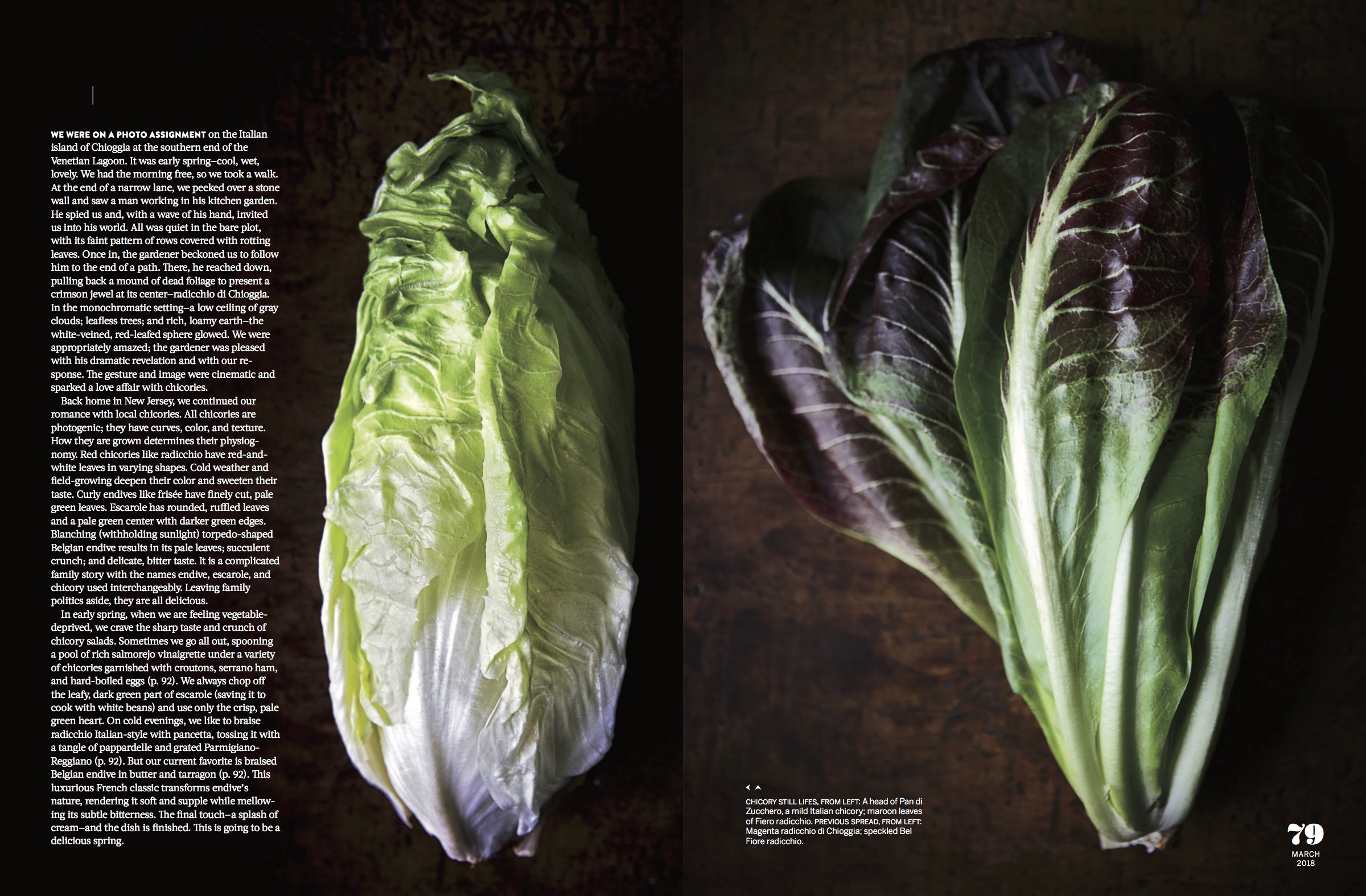
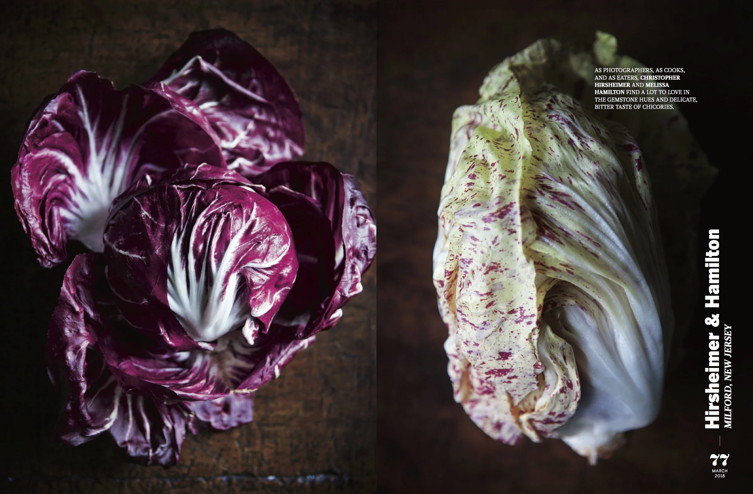
MC: I was really excited about our Cooks and Shooters package that featured photographers who don’t always show up in the editorial magazines on newsstands today. The point was not to get the newest or trendiest names in food photography, but instead to call upon the most passionate personalities straddling the world of food and photography, and straddling it with tried-and-true excellence. Penny De Los Santos, Eric Wolfinger, Romulo Yanes, Christopher Hirsheimer and Melissa Hamilton of Canal House…they are all contributors who had passions to share. I was also excited to work with Landon Nordeman, who photographed our Round Table gathering at a cheese cave in New York City. Since we didn’t have a full photo department while producing this issue, I worked with Rory Walsh, a really talented photo producer in New York on this story, and we chose Landon for his strong compositions, his fashion-y light, and his reportage-style of photography. We wanted to capture the tone of the intimate discussion with the photography as well as the words, and Landon was into it!
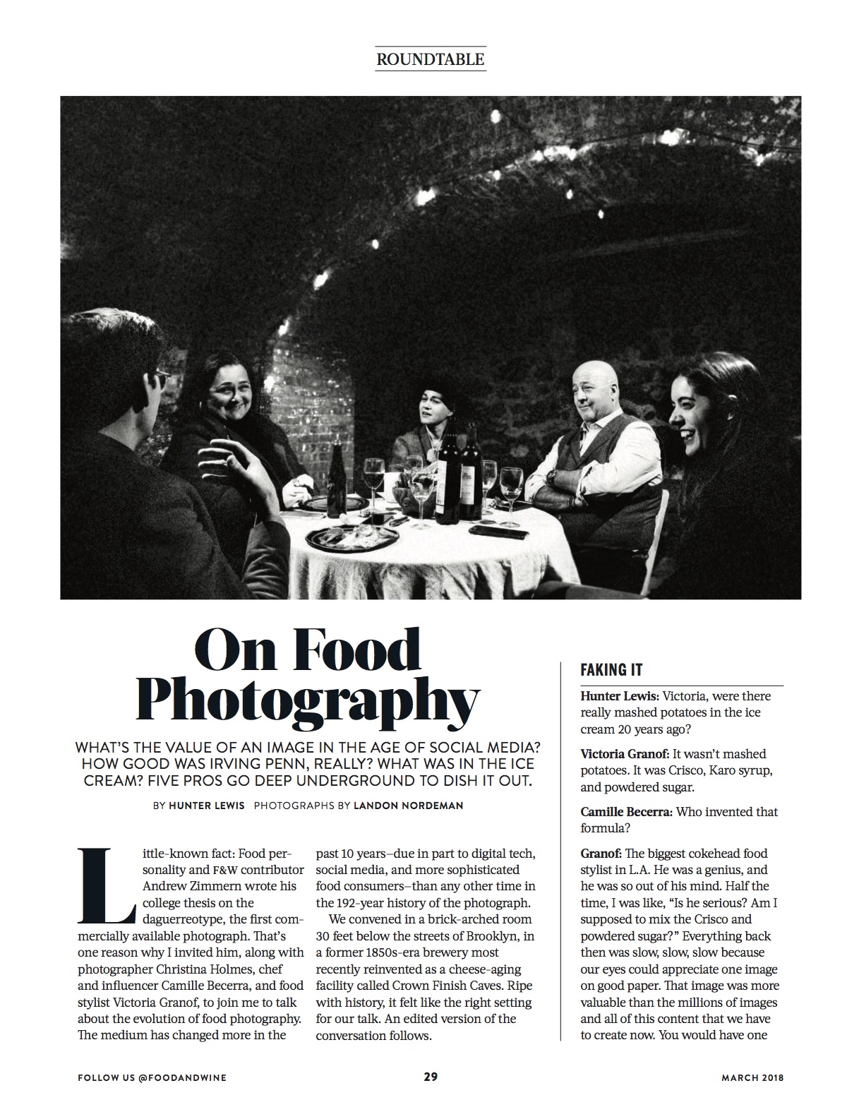
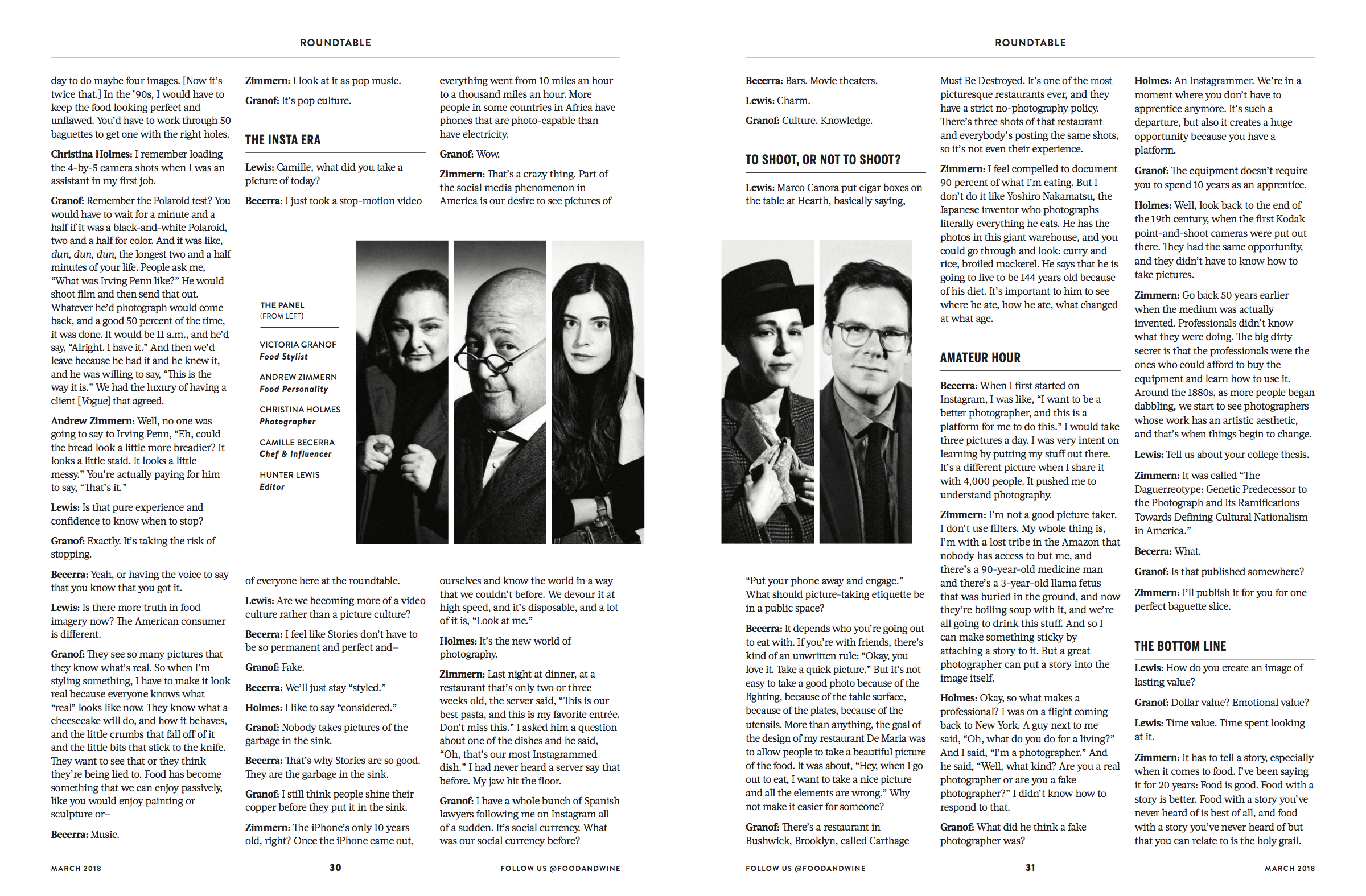
SPD: Winslow, though this was the Photography Issue, what was your favorite design element?
WT: Being the Photo Issue I designed with the intention of the photos stealing the show but I was very happy with how the vertical titling anchored by the large page numbers played a strong second fiddle to them. The repetition of those elements was all that was needed to create a cohesive package and they allowed enough flexibility to accommodate full spread images and even some copy! Editor’s Rejoice!
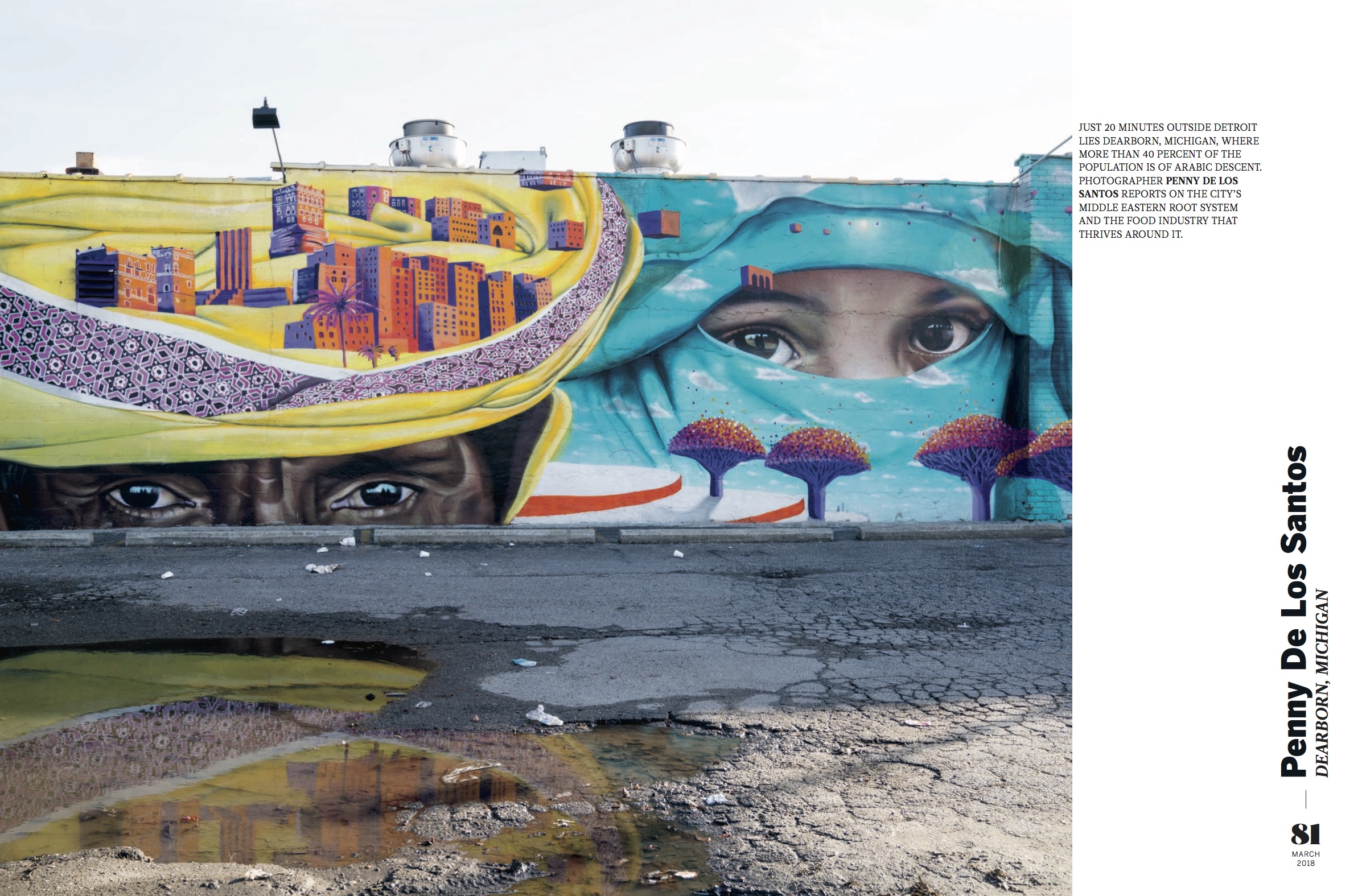
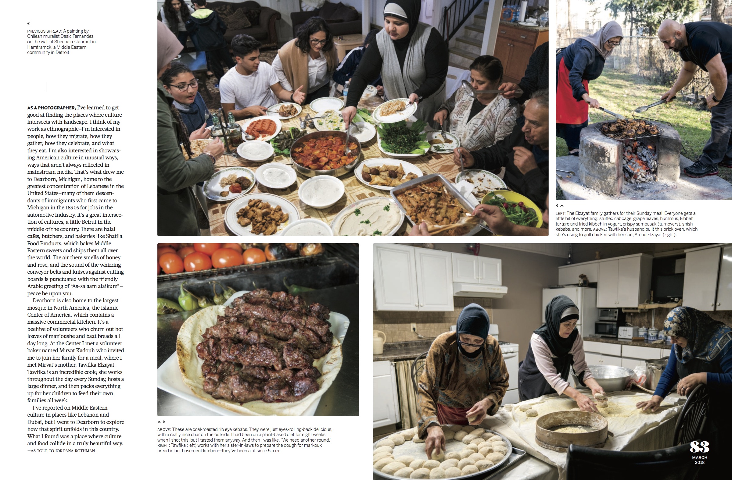
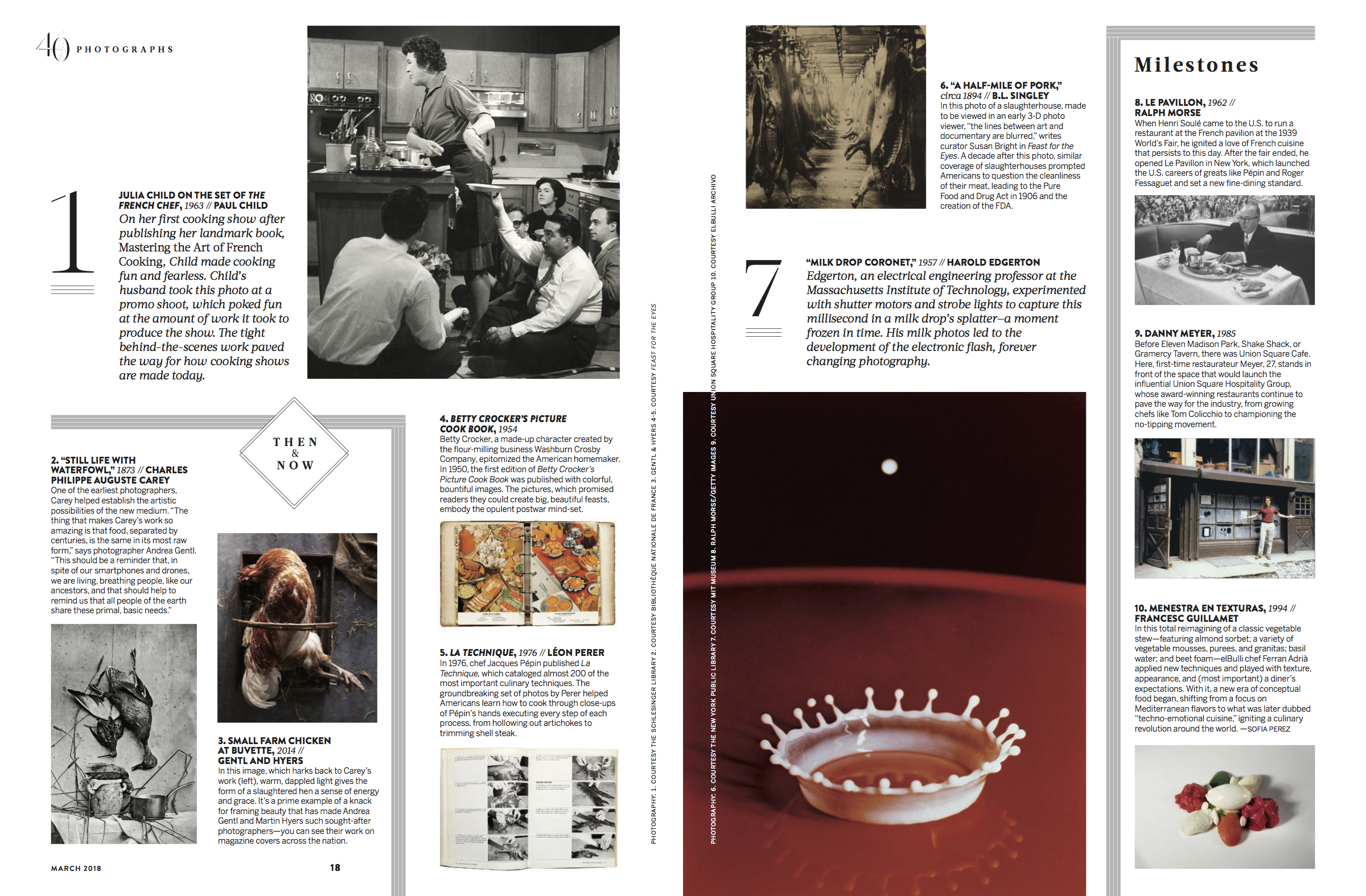
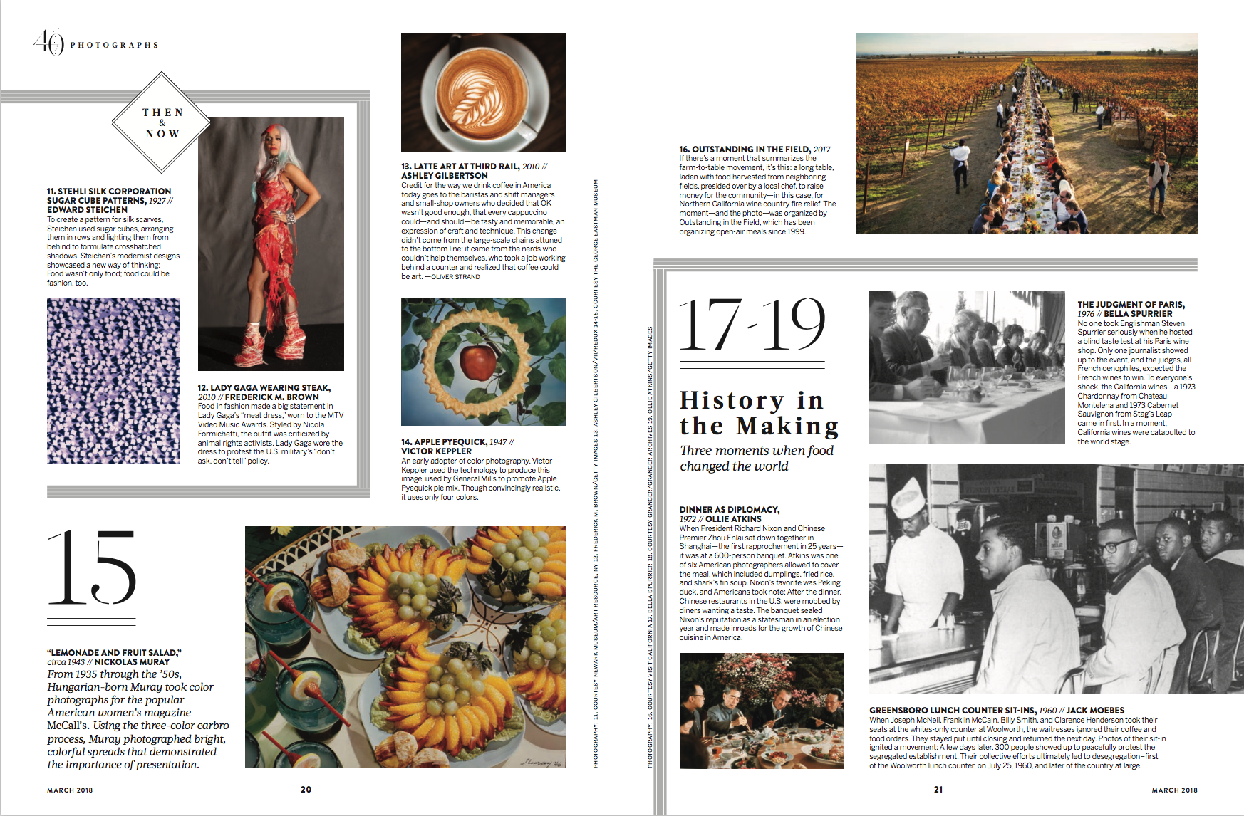
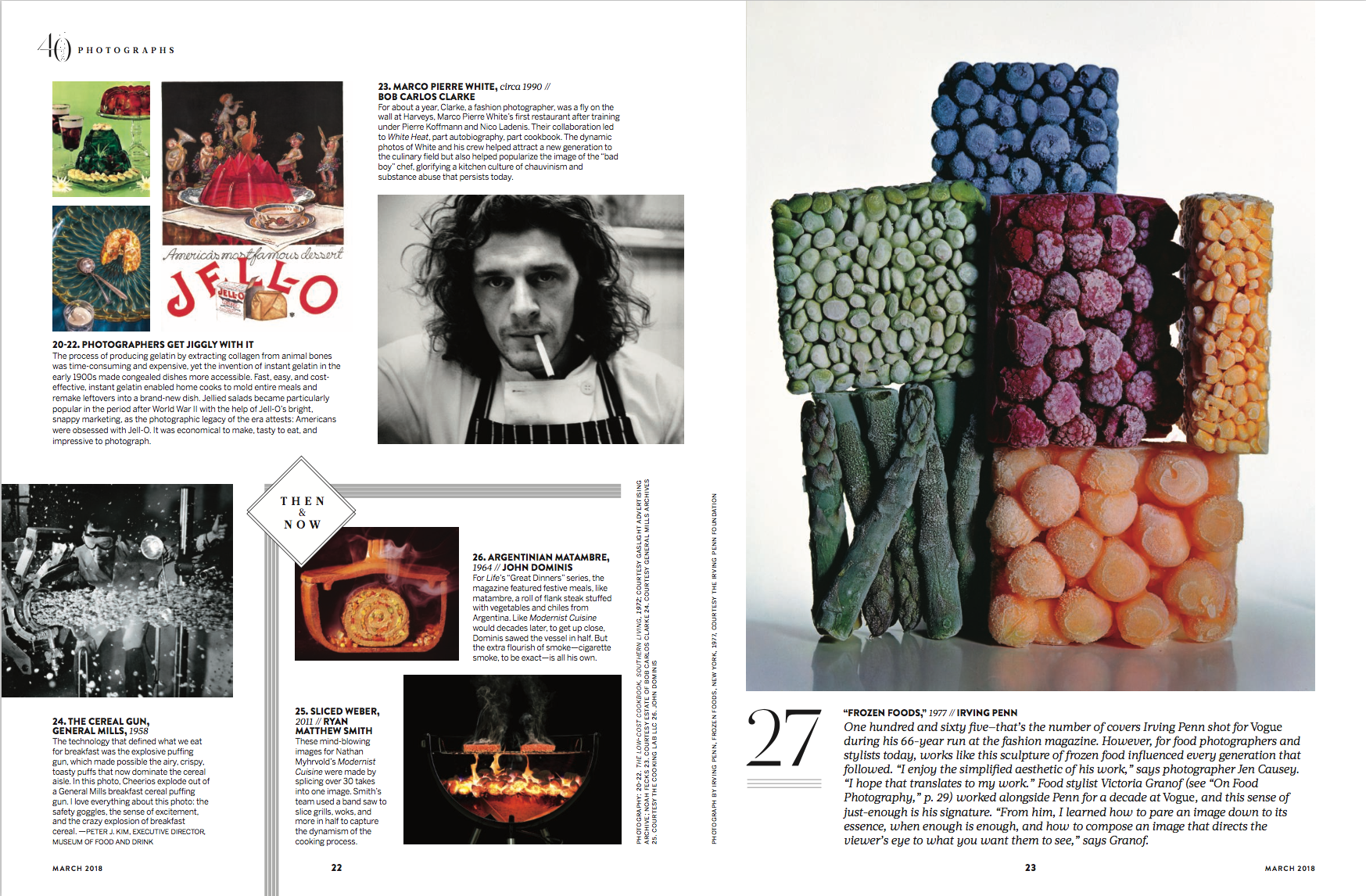
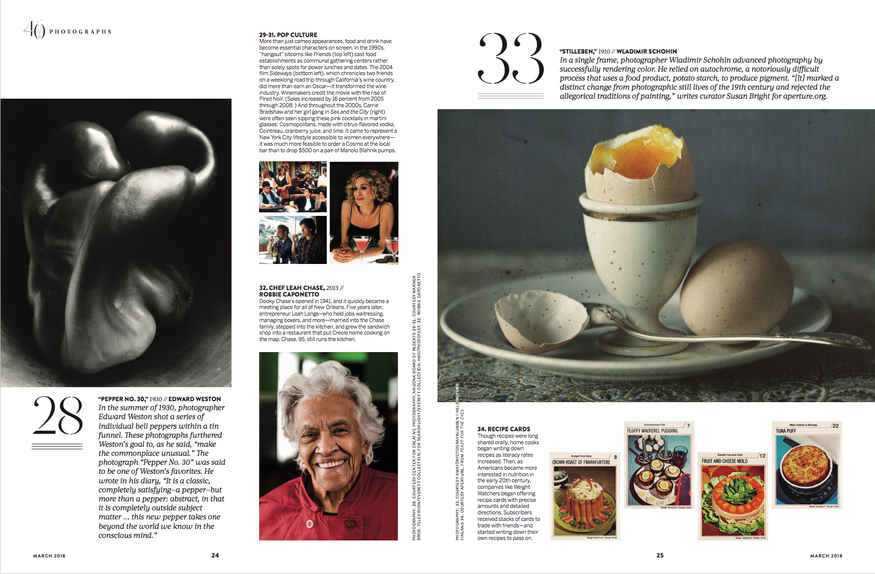
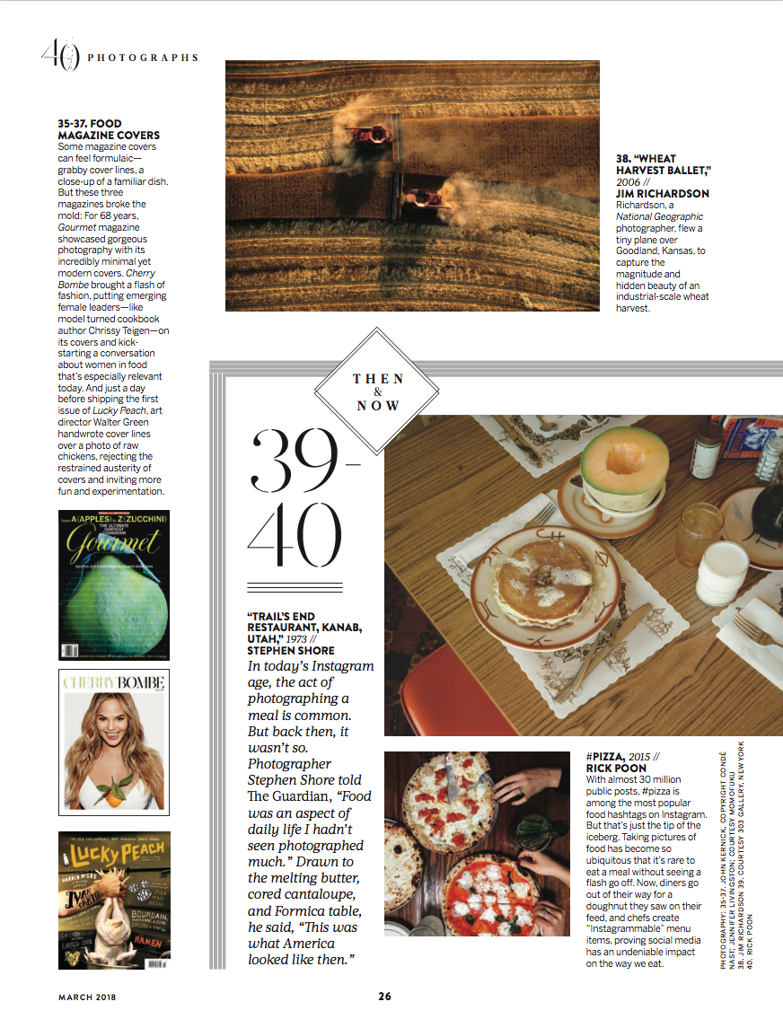
SPD: For the "40 Photographs (and Moments) that Changed the Way We Eat" story, what was the process of narrowing down and deciding on those particular photos/moments?
WT: Mackenzie Craig really took the reigns on this story [by] pulling together a great list of possible images. From there, it was a series of wall reviews where the merits of certain images were weighed against one another to get us to a place to begin the layout. Of course, once you could see all the images together in the layout certain repetitions and holes presented themselves so a few last changes were made to round out the list.
MC: The process of choosing those images took months, and strangely took us on a full-circle creative journey. We started with this broad idea that iconic moments in food photography have shaped food culture today. And we had a lot of questions: was it about the images themselves, or the moments they represented? Was it chronological? Topical? Were there categories? Was it a then-and-now comparison? Were there personal stories and anecdotes that should be tied to the moments? At one point, we even wondered…did paintings count?? I was really excited to get to work on this project with Kim Gougenheim, one of my first magazine mentors. She has such a deep knowledge of photography, photographers, and the history of food and media, and she did a lot of the legwork with the image research. After weeks of sorting through hundreds of print outs hanging on the walls of the office, we decided that this story might not actually fit into a tidy rubric; it was about everything—time, place, context, history, personality, and influence. The most truthful way for us to tell the story would be to almost go back to where we had started: quite simply, 40 photographs, and moments, that changed the way we eat. We finally made a list numbered 1-40 and started filling slots with images or moments about which we felt strongly. Each of the editors involved fought for their picks, adjustments were made to account for overlap, and in the end, the list that came together felt like a truthful representation of the original concept. The funny thing is that everyone who walked by the wall would say, “Hey, did you consider this image or that person or this archival work?” And it was kind of liberating to realize….we believe in our choices, but there’s no right answer here.
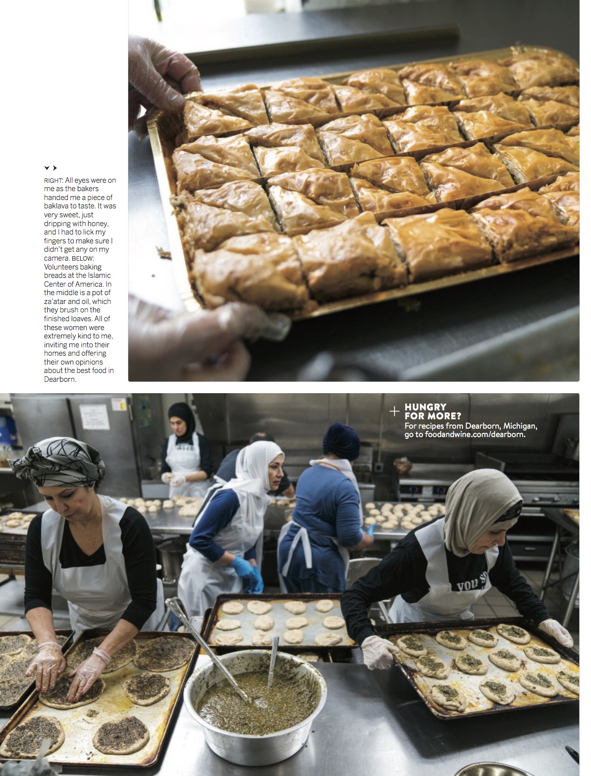
SPD: What part of the photo issue are you most proud of and do you have a favorite photo from the issue?
MC: That’s like choosing a favorite child! I actually love different parts of the issue for different reasons. [Cooks & Shooters}, the feature well, was really interesting because we didn’t over-produce it. We spoke to all of the contributors, flushed out our vision and the direction, aligned our goals, and then gave them a lot of freedom to deliver their stories in a way that felt true to their style. As a result, I got to feel like I experienced that package without getting too caught up in "how the sausage was being made!" The 40 images story, on the other hand, nearly killed me but morphed into a true labor of love. I recently flipped back through the issue after a bit of time away from it, and was kind of surprised to realize that my favorite image in the whole magazine was one of the quieter moments, the photograph from Bo Bech of a hotel room in Paris. It’s striking and romantic and intriguing and I just can’t stop thinking about what the woman on the right is laughing about! I love that we were able to include an image like this in Food & Wine.
EW: Cover to cover, the photo issue looks fresh but feels timeless; I think we found the soul that Hunter was looking for. So many food magazines are chasing trends – in content and in style – and Hunter is setting a different course with this issue. I am extremely proud to be a part of that.
WT: I’m most proud of the cover, though the issue overall is a close second. My favorite photo is Bo Bech’s hotel room in Paris. It’s a fantastic food moment captured in a way that is a bit of a departure from our normal photo style but get’s at the heart of what this issue is truly about—capturing these photographer’s passion for food.
SPD: What's next for the yearlong celebration of Food & Wine's 40th Anniversary?
WT: The next celebration for Food and Wine’s 40th Anniversary is the history of our Best New Chefs franchise. We will examine how BNC was, and in this very issue remains, the definitive time capsule of a moment in the ongoing food revolution/evolution. These are not the trends, but the people who create the trends. It’s the people and their passion that will continue to drive food culture as the platforms and forms of cooking and eating change. These honorees—just 10 each year (it started in 1988)—have changed where, what, and how we eat, cook, and dine. To watch their rise and the history of Best New Chefs is to observe the evolution of modern American culinary culture in real time.
MC: Next up will be Best New Chefs, a Food & Wine franchise that has, for years, been redefining the landscape of food culture in this country and bringing recognition to some of the most talented chefs in the industry today. We just wrapped up the May issue, which will feature one of Food & Wine’s newer franchises, “Restaurants of the Year.” It’s a package that celebrates restaurants across that country that are doing innovative or exciting or just generally excellent work, and I think this year’s package is stronger than ever. From there we roll into a special themed travel issue and move onto our 40th anniversary celebration issue after that. It has been and will be a busy year for Food & Wine!
SPD Bonus Question: Last question, what would your ideal last meal be?
WT: Food for me is always about the time and place it’s experienced, so my ideal last meal would be something simple (burger and fries perhaps?) from a local diner in a small town with good friends during a long motorcycle trip.
EW: I don't want to know when I'm having my last meal, but I hope it's with people I love – along with fresh bread, grilled meats, spicy greens, and a few epic bottles of wine.
MC: Don’t tell anyone at either of the food magazines I work for but...a Five Guys burger and a shot of Fireball?
CREDITS
Creative Director: Winslow Taft
Art Director: Emily Johnson
Senior Designer: Hagen Stegall
Photo Director: Mackenzie Craig
Photo Assistant: Savanna Sturkie
Cover Animation: Daniel Boone
Guest Editor: Eric Wolfinger
Editor-In-Chief: Hunter Lewis
